Introduction
The fdars package provides convenient
plot() and autoplot() methods for functional
data objects. However, for publication-quality figures or specialized
visualizations, you may need more control. This vignette shows how to
create fully customizable plots using ggplot2 directly.
Understanding the fdata Structure
An fdata object contains:
-
data: Matrix of size[n, m]where n is the number of curves and m is the number of evaluation points -
argvals: Vector of length m with the evaluation points (time/domain values) -
id: Character vector of curve identifiers -
metadata: Optional data frame with covariates
# Create example data
set.seed(42)
n <- 30
m <- 100
t_grid <- seq(0, 2*pi, length.out = m)

# Generate curves from two groups
X <- matrix(0, n, m)
groups <- rep(c("Treatment", "Control"), each = n/2)
for (i in 1:n) {
  if (groups[i] == "Treatment") {
    X[i, ] <- sin(t_grid) + 0.5 + rnorm(m, sd = 0.2)
  } else {
    X[i, ] <- sin(t_grid) + rnorm(m, sd = 0.2)
  }
}

# Create fdata with metadata
meta <- data.frame(
  group = groups,
  age = runif(n, 20, 60),
  response = rnorm(n)
)

fd <- fdata(X, argvals = t_grid,
            id = paste0("subject_", 1:n),
            metadata = meta,
            names = list(main = "Example Data",
                        xlab = "Time (s)",
                        ylab = "Signal"))

# Inspect the structure
str(fd, max.level = 1)
#> List of 7
#>  $ data    : num [1:30, 1:100] 0.7742 0.7402 0.0998 0.4991 0.767 ...
#>  $ argvals : num [1:100] 0 0.0635 0.1269 0.1904 0.2539 ...
#>  $ rangeval: num [1:2] 0 6.28
#>  $ names   :List of 3
#>  $ fdata2d : logi FALSE
#>  $ id      : chr [1:30] "subject_1" "subject_2" "subject_3" "subject_4" ...
#>  $ metadata:'data.frame':    30 obs. of  3 variables:
#>  - attr(*, "class")= chr "fdata"
Converting fdata to Long Format
The key to custom plotting is converting the wide matrix format to a long (tidy) format that ggplot2 expects.
# Function to convert fdata to long format
fdata_to_long <- function(fd, include_metadata = TRUE) {
  n <- nrow(fd$data)
  m <- ncol(fd$data)

  # Create base long-format data frame
  df <- data.frame(
    curve_id = rep(fd$id, each = m),
    t = rep(fd$argvals, n),
    value = as.vector(t(fd$data))
  )

  # Add metadata if requested and available
  if (include_metadata && !is.null(fd$metadata)) {
    # Expand metadata to match long format
    meta_expanded <- fd$metadata[rep(seq_len(n), each = m), , drop = FALSE]
    df <- cbind(df, meta_expanded)
    rownames(df) <- NULL
  }

  df
}

# Convert our data
df_long <- fdata_to_long(fd)
head(df_long)
#>    curve_id          t     value     group      age response
#> 1 subject_1 0.00000000 0.7741917 Treatment 29.85853 -1.11855
#> 2 subject_1 0.06346652 0.4504843 Treatment 29.85853 -1.11855
#> 3 subject_1 0.12693304 0.6992181 Treatment 29.85853 -1.11855
#> 4 subject_1 0.19039955 0.8158238 Treatment 29.85853 -1.11855
#> 5 subject_1 0.25386607 0.8320017 Treatment 29.85853 -1.11855
#> 6 subject_1 0.31733259 0.7908085 Treatment 29.85853 -1.11855
Basic Custom Plots
Simple Spaghetti Plot
ggplot(df_long, aes(x = t, y = value, group = curve_id)) +
  geom_line(alpha = 0.5, linewidth = 0.3) +
  labs(x = "Time (s)", y = "Signal", title = "All Curves") +
  theme_minimal()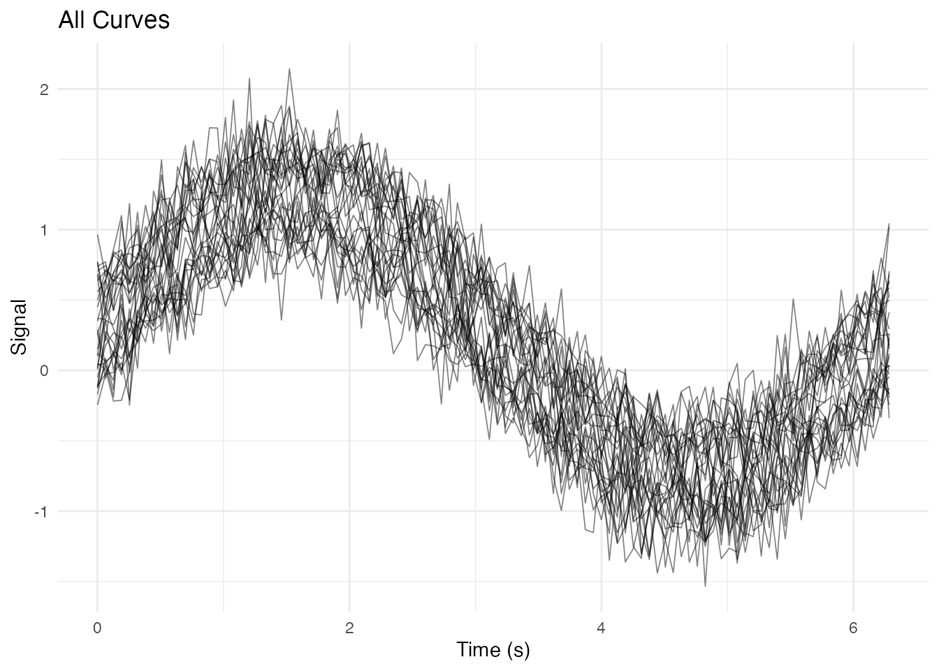
Coloring by Group
ggplot(df_long, aes(x = t, y = value, group = curve_id, color = group)) +
  geom_line(alpha = 0.6, linewidth = 0.4) +
  scale_color_manual(values = c("Treatment" = "#E69F00", "Control" = "#56B4E9")) +
  labs(x = "Time (s)", y = "Signal", color = "Group") +
  theme_minimal() +
  theme(legend.position = "top")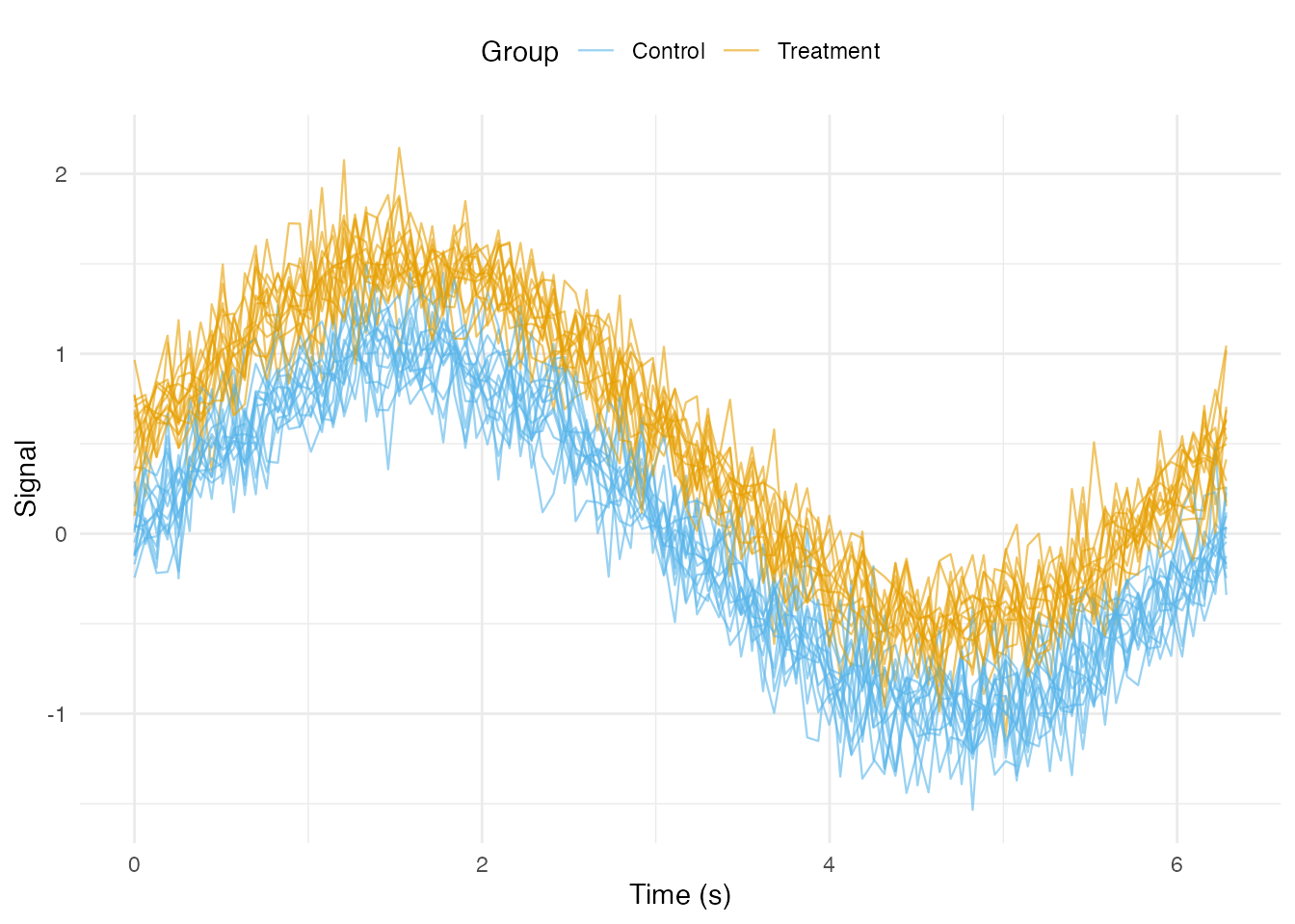
Coloring by Continuous Variable
ggplot(df_long, aes(x = t, y = value, group = curve_id, color = age)) +
  geom_line(alpha = 0.7, linewidth = 0.4) +
  scale_color_viridis_c(option = "plasma") +
  labs(x = "Time (s)", y = "Signal", color = "Age") +
  theme_minimal()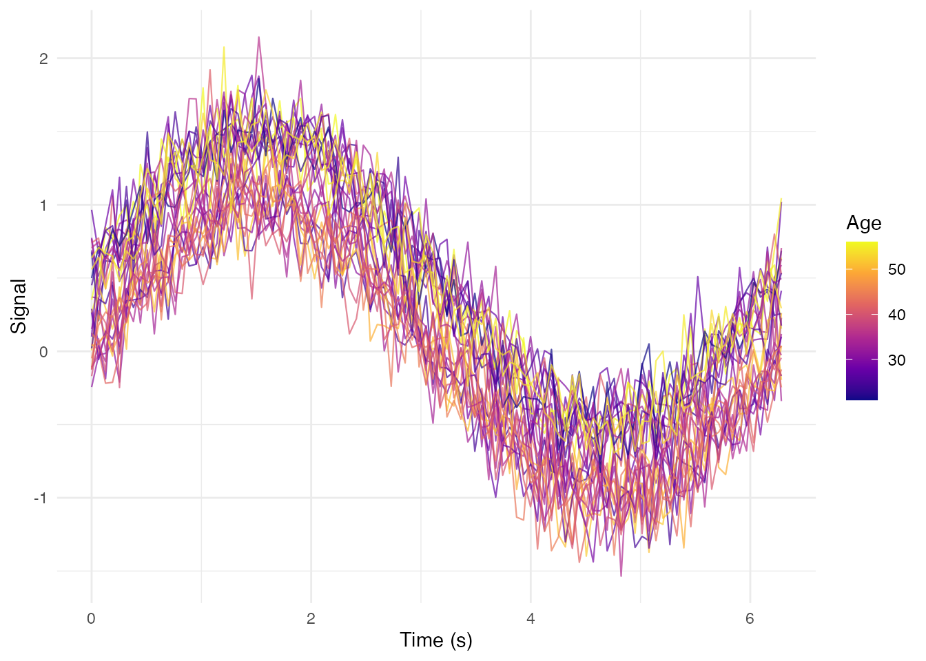
Adding Summary Statistics
Mean and Confidence Intervals by Group
# Compute group summaries
df_summary <- df_long %>%
  group_by(group, t) %>%
  summarise(
    mean = mean(value),
    sd = sd(value),
    n = n(),
    se = sd / sqrt(n),
    ci_lower = mean - 1.96 * se,
    ci_upper = mean + 1.96 * se,
    .groups = "drop"
  )

# Plot with ribbons and mean lines
ggplot() +
  # Individual curves (faded)
  geom_line(data = df_long,
            aes(x = t, y = value, group = curve_id, color = group),
            alpha = 0.2, linewidth = 0.3) +
  # Confidence interval ribbons
  geom_ribbon(data = df_summary,
              aes(x = t, ymin = ci_lower, ymax = ci_upper, fill = group),
              alpha = 0.3) +
  # Mean lines
  geom_line(data = df_summary,
            aes(x = t, y = mean, color = group),
            linewidth = 1.2) +
  scale_color_manual(values = c("Treatment" = "#E69F00", "Control" = "#56B4E9")) +
  scale_fill_manual(values = c("Treatment" = "#E69F00", "Control" = "#56B4E9")) +
  labs(x = "Time (s)", y = "Signal",
       title = "Group Means with 95% CI",
       color = "Group", fill = "Group") +
  theme_minimal() +
  theme(legend.position = "top")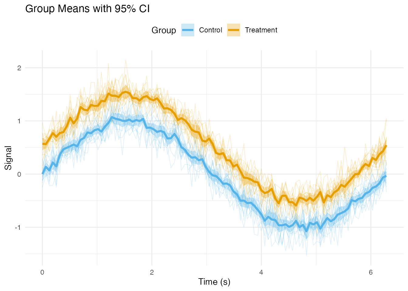
Median and Quantile Bands
df_quantiles <- df_long %>%
  group_by(group, t) %>%
  summarise(
    median = median(value),
    q25 = quantile(value, 0.25),
    q75 = quantile(value, 0.75),
    q10 = quantile(value, 0.10),
    q90 = quantile(value, 0.90),
    .groups = "drop"
  )

ggplot(df_quantiles, aes(x = t)) +
  # 10-90% band
  geom_ribbon(aes(ymin = q10, ymax = q90, fill = group), alpha = 0.2) +
  # 25-75% band (IQR)
  geom_ribbon(aes(ymin = q25, ymax = q75, fill = group), alpha = 0.4) +
  # Median line
  geom_line(aes(y = median, color = group), linewidth = 1) +
  scale_color_brewer(palette = "Set1") +
  scale_fill_brewer(palette = "Set1") +
  facet_wrap(~ group) +
  labs(x = "Time (s)", y = "Signal",
       title = "Median with IQR and 10-90% Bands") +
  theme_minimal() +
  theme(legend.position = "none")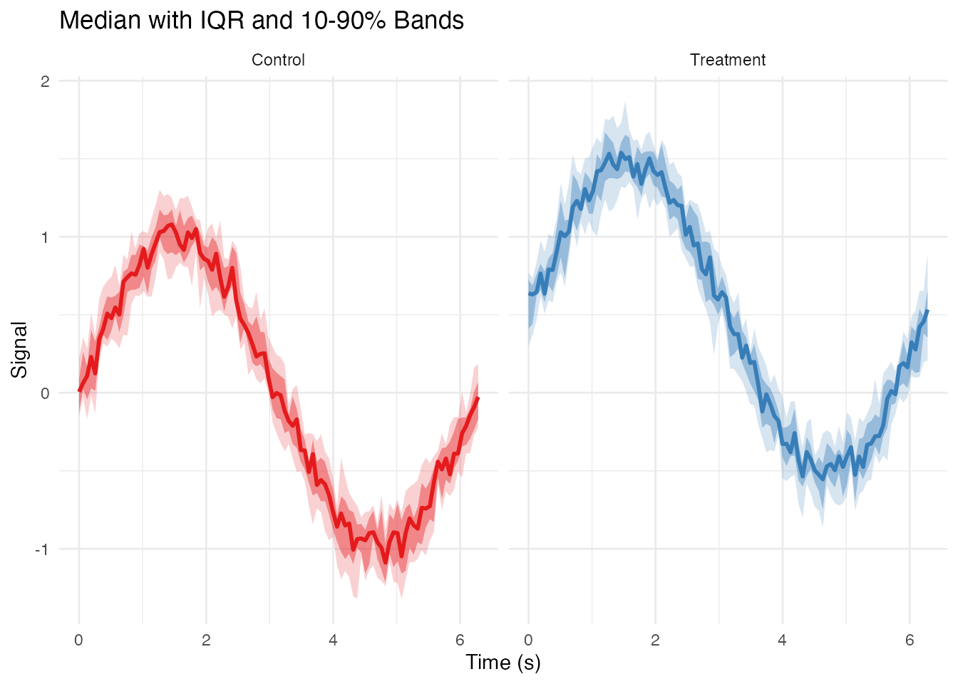
Highlighting Specific Curves
Highlighting Outliers
# Detect outliers using depth
depths <- depth.MBD(fd)
outlier_threshold <- quantile(depths, 0.1)
outlier_ids <- fd$id[depths < outlier_threshold]

# Add outlier flag to data
df_long$is_outlier <- df_long$curve_id %in% outlier_ids

ggplot(df_long, aes(x = t, y = value, group = curve_id)) +
  # Non-outliers in gray
  geom_line(data = filter(df_long, !is_outlier),
            color = "gray70", alpha = 0.5, linewidth = 0.3) +
  # Outliers in red
  geom_line(data = filter(df_long, is_outlier),
            color = "red", alpha = 0.8, linewidth = 0.6) +
  labs(x = "Time (s)", y = "Signal",
       title = "Outlier Curves Highlighted",
       subtitle = paste(length(outlier_ids), "outliers detected")) +
  theme_minimal()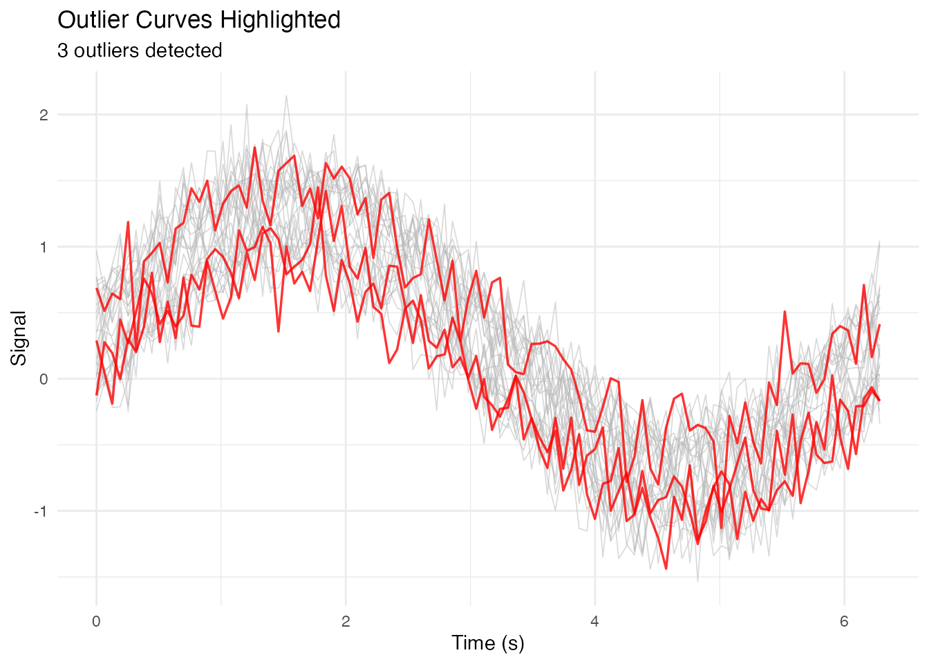
Highlighting a Subset with Labels
# Select specific curves to highlight
highlight_ids <- c("subject_1", "subject_15", "subject_30")
df_long$highlight <- df_long$curve_id %in% highlight_ids

# Get endpoint positions for labels
df_endpoints <- df_long %>%
  filter(highlight) %>%
  group_by(curve_id) %>%
  filter(t == max(t))

ggplot(df_long, aes(x = t, y = value, group = curve_id)) +
  geom_line(data = filter(df_long, !highlight),
            color = "gray80", alpha = 0.5, linewidth = 0.3) +
  geom_line(data = filter(df_long, highlight),
            aes(color = curve_id), linewidth = 0.8) +
  geom_text(data = df_endpoints,
            aes(label = curve_id, color = curve_id),
            hjust = -0.1, size = 3) +
  scale_color_brewer(palette = "Dark2") +
  coord_cartesian(xlim = c(0, max(t_grid) * 1.15)) +
  labs(x = "Time (s)", y = "Signal") +
  theme_minimal() +
  theme(legend.position = "none")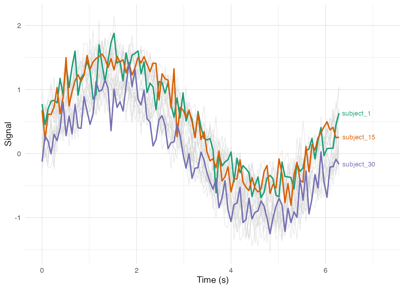
Faceted Plots
Facet by Group
ggplot(df_long, aes(x = t, y = value, group = curve_id)) +
geom_line(alpha = 0.5, linewidth = 0.3) +
facet_wrap(~ group, ncol = 2) +
labs(x = "Time (s)", y = "Signal") +
theme_bw()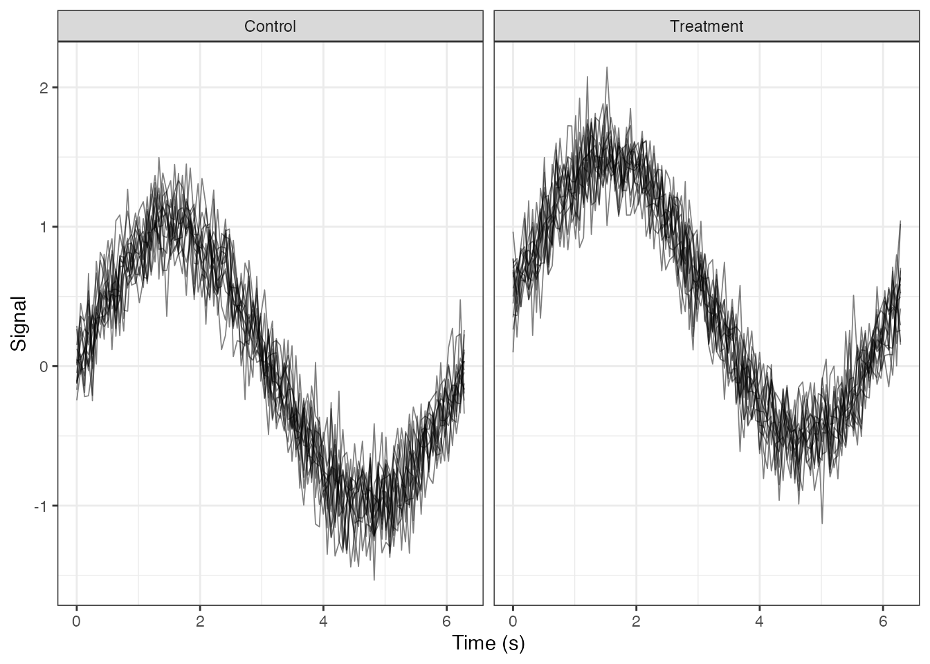 ### Facet by Binned Continuous Variable
# Create age bins
df_long$age_bin <- cut(df_long$age,
                       breaks = c(20, 35, 50, 65),
                       labels = c("Young (20-35)", "Middle (35-50)", "Senior (50-65)"))

ggplot(df_long, aes(x = t, y = value, group = curve_id, color = group)) +
  geom_line(alpha = 0.6, linewidth = 0.4) +
  facet_wrap(~ age_bin, nrow = 1) +
  scale_color_brewer(palette = "Set1") +
  labs(x = "Time (s)", y = "Signal", color = "Group") +
  theme_minimal() +
  theme(legend.position = "bottom")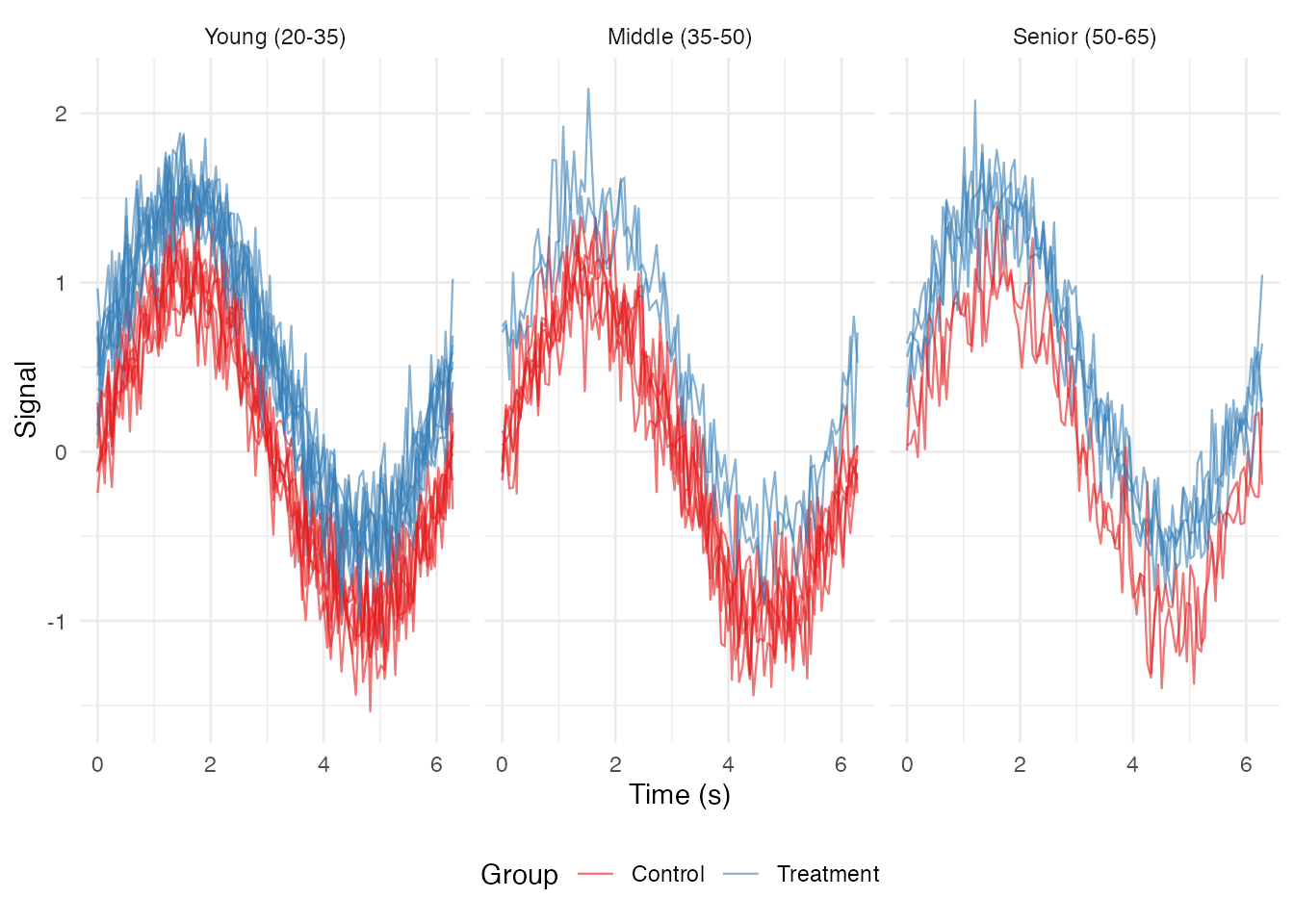
Small Multiples (Individual Curves)
# Show first 12 curves as small multiples
selected_ids <- fd$id[1:12]
df_subset <- filter(df_long, curve_id %in% selected_ids)

ggplot(df_subset, aes(x = t, y = value)) +
  geom_line(color = "steelblue") +
  facet_wrap(~ curve_id, ncol = 4, scales = "free_y") +
  labs(x = "Time", y = "Signal") +
  theme_minimal() +
  theme(strip.text = element_text(size = 8))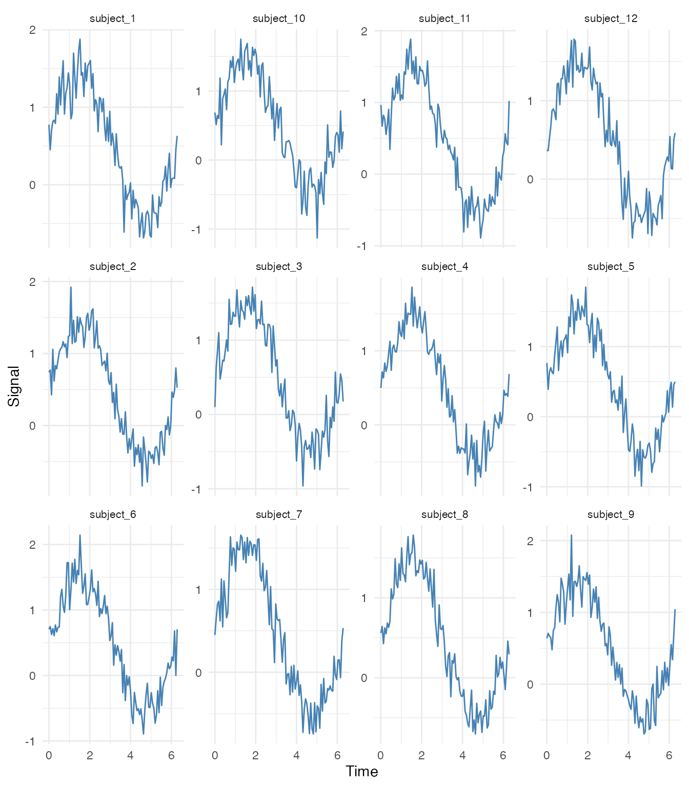
Advanced Visualizations
Rainbow Plot (Curves Colored by Index)
# Add curve index
curve_order <- match(df_long$curve_id, unique(df_long$curve_id))
df_long$curve_index <- curve_order

ggplot(df_long, aes(x = t, y = value, group = curve_id, color = curve_index)) +
  geom_line(alpha = 0.7, linewidth = 0.4) +
  scale_color_viridis_c(option = "turbo") +
  labs(x = "Time (s)", y = "Signal", color = "Curve #") +
  theme_minimal()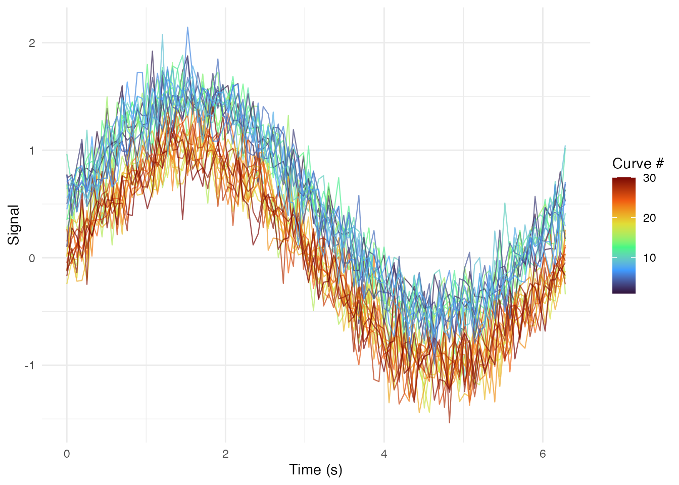
Phase Plane Plot (Value vs Derivative)
# Compute derivatives
fd_deriv <- deriv(fd)
df_deriv <- fdata_to_long(fd_deriv)
names(df_deriv)[names(df_deriv) == "value"] <- "velocity"

# Merge with original values
df_phase <- df_long %>%
  select(curve_id, t, value, group) %>%
  left_join(select(df_deriv, curve_id, t, velocity),
            by = c("curve_id", "t"))

ggplot(df_phase, aes(x = value, y = velocity, group = curve_id, color = group)) +
  geom_path(alpha = 0.5, linewidth = 0.3) +
  scale_color_brewer(palette = "Set1") +
  labs(x = "Signal Value", y = "Signal Velocity (derivative)",
       title = "Phase Plane Plot") +
  theme_minimal() +
  coord_equal()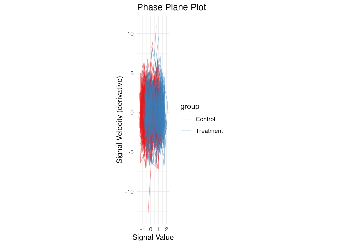
Functional Boxplot Components
# Get functional boxplot data
fbp <- boxplot(fd)

# Extract components manually for custom plotting
median_curve <- fd$data[fbp$median, ]
central_curves <- fd$data[fbp$central, ]
outlier_curves <- if (length(fbp$outliers) > 0) fd$data[fbp$outliers, , drop = FALSE] else NULL

# Compute envelopes
env_lower <- apply(central_curves, 2, min)
env_upper <- apply(central_curves, 2, max)

# Create custom plot
df_envelope <- data.frame(
  t = fd$argvals,
  lower = env_lower,
  upper = env_upper,
  median = median_curve
)

p <- ggplot() +
  # Central envelope
  geom_ribbon(data = df_envelope,
              aes(x = t, ymin = lower, ymax = upper),
              fill = "steelblue", alpha = 0.4) +
  # Median curve
  geom_line(data = df_envelope,
            aes(x = t, y = median),
            color = "navy", linewidth = 1.2) +
  labs(x = "Time (s)", y = "Signal",
       title = "Custom Functional Boxplot") +
  theme_minimal()

# Add outliers if present
if (!is.null(outlier_curves)) {
  df_outliers <- data.frame(
    curve_id = rep(fbp$outliers, each = m),
    t = rep(fd$argvals, length(fbp$outliers)),
    value = as.vector(t(outlier_curves))
  )
  p <- p + geom_line(data = df_outliers,
                     aes(x = t, y = value, group = curve_id),
                     color = "red", alpha = 0.7, linewidth = 0.5)
}

p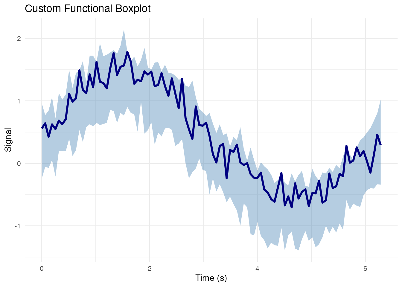
Heatmap Representation
# Order curves by depth for better visualization
depth_order <- order(depths, decreasing = TRUE)
df_long$curve_rank <- match(df_long$curve_id, fd$id[depth_order])

ggplot(df_long, aes(x = t, y = curve_rank, fill = value)) +
  geom_tile() +
  scale_fill_viridis_c(option = "magma") +
  scale_y_reverse() +
  labs(x = "Time (s)", y = "Curve (ordered by depth)",
       fill = "Value",
       title = "Heatmap of Functional Data") +
  theme_minimal()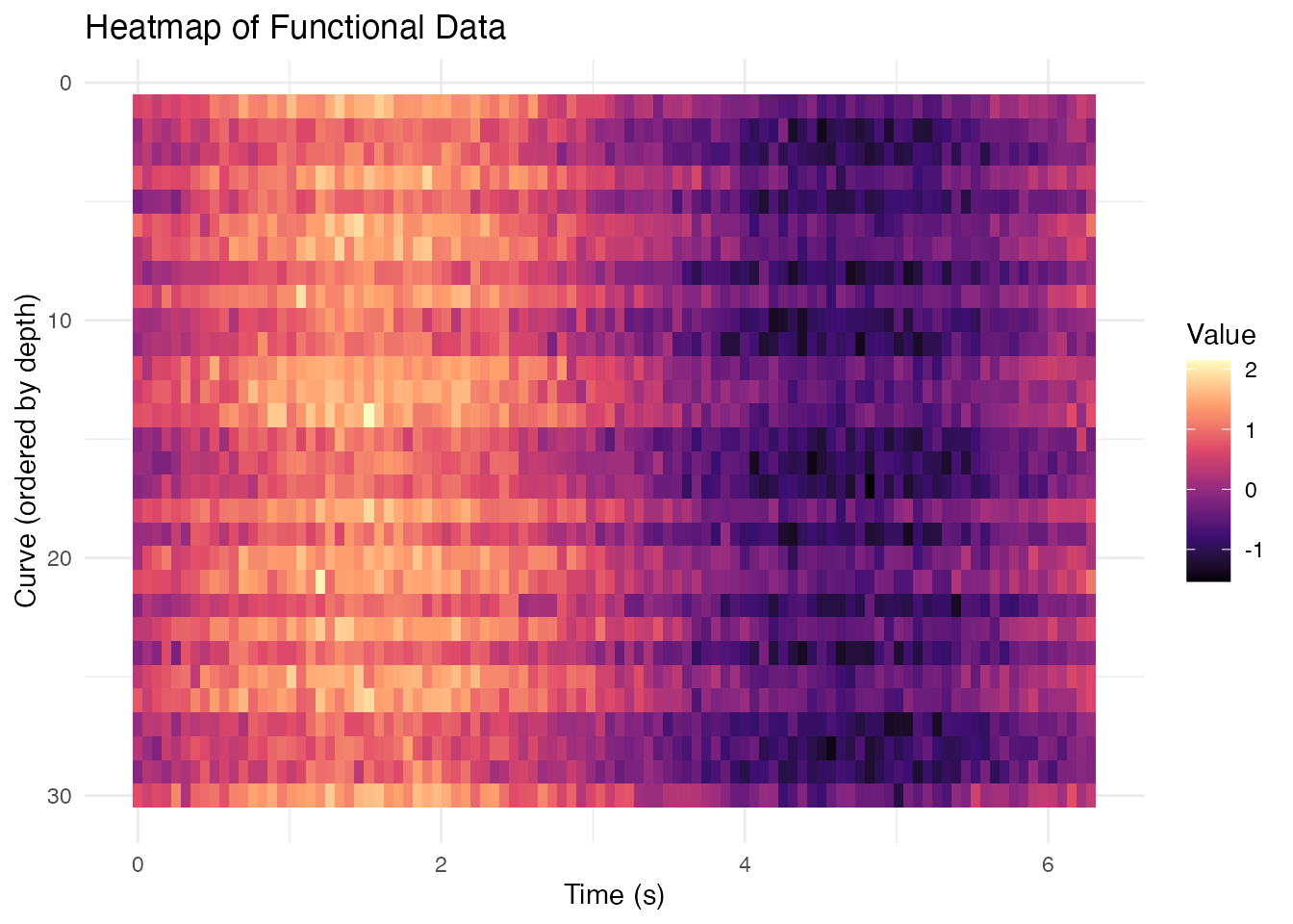
Combining with Other ggplot2 Extensions
Adding Annotations
# Find peaks for each curve
df_peaks <- df_long %>%
  group_by(curve_id) %>%
  slice_max(value, n = 1) %>%
  ungroup()

ggplot(df_long, aes(x = t, y = value, group = curve_id)) +
  geom_line(alpha = 0.3, linewidth = 0.3, color = "gray50") +
  geom_point(data = df_peaks, aes(color = group), size = 1.5, alpha = 0.7) +
  scale_color_brewer(palette = "Set1") +
  labs(x = "Time (s)", y = "Signal",
       title = "Peak Locations by Group",
       color = "Group") +
  theme_minimal()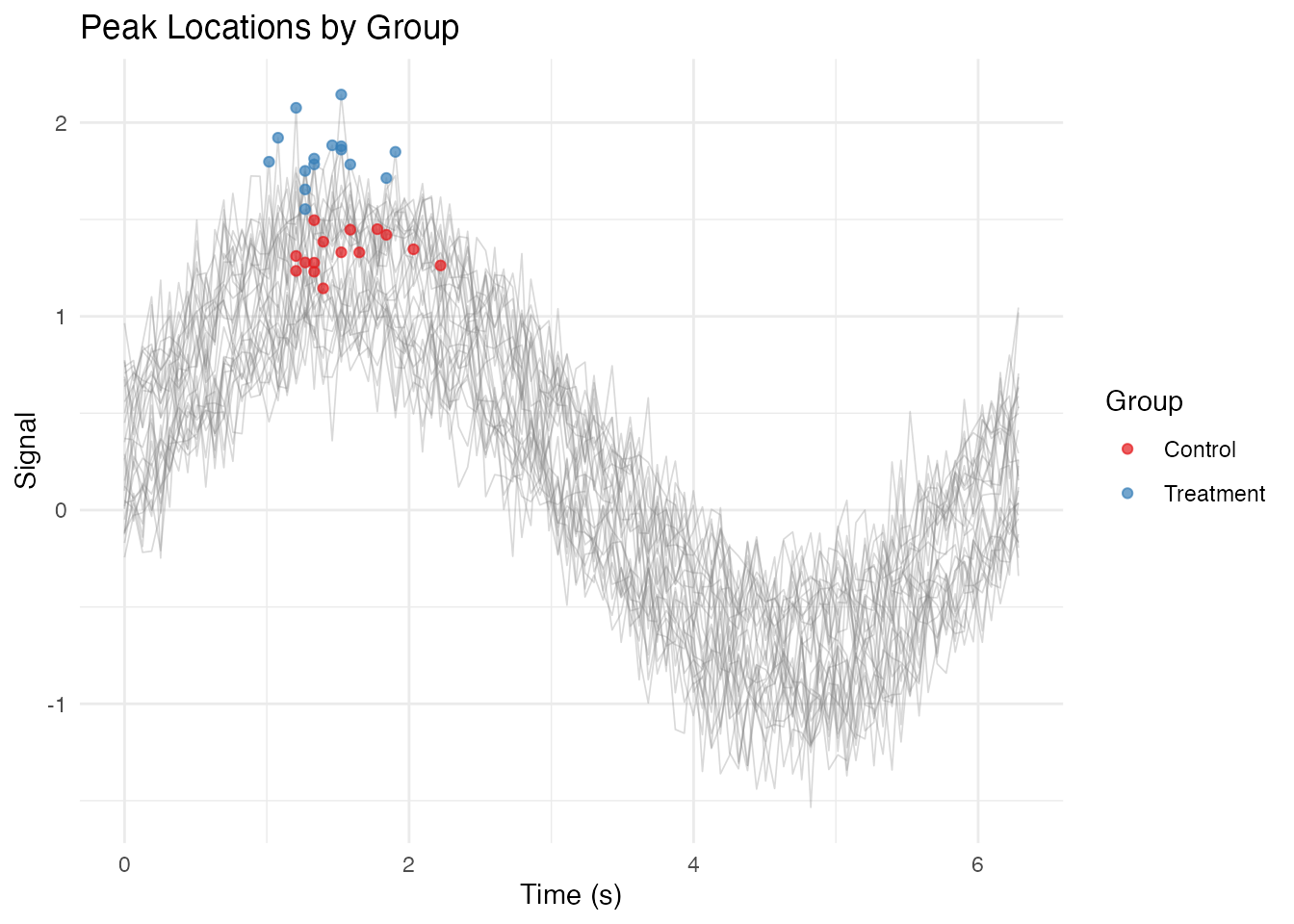
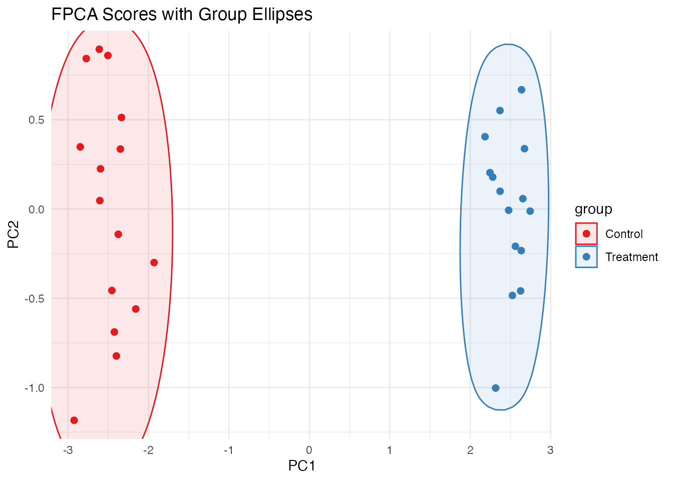
Using ggforce for Hulls
# If ggforce is available
if (requireNamespace("ggforce", quietly = TRUE)) {
  # Compute FPCA scores for 2D representation
  pc <- fdata2pc(fd, ncomp = 2)
  df_scores <- data.frame(
    PC1 = pc$x[, 1],
    PC2 = pc$x[, 2],
    group = fd$metadata$group
  )

  ggplot(df_scores, aes(x = PC1, y = PC2, color = group, fill = group)) +
    ggforce::geom_mark_ellipse(alpha = 0.1) +
    geom_point(size = 2) +
    scale_color_brewer(palette = "Set1") +
    scale_fill_brewer(palette = "Set1") +
    labs(title = "FPCA Scores with Group Ellipses") +
    theme_minimal()
}
Theming for Publication
# Define a publication-ready theme
theme_publication <- function(base_size = 11) {
  theme_minimal(base_size = base_size) %+replace%
    theme(
      panel.grid.minor = element_blank(),
      panel.grid.major = element_line(color = "gray90", linewidth = 0.3),
      axis.line = element_line(color = "black", linewidth = 0.4),
      axis.ticks = element_line(color = "black", linewidth = 0.3),
      legend.position = "bottom",
      legend.key.size = unit(0.8, "lines"),
      plot.title = element_text(face = "bold", hjust = 0),
      strip.background = element_rect(fill = "gray95", color = NA)
    )
}

# Publication-quality plot
ggplot(df_summary, aes(x = t, color = group, fill = group)) +
  geom_ribbon(aes(ymin = ci_lower, ymax = ci_upper), alpha = 0.2, color = NA) +
  geom_line(aes(y = mean), linewidth = 0.8) +
  scale_color_manual(values = c("Treatment" = "#D55E00", "Control" = "#0072B2"),
                     labels = c("Treatment", "Control")) +
  scale_fill_manual(values = c("Treatment" = "#D55E00", "Control" = "#0072B2"),
                    labels = c("Treatment", "Control")) +
  labs(x = "Time (s)", y = "Signal (a.u.)",
       color = NULL, fill = NULL) +
  theme_publication() +
  guides(color = guide_legend(override.aes = list(linewidth = 2)))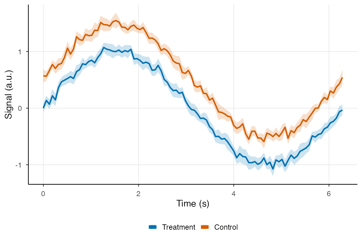
Saving Plots
# Create your plot
p <- ggplot(df_summary, aes(x = t, y = mean, color = group)) +
  geom_line(linewidth = 1) +
  theme_minimal()

# Save as PNG (for web/presentations)
ggsave("functional_plot.png", p, width = 7, height = 5, dpi = 300)

# Save as PDF (for publications)
ggsave("functional_plot.pdf", p, width = 7, height = 5)

# Save as SVG (for editing in Illustrator/Inkscape)
ggsave("functional_plot.svg", p, width = 7, height = 5)
Summary: fdata to ggplot2 Workflow
-
Convert to long format: Use the
fdata_to_long()function shown above - Add metadata: Include covariates for coloring/faceting
- Compute summaries: Use dplyr for means, CIs, quantiles
- Build layers: Start with individual curves, add summaries on top
- Customize appearance: Apply themes, colors, labels
-
Export: Use
ggsave()with appropriate format and resolution
# Complete workflow example
fd %>%
  fdata_to_long() %>%
  ggplot(aes(x = t, y = value, group = curve_id, color = group)) +
  geom_line(alpha = 0.5) +
  stat_summary(aes(group = group), fun = mean, geom = "line", linewidth = 1.5) +
  scale_color_brewer(palette = "Set1") +
  labs(x = "Time", y = "Value") +
  theme_minimal()