Introduction
Outlier detection in functional data identifies curves that are atypical or anomalous compared to the rest of the sample. fdars provides several methods based on functional depth and likelihood ratio tests.
library(fdars)
#>
#> Attaching package: 'fdars'
#> The following objects are masked from 'package:stats':
#>
#>     cov, decompose, deriv, median, sd, var
#> The following object is masked from 'package:base':
#>
#>     norm
library(ggplot2)
theme_set(theme_minimal())

# Generate normal data with low noise for clear signal
set.seed(42)
n <- 30
m <- 100
t_grid <- seq(0, 1, length.out = m)

X <- matrix(0, n, m)
for (i in 1:n) {
  X[i, ] <- sin(2 * pi * t_grid) + rnorm(m, sd = 0.1)
}

# Add three distinct types of outliers
X[1, ] <- sin(2 * pi * t_grid) + 3           # MAGNITUDE outlier (shifted up)
X[2, ] <- -sin(2 * pi * t_grid)              # SHAPE outlier (inverted pattern)
X[3, ] <- 3 * sin(2 * pi * t_grid)           # AMPLITUDE outlier (larger scale)

fd <- fdata(X, argvals = t_grid)

# Visualize with outliers highlighted
df_curves <- data.frame(
  t = rep(t_grid, n),
  value = as.vector(t(X)),
  curve = rep(1:n, each = m),
  type = rep(c("Magnitude", "Shape", "Amplitude", rep("Normal", n - 3)), each = m)
)
df_curves$type <- factor(df_curves$type, levels = c("Normal", "Magnitude", "Shape", "Amplitude"))

ggplot(df_curves, aes(x = t, y = value, group = curve, color = type)) +
  geom_line(alpha = 0.7) +
  scale_color_manual(values = c("Normal" = "gray50", "Magnitude" = "red",
                                 "Shape" = "blue", "Amplitude" = "green3")) +
  labs(title = "Functional Data with Three Types of Outliers",
       x = "t", y = "X(t)", color = "Type") +
  theme(legend.position = "bottom")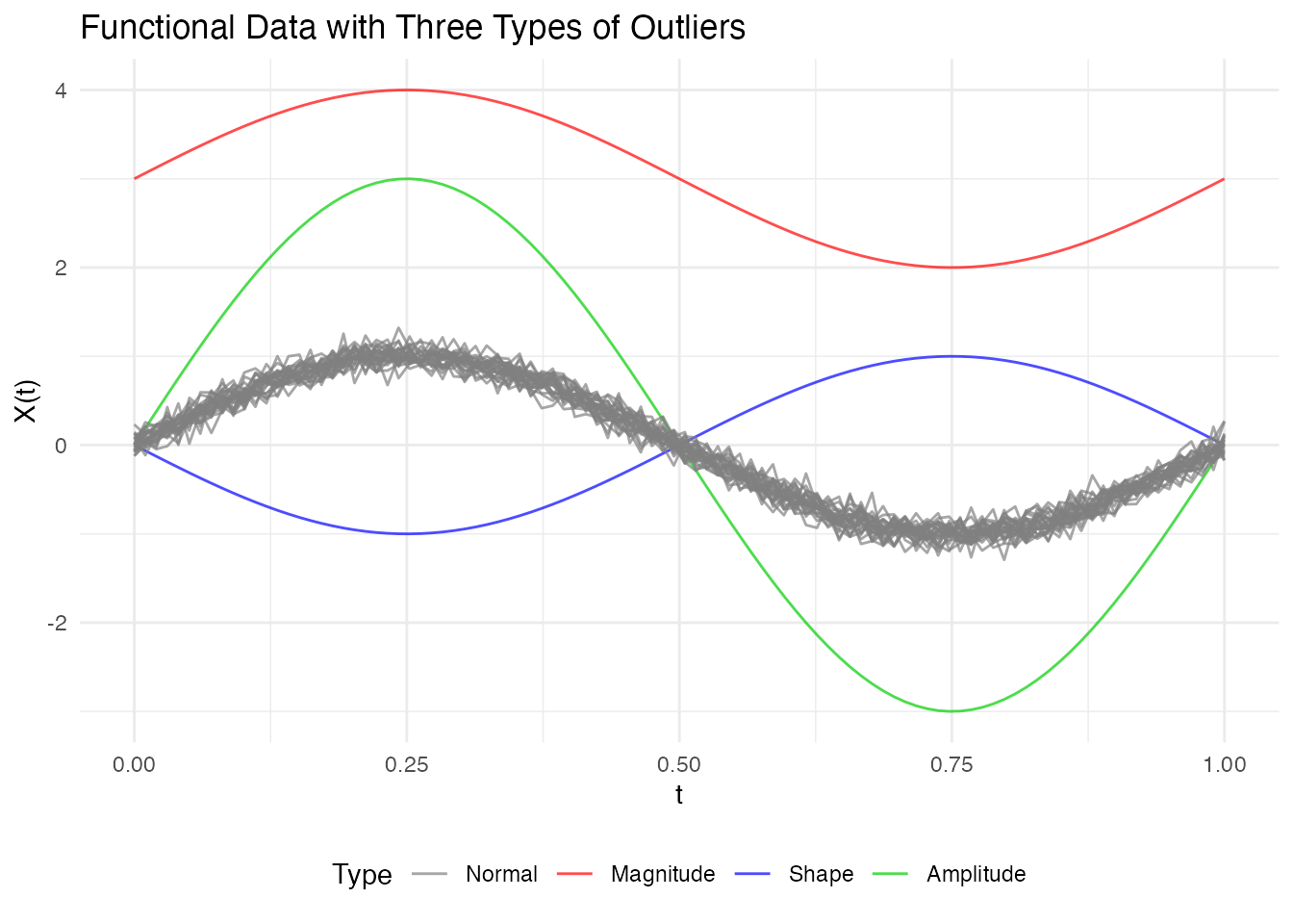
Depth-Based Methods
Depth-based outlier detection identifies curves with unusually low depth (far from the center of the data).
Weighted Depth Method (outliers.depth.pond)
Uses bootstrap resampling to estimate the distribution of depths and identifies curves with depth below a data-driven cutoff. The function supports three different methods for computing the threshold.
Threshold Methods
| Method | Formula | When to Use |
|---|---|---|
"quantile" |
quantile(depths, quan) |
When you expect a specific proportion of outliers |
"mad" |
median - k × MAD |
More robust when outliers may already exist |
"iqr" |
Q1 - k × IQR |
Boxplot-style detection |
Default: 95th percentile threshold
(quan = 0.05), which flags curves in the bottom 5% of
depths as outliers.
# Default: quantile method with quan = 0.05 (95th percentile, flags bottom 5%)
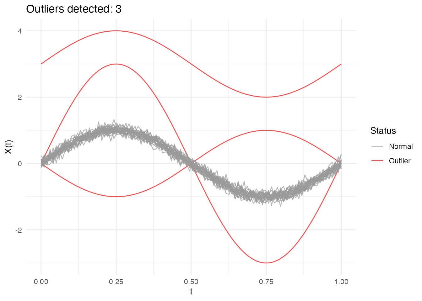
out_pond <- outliers.depth.pond(fd, nb = 1000)
print(out_pond)
#> Functional data outlier detection
#> Number of observations: 30
#> Number of outliers: 3
#> Outlier indices: 1 2 3
#> Threshold method: quantile
#> Depth cutoff: 0.0591Comparing Threshold Methods
# Quantile method: flags curves with depth in the bottom 5% (default)
out_quantile <- outliers.depth.pond(fd, nb = 1000,
                                     threshold_method = "quantile", quan = 0.05)
cat("Quantile (5%): ", out_quantile$outliers, "\n")
#> Quantile (5%):  1 2 3

# More permissive: bottom 10%
out_quantile10 <- outliers.depth.pond(fd, nb = 1000,
                                       threshold_method = "quantile", quan = 0.1)
cat("Quantile (10%):", out_quantile10$outliers, "\n")
#> Quantile (10%): 1 2 3

# MAD method: more robust, uses median - 2.5*MAD
out_mad <- outliers.depth.pond(fd, nb = 1000,
                                threshold_method = "mad", k = 2.5)
cat("MAD (k=2.5):   ", out_mad$outliers, "\n")
#> MAD (k=2.5):    1 2 3

# IQR method: boxplot-like, uses Q1 - 1.5*IQR
out_iqr <- outliers.depth.pond(fd, nb = 1000,
                                threshold_method = "iqr", k = 1.5)
cat("IQR (k=1.5):   ", out_iqr$outliers, "\n")
#> IQR (k=1.5):    1 2 3
Choosing the right method:
Quantile (default): Uses a fixed proportion cutoff. The default
quan = 0.05(95th percentile) flags the bottom 5% of curves. Increase toquan = 0.1for more permissive detection.MAD: More robust to existing outliers in the data. The default
k = 2.5corresponds roughly to a 1-2% false positive rate. Increasekfor stricter detection (fewer outliers).IQR: Similar to boxplot fences. The default
k = 1.5is the standard boxplot rule. Usek = 3.0for “far outliers” only.
Examining Results
# Which curves are outliers?
out_pond$outliers
#> [1] 1 2 3

# Depth values for all curves
head(out_pond$depths)
#> [1] 0.03333337 0.05506193 0.05477837 0.87274161 0.86959674 0.86759472

# Cutoff used
cat("Cutoff:", out_pond$cutoff, "\n")
#> Cutoff: 0.05905061
cat("Threshold method:", out_pond$threshold_method, "\n")
#> Threshold method: quantile
Understanding depth.pond Results
The outliers.depth.pond method uses bootstrap resampling
to estimate what depth values are “normal” for your dataset.
Key behaviors:
- Edge curves: Curves near the boundary of the data cloud naturally have lower depth, even if they’re not true outliers
-
Bootstrap variability: Small samples give unstable
cutoffs - use at least
nb = 200for stable results -
Threshold choice matters: The
quantilemethod with a fixed proportion will always flag that proportion as outliers. Usemadoriqrfor data-driven thresholds that adapt to the actual depth distribution.
Recommendation: Start with
threshold_method = "mad" for a robust, data-driven
approach. Adjust k based on how conservative you want the
detection to be.
Compare with outliers.depth.trim which uses a fixed trim
proportion - more predictable but requires you to choose the
proportion.
Trimming-Based Method (outliers.depth.trim)
Iteratively removes curves with lowest depth:
out_trim <- outliers.depth.trim(fd, trim = 0.1, seed = 123)
print(out_trim)
#> Functional data outlier detection
#>   Number of observations: 30
#>   Number of outliers: 3
#>   Outlier indices: 1 2 3
#>   Depth cutoff: 0.7817
plot(out_trim)
Using Different Depth Functions
Both methods accept a depth parameter to specify the
depth function:
# Using Random Projection depth
out_rp <- outliers.depth.pond(fd, nb = 1000, seed = 123)

# Using modal depth (default is FM)
out_mode <- outliers.depth.trim(fd, trim = 0.1, seed = 123)
Likelihood Ratio Test (LRT) Method
The LRT method uses a likelihood ratio test to sequentially identify outliers. It’s particularly effective for detecting magnitude outliers.
Automatic Threshold Computation
The LRT method automatically computes a bootstrap threshold based on a percentile of the maximum distance distribution under the null hypothesis (no outliers). By default, the 99th percentile is used, meaning approximately 1% of observations would be flagged as outliers when there are no true outliers.
# The outliers.lrt function automatically computes the threshold
out_lrt <- outliers.lrt(fd, nb = 1000, seed = 123)
print(out_lrt)
#> Functional data outlier detection
#>   Number of observations: 30
#>   Number of outliers: 0
#>   LRT threshold: 32.913  (99th percentile)
plot(out_lrt)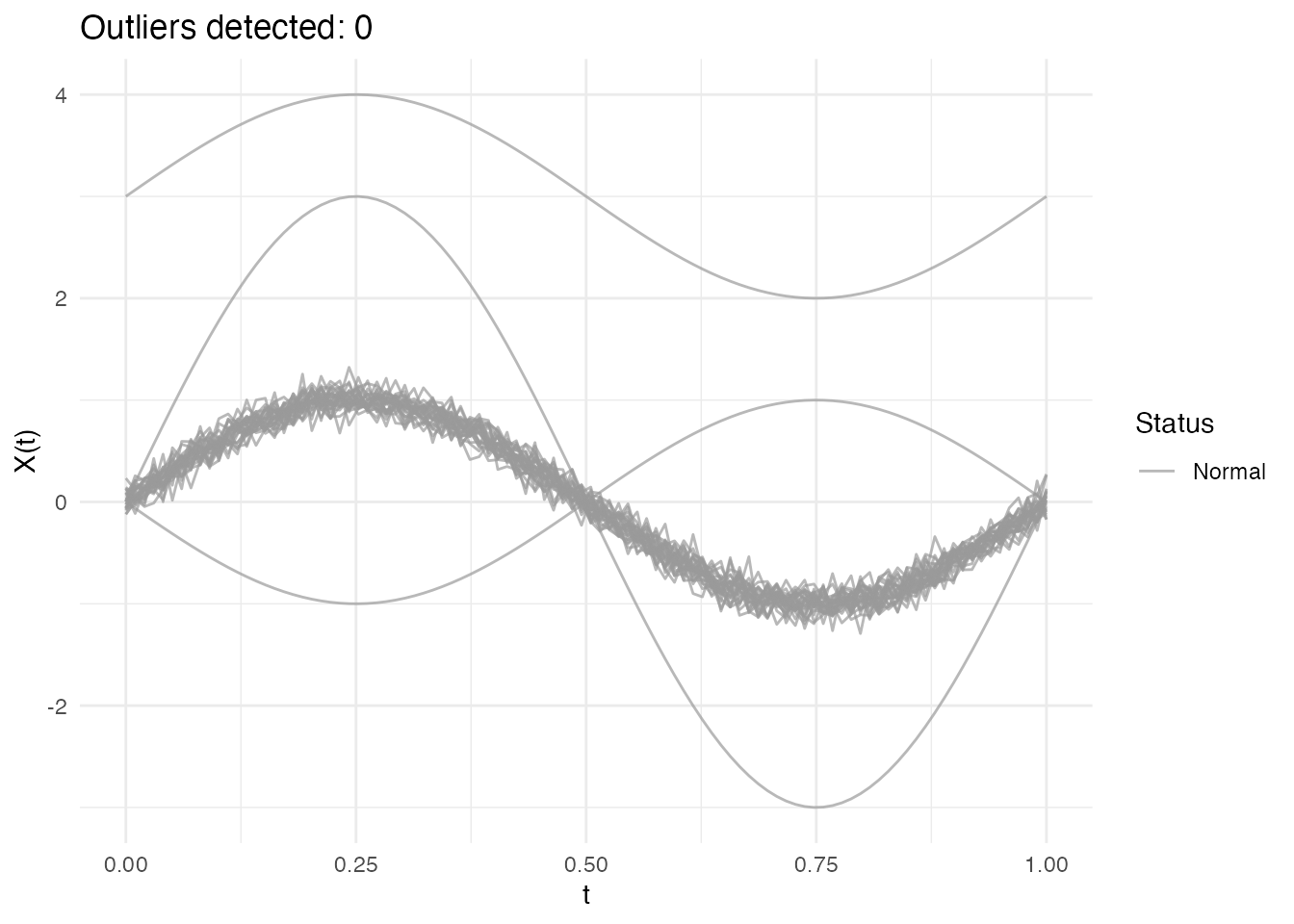
Configuring the Percentile
The percentile parameter controls the sensitivity of the
LRT method:
- Higher percentile (e.g., 0.99): More conservative, fewer false positives
- Lower percentile (e.g., 0.95): More sensitive, may catch more subtle outliers
# Default: 99th percentile (conservative)
out_lrt_99 <- outliers.lrt(fd, nb = 1000, seed = 123, percentile = 0.99)
cat("99th percentile outliers:", out_lrt_99$outliers, "\n")
#> 99th percentile outliers:

# More sensitive: 95th percentile
out_lrt_95 <- outliers.lrt(fd, nb = 1000, seed = 123, percentile = 0.95)
cat("95th percentile outliers:", out_lrt_95$outliers, "\n")
#> 95th percentile outliers:
Manual Threshold Computation
You can also compute the threshold separately if you want to examine it or apply a custom threshold:
# Compute threshold separately (99th percentile by default)
threshold_99 <- outliers.thres.lrt(fd, nb = 1000, seed = 123)
cat("LRT threshold (99th percentile):", threshold_99, "\n")
#> LRT threshold (99th percentile): 32.91297

# Or with a different percentile
threshold_95 <- outliers.thres.lrt(fd, nb = 1000, seed = 123, percentile = 0.95)
cat("LRT threshold (95th percentile):", threshold_95, "\n")
#> LRT threshold (95th percentile): 32.36814
LRT Results
# Outlier indices
out_lrt$outliers
#> integer(0)

# Distance from center for each curve
head(out_lrt$distances)
#> [1] 31.2933479 14.5221905 14.5627739  0.8885643  0.9423256  1.0432319

# Threshold used
out_lrt$threshold
#> [1] 32.91297
When LRT Works Best
The LRT method is specifically optimized for magnitude outliers - curves that are shifted up or down relative to the main data cloud. It computes how far each curve is from the center (mean) of the data.
What LRT detects well: - Curves shifted up or down (magnitude outliers) - Curves with unusual overall level
What LRT may miss: - Shape outliers (different pattern but similar overall level) - Amplitude outliers (scaled versions centered at the same level)
Using the threshold
(outliers.thres.lrt()):
The threshold represents the critical value of the LRT statistic. Use it to:
- Apply a custom significance level
- Compare test statistics across different datasets
- Combine with domain knowledge for decision-making
If LRT detects no outliers when you expect some: 1. The outliers may
be shape-based rather than magnitude-based 2. Try depth-based methods
(outliers.depth.pond or outliers.depth.trim)
instead 3. Use the outliergram or MS-plot for visual detection
Comparing Methods
Different methods may detect different types of outliers:
# Run all methods
out1 <- outliers.depth.pond(fd, nb = 1000, seed = 123)
out2 <- outliers.depth.trim(fd, trim = 0.1, seed = 123)
out3 <- outliers.lrt(fd, nb = 1000, seed = 123)

# Compare detected outliers
cat("Depth-pond outliers:", out1$outliers, "\n")
#> Depth-pond outliers: 1 2 3
cat("Depth-trim outliers:", out2$outliers, "\n")
#> Depth-trim outliers: 1 2 3
cat("LRT outliers:", out3$outliers, "\n")
#> LRT outliers:

# True outliers are curves 1, 2, 3
cat("True outliers: 1, 2, 3\n")
#> True outliers: 1, 2, 3
Types of Outliers
Magnitude Outliers
Curves shifted up or down from the main group:
# Create clean data with just a magnitude outlier
X_mag <- matrix(0, n, m)
for (i in 1:n) {
  X_mag[i, ] <- sin(2 * pi * t_grid) + rnorm(m, sd = 0.1)
}
X_mag[1, ] <- sin(2 * pi * t_grid) + 3  # Large vertical shift

fd_mag <- fdata(X_mag, argvals = t_grid)

# Visualize the magnitude outlier
plot(fd_mag) +
  labs(title = "Magnitude Outlier: Curve 1 Shifted Up",
       subtitle = "Same shape as others, but at a different level")
out_mag <- outliers.depth.pond(fd_mag, nb = 1000, seed = 123)
cat("Detected magnitude outlier:", out_mag$outliers, "\n")
#> Detected magnitude outlier: 1
Shape Outliers
Curves with different patterns but similar overall level:
# Create clean data with just a shape outlier
X_shape <- matrix(0, n, m)
for (i in 1:n) {
  X_shape[i, ] <- sin(2 * pi * t_grid) + rnorm(m, sd = 0.1)
}
X_shape[1, ] <- -sin(2 * pi * t_grid)  # Inverted (phase-shifted by pi)

fd_shape <- fdata(X_shape, argvals = t_grid)

# Visualize the shape outlier
plot(fd_shape) +
  labs(title = "Shape Outlier: Curve 1 Has Inverted Pattern",
       subtitle = "Same amplitude and level, but opposite phase")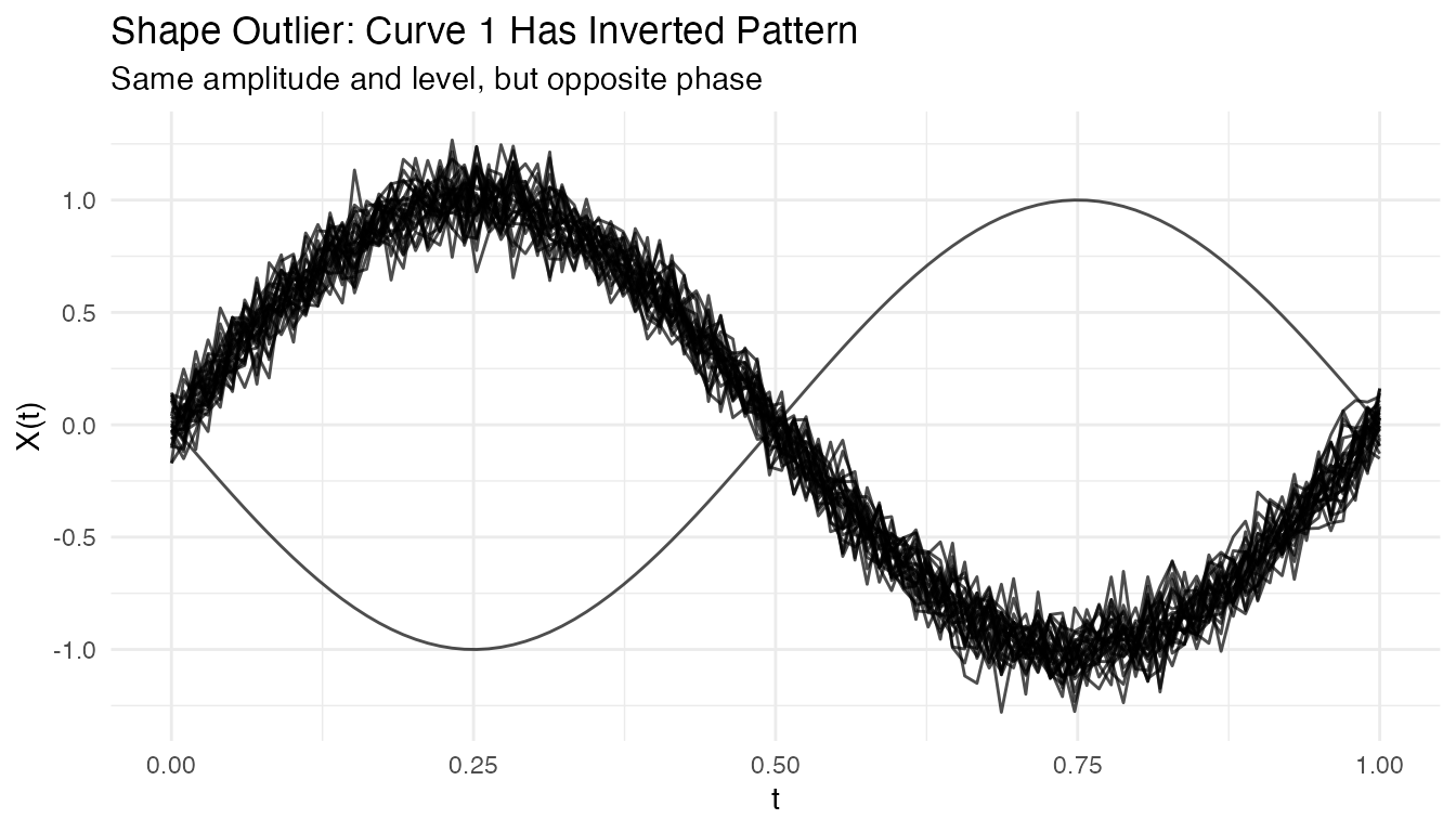
out_shape <- outliers.depth.pond(fd_shape, nb = 1000, seed = 123)
cat("Detected shape outlier:", out_shape$outliers, "\n")
#> Detected shape outlier: 1
Amplitude Outliers
Curves with unusual amplitude (larger or smaller scale):
# Create clean data with just an amplitude outlier
X_amp <- matrix(0, n, m)
for (i in 1:n) {
  X_amp[i, ] <- sin(2 * pi * t_grid) + rnorm(m, sd = 0.1)
}
X_amp[1, ] <- 3 * sin(2 * pi * t_grid)  # 3x larger amplitude

fd_amp <- fdata(X_amp, argvals = t_grid)

# Visualize the amplitude outlier
plot(fd_amp) +
  labs(title = "Amplitude Outlier: Curve 1 Has 3x Larger Scale",
       subtitle = "Same shape and center, but much larger oscillations")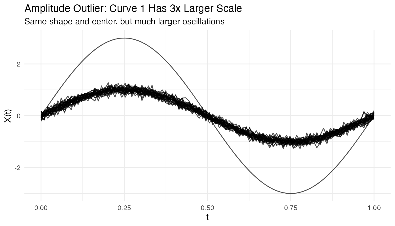
out_amp <- outliers.depth.pond(fd_amp, nb = 1000, seed = 123)
cat("Detected amplitude outlier:", out_amp$outliers, "\n")
#> Detected amplitude outlier: 1
Tuning Parameters
Number of Bootstrap Samples
More bootstrap samples give more stable results but take longer:
# Compare with different nb values
out_nb50 <- outliers.depth.pond(fd, nb = 50, seed = 123)
out_nb200 <- outliers.depth.pond(fd, nb = 200, seed = 123)

cat("nb=50 outliers:", out_nb50$outliers, "\n")
#> nb=50 outliers: 1 2 3
cat("nb=200 outliers:", out_nb200$outliers, "\n")
#> nb=200 outliers: 1 2 3
Trim Proportion
For outliers.depth.trim, the trim proportion controls
sensitivity:
# More aggressive trimming
out_trim05 <- outliers.depth.trim(fd, trim = 0.05, seed = 123)
out_trim20 <- outliers.depth.trim(fd, trim = 0.2, seed = 123)

cat("trim=0.05 outliers:", out_trim05$outliers, "\n")
#> trim=0.05 outliers: 1 3
cat("trim=0.20 outliers:", out_trim20$outliers, "\n")
#> trim=0.20 outliers: 1 2 3 10 29 30
Handling High Contamination
When outlier contamination is high, use robust methods:
# Create data with 20% outliers
X_contam <- X
n_outliers <- 6
for (i in 1:n_outliers) {
  X_contam[i, ] <- sin(2 * pi * t_grid) + rnorm(1, 0, 2)
}

fd_contam <- fdata(X_contam, argvals = t_grid)

# Depth-trim with higher trim proportion
out_contam <- outliers.depth.trim(fd_contam, trim = 0.2, seed = 123)
cat("Detected outliers:", out_contam$outliers, "\n")
#> Detected outliers: 1 2 3 4 5 6
cat("True outliers: 1-6\n")
#> True outliers: 1-6
Visualizing Depth Distribution
# Compute depths
depths <- depth.FM(fd)

# Create histogram
library(ggplot2)
df_depths <- data.frame(
  curve = 1:n,
  depth = depths,
  type = ifelse(1:n %in% c(1, 2, 3), "Outlier", "Normal")
)

ggplot(df_depths, aes(x = depth, fill = type)) +
  geom_histogram(bins = 10, alpha = 0.7, position = "identity") +
  labs(title = "Distribution of Functional Depths",
       x = "Depth", y = "Count", fill = "") +
  theme_minimal()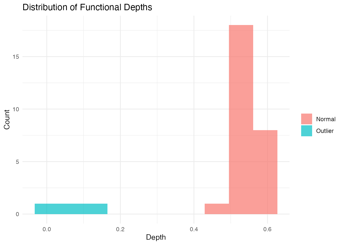
Performance
The LRT method uses a parallel Rust backend for speed:
# Benchmark with larger dataset
X_large <- matrix(rnorm(200 * 100), 200, 100)
fd_large <- fdata(X_large)

system.time(outliers.lrt(fd_large, nb = 200, seed = 123))
#>    user  system elapsed
#>   0.456   0.000   0.123
Outliergram and MS-Plot
For visual outlier detection, fdars provides two powerful diagnostic plots.
The Outliergram
The outliergram plots the Modified Epigraph Index (MEI) against Modified Band Depth (MBD):
og <- outliergram(fd)
plot(og)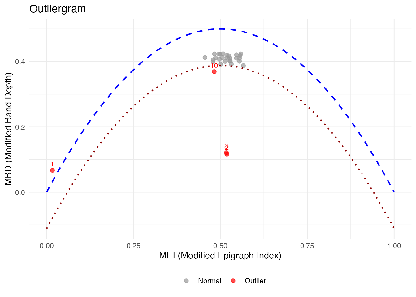
How to read the outliergram:
| Position | MEI (X-axis) | MBD (Y-axis) | Interpretation |
|---|---|---|---|
| Bottom-left | Low | Low | Extreme outlier (unusual shape AND position) |
| Bottom-right | High | Low | Magnitude outlier (shifted up/down) |
| Top-left | Low | High | Shape outlier (unusual pattern, typical level) |
| Top-right | High | High | Normal curve (typical shape and position) |
The parabolic boundary marks the theoretical limit for non-outlying curves. Points below this boundary are flagged as outliers.
The Magnitude-Shape Plot (MS-Plot)
The MS-plot separates magnitude outlyingness from shape outlyingness:
ms <- magnitudeshape(fd)
plot(ms)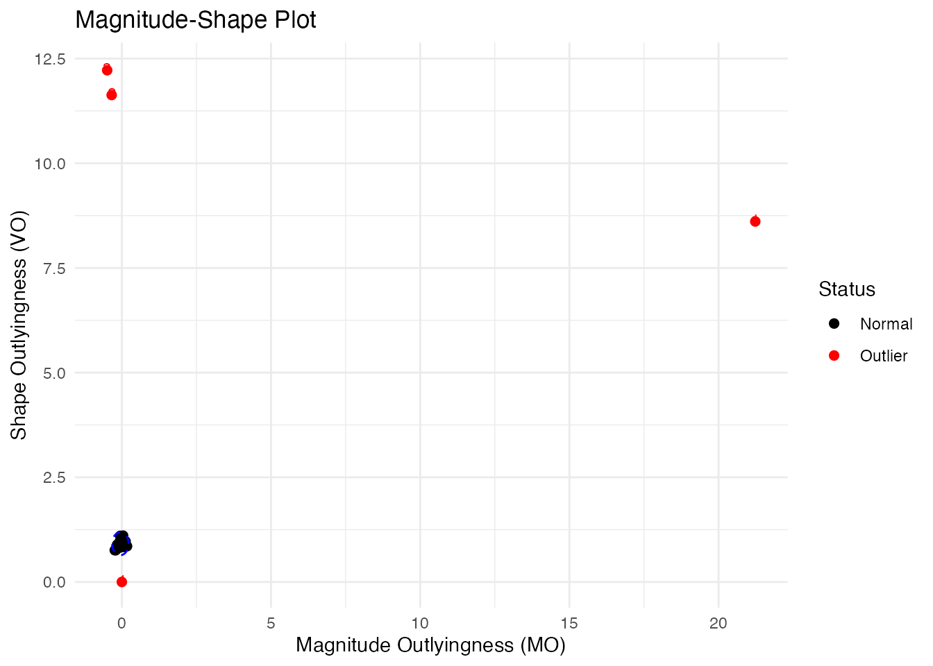
How to read the MS-plot:
| Quadrant | Magnitude Outlyingness | Shape Outlyingness | Type |
|---|---|---|---|
| Bottom-left | Low | Low | Normal curve |
| Bottom-right | High | Low | Magnitude outlier only |
| Top-left | Low | High | Shape outlier only |
| Top-right | High | High | Combined outlier (both types) |
The MS-plot is particularly useful when you want to understand why a curve is an outlier - is it because of its level (magnitude) or its pattern (shape)?
Labeling Outliers by ID or Metadata
When fdata has IDs or metadata, you can label outliers in plots:
# Create fdata with IDs and metadata
meta <- data.frame(
  subject = paste0("S", sprintf("%02d", 1:n)),
  group = rep(c("A", "B"), length.out = n)
)
fd_labeled <- fdata(X, argvals = t_grid,
                    id = paste0("patient_", 1:n),
                    metadata = meta)

# Outliergram with patient IDs
og_labeled <- outliergram(fd_labeled)
plot(og_labeled, label = "id")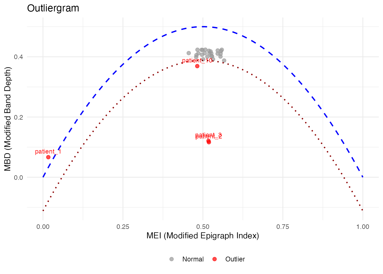
# Or with metadata column
plot(og_labeled, label = "subject")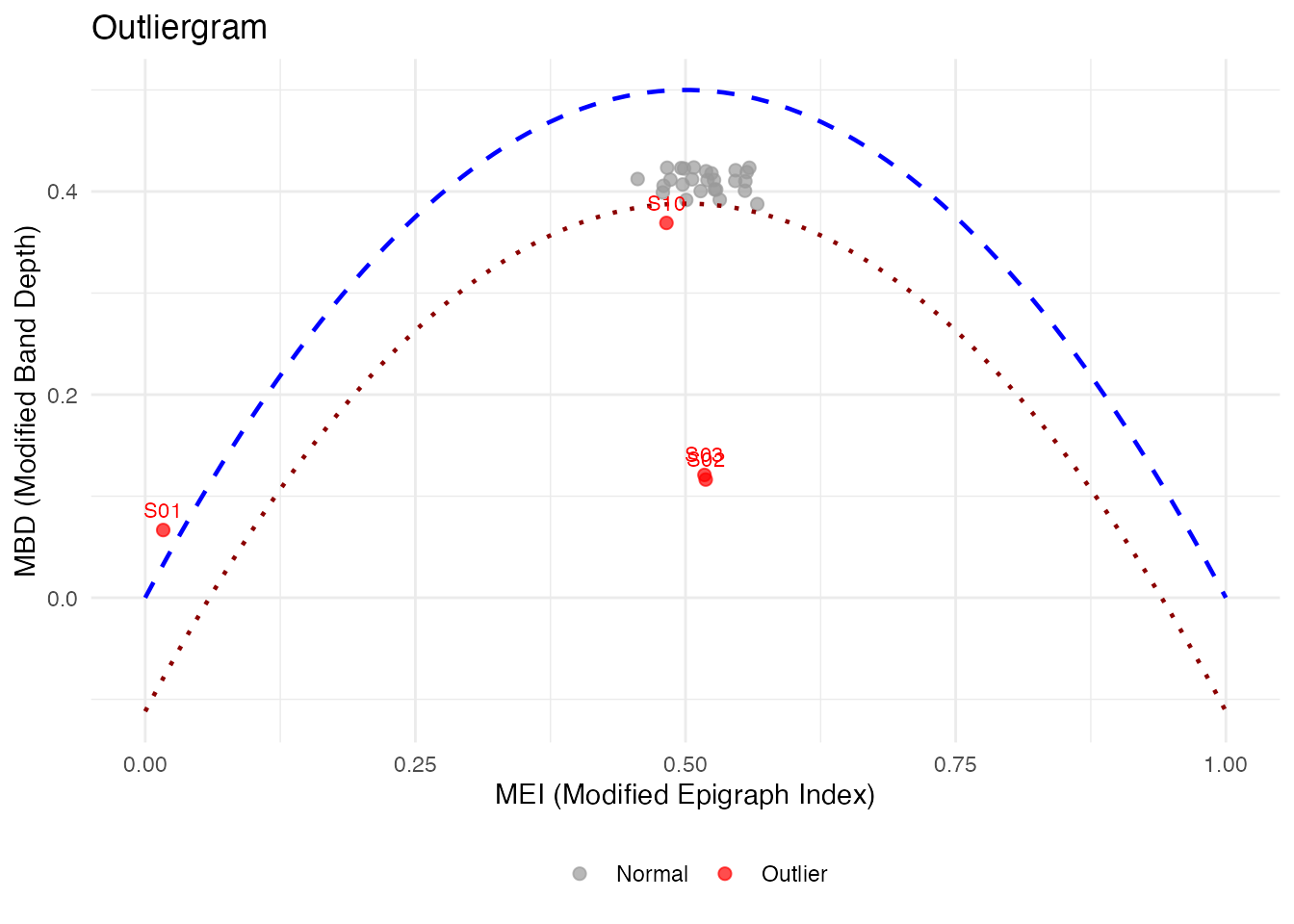
# Label ALL points, not just outliers
plot(og_labeled, label = "id", label_all = TRUE)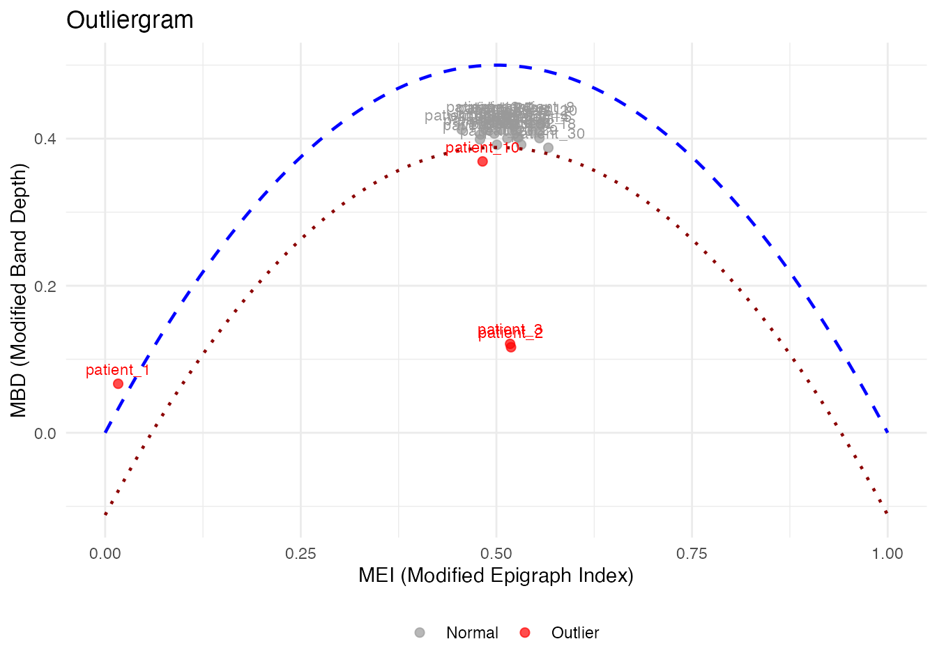
# magnitudeshape with custom labels
magnitudeshape(fd_labeled, label = "subject")
Method Selection Guide
| Method | Best For | Sensitivity |
|---|---|---|
| depth.pond | General purpose | Moderate |
| depth.trim | Known contamination rate | Controllable |
| LRT | Magnitude outliers | High |
| outliergram | Shape outliers | Visual |
| magnitudeshape | Both magnitude & shape | Visual |
Best Practices
- Start with visualization: Plot the data to understand outlier types
- Try multiple methods: Different methods catch different outliers
- Use sufficient bootstrap samples: At least 100 for stable results
- Consider domain knowledge: Some “outliers” may be valid observations
- Validate findings: Check detected outliers make sense contextually
References
- Febrero, M., Galeano, P., and González-Manteiga, W. (2008). Outlier detection in functional data by depth measures, with application to identify abnormal NOx levels. Environmetrics, 19(4), 331-345.
- Hyndman, R.J. and Shang, H.L. (2010). Rainbow plots, bagplots, and boxplots for functional data. Journal of Computational and Graphical Statistics, 19(1), 29-45.