For 1D functional data, plots curves as lines with optional coloring by external variables. For 2D functional data, plots surfaces as heatmaps with contour lines.
Usage
# S3 method for class 'fdata'
autoplot(
  object,
  color = NULL,
  alpha = NULL,
  show.mean = FALSE,
  show.ci = FALSE,
  ci.level = 0.9,
  palette = NULL,
  ...
)
Arguments
- object
An object of class 'fdata'.
- color
Optional vector for coloring curves. Can be:
Numeric vector: curves colored by continuous scale (viridis)
Factor/character: curves colored by discrete groups
Must have length equal to number of curves.
- alpha
Transparency of individual curve lines. Default is 0.7 for basic plots, but automatically reduced to 0.3 when
show.mean = TRUEorshow.ci = TRUEto reduce visual clutter and allow mean curves to stand out. Can be explicitly set to override the default.- show.mean
Logical. If TRUE and color is categorical, overlay group mean curves with thicker lines (default FALSE).
- show.ci
Logical. If TRUE and color is categorical, show pointwise confidence interval ribbons per group (default FALSE).
- ci.level
Confidence level for CI ribbons (default 0.90 for 90 percent).
- palette
Optional named vector of colors for categorical coloring, e.g., c("A" = "blue", "B" = "red").
- ...
Additional arguments (currently ignored).
Details
Use autoplot() to get the ggplot object without displaying it.
Use plot() to display the plot (returns invisibly).
Examples
library(ggplot2)
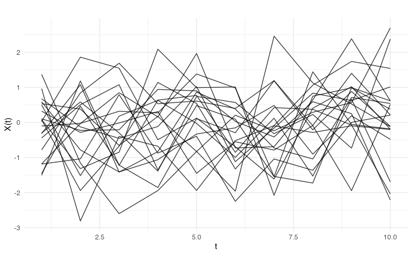
# Get ggplot object without displaying
fd <- fdata(matrix(rnorm(200), 20, 10))
p <- autoplot(fd)
# Customize the plot
p + theme_minimal()
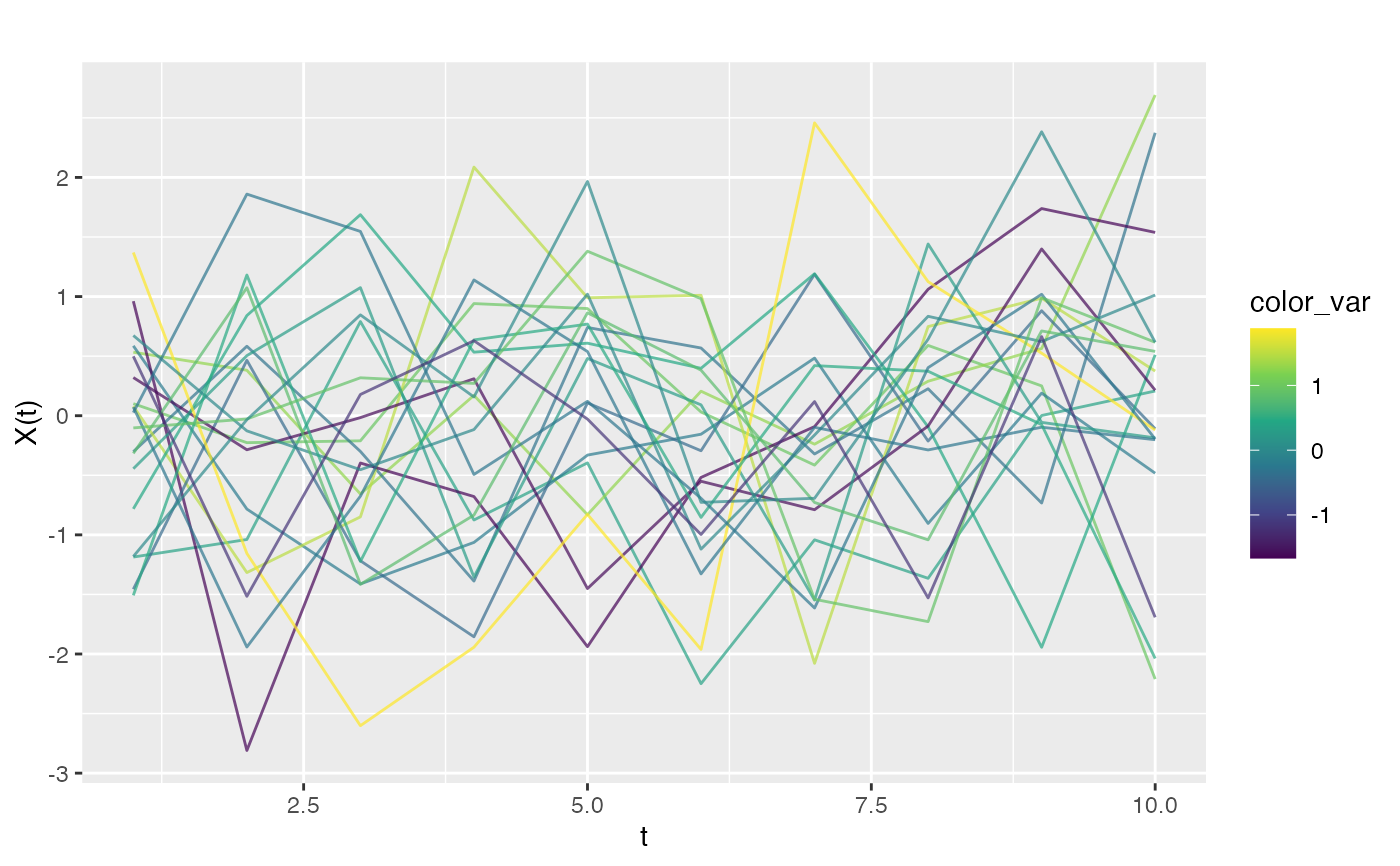
 # Color by numeric variable
y <- rnorm(20)
autoplot(fd, color = y)
# Color by numeric variable
y <- rnorm(20)
autoplot(fd, color = y)
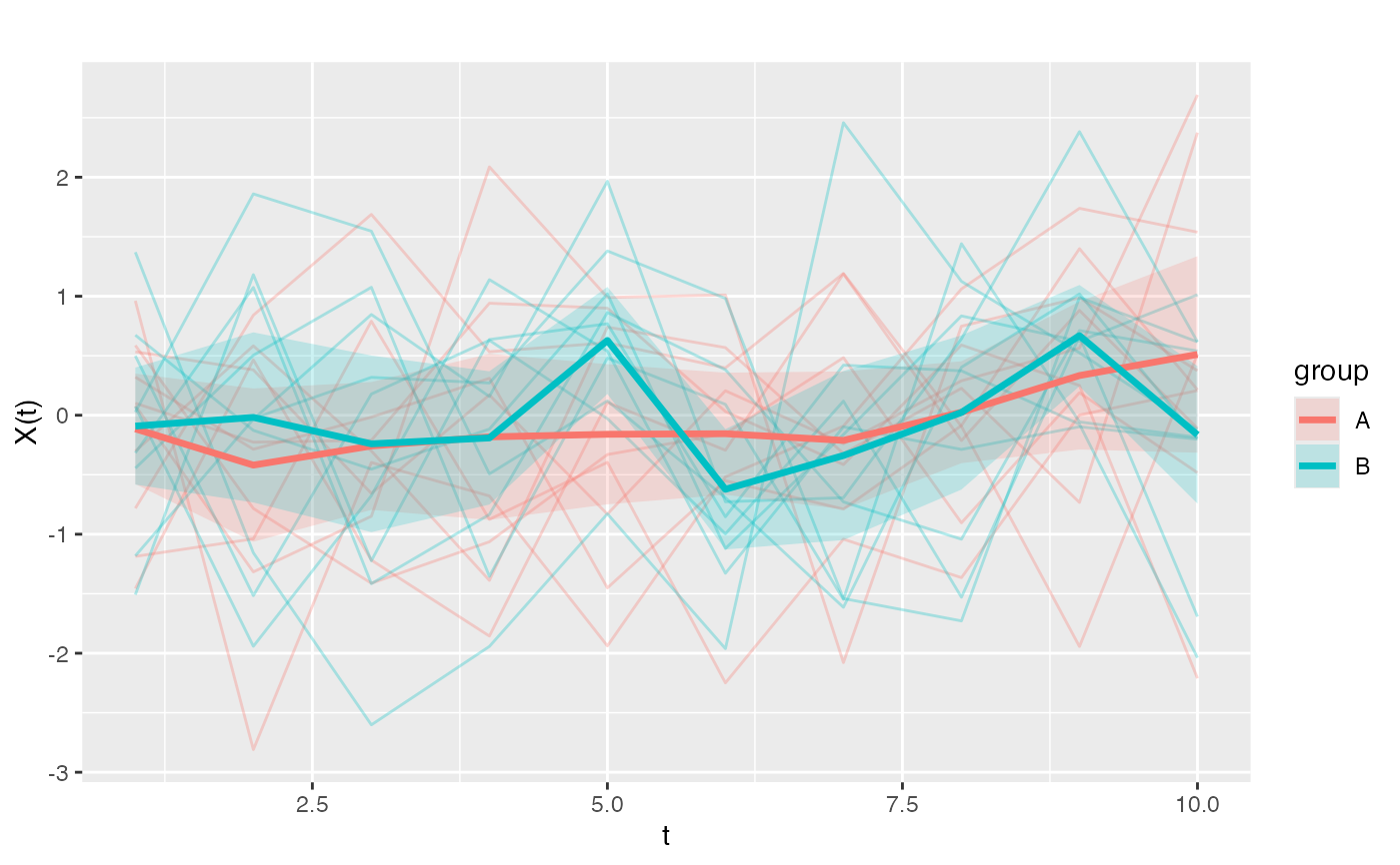
 # Color by category with mean and CI
groups <- factor(rep(c("A", "B"), each = 10))
autoplot(fd, color = groups, show.mean = TRUE, show.ci = TRUE)
# Color by category with mean and CI
groups <- factor(rep(c("A", "B"), each = 10))
autoplot(fd, color = groups, show.mean = TRUE, show.ci = TRUE)