Introduction to fdars
This guide introduces Functional Data Analysis (FDA) and shows you how to use fdars's Python API to perform common tasks. By the end, you will understand the data layout, core operations, and the breadth of functionality available.
What Is Functional Data Analysis?
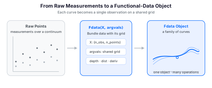
Functional Data Analysis (FDA) is the branch of statistics that deals with data where each observation is an entire function -- a curve, a spectrum, a trajectory, or a surface measured over a continuum -- rather than a single number or a fixed-length vector.
Examples of functional data appear everywhere:
- Spectroscopy -- absorbance spectra measured at hundreds of wavelengths
- Growth curves -- height-over-age profiles for a cohort of children
- Finance -- intraday price trajectories throughout the trading day
- Environmental science -- daily temperature profiles across weather stations
- Manufacturing -- quality profiles recorded along a production line
In FDA we treat each curve as a single observation and develop methods to analyze collections of such curves. The key insight is that these are not just high-dimensional vectors; they have a smoothness structure that can be exploited for better estimation, prediction, and interpretation.
Infinite-dimensional observations
Mathematically, each observation lives in a function space such as \(L^2([0, 1])\). In practice we observe each function on a discrete grid, but FDA methods respect the underlying continuity.
The fdars Package
fdars provides a comprehensive set of FDA methods implemented in Rust (via fdars-core) and exposed to Python through PyO3. This gives you:
- Native speed -- all heavy computation runs in compiled Rust with multithreading, not in Python loops.
Fdataclass -- a functional data container that bundles data, grid, IDs, and metadata into a single object (mirroring the R package'sfdata).- NumPy interface -- you can also work directly with
numpy.ndarrayfor full control. - Broad coverage -- depth, distance, smoothing, basis representation, FPCA, regression, clustering, alignment, outlier detection, monitoring, and more.
- 2D support -- many methods extend from curves to surfaces, with dedicated
*_2dvariants throughout the depth, distance, and derivative modules.
Because the numerics run in Rust, computationally intensive operations such as depth functions and distance matrices are typically 10-200x faster than the equivalent pure-Python (or pure-R) implementation, without giving up the convenience of a NumPy-based front end.
Installation
The only runtime dependency is NumPy.
Getting Started
The Fdata Class
The central object in fdars is Fdata -- a functional data container that
bundles observation data, evaluation grid, identifiers, and per-observation
metadata. It mirrors the R package's fdata S3 class.
| Parameter | Type | Description |
|---|---|---|
data |
ndarray (n, m) |
Observations — one curve per row, one grid point per column |
argvals |
ndarray (m,) |
Evaluation grid (defaults to a uniform \([0, 1]\) grid) |
id |
list[str], optional |
Per-observation identifiers |
names |
list[str], optional |
Names for the argvals dimension(s) |
metadata |
dict / DataFrame, optional |
Per-observation covariates aligned to the rows |
| Attribute / method | Returns | Description |
|---|---|---|
n_obs, n_points |
int |
Number of curves and grid points |
mean() |
ndarray (m,) |
Pointwise cross-sectional mean |
center(), norm(), deriv() |
Fdata / ndarray |
Centering, \(L^p\) norm, and numerical derivative |
Create functional data from a matrix where rows are observations (curves) and columns are evaluation points. Here we generate 20 curves observed at 100 points on \([0, 1]\) as sine waves with random phase and a little measurement noise -- the same running example used throughout this guide:
import numpy as np
import pandas as pd
from fdars import Fdata

# 20 curves evaluated at 100 points on [0, 1]
rng = np.random.default_rng(42)
n_obs, n_points = 20, 100
argvals = np.linspace(0, 1, n_points)

# Sine waves with random phase and noise
X = np.array([
    np.sin(2 * np.pi * argvals + rng.uniform(0, np.pi)) + rng.normal(0, 0.1, n_points)
    for _ in range(n_obs)
])

# Wrap in an Fdata object
fd = Fdata(X, argvals=argvals)
print(fd)
# Fdata (1D)  –  20 obs × 100 points  –  range [0.0, 1.0]
Adding Identifiers and Metadata
You can attach identifiers and a pandas.DataFrame of per-observation covariates
(a group factor, age, a scalar response, ...):
meta = pd.DataFrame({
    "group": ["control"] * 10 + ["treatment"] * 10,
    "age": rng.integers(20, 60, size=n_obs),
    "response": rng.normal(size=n_obs),
})
fd_meta = Fdata(
    X, argvals=argvals,
    id=[f"patient_{i}" for i in range(1, n_obs + 1)],
    metadata=meta,
)
print(fd_meta)
# Fdata (1D)  –  20 obs × 100 points  –  range [0.0, 1.0]  –  metadata: group, age, response

# Access ids and metadata directly
print(fd_meta.id[:5])          # ['patient_1', ..., 'patient_5']
fd_meta.metadata.head()
Metadata is preserved when subsetting -- both the ids and the covariate rows are carried along:
fd_sub = fd_meta[0:5]
print(fd_sub.id)                    # ['patient_1', ..., 'patient_5']
print(fd_sub.metadata["group"][:3]) # 'control', 'control', 'control'
Row = observation, Column = grid point
The underlying fd.data array has shape (n_obs, n_points) -- the same
convention used by scikit-learn, making it easy to mix functional and scalar
analyses.
Simulating Data
For reproducible experiments, use the built-in simulation module:
from fdars.simulation import simulate

argvals = np.linspace(0, 1, 100)
data = simulate(n=50, argvals=argvals, n_basis=5, seed=42)

fd = Fdata(data, argvals=argvals)
print(fd)  # Fdata (1D)  –  50 obs × 100 points  –  range [0.0, 1.0]
Visualizing Functional Data
A functional sample is a family of curves rather than a cloud of points. Plotting the whole ensemble at once -- here the 20 sine curves from above together with their pointwise mean -- is the first thing you do with any dataset, and the kind of object every fdars method operates on:
import numpy as np
from docs_fig import fig, render
from fdars import Fdata

rng = np.random.default_rng(42)
t = np.linspace(0, 1, 100)
X = np.array([
    np.sin(2 * np.pi * t + rng.uniform(0, np.pi)) + rng.normal(0, 0.1, 100)
    for _ in range(20)
])
fd = Fdata(X, argvals=t)
mu = np.asarray(fd.mean())

f, ax = fig()
ax.plot(t, np.asarray(fd.data).T, color="#3f51b5", lw=1, alpha=0.5)
ax.plot(t, mu, color="#e8710a", lw=2.6, label="pointwise mean")
ax.set(title="20 phase-shifted sine curves and their mean",
       xlabel="t", ylabel="X(t)")
ax.legend()
print(render(f))
Each thin blue line is one observation -- a whole curve, not a point -- and the bold orange line is the pointwise mean. Because the curves differ only in phase, their mean has smaller amplitude than any individual curve: averaging misaligned peaks and troughs partially cancels them, a first hint of why alignment matters in FDA.
Basic Operations
A handful of operations are so common they form the vocabulary of every FDA workflow: the mean function, centering, and the pointwise variance. The mean function is evaluated pointwise across the sample,
and centering subtracts it from every curve, \(\tilde{X}_i(t) = X_i(t) - \bar{X}(t)\).
The mean and centering are Rust-backed Fdata methods; there is no dedicated
variance binding, so we compute it directly in NumPy over the grid:
# Mean function -- one value per grid point
mean_curve = fd.mean()

# Center the data (subtract the mean function from every curve)
fd_centered = fd.center()

# Pointwise (functional) variance across the sample
variance = np.asarray(fd.data).var(axis=0)   # shape (n_points,)
No var() binding
Unlike R's var(fd), fdars does not expose a functional-variance function,
so the example above computes the pointwise variance with NumPy. For the full
covariance surface \(\operatorname{Cov}(s, t)\), see
fdars.simulation.covariance_matrix and the FPCA guide.
Subsetting
Indexing an Fdata selects curves (rows). To restrict the evaluation
grid (columns) to a sub-interval, build a boolean mask over argvals and slice
the underlying array:
# First 5 curves
fd_first5 = fd[0:5]
print(fd_first5.shape)            # (5, 100)

# Restrict the domain to t in [0.25, 0.75]
mask = (fd.argvals >= 0.25) & (fd.argvals <= 0.75)
fd_range = Fdata(np.asarray(fd.data)[:, mask], argvals=fd.argvals[mask])
print(fd_range.shape)             # (20, 50)
Norms and Normalization
Fdata methods delegate to the Rust backend. They return either numpy arrays
(for scalar results) or new Fdata objects (for transformed functional data),
preserving metadata.
Centering, Visually
We met fd.center() above. Because centering only subtracts the common mean, it
leaves the shape variation between curves untouched -- exactly what most
downstream analyses (FPCA, depth, clustering) care about. Side by side:
Centering slides the whole family down so it fluctuates around zero (right), but the shape variation between curves is untouched -- the spread at each \(t\) is identical in both panels. This is exactly what downstream methods like FPCA and depth care about, which is why they operate on centered data.
Norms
Compute the \(L^p\) norm of each curve:
l2_norms = fd.norm(p=2.0)
print(l2_norms.shape)  # (30,) -- one norm per curve
print(f"Mean L2 norm: {l2_norms.mean():.4f}")
Normalization
# Center and scale each grid point (like sklearn's StandardScaler)
fd_scaled = fd.normalize("autoscale")

# Or normalize each curve individually
fd_curve = fd.normalize("curve_standardize")
Available methods: "center", "autoscale", "pareto", "range",
"curve_center", "curve_standardize", "curve_range".
Key Functionality Overview
Depth
Depth measures quantify how "central" a curve is within a sample. Higher depth indicates a more typical curve; shallow curves are potential outliers. The deepest curve is a natural notion of a functional median -- a robust center that, unlike the pointwise mean, is itself one of the observed curves.
# Via Fdata convenience method -- Fraiman-Muniz depth
fm_depth = np.asarray(fd.depth("fraiman_muniz"))
median_idx = int(np.argmax(fm_depth))
print(f"Median (deepest) curve index: {median_idx}")

# Or via low-level functions
from fdars.depth import modified_band_1d
mbd = modified_band_1d(fd.data, fd.data)
Other depth functions available: modal, band, random_projection,
random_tukey, functional_spatial, kernel_functional_spatial, and
their 2D counterparts.
Distance Metrics
# Via Fdata convenience method
dist_l2 = fd.distance(method="lp", p=2.0)
print(dist_l2.shape)  # (50, 50)

# Or via low-level functions
from fdars.metric import dtw_self_1d
dist_dtw = dtw_self_1d(fd.data, p=2.0)
print(dist_dtw.shape)  # (50, 50)
See also: hausdorff, soft_dtw, fourier, hshift, and cross-distance
variants.
Regression
A common task is to predict a scalar response from a functional predictor --
regressing a number \(y_i\) on each whole curve \(x_i(t)\). Because a curve has far
more grid points than we have observations, fdars regresses on a low-dimensional
summary of the curves. fregre_pls fits a functional partial-least-squares model
and reports the in-sample \(R^2\):
from fdars.regression import fregre_pls

# Scalar response driven by the mean level of each curve, plus noise
y = np.asarray(fd.data).mean(axis=1) + np.random.default_rng(1).normal(0, 0.1, fd.n_obs)

fit = fregre_pls(fd.data, fd.argvals, y, n_comp=3)
print(f"R-squared: {fit['r_squared']:.4f}")
Related fits: fregre_lm, fregre_np (nonparametric kernel), fregre_pls,
fregre_huber/fregre_l1 (robust), and functional_logistic for binary
responses. See the Scalar-on-Function Regression
guide for the full menu.
FPCA
Functional principal component analysis reduces each curve to a handful of scores, capturing the dominant modes of variation:
from fdars.regression import fpca

result = fpca(fd.data, fd.argvals, n_comp=3)
scores = result["scores"]        # (50, 3) -- one row per curve
rotation = result["rotation"]    # (100, 3) -- eigenfunctions
print(f"Leading singular value: {result['singular_values'][0]:.4f}")
Clustering
Group curves into clusters by shape. kmeans_fd runs functional \(k\)-means and
returns the label vector, the cluster centers, and the total within-cluster sum
of squares:
from fdars.clustering import kmeans_fd

clusters = kmeans_fd(fd.data, fd.argvals, k=3, seed=0)
print(f"Cluster labels: {clusters['cluster']}")
print(f"Total within-cluster SS: {clusters['tot_withinss']:.4f}")
Coloring the curves by their assigned cluster shows how \(k\)-means partitions the sample; the cluster centers (bold) summarize each group:
import numpy as np
from docs_fig import fig, render
from fdars import Fdata
from fdars.simulation import simulate
from fdars.clustering import kmeans_fd

t = np.linspace(0, 1, 100)
fd = Fdata(np.asarray(simulate(n=45, argvals=t, n_basis=6, seed=7)), argvals=t)
km = kmeans_fd(fd.data, fd.argvals, k=3, seed=0)
labels = np.asarray(km["cluster"])
centers = np.asarray(km["centers"])

colors = ["#3f51b5", "#e8710a", "#198754"]
f, ax = fig()
for k in range(3):
    ax.plot(t, np.asarray(fd.data)[labels == k].T, color=colors[k], lw=1, alpha=0.35)
    ax.plot(t, centers[k], color=colors[k], lw=3.0)
ax.set(title="Functional k-means: curves colored by cluster",
       xlabel="t", ylabel="X(t)")
print(render(f))
The three colours partition the sample into groups of similarly-shaped curves, and each bold cluster center summarizes its group's typical trajectory. Curves sharing a colour rise and fall together, showing that \(k\)-means has organized the sample by shape rather than by any single value.
Outlier Detection
Identify atypical curves. Here we take a clean sample, add a single curve shifted far above the rest, and let the magnitude-shape method (which scores each curve on how far it departs from the sample in level and in shape) flag it:
import numpy as np
from docs_fig import fig, render
from fdars.outliers import magnitude_shape

rng = np.random.default_rng(3)
t = np.linspace(0, 1, 100)
X = np.array([
    np.sin(2 * np.pi * t + rng.uniform(0, np.pi)) + rng.normal(0, 0.1, 100)
    for _ in range(25)
])
X_out = np.vstack([X, X[0] + 3.0])           # append one magnitude outlier

ms = magnitude_shape(X_out)
mag = np.abs(np.asarray(ms["magnitude"]))     # magnitude outlyingness
shp = np.abs(np.asarray(ms["shape"]))         # shape outlyingness
score = np.hypot(mag, shp)                     # combined MS distance
flagged = int(np.argmax(score))
print(f"# Flagged curve index {flagged} of {len(score) - 1} (the appended outlier)")

f, ax = fig()
ax.plot(t, X_out[:-1].T, color="#3f51b5", lw=1, alpha=0.4)
ax.plot(t, X_out[flagged], color="#d81b60", lw=2.6, label="detected outlier")
ax.set(title="Outlier detection via magnitude-shape depth",
       xlabel="t", ylabel="X(t)")
ax.legend()
print(render(f))
outliergram (shape outliers via MEI/MBD) and detect_outliers_lrt (a
likelihood-ratio test) provide complementary rules; see the
Outlier Detection guide.
Smoothing
Kernel smoothing recovers the underlying signal from noisy samples. Below we take
one curve, corrupt it with measurement noise, let optim_bandwidth pick the
bandwidth by GCV, and reconstruct it with the Nadaraya-Watson estimator:
import numpy as np
from docs_fig import fig, render
from fdars.simulation import simulate
from fdars.smoothing import nadaraya_watson, optim_bandwidth

t = np.linspace(0, 1, 100)
clean = np.asarray(simulate(n=1, argvals=t, n_basis=5, seed=11))[0]
y = clean + np.random.default_rng(0).normal(0, 0.25, size=t.size)

bw = optim_bandwidth(t, y)["h_opt"]                 # GCV-chosen bandwidth
y_hat = np.asarray(nadaraya_watson(t, y, t, bandwidth=bw))

f, ax = fig()
ax.scatter(t, y, s=14, color="#6c757d", alpha=0.6, label="noisy observations")
ax.plot(t, clean, color="#198754", lw=2.0, ls="--", label="true signal")
ax.plot(t, y_hat, color="#3f51b5", lw=2.4, label=f"NW smooth (h={bw:.3f})")
ax.set(title="Nadaraya-Watson smoothing with a GCV-chosen bandwidth",
       xlabel="t", ylabel="X(t)")
ax.legend()
print(render(f))
The blue smooth threads through the grey noise and lands close to the dashed true
signal, with none of the point-to-point jitter of the raw observations. The
bandwidth was not guessed -- optim_bandwidth selected it by generalized
cross-validation, trading fit against smoothness automatically.
Performance Notes
fdars compiles all FDA algorithms to native machine code via Rust. Key performance characteristics:
- No GIL contention -- Rust computations release the Python GIL, so they can run alongside other Python threads.
- Parallelism -- distance matrices, depth calculations, and other embarrassingly parallel tasks use Rayon for automatic multithreading.
- Zero-copy where possible -- NumPy arrays are passed directly to Rust without copying when memory layouts are compatible.
- Small overhead -- the Python/Rust boundary crossing adds only microseconds per call, so even small problems benefit.
Benchmarks
On a dataset of 500 curves with 1000 grid points, fdars computes the full \(500 \times 500\) L2 distance matrix in milliseconds -- orders of magnitude faster than a pure-Python double loop.
Next Steps
- Simulation Toolbox -- learn how to generate realistic synthetic data for experiments and benchmarks.
- Smoothing -- remove noise while preserving shape.
- Working with Derivatives -- extract velocity and acceleration from functional observations.
- Depth Functions -- deep dive into centrality measures.
- Clustering -- group curves by shape.
- FPCA -- dimensionality reduction for curves.
References
- Ramsay, J. O. & Silverman, B. W. (2005). Functional Data Analysis (2nd ed.). Springer.
- Ferraty, F. & Vieu, P. (2006). Nonparametric Functional Data Analysis: Theory and Practice. Springer.
- Febrero-Bande, M. & Oviedo de la Fuente, M. (2012). Statistical Computing in
Functional Data Analysis: The R Package
fda.usc. Journal of Statistical Software, 51(4), 1--28.