Simulation Toolbox
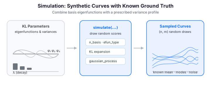
Synthetic functional data is essential for benchmarking methods, running power analyses, teaching, and building intuition. When you generate the data yourself you know the ground truth -- the true mean, the number of modes, the noise level -- so you can measure exactly how well a method recovers it.
fdars provides two complementary generators:
- Karhunen-Loeve (KL) simulation -- construct curves as random linear combinations of basis eigenfunctions with a prescribed variance profile.
- Gaussian process (GP) generation -- sample from a zero-mean GP with a specified covariance kernel.
Both live in the fdars.simulation module and return a 2D NumPy array of shape
(n, m) where n is the number of curves and m is the number of grid points.
Wrapping the result in an Fdata object bundles the data with its evaluation
grid and unlocks convenience methods for depth, distances, derivatives, and more.
Karhunen-Loeve Simulation
The Karhunen-Loeve theorem states that any square-integrable random function can be expanded as:
where \(\mu(t)\) is the mean function, \(\phi_k\) are orthonormal eigenfunctions, and \(\xi_k \sim \mathcal{N}(0, \lambda_k)\) are independent scores with \(\operatorname{Var}(\xi_k) = \lambda_k\).
simulate() truncates this expansion to n_basis terms. Two ingredients shape
the output:
- the eigenfunction type (
efun_type) sets the shape of each mode \(\phi_k\); - the eigenvalue decay (
eval_type) sets how much variance each mode carries.
Basic Usage
argvals = np.linspace(0, 1, 100)

data = simulate(
    n=50,              # number of curves
    argvals=argvals,   # evaluation grid
    n_basis=5,         # number of KL terms
    efun_type="fourier",  # eigenfunction family
    eval_type="linear",   # eigenvalue decay
    seed=42,           # reproducibility
)
fd = Fdata(data, argvals=argvals)
print(fd)  # Fdata (1D)  –  50 obs × 100 points  –  range [0.0, 1.0]
Reproducibility
Pass a fixed seed to get identical results across runs. Calling
simulate(...) twice with the same seed produces byte-for-byte identical
arrays; with seed=None a fresh random sample is drawn each time.
Eigenfunction Types
The efun_type parameter controls the shape of the basis functions \(\phi_k\).
You can inspect the eigenfunctions themselves with eigenfunctions(), which
returns an (m, n_basis) matrix -- the columns are the modes \(\phi_1, \dots,
\phi_{K}\) evaluated on argvals.
"fourier" (default)
Sines and cosines of increasing frequency. Best for periodic or smoothly oscillating data.
data_fourier = simulate(
    n=30, argvals=argvals, n_basis=7,
    efun_type="fourier", seed=1,
)
fd_fourier = Fdata(data_fourier, argvals=argvals)
"poly"
Legendre-like orthogonal polynomials on \([0, 1]\). Curves tend to show broad trends without rapid oscillation.
data_poly = simulate(
    n=30, argvals=argvals, n_basis=5,
    efun_type="poly", seed=1,
)
fd_poly = Fdata(data_poly, argvals=argvals)
"poly_high"
Higher-degree polynomial eigenfunctions that introduce more local variation
than "poly".
data_poly_high = simulate(
    n=30, argvals=argvals, n_basis=5,
    efun_type="poly_high", seed=1,
)
fd_poly_high = Fdata(data_poly_high, argvals=argvals)
"wiener"
Eigenfunctions of the Wiener process (Brownian motion), whose covariance is \(K(s, t) = \min(s, t)\). Useful for simulating non-stationary, drifting paths.
data_wiener = simulate(
    n=30, argvals=argvals, n_basis=5,
    efun_type="wiener", seed=1,
)
fd_wiener = Fdata(data_wiener, argvals=argvals)
Choosing an eigenfunction type
Use "fourier" for periodic or oscillatory data, "poly" for smooth
monotonic trends, and "wiener" for random-walk-like behavior.
The basis functions themselves make the choice concrete. Each family is a set of orthonormal modes of increasing complexity:
import numpy as np
from docs_fig import fig, render
from fdars.simulation import eigenfunctions

t = np.linspace(0, 1, 150)
f, axes = fig(1, 3, figsize=(10.5, 3.4), sharex=True)
for ax, kind in zip(axes, ["fourier", "poly", "wiener"]):
    phi = np.asarray(eigenfunctions(t, 5, efun_type=kind))  # (m, 5)
    for k in range(phi.shape[1]):
        ax.plot(t, phi[:, k], lw=1.4, label=f"$\\phi_{{{k + 1}}}$")
    ax.set(title=f'efun_type="{kind}"', xlabel="t")
axes[0].set_ylabel(r"$\phi_k(t)$")
axes[0].legend(fontsize=7, ncol=2, loc="best")
print(render(f))
And here is the character each family imprints on the sampled curves:
import numpy as np
from docs_fig import fig, render
from fdars.simulation import simulate

t = np.linspace(0, 1, 120)
f, axes = fig(2, 2, figsize=(9.0, 6.0), sharex=True)
for ax, kind in zip(axes.ravel(), ["fourier", "poly", "poly_high", "wiener"]):
    X = np.asarray(simulate(n=20, argvals=t, n_basis=5, efun_type=kind, seed=1))
    ax.plot(t, X.T, color="#3f51b5", lw=1, alpha=0.5)
    ax.set(title=f'efun_type="{kind}"', ylabel="X(t)")
for ax in axes[-1]:
    ax.set_xlabel("t")
print(render(f))
The imprint of each basis is unmistakable: fourier produces smooth oscillations,
poly broad low-order trends, poly_high more localized wiggles, and wiener
the rough, drifting paths of Brownian motion. Match the basis to the qualitative
shape you expect in your real data.
Eigenvalue Decay Patterns
The eigenvalue sequence \(\lambda_1 \geq \lambda_2 \geq \dots\) controls how much
each mode contributes to the total variance, and therefore the effective
dimensionality (and smoothness) of the data. Faster decay means higher-order
modes contribute little, so the curves are smoother. The eval_type parameter
selects the pattern; eigenvalues() returns the raw sequence.
"linear" (default)
\(\lambda_k = 1/k\). Slow decay means higher-order components still carry substantial variance, producing more complex curves.
"exponential"
\(\lambda_k = e^{-k}\). Fast decay concentrates variance in the first few components, yielding smoother, lower-dimensional data.
"wiener"
\(\lambda_k = 1 / \big((k - 0.5)^2 \pi^2\big)\). The eigenvalue pattern of the Brownian-motion covariance.
The three patterns span more than an order of magnitude by mode 5. On a log scale the difference in decay rate is clear:
import numpy as np
from docs_fig import fig, render
from fdars.simulation import eigenvalues

M = 20
k = np.arange(1, M + 1)
f, ax = fig(figsize=(7.0, 3.8))
for name, style in [("linear", "-o"), ("exponential", "-s"), ("wiener", "-^")]:
    ev = np.asarray(eigenvalues(M, eval_type=name))
    ax.semilogy(k, ev, style, ms=4, lw=1.2, label=name)
ax.set(xlabel="mode k", ylabel=r"$\lambda_k$",
       title="Eigenvalue decay patterns")
ax.legend()
print(render(f))
Because faster decay suppresses the high-frequency modes, it directly controls how rough the sampled curves look. With the same Fourier basis, linear decay keeps the wiggles while exponential decay smooths them away:
import numpy as np
from docs_fig import fig, render
from fdars.simulation import simulate

t = np.linspace(0, 1, 150)
f, (a1, a2) = fig(1, 2, figsize=(9.0, 3.6), sharex=True, sharey=True)
lin = np.asarray(simulate(n=10, argvals=t, n_basis=10,
                          efun_type="fourier", eval_type="linear", seed=42))
exp = np.asarray(simulate(n=10, argvals=t, n_basis=10,
                          efun_type="fourier", eval_type="exponential", seed=42))
a1.plot(t, lin.T, color="#dc3545", lw=1.2, alpha=0.8)
a1.set(title="linear decay (rougher)", xlabel="t", ylabel="X(t)")
a2.plot(t, exp.T, color="#198754", lw=1.2, alpha=0.8)
a2.set(title="exponential decay (smoother)", xlabel="t")
print(render(f))
With the basis and seed held fixed, only the eigenvalue decay differs, yet the curves look completely different: linear decay keeps the high-frequency modes alive (left, rough), while exponential decay starves them of variance (right, smooth). Decay is therefore your main lever for the effective smoothness of a simulated sample.
Combining Options and n_basis
You can mix any eigenfunction type with any eigenvalue decay. Increasing
n_basis adds higher-frequency modes (whether they matter depends on the decay
you paired them with):
# Fourier shapes with fast exponential decay -> very smooth oscillatory curves
smooth_osc = simulate(
    n=40, argvals=argvals, n_basis=7,
    efun_type="fourier", eval_type="exponential", seed=10,
)

# Polynomial shapes with linear decay -> complex trending curves
complex_trend = simulate(
    n=40, argvals=argvals, n_basis=7,
    efun_type="poly", eval_type="linear", seed=10,
)

# Effect of n_basis: low vs. high complexity (linear decay keeps modes active)
simple = simulate(n=20, argvals=argvals, n_basis=3, seed=0)
complex_ = simulate(n=20, argvals=argvals, n_basis=15, seed=0)
Adding a Mean Function
simulate() generates zero-mean curves: the KL scores are centered, so the
sample fluctuates around \(0\). To simulate around a non-trivial mean \(\mu(t)\),
add it to the returned array -- broadcasting handles the shape (n, m) + (m,).
No mean= argument
Unlike the R simFunData(mean = ...), the Python simulate() has no mean
parameter. Adding the mean afterwards is exact and equivalent, since the mean
enters the KL expansion additively.
import numpy as np
from docs_fig import fig, render
from fdars.simulation import simulate

t = np.linspace(0, 1, 100)
mean_fn = lambda t: 2 * np.sin(2 * np.pi * t) + t   # noqa: E731

X = np.asarray(simulate(n=30, argvals=t, n_basis=5, seed=42))
X_mean = X + mean_fn(t)                              # (30, 100) + (100,)

f, ax = fig(figsize=(7.0, 3.8))
ax.plot(t, X_mean.T, color="#3f51b5", lw=1, alpha=0.35)
ax.plot(t, mean_fn(t), color="#dc3545", lw=2.5, label=r"$\mu(t)$")
ax.set(title="Simulated data with sinusoidal mean", xlabel="t", ylabel="X(t)")
ax.legend()
print(render(f))
The whole sample now fluctuates around the red mean function rather than around
zero: the KL variability rides on top of \(\mu(t)\) additively, so the shape of the
ensemble is unchanged and only its centre has moved. This is why adding the mean
afterwards is exactly equivalent to a built-in mean= argument.
Adding Measurement Error
Real observations are noisy. fdars offers two noise models that take a data array and return a noisy copy of the same shape:
add_error_pointwise(data, sd, seed=None)-- independent Gaussian noise at every \((curve, t)\) point. This is ordinary i.i.d. measurement error and roughens each curve.add_error_curve(data, sd, seed=None)-- a single Gaussian offset per curve, constant across \(t\). This models a curve-specific bias (a systematic shift of the whole trajectory) rather than pointwise jitter.
Pointwise Noise
Increasing sd progressively buries the underlying smooth signal:
import numpy as np
from docs_fig import fig, render
from fdars.simulation import simulate, add_error_pointwise

t = np.linspace(0, 1, 100)
clean = np.asarray(simulate(n=10, argvals=t, n_basis=5, seed=42))

f, axes = fig(2, 2, figsize=(9.0, 6.0), sharex=True, sharey=True)
panels = [("clean", clean)]
for sd in (0.1, 0.3, 0.5):
    panels.append((f"pointwise sd={sd}",
                   np.asarray(add_error_pointwise(clean, sd=sd, seed=123))))
for ax, (title, Y) in zip(axes.ravel(), panels):
    ax.plot(t, Y.T, lw=0.9, alpha=0.8)
    ax.set(title=title)
for ax in axes[-1]:
    ax.set_xlabel("t")
for ax in axes[:, 0]:
    ax.set_ylabel("X(t)")
print(render(f))
As sd climbs from the clean panel to 0.5, the smooth underlying signal is
progressively drowned out point-by-point: at sd=0.5 the curves are barely
distinguishable from noise. This panel calibrates how much pointwise error your
downstream method must tolerate.
Curve-Level Noise
Here every curve is shifted by its own constant; the shapes are untouched but the whole family is spread vertically:
import numpy as np
from docs_fig import fig, render
from fdars.simulation import simulate, add_error_curve

t = np.linspace(0, 1, 100)
clean = np.asarray(simulate(n=10, argvals=t, n_basis=5, seed=42))
shifted = np.asarray(add_error_curve(clean, sd=2.5, seed=123))

f, (a1, a2) = fig(1, 2, figsize=(9.0, 3.6), sharex=True, sharey=True)
a1.plot(t, clean.T, lw=1.0, alpha=0.8)
a1.set(title="clean", xlabel="t", ylabel="X(t)")
a2.plot(t, shifted.T, lw=1.0, alpha=0.8)
a2.set(title="curve-level offset (sd=2.5)", xlabel="t")
print(render(f))
Unlike pointwise noise, the curve-level offset leaves every individual shape intact and simply spreads the family vertically -- each curve is rigidly shifted by its own constant. This is the right model for a per-subject bias (a mis-zeroed sensor, say) rather than tick-by-tick jitter.
Sparse / Irregular Sampling
No dedicated sparsify() binding
The R package ships a sparsify() helper that turns a dense sample into an
irregularly observed one. There is no Python binding for it yet, but you can
reproduce it transparently with NumPy: draw a random number of observed
indices per curve and keep only those. Because the curves then live on
different grids they are no longer a rectangular Fdata, so we visualise the
thinned observations directly.
import numpy as np
from docs_fig import fig, render
from fdars.simulation import simulate

t = np.linspace(0, 1, 100)
X = np.asarray(simulate(n=8, argvals=t, n_basis=5, seed=42))

rng = np.random.default_rng(123)
f, ax = fig(figsize=(7.0, 3.8))
for i in range(X.shape[0]):
    n_obs = rng.integers(10, 30)                       # 10-29 points kept
    idx = np.sort(rng.choice(t.size, size=n_obs, replace=False))
    ax.plot(t[idx], X[i, idx], "-o", ms=3, lw=0.7, alpha=0.7)
ax.set(title="Sparsified functional data (10-29 points per curve)",
       xlabel="t", ylabel="X(t)")
print(render(f))
Each curve now lives on its own irregular grid with a different number of retained points, so the sample is no longer a rectangular matrix. Recovering a common grid from data like this is exactly the problem the irregular-sampling guide solves.
Multivariate simulation
The R simMultiFunData() for jointly simulating several correlated
functional components has no Python binding. To approximate it, call
simulate() once per component with its own grid and basis and treat the
results as aligned by row index.
Gaussian Process Generation
For direct control over the local correlation structure, generate samples from a zero-mean Gaussian process with a specified covariance kernel. Where KL simulation is a modal description (which eigenfunctions, how much variance each), a GP is a correlational one (how strongly are \(X(s)\) and \(X(t)\) tied).
Basic Usage
argvals = np.linspace(0, 1, 100)

gp_data = gaussian_process(
    n=40, argvals=argvals,
    kernel="gaussian", length_scale=0.2, variance=1.0, seed=42,
)
fd_gp = Fdata(gp_data, argvals=argvals)
print(fd_gp)  # Fdata (1D)  –  40 obs × 100 points  –  range [0.0, 1.0]
Internally this builds the covariance matrix \(C\) on argvals, takes a Cholesky
factor \(C = L L^\top\), and returns \(L z\) for standard-normal \(z\) -- an
\(O(m^3)\) factorization versus the \(O(nM)\) cost of KL simulation.
Covariance Kernels
"gaussian" (squared exponential)
Produces infinitely differentiable (very smooth) sample paths.
"exponential" (Ornstein-Uhlenbeck)
Sample paths are continuous but not differentiable -- rougher than Gaussian.
"matern"
The Matern kernel with smoothness \(\nu = 1.5\):
A middle ground between Gaussian (too smooth) and exponential (too rough).
"periodic"
Generates sample paths with a repeating pattern (period \(p = 1.0\) by default).
The choice of kernel controls the roughness of the sample paths -- from the infinitely smooth Gaussian kernel to the jagged exponential (Ornstein-Uhlenbeck):
import numpy as np
from docs_fig import fig, render
from fdars.simulation import gaussian_process

t = np.linspace(0, 1, 150)
f, axes = fig(2, 2, figsize=(9.0, 6.0), sharex=True)
kernels = ["gaussian", "exponential", "matern", "periodic"]
ls = {"gaussian": 0.15, "exponential": 0.15, "matern": 0.15, "periodic": 0.3}
for ax, k in zip(axes.ravel(), kernels):
    X = np.asarray(gaussian_process(n=8, argvals=t, kernel=k,
                                    length_scale=ls[k], variance=1.0, seed=1))
    ax.plot(t, X.T, lw=1.2, alpha=0.8)
    ax.set(title=f'kernel="{k}"', ylabel="X(t)")
for ax in axes[-1]:
    ax.set_xlabel("t")
print(render(f))
The four kernels sample four textures: the Gaussian kernel gives glassy-smooth paths, the exponential (Ornstein-Uhlenbeck) kernel gives visibly jagged ones, the Matern sits between them, and the periodic kernel repeats its pattern along the domain. Pick the kernel whose roughness matches the physics you are modelling.
Controlling Smoothness with length_scale
The length scale \(\ell\) sets how quickly the correlation decays with distance. Smaller values produce more wiggly paths; larger values yield smoother, slowly varying curves.
import numpy as np
from docs_fig import fig, render
from fdars.simulation import gaussian_process

t = np.linspace(0, 1, 150)
f, (a1, a2) = fig(1, 2, figsize=(9.0, 3.6), sharex=True, sharey=True)
rough = np.asarray(gaussian_process(n=6, argvals=t, kernel="gaussian",
                                    length_scale=0.05, seed=0))
smooth = np.asarray(gaussian_process(n=6, argvals=t, kernel="gaussian",
                                     length_scale=0.5, seed=0))
a1.plot(t, rough.T, color="#dc3545", lw=1.2, alpha=0.8)
a1.set(title="length_scale = 0.05 (rough)", xlabel="t", ylabel="X(t)")
a2.plot(t, smooth.T, color="#198754", lw=1.2, alpha=0.8)
a2.set(title="length_scale = 0.5 (smooth)", xlabel="t")
print(render(f))
At \(\ell = 0.05\) the correlation dies within a twentieth of the domain, so neighbouring points are nearly independent and the paths are wiggly; at \(\ell = 0.5\) points half the domain apart still co-vary, giving slow, gentle curves. The length scale is thus the GP's direct knob for horizontal smoothness.
Controlling Amplitude with variance
The variance parameter \(\sigma^2\) scales the overall amplitude of the curves:
low_var = gaussian_process(
    n=20, argvals=argvals,
    kernel="gaussian", length_scale=0.2, variance=0.1, seed=0,
)
high_var = gaussian_process(
    n=20, argvals=argvals,
    kernel="gaussian", length_scale=0.2, variance=5.0, seed=0,
)
Computing a Covariance Matrix
If you need the raw covariance matrix \(C(s_i, t_j)\) for custom purposes (e.g.,
feeding into your own sampler), use covariance_matrix. It supports the
"gaussian" and "exponential" kernels:
from fdars.simulation import covariance_matrix

argvals = np.linspace(0, 1, 50)
cov = covariance_matrix(
    argvals, kernel="gaussian", length_scale=0.2, variance=1.0,
)
print(cov.shape)  # (50, 50)
print(f"Diagonal (should be ~1.0): {cov[0, 0]:.4f}")
KL versus GP: Which to Use?
The two generators overlap -- a "wiener" KL simulation and a Brownian-kernel GP
describe the same process from different angles -- but they are parameterized
differently:
| Aspect | KL (simulate) |
GP (gaussian_process) |
|---|---|---|
| Control | eigenfunctions + eigenvalues | covariance kernel |
| Interpretation | modal decomposition (FPCA) | correlation structure |
| Best for | known/target FPCA structure | known covariance kernel |
| Cost | \(O(nM)\) per curve | \(O(m^3)\) Cholesky, once |
No "brownian" GP kernel
The R comparison uses make.gaussian.process(cov = kernel.brownian()). The
Python gaussian_process does not expose a Brownian kernel, so the closest
reproduction of Brownian-motion paths is the "wiener" KL route below. The
GP "exponential" (Ornstein-Uhlenbeck) kernel gives visually comparable
non-differentiable roughness.
import numpy as np
from docs_fig import fig, render
from fdars.simulation import simulate, gaussian_process

t = np.linspace(0, 1, 150)
kl = np.asarray(simulate(n=10, argvals=t, n_basis=10,
                         efun_type="wiener", eval_type="wiener", seed=42))
gp = np.asarray(gaussian_process(n=10, argvals=t, kernel="exponential",
                                 length_scale=0.2, seed=42))

f, (a1, a2) = fig(1, 2, figsize=(9.0, 3.6), sharex=True)
a1.plot(t, kl.T, lw=1.1, alpha=0.8)
a1.set(title="KL simulation (wiener / wiener)", xlabel="t", ylabel="X(t)")
a2.plot(t, gp.T, lw=1.1, alpha=0.8)
a2.set(title="GP simulation (exponential kernel)", xlabel="t")
print(render(f))
Both routes produce the same qualitative object -- non-differentiable, random-walk-like paths -- from opposite parameterizations: the KL side specifies Wiener eigenfunctions and eigenvalues, the GP side an Ornstein-Uhlenbeck kernel. When you have a target covariance, reach for the GP; when you have a target FPCA structure, reach for KL.
Complete Recipe: A Two-Group Power Analysis
A common use of simulation is to check whether a method can separate two groups that differ only in their mean function. Here we simulate two 30-curve groups with different means, add pointwise measurement noise, and then confirm the separation with unsupervised clustering.
import numpy as np
import pandas as pd
from docs_fig import fig, render
from fdars import Fdata
from fdars.simulation import simulate, add_error_pointwise
from fdars.clustering import kmeans_fd

t = np.linspace(0, 1, 100)
n_per = 30

# 1. Two groups differing only in the mean function. We use exponential
#    eigenvalue decay so the within-group KL variability stays modest relative
#    to the between-group mean gap -- otherwise the groups overlap too much for
#    unsupervised clustering to recover them.
mean1 = lambda t: np.sin(2 * np.pi * t)                              # noqa: E731
mean2 = lambda t: np.sin(2 * np.pi * t) + 2.0 * np.cos(4 * np.pi * t)  # noqa: E731

g1 = np.asarray(simulate(n=n_per, argvals=t, n_basis=5,
                         eval_type="exponential", seed=1)) + mean1(t)
g2 = np.asarray(simulate(n=n_per, argvals=t, n_basis=5,
                         eval_type="exponential", seed=2)) + mean2(t)

# 2. Add measurement noise
g1 = np.asarray(add_error_pointwise(g1, sd=0.2, seed=11))
g2 = np.asarray(add_error_pointwise(g2, sd=0.2, seed=22))

# 3. Visualise each group with its true mean overlaid
f, (a1, a2) = fig(1, 2, figsize=(9.0, 3.6), sharex=True, sharey=True)
a1.plot(t, g1.T, color="#3f51b5", lw=0.8, alpha=0.4)
a1.plot(t, mean1(t), color="#0d6efd", lw=2.5, label=r"$\mu_1$")
a1.set(title="Group 1", xlabel="t", ylabel="X(t)"); a1.legend()
a2.plot(t, g2.T, color="#b53f3f", lw=0.8, alpha=0.4)
a2.plot(t, mean2(t), color="#dc3545", lw=2.5, label=r"$\mu_2$")
a2.set(title="Group 2", xlabel="t"); a2.legend()
print(render(f))
Now stack the two groups, cluster them without labels, and measure how well the recovered clusters match the true groups (agreement is reported up to a label swap, since cluster ids are arbitrary):
import numpy as np
import pandas as pd
from docs_fig import fig, render
from fdars import Fdata
from fdars.simulation import simulate, add_error_pointwise
from fdars.clustering import kmeans_fd

t = np.linspace(0, 1, 100)
n_per = 30
mean1 = lambda t: np.sin(2 * np.pi * t)                              # noqa: E731
mean2 = lambda t: np.sin(2 * np.pi * t) + 2.0 * np.cos(4 * np.pi * t)  # noqa: E731
g1 = np.asarray(simulate(n=n_per, argvals=t, n_basis=5,
                         eval_type="exponential", seed=1)) + mean1(t)
g2 = np.asarray(simulate(n=n_per, argvals=t, n_basis=5,
                         eval_type="exponential", seed=2)) + mean2(t)
g1 = np.asarray(add_error_pointwise(g1, sd=0.2, seed=11))
g2 = np.asarray(add_error_pointwise(g2, sd=0.2, seed=22))

data = np.vstack([g1, g2])                       # (60, 100)
true_labels = np.array([0] * n_per + [1] * n_per)
fd = Fdata(data, argvals=t, metadata=pd.DataFrame({"group": true_labels}))

# Summary statistics via Fdata convenience methods
mu = fd.mean()
depths = fd.depth("fraiman_muniz")
median_idx = int(np.argmax(depths))

# Unsupervised recovery
result = kmeans_fd(fd.data, fd.argvals, k=2, seed=0)
pred = np.asarray(result["cluster"])
agreement = max((pred == true_labels).mean(), (pred != true_labels).mean())

lines = [
    f"grand-mean range : [{mu.min():.2f}, {mu.max():.2f}]",
    f"deepest curve    : index {median_idx} (depth {depths[median_idx]:.3f})",
    f"cluster agreement: {agreement:.0%}",
]
f, ax = fig(figsize=(7.0, 2.4))
ax.axis("off")
ax.text(0.02, 0.95, "\n".join(lines), va="top", family="monospace", fontsize=11)
print(render(f))
The high cluster agreement confirms the payoff of simulating with a known ground truth: because we built the two groups with a deliberate mean gap and modest within-group variance, unsupervised \(k\)-means recovers the true labels almost perfectly, and the depth-based median falls in the expected group. This is the skeleton of a power analysis -- shrink the mean gap or raise the noise until the agreement drops, and you have mapped the method's detection limit.
Summary
| Function | Purpose |
|---|---|
simulate() |
KL simulation with chosen eigenfunctions/eigenvalues |
sim_kl() |
low-level KL simulation from explicit phi, lambda |
eigenfunctions() |
eigenfunction bases (fourier, poly, poly_high, wiener) |
eigenvalues() |
eigenvalue sequences (linear, exponential, wiener) |
gaussian_process() |
GP simulation with covariance kernels |
covariance_matrix() |
raw covariance matrix (gaussian / exponential) |
add_error_pointwise() |
i.i.d. Gaussian measurement noise |
add_error_curve() |
curve-level (constant) offset per curve |
References
- Ramsay, J. O. & Silverman, B. W. (2005). Functional Data Analysis (2nd ed.). Springer. (Ch. 8--9, the Karhunen--Loève expansion and functional principal components.)
- Rasmussen, C. E. & Williams, C. K. I. (2006). Gaussian Processes for Machine Learning. MIT Press.
- Karhunen, K. (1947). Über lineare Methoden in der Wahrscheinlichkeitsrechnung. Annales Academiae Scientiarum Fennicae, Series A. I. Mathematica-Physica, 37, 1--79.
- Hall, P., Müller, H.-G. & Wang, J.-L. (2006). Properties of Principal Component Methods for Functional and Longitudinal Data Analysis. The Annals of Statistics, 34(3), 1493--1517.
Next Steps
- Introduction to fdars -- if you haven't read it yet.
- Smoothing -- apply smoothing to your simulated data.
- Working with Derivatives -- differentiate your curves.
- Covariance Functions -- deeper look at kernel functions.