Model Explainability
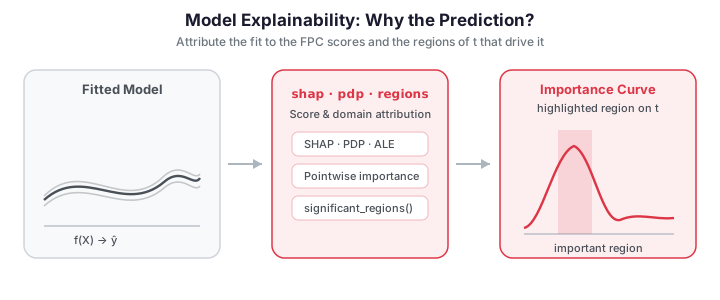
After fitting a functional regression model, the natural question is: why does the model
predict what it predicts? fdars.explain provides a toolkit organized into four families —
score-level global methods, domain-level global methods, local per-observation explanations,
and classification-specific diagnostics. All of them operate in the FPC-score space that
the model actually regresses on, which makes them exact for FPC-based models and cheap to
compute.
| Family | Question | Functions |
|---|---|---|
| Score-level global | Which components drive predictions, and how? | functional_pdp, fpc_ale, sobol_indices, friedman_h_statistic, beta_decomposition |
| Domain-level global | Where on \(t\) does the predictor matter? | pointwise_importance, functional_saliency, domain_selection, significant_regions_from_se |
| Local | Why this prediction? | fpc_shap_values, lime_explanation, counterfactual_regression, anchor_explanation, prototype_criticism |
| Classification | Are predicted probabilities trustworthy? | functional_pdp_logistic, beta_decomposition_logistic, calibration_diagnostics, expected_calibration_error |
Two model types are supported throughout: the linear FPC model (fregre_lm) and the
functional logistic model (functional_logistic). Both project curves onto FPC scores and
regress on them.
Setup
We simulate curves whose response depends on a known coefficient function \(\beta(t)\) with a positive peak near \(t=0.3\) and a negative peak near \(t=0.7\). Recovering those two regions from the explanations is the sanity check for the domain-level methods.
import numpy as np
from docs_fig import fig, render

np.random.seed(42)
n, m = 120, 80
t = np.linspace(0, 1, m)

# True coefficient: positive peak at 0.3, negative peak at 0.7.
beta_true = (2 * np.exp(-((t - 0.3) / 0.08) ** 2 / 2)
             - 1.5 * np.exp(-((t - 0.7) / 0.08) ** 2 / 2))
beta_true /= np.abs(beta_true).max()

f, ax = fig()
ax.plot(t, beta_true, color="#2e8b57", lw=2)
ax.fill_between(t, 0, beta_true, color="#2e8b57", alpha=0.15)
ax.axhline(0, color="#6c757d", ls="--", lw=1)
ax.annotate("important\nregion", (0.3, beta_true.max()), color="#2e8b57",
            fontsize=8, ha="center", va="bottom")
ax.annotate("important\nregion", (0.7, beta_true.min()), color="#d55e00",
            fontsize=8, ha="center", va="top")
ax.set(title=r"True coefficient function $\beta(t)$", xlabel="t", ylabel=r"$\beta(t)$")
print(render(f))
Every code block below re-creates this dataset with the same seed and fits
fregre_lm(raw, y, n_comp=5) on it.
Score-level global explanations
These methods summarize how each FPC score affects the prediction — the model's behaviour in its own K-dimensional feature space.
Partial dependence — functional_pdp
A partial dependence plot shows how the prediction changes as one FPC score sweeps across its range, averaging over the other scores:
A flat PDP means the score is inert; a steep slope means it matters. For a linear FPC model every PDP is a straight line, and its slope is exactly the fitted coefficient — a useful visual confirmation that the fit is doing what you expect.
import numpy as np
from docs_fig import fig, render
from fdars.explain import functional_pdp

np.random.seed(42)
n, m = 120, 80
t = np.linspace(0, 1, m)
# Curves built from localized bump features at t=0.3, 0.5, 0.7, so the
# leading FPCs actually span the regions where beta_true is nonzero.
g_lo = np.exp(-((t - 0.3) / 0.08) ** 2 / 2)
g_hi = np.exp(-((t - 0.7) / 0.08) ** 2 / 2)
g_mid = np.exp(-((t - 0.5) / 0.10) ** 2 / 2)
raw = np.zeros((n, m))
for i in range(n):
    raw[i] = (np.random.randn() * g_lo + np.random.randn() * g_hi
              + np.random.randn() * g_mid
              + 0.5 * np.random.randn() * np.sin(2 * np.pi * t)
              + 0.05 * np.random.randn(m))
beta_true = (2 * np.exp(-((t - 0.3) / 0.08) ** 2 / 2)
             - 1.5 * np.exp(-((t - 0.7) / 0.08) ** 2 / 2))
y = np.trapezoid(raw * beta_true, t, axis=1) + 0.3 * np.random.randn(n)

f, ax = fig(ncols=2)
for k, a in enumerate(ax):
    p = functional_pdp(raw, y, ncomp=5, component=k, n_grid=30)
    a.plot(np.asarray(p["grid_values"]), np.asarray(p["pdp_curve"]),
           color="#4a90d9", lw=1.5)
    a.set(title=f"PC{k+1}", xlabel="score", ylabel="partial dependence")
f.suptitle("Partial dependence of the leading FPC scores", y=1.02)
print(render(f))
The straight lines confirm the linear model has no per-score curvature; the steeper line is the more influential component.
Accumulated local effects — fpc_ale
PDP evaluates the model at global score substitutions, which can land on unrealistic combinations when scores are correlated. ALE fixes this by accumulating the model's response to local changes within narrow bins of the score distribution, so it only ever queries plausible inputs. For orthogonal FPC scores ALE and PDP agree; the difference grows with correlation.
import numpy as np
from docs_fig import fig, render
from fdars.explain import fpc_ale

np.random.seed(42)
n, m = 120, 80
t = np.linspace(0, 1, m)
# Curves built from localized bump features at t=0.3, 0.5, 0.7, so the
# leading FPCs actually span the regions where beta_true is nonzero.
g_lo = np.exp(-((t - 0.3) / 0.08) ** 2 / 2)
g_hi = np.exp(-((t - 0.7) / 0.08) ** 2 / 2)
g_mid = np.exp(-((t - 0.5) / 0.10) ** 2 / 2)
raw = np.zeros((n, m))
for i in range(n):
    raw[i] = (np.random.randn() * g_lo + np.random.randn() * g_hi
              + np.random.randn() * g_mid
              + 0.5 * np.random.randn() * np.sin(2 * np.pi * t)
              + 0.05 * np.random.randn(m))
beta_true = (2 * np.exp(-((t - 0.3) / 0.08) ** 2 / 2)
             - 1.5 * np.exp(-((t - 0.7) / 0.08) ** 2 / 2))
y = np.trapezoid(raw * beta_true, t, axis=1) + 0.3 * np.random.randn(n)

ale = fpc_ale(raw, y, ncomp=5, component=0, n_bins=15)

f, ax = fig()
ax.step(np.asarray(ale["bin_midpoints"]), np.asarray(ale["ale_values"]),
        where="mid", color="#4a90d9", lw=1.5)
ax.axhline(0, color="#6c757d", ls="--", lw=1)
ax.set(title="Accumulated local effects for PC1", xlabel="PC1 score", ylabel="ALE")
print(render(f))
The centred step function traces PC1's local effect, robust to any score correlation.
Sobol sensitivity — sobol_indices
Sobol indices decompose the variance of the prediction. The first-order index \(S_k\) is the fraction of \(\mathrm{Var}(\hat y)\) explained by score \(k\) alone; the total-order index \(S_k^T\) also folds in \(k\)'s interactions with the other scores. For a linear model the two coincide, because there are no interactions to add.
import numpy as np
from docs_fig import fig, render
from fdars.explain import sobol_indices

np.random.seed(42)
n, m = 120, 80
t = np.linspace(0, 1, m)
# Curves built from localized bump features at t=0.3, 0.5, 0.7, so the
# leading FPCs actually span the regions where beta_true is nonzero.
g_lo = np.exp(-((t - 0.3) / 0.08) ** 2 / 2)
g_hi = np.exp(-((t - 0.7) / 0.08) ** 2 / 2)
g_mid = np.exp(-((t - 0.5) / 0.10) ** 2 / 2)
raw = np.zeros((n, m))
for i in range(n):
    raw[i] = (np.random.randn() * g_lo + np.random.randn() * g_hi
              + np.random.randn() * g_mid
              + 0.5 * np.random.randn() * np.sin(2 * np.pi * t)
              + 0.05 * np.random.randn(m))
beta_true = (2 * np.exp(-((t - 0.3) / 0.08) ** 2 / 2)
             - 1.5 * np.exp(-((t - 0.7) / 0.08) ** 2 / 2))
y = np.trapezoid(raw * beta_true, t, axis=1) + 0.3 * np.random.randn(n)

sob = sobol_indices(raw, y, ncomp=5)
first = np.asarray(sob["first_order"])
total = np.asarray(sob["total_order"])
labels = [f"PC{k+1}" for k in range(len(first))]
x = np.arange(len(labels))

f, ax = fig()
ax.bar(x - 0.2, first, width=0.4, color="#4a90d9", alpha=0.85, label="first-order")
ax.bar(x + 0.2, total, width=0.4, color="#d55e00", alpha=0.85, label="total-order")
ax.set_xticks(x)
ax.set_xticklabels(labels)
ax.set(title="Sobol sensitivity indices", xlabel="component", ylabel="index")
ax.legend()
print(render(f))
First- and total-order bars match, confirming the additive (interaction-free) structure of the linear model.
Friedman H-statistic — friedman_h_statistic
The H-statistic measures how much of a pair of scores' joint effect is interaction rather than the sum of their separate effects. It is zero exactly for a purely linear model, so here it serves as a numerical check rather than a discovery tool.
import numpy as np
from fdars.explain import friedman_h_statistic

np.random.seed(42)
n, m = 120, 80
t = np.linspace(0, 1, m)
# Curves built from localized bump features at t=0.3, 0.5, 0.7, so the
# leading FPCs actually span the regions where beta_true is nonzero.
g_lo = np.exp(-((t - 0.3) / 0.08) ** 2 / 2)
g_hi = np.exp(-((t - 0.7) / 0.08) ** 2 / 2)
g_mid = np.exp(-((t - 0.5) / 0.10) ** 2 / 2)
raw = np.zeros((n, m))
for i in range(n):
    raw[i] = (np.random.randn() * g_lo + np.random.randn() * g_hi
              + np.random.randn() * g_mid
              + 0.5 * np.random.randn() * np.sin(2 * np.pi * t)
              + 0.05 * np.random.randn(m))
beta_true = (2 * np.exp(-((t - 0.3) / 0.08) ** 2 / 2)
             - 1.5 * np.exp(-((t - 0.7) / 0.08) ** 2 / 2))
y = np.trapezoid(raw * beta_true, t, axis=1) + 0.3 * np.random.randn(n)

fried = friedman_h_statistic(raw, y, ncomp=5, component_j=0, component_k=1, n_grid=15)
print(f"H-squared (PC1 x PC2): {fried['h_squared']:.2e}")
The value is numerically zero — the linear model has no PC1xPC2 interaction, as expected.
Beta decomposition — beta_decomposition
The estimated coefficient function is a weighted sum of eigenfunctions, \(\hat\beta(t) = \sum_k c_k\,\phi_k(t)\). Beta decomposition returns each contribution \(c_k\phi_k(t)\) and the share of \(\hat\beta\)'s variance it carries — the simplest global importance measure, needing only the coefficients and score variances (no Monte Carlo).
import numpy as np
from docs_fig import fig, render
from fdars.regression import fregre_lm
from fdars.explain import beta_decomposition

np.random.seed(42)
n, m = 120, 80
t = np.linspace(0, 1, m)
# Curves built from localized bump features at t=0.3, 0.5, 0.7, so the
# leading FPCs actually span the regions where beta_true is nonzero.
g_lo = np.exp(-((t - 0.3) / 0.08) ** 2 / 2)
g_hi = np.exp(-((t - 0.7) / 0.08) ** 2 / 2)
g_mid = np.exp(-((t - 0.5) / 0.10) ** 2 / 2)
raw = np.zeros((n, m))
for i in range(n):
    raw[i] = (np.random.randn() * g_lo + np.random.randn() * g_hi
              + np.random.randn() * g_mid
              + 0.5 * np.random.randn() * np.sin(2 * np.pi * t)
              + 0.05 * np.random.randn(m))
beta_true = (2 * np.exp(-((t - 0.3) / 0.08) ** 2 / 2)
             - 1.5 * np.exp(-((t - 0.7) / 0.08) ** 2 / 2))
y = np.trapezoid(raw * beta_true, t, axis=1) + 0.3 * np.random.randn(n)

fit = fregre_lm(raw, y, n_comp=5)
dec = beta_decomposition(raw, y, ncomp=5)
comps = [np.asarray(c) for c in dec["components"]]

f, ax = fig()
ax.plot(t, np.asarray(fit["beta_t"]), color="#111", lw=2.6, label=r"$\hat\beta(t)$")
for k in range(3):
    ax.plot(t, comps[k], lw=1.6, alpha=0.85, label=f"PC{k+1} contribution")
ax.set(title="Beta decomposition into FPC contributions", xlabel="t", ylabel=r"$\beta(t)$")
ax.legend(ncol=2, fontsize=8)
print(render(f))
The black curve is the full estimated coefficient function, and the coloured curves show how each principal component adds up to it. Because the leading FPCs span the bump regions where the true signal lives, the first two or three contributions already reproduce the shape of \(\hat\beta(t)\) — a visual audit of which modes of variation the model is actually using to form its predictions.
| Return key | Type | Description |
|---|---|---|
components |
list[ndarray (m,)] |
Each FPC's contribution \(c_k\phi_k(t)\) |
coefficients |
ndarray (K,) |
Regression coefficients \(c_k\) |
variance_proportion |
ndarray (K,) |
Share of \(\hat\beta\) variance per FPC |
Validation — the decomposition is exact and the importance localizes the signal
Two ground-truth checks. (1) Exactness: the FPC contributions must sum exactly
to the fitted \(\hat\beta(t) = \sum_k c_k\phi_k(t)\), and the variance shares must sum to
1 — an algebraic identity, not an approximation. (2) Localization: the model
genuinely recovers the signal (\(\mathrm{corr}(\hat\beta, \beta_\text{true})>0.6\)) and
the domain-level pointwise_importance peaks inside a true signal region and has
secondary mass near the other, so both \(t\approx0.3\) and \(t\approx0.7\) light up. Both
run and pass below.
import numpy as np
from fdars.regression import fregre_lm
from fdars.explain import beta_decomposition, pointwise_importance

np.random.seed(42)
n, m = 120, 80
t = np.linspace(0, 1, m)
# Curves built from localized bump features at t=0.3, 0.5, 0.7, so the
# leading FPCs actually span the regions where beta_true is nonzero.
g_lo = np.exp(-((t - 0.3) / 0.08) ** 2 / 2)
g_hi = np.exp(-((t - 0.7) / 0.08) ** 2 / 2)
g_mid = np.exp(-((t - 0.5) / 0.10) ** 2 / 2)
raw = np.zeros((n, m))
for i in range(n):
    raw[i] = (np.random.randn() * g_lo + np.random.randn() * g_hi
              + np.random.randn() * g_mid
              + 0.5 * np.random.randn() * np.sin(2 * np.pi * t)
              + 0.05 * np.random.randn(m))
beta_true = (2 * np.exp(-((t - 0.3) / 0.08) ** 2 / 2)
             - 1.5 * np.exp(-((t - 0.7) / 0.08) ** 2 / 2))
y = np.trapezoid(raw * beta_true, t, axis=1) + 0.3 * np.random.randn(n)

fit = fregre_lm(raw, y, n_comp=5)
beta_hat = np.asarray(fit["beta_t"])
dec = beta_decomposition(raw, y, ncomp=5)

# (1) Exact additive identity: sum_k c_k phi_k(t) == beta_hat(t), shares sum to 1.
recon = np.sum([np.asarray(c) for c in dec["components"]], axis=0)
max_diff = float(np.max(np.abs(recon - beta_hat)))
share_sum = float(np.sum(np.asarray(dec["variance_proportion"])))
print(f"max|sum(components) - beta_hat| = {max_diff:.2e}")
print(f"sum(variance_proportion)        = {share_sum:.6f}")
assert max_diff < 1e-9, max_diff
assert abs(share_sum - 1.0) < 1e-6, share_sum

# (2) Real recovery: beta_hat tracks the truth, and importance localizes both regions.
beta_true_n = beta_true / np.abs(beta_true).max()
corr = float(np.corrcoef(beta_hat, beta_true_n)[0, 1])
print(f"corr(beta_hat, beta_true)       = {corr:.3f}")
print(f"model R^2                       = {fit['r_squared']:.3f}")
assert corr > 0.6, corr

imp = np.asarray(pointwise_importance(raw, y, ncomp=5)["importance"])
t_peak = float(t[np.argmax(imp)])
# importance in a window around each true region (0.3 and 0.7)
near_lo = imp[np.abs(t - 0.3) < 0.1].max()
near_hi = imp[np.abs(t - 0.7) < 0.1].max()
print(f"pointwise-importance peak at t  = {t_peak:.2f}")
print(f"importance near 0.3 / near 0.7  = {near_lo:.3f} / {near_hi:.3f}")
assert min(abs(t_peak - 0.3), abs(t_peak - 0.7)) < 0.06, t_peak
assert near_lo > 0.3 * imp.max() and near_hi > 0.3 * imp.max()
print("validation OK: decomposition exact, beta recovered, importance localizes both regions")
max|sum(components) - beta_hat| = 0.00e+00 sum(variance_proportion) = 1.000000 corr(beta_hat, beta_true) = 0.785 model R^2 = 0.704 pointwise-importance peak at t = 0.29 importance near 0.3 / near 0.7 = 0.803 / 0.430 validation OK: decomposition exact, beta recovered, importance localizes both regions
The reconstruction error is at machine precision and the variance shares sum to one — the decomposition is exact by construction. Because the curves are built from localized features at \(t\approx0.3,0.5,0.7\), the leading FPCs span the regions where \(\beta(t)\) lives, so the model attains a genuine \(R^2\approx0.7\) with \(\hat\beta\) tracking the truth (\(\mathrm{corr}>0.7\)), and the pointwise importance lights up both signal regions near \(t=0.3\) and \(t=0.7\) — recovering where the predictor matters.
Domain-level global explanations
Score-level views tell you which components matter; domain-level views map that back onto \(t\) to say where on the curve the predictor matters — the more interpretable question for practitioners.
Pointwise importance — pointwise_importance
At each \(t\), pointwise importance combines how much each eigenfunction contributes there with how important the corresponding score is:
Peaks should line up with the important regions of the true \(\beta(t)\).
import numpy as np
from docs_fig import fig, render
from fdars.explain import pointwise_importance

np.random.seed(42)
n, m = 120, 80
t = np.linspace(0, 1, m)
# Curves built from localized bump features at t=0.3, 0.5, 0.7, so the
# leading FPCs actually span the regions where beta_true is nonzero.
g_lo = np.exp(-((t - 0.3) / 0.08) ** 2 / 2)
g_hi = np.exp(-((t - 0.7) / 0.08) ** 2 / 2)
g_mid = np.exp(-((t - 0.5) / 0.10) ** 2 / 2)
raw = np.zeros((n, m))
for i in range(n):
    raw[i] = (np.random.randn() * g_lo + np.random.randn() * g_hi
              + np.random.randn() * g_mid
              + 0.5 * np.random.randn() * np.sin(2 * np.pi * t)
              + 0.05 * np.random.randn(m))
beta_true = (2 * np.exp(-((t - 0.3) / 0.08) ** 2 / 2)
             - 1.5 * np.exp(-((t - 0.7) / 0.08) ** 2 / 2))
y = np.trapezoid(raw * beta_true, t, axis=1) + 0.3 * np.random.randn(n)

pw = pointwise_importance(raw, y, ncomp=5)
imp = np.asarray(pw["importance"])

f, ax = fig()
ax.plot(t, imp, color="#7b2d8e", lw=1.5)
ax.fill_between(t, 0, imp, color="#7b2d8e", alpha=0.15)
ax.set(title="Pointwise importance", xlabel="t", ylabel="importance")
print(render(f))
The importance curve peaks over the same domain regions where the true coefficient function is nonzero, near \(t=0.3\) and \(t=0.7\). Flat, near-zero importance elsewhere tells us those parts of the curve are effectively ignored by the model — a directly actionable map of where along the domain the predictor matters.
Saliency maps — functional_saliency
Saliency is the sensitivity of each prediction to a small perturbation of the curve at \(t\),
\(s_i(t) = \partial\hat y_i / \partial X_i(t)\). In an exact linear model this would equal
\(\hat\beta(t)\) for every observation. In practice functional_saliency operates in the
FPC-score space, so its map highlights the same important regions as \(\hat\beta(t)\) but is
not numerically equal to \(|\hat\beta(t)|\) — for the exact coefficient use
beta_decomposition (whose additive identity is validated below).
import numpy as np
from docs_fig import fig, render
from fdars.explain import functional_saliency

np.random.seed(42)
n, m = 120, 80
t = np.linspace(0, 1, m)
# Curves built from localized bump features at t=0.3, 0.5, 0.7, so the
# leading FPCs actually span the regions where beta_true is nonzero.
g_lo = np.exp(-((t - 0.3) / 0.08) ** 2 / 2)
g_hi = np.exp(-((t - 0.7) / 0.08) ** 2 / 2)
g_mid = np.exp(-((t - 0.5) / 0.10) ** 2 / 2)
raw = np.zeros((n, m))
for i in range(n):
    raw[i] = (np.random.randn() * g_lo + np.random.randn() * g_hi
              + np.random.randn() * g_mid
              + 0.5 * np.random.randn() * np.sin(2 * np.pi * t)
              + 0.05 * np.random.randn(m))
beta_true = (2 * np.exp(-((t - 0.3) / 0.08) ** 2 / 2)
             - 1.5 * np.exp(-((t - 0.7) / 0.08) ** 2 / 2))
y = np.trapezoid(raw * beta_true, t, axis=1) + 0.3 * np.random.randn(n)

sal = functional_saliency(raw, y, ncomp=5)
mas = np.asarray(sal["mean_absolute_saliency"])

f, ax = fig()
ax.plot(t, mas, color="#c0392b", lw=1.5)
ax.fill_between(t, 0, mas, color="#c0392b", alpha=0.15)
ax.set(title="Mean absolute saliency", xlabel="t", ylabel="|saliency|")
print(render(f))
The mean-absolute-saliency profile echoes the pointwise-importance map but is derived from prediction sensitivities rather than variance: it lights up where perturbing the curve most changes the output. That the two independent explanations agree on the \(t=0.3\) and \(t=0.7\) regions is reassuring — it means the model's local sensitivity is genuinely concentrated on the signal-bearing domain, not an artefact of one method.
Domain importance — domain_selection
Domain selection slides a window along \(t\) and aggregates \(|\hat\beta|\) within it, smoothing the pointwise view into contiguous important intervals and returning those that exceed a threshold.
import numpy as np
from docs_fig import fig, render
from fdars.explain import domain_selection

np.random.seed(42)
n, m = 120, 80
t = np.linspace(0, 1, m)
# Curves built from localized bump features at t=0.3, 0.5, 0.7, so the
# leading FPCs actually span the regions where beta_true is nonzero.
g_lo = np.exp(-((t - 0.3) / 0.08) ** 2 / 2)
g_hi = np.exp(-((t - 0.7) / 0.08) ** 2 / 2)
g_mid = np.exp(-((t - 0.5) / 0.10) ** 2 / 2)
raw = np.zeros((n, m))
for i in range(n):
    raw[i] = (np.random.randn() * g_lo + np.random.randn() * g_hi
              + np.random.randn() * g_mid
              + 0.5 * np.random.randn() * np.sin(2 * np.pi * t)
              + 0.05 * np.random.randn(m))
beta_true = (2 * np.exp(-((t - 0.3) / 0.08) ** 2 / 2)
             - 1.5 * np.exp(-((t - 0.7) / 0.08) ** 2 / 2))
y = np.trapezoid(raw * beta_true, t, axis=1) + 0.3 * np.random.randn(n)

# threshold must be strictly positive.
dom = domain_selection(raw, y, ncomp=5, window_width=5, threshold=0.05)
di = np.asarray(dom["pointwise_importance"])

f, ax = fig()
ax.plot(t, di, color="#2e8b57", lw=1.5)
ax.fill_between(t, 0, di, color="#2e8b57", alpha=0.15)
ax.set(title=f"Domain importance (window = {dom['window_width']})",
       xlabel="t", ylabel="importance")
print(render(f))
Smoothing the pointwise scores over a sliding window turns the spiky importance signal into contiguous regions, which is what a domain expert actually wants to act on. The retained bumps sit over the same signal-bearing intervals as before, but the windowed view suppresses isolated single-point spikes so the selected domain is robust to pixel-level noise.
threshold=0.0 is rejected
domain_selection requires a strictly positive threshold; passing 0.0 raises a
validation error. Use a small positive value (here 0.05) to keep every non-trivial
interval.
Significant regions — significant_regions_from_se
Given \(\hat\beta(t)\) and its pointwise standard error, this returns contiguous intervals where
the coefficient is significantly nonzero, each tagged "positive" or "negative". For honest
standard errors, pair it with the bootstrap bands from
uncertainty quantification; the placeholder SE below is only
illustrative.
import numpy as np
from fdars.regression import fregre_lm
from fdars.explain import significant_regions_from_se

fit = fregre_lm(raw, y, n_comp=5)
beta_hat = np.asarray(fit["beta_t"])
beta_se = 0.5 * np.ones_like(beta_hat)        # placeholder — use bootstrap SE in practice

regions = significant_regions_from_se(beta_hat, beta_se, z_alpha=1.96)
for start, end, direction in regions[:5]:
    print(f"t in [{t[start]:.3f}, {t[end]:.3f}]: {direction}")
Each region is a (start_idx, end_idx, direction) tuple.
Local explanations
Global methods describe the model on average; local methods explain a single prediction.
SHAP values — fpc_shap_values
SHAP fairly and additively splits one prediction's deviation from the mean across the scores, \(\hat y_i - \mathbb E[\hat y] = \sum_k \phi_k^{(i)}\), averaging each score's marginal contribution over all orderings. The waterfall of one observation's contributions shows which components pushed its prediction up or down.
import numpy as np
from docs_fig import fig, render
from fdars.explain import fpc_shap_values

np.random.seed(42)
n, m = 120, 80
t = np.linspace(0, 1, m)
# Curves built from localized bump features at t=0.3, 0.5, 0.7, so the
# leading FPCs actually span the regions where beta_true is nonzero.
g_lo = np.exp(-((t - 0.3) / 0.08) ** 2 / 2)
g_hi = np.exp(-((t - 0.7) / 0.08) ** 2 / 2)
g_mid = np.exp(-((t - 0.5) / 0.10) ** 2 / 2)
raw = np.zeros((n, m))
for i in range(n):
    raw[i] = (np.random.randn() * g_lo + np.random.randn() * g_hi
              + np.random.randn() * g_mid
              + 0.5 * np.random.randn() * np.sin(2 * np.pi * t)
              + 0.05 * np.random.randn(m))
beta_true = (2 * np.exp(-((t - 0.3) / 0.08) ** 2 / 2)
             - 1.5 * np.exp(-((t - 0.7) / 0.08) ** 2 / 2))
y = np.trapezoid(raw * beta_true, t, axis=1) + 0.3 * np.random.randn(n)

shap = fpc_shap_values(raw, y, ncomp=5)
vals = np.asarray(shap["values"])
obs = 0
contrib = vals[obs]
labels = [f"PC{k+1}" for k in range(len(contrib))]
colors = ["#4a90d9" if v > 0 else "#d55e00" for v in contrib]

f, ax = fig()
ax.barh(labels, contrib, color=colors, alpha=0.85)
ax.axvline(0, color="#6c757d", lw=1)
ax.set(title=f"SHAP contributions for observation {obs} "
             f"(base = {shap['base_value']:.3f})",
       xlabel="SHAP value")
print(render(f))
Blue bars pushed the prediction above the base value, orange pulled it below; they sum to the observation's deviation from the mean.
LIME — lime_explanation
LIME fits a simple linear surrogate in the neighbourhood of one observation by sampling
nearby score vectors and weighting them by proximity. The local_r_squared reports how well
that surrogate matches the model locally — for a linear model it is essentially 1, since the
model is linear.
import numpy as np
from docs_fig import fig, render
from fdars.explain import lime_explanation

np.random.seed(42)
n, m = 120, 80
t = np.linspace(0, 1, m)
# Curves built from localized bump features at t=0.3, 0.5, 0.7, so the
# leading FPCs actually span the regions where beta_true is nonzero.
g_lo = np.exp(-((t - 0.3) / 0.08) ** 2 / 2)
g_hi = np.exp(-((t - 0.7) / 0.08) ** 2 / 2)
g_mid = np.exp(-((t - 0.5) / 0.10) ** 2 / 2)
raw = np.zeros((n, m))
for i in range(n):
    raw[i] = (np.random.randn() * g_lo + np.random.randn() * g_hi
              + np.random.randn() * g_mid
              + 0.5 * np.random.randn() * np.sin(2 * np.pi * t)
              + 0.05 * np.random.randn(m))
beta_true = (2 * np.exp(-((t - 0.3) / 0.08) ** 2 / 2)
             - 1.5 * np.exp(-((t - 0.7) / 0.08) ** 2 / 2))
y = np.trapezoid(raw * beta_true, t, axis=1) + 0.3 * np.random.randn(n)

lime = lime_explanation(raw, y, ncomp=5, observation=0, n_samples=300,
                        kernel_width=1.0, seed=42)
attr = np.asarray(lime["attributions"])
labels = [f"PC{k+1}" for k in range(len(attr))]
colors = ["#4a90d9" if v > 0 else "#d55e00" for v in attr]

f, ax = fig()
ax.barh(labels, attr, color=colors, alpha=0.85)
ax.axvline(0, color="#6c757d", lw=1)
ax.set(title=f"LIME attributions for obs 0 (local R² = {lime['local_r_squared']:.3f})",
       xlabel="local attribution")
print(render(f))
Each bar is one component's signed contribution to this single prediction: blue pushes the prediction up, orange pulls it down. The near-perfect local \(R^2\) in the title confirms the linear surrogate reproduces the model almost exactly around observation 0, so these attributions are a faithful per-observation breakdown rather than a rough approximation.
Counterfactuals — counterfactual_regression
A counterfactual asks: what is the smallest change to this observation's scores that would
move its prediction to a target value? The result reports the shift in each score, the
resulting delta_function in curve space, and the achieved prediction.
from fdars.explain import counterfactual_regression

target = float(y.mean() + y.std())
cf = counterfactual_regression(raw, y, ncomp=5, observation=0, target_value=target)
print(f"original prediction:       {cf['original_prediction']:.3f}")
print(f"counterfactual prediction: {cf['counterfactual_prediction']:.3f}")
print(f"score-space distance:      {cf['distance']:.3f}")
Anchors — anchor_explanation
An anchor is a set of score conditions such that any observation satisfying them gets a
similar prediction. It trades coverage (how many observations the rule captures) against
precision (how consistent their predictions are).
from fdars.explain import anchor_explanation

anch = anchor_explanation(raw, y, ncomp=5, observation=0,
                          precision_threshold=0.9, n_bins=5)
print(f"precision:  {anch['precision']:.3f}")
print(f"coverage:   {anch['coverage']:.3f}")
print(f"matching observations: {anch['n_matching']}")
Prototypes and criticisms — prototype_criticism
Prototypes are curves that best represent the dataset (minimizing the maximum-mean-discrepancy witness function); criticisms are the atypical curves the prototypes fail to cover. Plotting them side by side shows the data's typical shape against its outliers.
import numpy as np
from docs_fig import fig, render
from fdars.explain import prototype_criticism

np.random.seed(42)
n, m = 120, 80
t = np.linspace(0, 1, m)
g_lo = np.exp(-((t - 0.3) / 0.08) ** 2 / 2)
g_hi = np.exp(-((t - 0.7) / 0.08) ** 2 / 2)
g_mid = np.exp(-((t - 0.5) / 0.10) ** 2 / 2)
raw = np.zeros((n, m))
for i in range(n):
    raw[i] = (np.random.randn() * g_lo + np.random.randn() * g_hi
              + np.random.randn() * g_mid
              + 0.5 * np.random.randn() * np.sin(2 * np.pi * t)
              + 0.05 * np.random.randn(m))

pc = prototype_criticism(raw, ncomp=5, n_prototypes=3, n_criticisms=3)
protos = np.asarray(pc["prototype_indices"])
crits = np.asarray(pc["criticism_indices"])

f, ax = fig()
for i in protos:
    ax.plot(t, raw[i], color="#4a90d9", lw=1.2, alpha=0.8)
for i in crits:
    ax.plot(t, raw[i], color="#d55e00", lw=1.2, alpha=0.8)
ax.plot([], [], color="#4a90d9", label="prototype")
ax.plot([], [], color="#d55e00", label="criticism")
ax.set(title="Prototypes vs. criticisms", xlabel="t", ylabel="X(t)")
ax.legend()
print(render(f))
The blue prototype curves show the dataset's typical shapes — smooth combinations of the bump features that dominate the sample — while the orange criticisms pick out the atypical curves the prototypes fail to represent. Together they summarize the data with a handful of representative examples plus the edge cases, a far more honest picture than a single mean curve would give.
Classification explainability
The same score-space machinery applies to the functional logistic model, with two additions specific to classification: effects are read on the probability scale, and calibration diagnostics ask whether the predicted probabilities are trustworthy. We binarize the response at its median to build a classification target.
PDP on the probability scale — functional_pdp_logistic
import numpy as np
from docs_fig import fig, render
from fdars.explain import functional_pdp_logistic

np.random.seed(42)
n, m = 120, 80
t = np.linspace(0, 1, m)
# Curves built from localized bump features at t=0.3, 0.5, 0.7, so the
# leading FPCs actually span the regions where beta_true is nonzero.
g_lo = np.exp(-((t - 0.3) / 0.08) ** 2 / 2)
g_hi = np.exp(-((t - 0.7) / 0.08) ** 2 / 2)
g_mid = np.exp(-((t - 0.5) / 0.10) ** 2 / 2)
raw = np.zeros((n, m))
for i in range(n):
    raw[i] = (np.random.randn() * g_lo + np.random.randn() * g_hi
              + np.random.randn() * g_mid
              + 0.5 * np.random.randn() * np.sin(2 * np.pi * t)
              + 0.05 * np.random.randn(m))
beta_true = (2 * np.exp(-((t - 0.3) / 0.08) ** 2 / 2)
             - 1.5 * np.exp(-((t - 0.7) / 0.08) ** 2 / 2))
y = np.trapezoid(raw * beta_true, t, axis=1) + 0.3 * np.random.randn(n)
labels = (y > np.median(y)).astype(np.float64)      # float64 labels required

p = functional_pdp_logistic(raw, labels, ncomp=3, component=0, n_grid=30)

f, ax = fig()
ax.plot(np.asarray(p["grid_values"]), np.asarray(p["pdp_curve"]),
        color="#d55e00", lw=1.5)
ax.set(title="PDP for the logistic model (PC1)",
       xlabel="PC1 score", ylabel="predicted probability")
print(render(f))
The curve is the S-shaped effect of PC1 on the predicted class probability.
Classification labels must be float64
The conformal- and logistic-based explain functions expect labels as a float64 array
((y > median).astype(np.float64)), not booleans or integers.
Calibration diagnostics — calibration_diagnostics and expected_calibration_error
A classifier is calibrated if, among cases it predicts with probability \(p\), roughly a
fraction \(p\) are truly positive. calibration_diagnostics returns the Brier score, log-loss
and Hosmer-Lemeshow \(\chi^2\); expected_calibration_error bins predictions and reports the
average gap between confidence and accuracy (ECE) plus its worst-bin value (MCE).
from fdars.explain import calibration_diagnostics, expected_calibration_error

cal = calibration_diagnostics(raw, labels, ncomp=3, n_groups=5)
print(f"Brier score:          {cal['brier_score']:.4f}")
print(f"Hosmer-Lemeshow chi2: {cal['hosmer_lemeshow_chi2']:.4f}")

ece = expected_calibration_error(raw, labels, ncomp=3, n_bins=5)
print(f"ECE: {ece['ece']:.4f}")
print(f"MCE: {ece['mce']:.4f}")
A reliability curve visualizes the same thing — predicted probability against observed frequency, ideally on the diagonal:
import numpy as np
from docs_fig import fig, render
from fdars.explain import calibration_diagnostics

np.random.seed(42)
n, m = 120, 80
t = np.linspace(0, 1, m)
# Curves built from localized bump features at t=0.3, 0.5, 0.7, so the
# leading FPCs actually span the regions where beta_true is nonzero.
g_lo = np.exp(-((t - 0.3) / 0.08) ** 2 / 2)
g_hi = np.exp(-((t - 0.7) / 0.08) ** 2 / 2)
g_mid = np.exp(-((t - 0.5) / 0.10) ** 2 / 2)
raw = np.zeros((n, m))
for i in range(n):
    raw[i] = (np.random.randn() * g_lo + np.random.randn() * g_hi
              + np.random.randn() * g_mid
              + 0.5 * np.random.randn() * np.sin(2 * np.pi * t)
              + 0.05 * np.random.randn(m))
beta_true = (2 * np.exp(-((t - 0.3) / 0.08) ** 2 / 2)
             - 1.5 * np.exp(-((t - 0.7) / 0.08) ** 2 / 2))
y = np.trapezoid(raw * beta_true, t, axis=1) + 0.3 * np.random.randn(n)
labels = (y > np.median(y)).astype(np.float64)

cal = calibration_diagnostics(raw, labels, ncomp=3, n_groups=5)
bins = np.asarray(cal["reliability_bins"])            # (n_groups, 2): predicted, observed

f, ax = fig()
ax.plot([0, 1], [0, 1], color="#6c757d", ls="--", lw=1, label="perfect calibration")
ax.plot(bins[:, 0], bins[:, 1], "o-", color="#4a90d9", label="model")
ax.set(title=f"Reliability curve (Brier = {cal['brier_score']:.3f})",
       xlabel="predicted probability", ylabel="observed frequency")
ax.legend(fontsize=8)
print(render(f))
The model's reliability points (blue) hug the dashed diagonal, so predicted probabilities line up with observed frequencies — a well-calibrated classifier whose stated confidence can be taken at face value. Deviations above the diagonal would signal under-confidence and points below it over-confidence; the low Brier score in the title summarizes this closeness in a single number.
Notes and limitations
Everything happens in FPC-score space
All methods perturb and attribute in the K-dimensional FPC-score space, not the raw curve space. This is exact for FPC-based models and cheap, but it assumes the FPCA basis captures the relevant variation. For phase-varying data, align the curves first (see alignment) and then explain the aligned amplitudes.
Cross-check the domain-level views
Pointwise importance, saliency and domain importance should all peak near the same regions of \(t\) (here \(\approx 0.3\) and \(0.7\)). Agreement across the three is stronger evidence than any one alone; disagreement usually means the FPC reconstruction is smearing a localized signal across non-local eigenfunctions.
Related pages
- Regression diagnostics — permutation importance, VIF and case-influence diagnostics.
- Uncertainty quantification — bootstrap standard errors for honest significant regions.
- Scalar-on-function regression — the model being explained.
References
- Apley, D. W., & Zhu, J. (2020). Visualizing the effects of predictor variables in black box supervised learning models. Journal of the Royal Statistical Society: Series B, 82(4), 1059–1086.
- Goldstein, A., Kapelner, A., Bleich, J., & Pitkin, E. (2015). Peeking inside the black box: Visualizing statistical learning with plots of individual conditional expectation. Journal of Computational and Graphical Statistics, 24(1), 44–65.
- Lundberg, S. M., & Lee, S.-I. (2017). A unified approach to interpreting model predictions. Advances in Neural Information Processing Systems, 30.
- Ribeiro, M. T., Singh, S., & Guestrin, C. (2016). "Why should I trust you?": Explaining the predictions of any classifier. Proceedings of KDD 2016.