Functional PCA
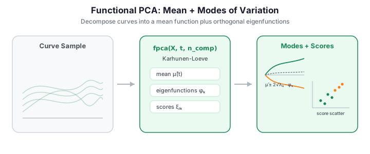
Functional Principal Component Analysis (FPCA) is the workhorse of functional data analysis. It extends classical PCA from vectors in \(\mathbb{R}^p\) to functions in \(L^2\), decomposing a sample of curves into a mean function plus a linear combination of orthogonal eigenfunctions and providing an optimal low-rank approximation of the covariance structure.
Why FPCA?
Functional data pose four difficulties that ordinary multivariate methods handle poorly:
- High dimensionality -- each curve is measured at many grid points, so a naive analysis lives in a very high-dimensional space.
- Infinite-dimensional nature -- the curves are really samples of functions, not fixed-length vectors.
- Correlation structure -- neighbouring grid points are strongly correlated, so treating them as independent variables wastes information.
- Noise -- observations carry measurement error that a good representation should suppress.
FPCA addresses all four at once by finding the principal modes of variation: a small set of orthogonal eigenfunctions that explain how the curves differ from their mean. A handful of scores then summarise each curve.
The Karhunen-Loeve decomposition
Every square-integrable random function \(X_i(t)\) with finite second moments admits the expansion
where
| Symbol | Meaning |
|---|---|
| \(\mu(t)\) | Population mean function |
| \(\phi_k(t)\) | \(k\)-th eigenfunction (functional principal component) |
| \(\xi_{ik}\) | \(k\)-th score for observation \(i\), with \(\mathrm{E}[\xi_{ik}]=0\), \(\mathrm{Var}(\xi_{ik})=\lambda_k\) |
| \(\lambda_1 \ge \lambda_2 \ge \cdots\) | Eigenvalues (variance explained by each component) |
The eigenfunctions and eigenvalues are exactly the eigenpairs of the covariance operator: with \(C(s,t) = \mathrm{Cov}\bigl(X(s), X(t)\bigr)\),
Three properties follow, and they are what make the decomposition useful:
- Orthonormality of the eigenfunctions, \(\displaystyle\int \phi_j(t)\,\phi_k(t)\,dt = \delta_{jk}\).
- Uncorrelated scores, \(\mathrm{Cov}(\xi_j, \xi_k) = \lambda_j\,\delta_{jk}\) -- each component captures a distinct, independent mode of variation.
- Optimality: truncating the sum at \(K\) terms gives the best rank-\(K\) approximation of the curves in \(L^2\), so no other \(K\)-dimensional linear representation reconstructs the sample with smaller integrated squared error.
The figure below decomposes a sample of curves: the mean function \(\hat\mu(t)\) plus the leading eigenfunctions \(\phi_k(t)\), each scaled by \(2\sqrt{\lambda_k}\) to show the mode of variation it captures.
import numpy as np
from docs_fig import fig, render
from fdars.simulation import simulate
from fdars.regression import fpca

t = np.linspace(0, 1, 150)
X = np.asarray(simulate(n=60, argvals=t, n_basis=5, efun_type="fourier", seed=7))
res = fpca(X, t, n_comp=3)
mean = np.asarray(res["mean"])
rot = np.asarray(res["rotation"])
sv = np.asarray(res["singular_values"])
ev = sv ** 2 / (X.shape[0] - 1)

f, (a0, a1) = fig(1, 2, figsize=(10, 3.8))
a0.plot(t, X.T, color="#3f51b5", lw=0.8, alpha=0.25)
a0.plot(t, mean, color="#dc3545", lw=2.4, label="mean $\\hat\\mu(t)$")
a0.set(title="60 curves and their mean", xlabel="t", ylabel="X(t)")
a0.legend()

for k in range(3):
    a1.plot(t, mean + 2 * np.sqrt(ev[k]) * rot[:, k], lw=1.8,
            label=f"$\\phi_{{{k+1}}}$ ({ev[k]/ev.sum()*100:.0f}%)")
a1.plot(t, mean, color="#6c757d", lw=1.2, ls="--", label="mean")
a1.set(title="Modes of variation $\\hat\\mu + 2\\sqrt{\\lambda_k}\\,\\phi_k$",
       xlabel="t", ylabel="X(t)")
a1.legend()
print(render(f))
The mean (red) traces the average sine-like shape; each mode curve departs from it by a smooth wiggle whose amplitude is set by \(\sqrt{\lambda_k}\). The first mode carries the largest share of the variance and departs most from the mean, while higher modes add progressively finer, lower-energy oscillations.
Quick start
FPCA lives in the regression module because principal component scores are the primary features for scalar-on-function regression.
The function signature is:
| Parameter | Type | Description |
|---|---|---|
data |
np.ndarray (n, m) |
Discretized curves -- \(n\) observations at \(m\) grid points |
argvals |
np.ndarray (m,) |
The common evaluation grid, e.g. np.linspace(0, 1, 100) |
n_comp |
int |
Number of principal components to retain (default 3) |
Returns a dict with keys:
| Key | Shape | Description |
|---|---|---|
scores |
(n, n_comp) | FPC scores \(\xi_{ik}\) |
rotation |
(m, n_comp) | Eigenfunctions \(\phi_k(t)\) evaluated on the grid |
singular_values |
(n_comp,) | Singular values from the SVD |
mean |
(m,) | Sample mean function \(\hat\mu(t)\) |
centered |
(n, m) | Mean-centered data |
weights |
(m,) | Quadrature weights used for the \(L^2\) inner product |
Worked example: the Berkeley growth curves
A classic use of FPCA is the Berkeley Growth Study: heights of 93 children (39 boys, 54 girls) measured at 31 ages from 1 to 18 years. Two natural sources of variation should emerge -- how tall a child is overall, and how early their growth spurt arrives. FPCA recovers exactly these as its first two components.
import numpy as np
from docs_fig import fig, render
from docs_data import load_growth
from fdars.regression import fpca

age, X, meta = load_growth()          # X: (93, 31) height curves
res = fpca(X, age, n_comp=4)
mean = np.asarray(res["mean"])
rot = np.asarray(res["rotation"])
sv = np.asarray(res["singular_values"])
ev = sv ** 2 / (X.shape[0] - 1)
pve = ev / ev.sum()

f, (a0, a1) = fig(1, 2, figsize=(11, 3.8))
a0.plot(age, X.T, color="#3f51b5", lw=0.7, alpha=0.35)
a0.plot(age, mean, color="#dc3545", lw=2.4, label="mean height")
a0.set(title="93 growth curves and their mean", xlabel="age (years)",
       ylabel="height (cm)")
a0.legend()

# Print the variance breakdown of the first four components.
report = "  ".join(f"PC{k+1}: {pve[k]*100:.1f}%" for k in range(4))
a1.bar(np.arange(1, 5), pve[:4] * 100, color="#3f51b5")
a1.set(title="Variance explained", xlabel="component",
       ylabel="% variance", xticks=[1, 2, 3, 4])
print(render(f))
The first component alone explains about 82 % of the variance and the first two about 96 %. Plotting each mode as \(\hat\mu(t) \pm 2\sqrt{\lambda_k}\,\phi_k(t)\) makes their meaning concrete:
import numpy as np
from docs_fig import fig, render
from docs_data import load_growth
from fdars.regression import fpca

age, X, meta = load_growth()
res = fpca(X, age, n_comp=3)
mean = np.asarray(res["mean"])
rot = np.asarray(res["rotation"])
ev = np.asarray(res["singular_values"]) ** 2 / (X.shape[0] - 1)
pve = ev / ev.sum()

f, axes = fig(1, 3, figsize=(13, 3.6), sharey=True)
for k, ax in enumerate(axes):
    c = 2 * np.sqrt(ev[k])
    ax.plot(age, mean, "k-", lw=1.6, label="mean")
    ax.plot(age, mean + c * rot[:, k], color="#3f51b5", lw=1.4, label="+2 SD")
    ax.plot(age, mean - c * rot[:, k], color="#e8710a", lw=1.4, label="-2 SD")
    ax.set(title=f"PC{k+1} ({pve[k]*100:.1f}%)", xlabel="age (years)")
    if k == 0:
        ax.set_ylabel("height (cm)")
        ax.legend(fontsize=8)
print(render(f))
PC1 shifts the whole curve up or down -- it is the overall height mode. PC2 raises the curve at young ages while lowering it later (or vice versa): the growth-timing mode, distinguishing early from late maturers. PC3 captures subtler shape variation around the pubertal spurt.
Score plot
FPC scores place each curve as a point in \(\mathbb{R}^K\). Because PC1 encodes overall height, colouring the score plot by sex confirms the interpretation: boys, who are taller on average by the end of the study, sit at higher PC1. In fact the cleanest separation here is vertical: PC2 (growth timing) splits the sexes almost completely -- girls sit above the axis and boys below it, a roughly 1.6 SD gap in mean PC2 score -- reflecting girls' earlier growth spurt, while the PC1 (height) distributions still overlap substantially at this age range.
import numpy as np
from docs_fig import fig, render
from docs_data import load_growth
from fdars.regression import fpca

age, X, meta = load_growth()
res = fpca(X, age, n_comp=4)
scores = np.asarray(res["scores"])
is_male = (meta["sex"] == "male").to_numpy()

f, ax = fig(figsize=(6.5, 5))
ax.scatter(scores[is_male, 0], scores[is_male, 1], s=28, color="#3f51b5",
           alpha=0.8, label="male")
ax.scatter(scores[~is_male, 0], scores[~is_male, 1], s=28, color="#e8710a",
           alpha=0.8, label="female")
ax.axhline(0, color="#6c757d", lw=0.6)
ax.axvline(0, color="#6c757d", lw=0.6)
ax.set(title="FPC score plot, coloured by sex",
       xlabel="PC1 score (overall height)",
       ylabel="PC2 score (growth timing)")
ax.legend()
print(render(f))
Boys and girls separate cleanly along PC2 rather than PC1: the vertical spread reflects growth timing, whereas the horizontal (overall-height) axis still overlaps at these ages. A curve high on PC2 belongs to an early maturer, and one low on PC2 to a late maturer.
Variance explained and scree plots
The singular values returned by fpca relate to the eigenvalues (variance per component) by
where \(s_k\) is the \(k\)-th singular value and \(n\) is the number of observations. The proportion of variance explained (PVE) by the first \(K\) components is
The scree plot and cumulative-PVE curve are the two most common tools for choosing \(K\): look for the elbow where eigenvalues stop dropping sharply, or read off where the cumulative curve crosses a target such as 95 %.
The eigenvalues drop steeply after the first one or two components and then flatten into a long low tail, so the scree plot's elbow sits at \(K=2\). The cumulative curve confirms this: it crosses the 95 % line within the first few components, meaning almost all sample variability is captured by a handful of modes.
Reconstruction and denoising
A truncated reconstruction
acts as a smoother: high-frequency noise lives in the discarded components. On the growth data, two components already reconstruct each child's curve almost perfectly, discarding the measurement jitter.
import numpy as np
from docs_fig import fig, render
from docs_data import load_growth
from fdars.regression import fpca

age, X, meta = load_growth()
res = fpca(X, age, n_comp=4)
mean = np.asarray(res["mean"])
rot = np.asarray(res["rotation"])
scores = np.asarray(res["scores"])

K = 2
recon = mean + scores[:, :K] @ rot[:, :K].T          # (93, 31)

f, ax = fig()
for idx in (0, 45, 80):
    ax.plot(age, X[idx], color="#6c757d", lw=0.9, alpha=0.6,
            marker="o", ms=3, label="observed" if idx == 0 else None)
    ax.plot(age, recon[idx], color="#3f51b5", lw=2,
            label=f"K={K} reconstruction" if idx == 0 else None)
ax.set(title="FPCA denoising: 2-component reconstruction",
       xlabel="age (years)", ylabel="height (cm)")
ax.legend()
print(render(f))
The two-component reconstructions (blue) pass smoothly through the observed points (grey) for all three children, tracking the overall level and the pubertal bend while ignoring the small measurement jitter between adjacent ages. This is FPCA acting as a denoiser: the noise lives in the discarded higher components.
Validation: orthonormality, PVE, and reconstruction
The three defining properties of the Karhunen-Loeve decomposition are checkable
numerically, so the block below asserts all three on the growth data rather than
trusting the plots. (1) The eigenfunctions are orthonormal under the weighted
\(L^2\) inner product returned in weights: the Gram matrix \(\Phi^\top W\,\Phi\) equals
the identity (\(\int\phi_j\phi_k\,dt = \delta_{jk}\)). (2) The proportions of variance
explained sum to 1 across the full set of components. (3) The integrated squared
reconstruction error is strictly decreasing in the number of retained components \(K\)
-- the optimality property. All checks pass to a \(10^{-9}\) tolerance.
import numpy as np
from docs_data import load_growth
from fdars.regression import fpca

age, X, meta = load_growth()          # X: (93, 31) height curves
n = X.shape[0]

# (1) Orthonormality of eigenfunctions in the weighted L2 inner product.
res = fpca(X, age, n_comp=6)
rot = np.asarray(res["rotation"])          # (m, n_comp) eigenfunctions
w = np.asarray(res["weights"])             # quadrature weights
gram = (rot * w[:, None]).T @ rot          # Phi^T W Phi
off = np.abs(gram - np.eye(gram.shape[0]))
assert off.max() < 1e-9, off.max()
print(f"eigenfunction Gram = I: max deviation {off.max():.2e}")

# (2) PVE over the full component set sums to 1.
full = fpca(X, age, n_comp=n - 1)          # all non-degenerate components
ev = np.asarray(full["singular_values"]) ** 2 / (n - 1)
pve = ev / ev.sum()
assert abs(pve.sum() - 1.0) < 1e-12, pve.sum()
print(f"PVE sums to {pve.sum():.12f};  PC1={pve[0]*100:.1f}%, "
      f"PC1+2={pve[:2].sum()*100:.1f}%")

# (3) Reconstruction error strictly decreases as K grows (optimality).
mean, scores = np.asarray(res["mean"]), np.asarray(res["scores"])
errs = [np.mean((X - (mean + scores[:, :K] @ rot[:, :K].T)) ** 2)
        for K in range(1, 6)]
assert all(errs[i] > errs[i + 1] for i in range(len(errs) - 1)), errs
print("reconstruction MSE by K:", [f"{e:.3f}" for e in errs])
eigenfunction Gram = I: max deviation 2.00e-15 PVE sums to 1.000000000000; PC1=81.0%, PC1+2=94.5% reconstruction MSE by K: ['8.572', '2.448', '1.269', '0.703', '0.416']
All three printouts confirm the theory numerically: the Gram matrix equals the identity to machine precision, the PVE vector sums to one, and the reconstruction MSE falls monotonically as components are added.
All three printouts confirm the theory numerically: the Gram matrix equals the identity to machine precision, the PVE vector sums to one, and the reconstruction MSE falls monotonically as components are added.
FPCA for dimension reduction
Storing the scores, eigenfunctions and mean instead of the full curves is a lossless-up-to-\(K\) compression. For the growth data, going from 93 curves at 31 points to 93 scores at \(K=4\) plus four eigenfunctions is a large saving:
import numpy as np
from docs_data import load_growth
from fdars.regression import fpca

age, X, meta = load_growth()
res = fpca(X, age, n_comp=4)

full = X.size                                           # 93 * 31 = 2883
compact = (res["scores"].size                           # 93 * 4
           + res["rotation"].size                       # 31 * 4
           + res["mean"].size)                          # 31
print(f"full curves:   {full} numbers")
print(f"FPCA (K=4):    {compact} numbers")
print(f"compression:   {100 * (1 - compact / full):.0f}%")
Score plots and clustering
Because the scores are a low-dimensional, decorrelated summary, ordinary multivariate tools apply directly. Clustering the growth curves in PC space, for instance, separates them into height/timing groups.
import numpy as np
from docs_fig import fig, render
from docs_data import load_growth
from fdars.regression import fpca
from fdars.clustering import kmeans_fd

age, X, meta = load_growth()
res = fpca(X, age, n_comp=4)
scores = np.asarray(res["scores"])

# Cluster the curves directly, then colour the score plot by cluster label.
km = kmeans_fd(X, age, k=3, seed=0)
cluster = np.asarray(km["cluster"])

palette = ["#3f51b5", "#e8710a", "#198754"]
f, ax = fig(figsize=(6.5, 5))
for c in range(3):
    m = cluster == c
    ax.scatter(scores[m, 0], scores[m, 1], s=30, color=palette[c],
               alpha=0.8, label=f"cluster {c + 1}")
ax.set(title="k-means clusters in FPC score space",
       xlabel="PC1 score", ylabel="PC2 score")
ax.legend()
print(render(f))
The three k-means clusters occupy distinct regions of the PC1-PC2 plane, confirming that the low-dimensional score summary preserves enough structure for ordinary multivariate clustering. The separation runs mainly along PC1 and PC2, i.e. the height and growth-timing modes are what distinguish the groups.
Depth-style outlier scoring in PC space
Distance from the origin in standardized score space is a cheap Mahalanobis-like outlyingness measure: dividing each score by \(\sqrt{\lambda_k}\) puts the components on a common scale, so
is large only for genuinely unusual curves. Curves in the periphery of the score cloud are exactly the ones drawn faintly at the edges of the raw-curve plot.
import numpy as np
from docs_fig import fig, render
from docs_data import load_growth
from fdars.regression import fpca

age, X, meta = load_growth()
res = fpca(X, age, n_comp=4)
scores = np.asarray(res["scores"])
ev = np.asarray(res["singular_values"]) ** 2 / (X.shape[0] - 1)

d = np.sqrt(((scores ** 2) / ev).sum(axis=1))       # standardized distance
order = np.argsort(d)
rng = np.ptp(d) + 1e-9

f, ax = fig()
for i in order:                                      # faint = central, bold = far
    ax.plot(age, X[i], color="#3f51b5", lw=1.0,
            alpha=0.15 + 0.8 * (d[i] - d.min()) / rng)
ax.plot(age, X[order[-1]], color="#dc3545", lw=2.4,
        label="largest PC distance")
ax.set(title="Growth curves shaded by distance from the PC centre",
       xlabel="age (years)", ylabel="height (cm)")
ax.legend()
print(render(f))
The most opaque curves -- those with the largest standardized PC distance, highlighted in red -- sit at the extremes of the height/timing envelope, while the faint central curves are the most typical. The Mahalanobis-style score thus flags exactly the peripheral growth trajectories as candidate outliers.
Using FPCA for feature extraction and regression
FPC scores are the standard features for scalar-on-function regression. fregre_lm runs the FPCA internally, or you can feed pre-computed scores into any estimator.
import numpy as np
from fdars.regression import fpca, fregre_lm

# A scalar response, here related to overall height and timing.
response = 0.5 * X[:, -1] + np.random.default_rng(0).normal(size=X.shape[0])

# Option A: let fregre_lm handle the FPCA internally.
model = fregre_lm(X, response, n_comp=4)

# Option B: use the scores as features in any downstream model.
scores = fpca(X, age, n_comp=4)["scores"]
from sklearn.linear_model import LinearRegression
r2 = LinearRegression().fit(scores, response).score(scores, response)
print("R^2 from PC scores:", r2)
Choosing the number of components
Three rules dominate in practice:
- Variance threshold -- retain enough components to reach, say, 95 % cumulative PVE.
- Scree-plot elbow -- stop where the eigenvalues flatten.
- Cross-validation -- when the goal is prediction, choose \(K\) by predictive error directly.
Model selection for regression
Use model_selection_ncomp from fdars.regression to choose \(K\) via GCV, AIC, or BIC when the goal is regression:
FPCA on smoothed data
Smoothing before FPCA often improves results, especially with noisy data. Use P-splines or basis smoothing first (see Basis Representation):
from fdars.basis import pspline_fit_gcv
from fdars.regression import fpca

# Smooth with GCV-selected P-splines, then run FPCA on the smoothed curves.
smooth = pspline_fit_gcv(X, age, n_basis=15)
result_smooth = fpca(np.asarray(smooth["fitted"]), age, n_comp=4)
FPCA vs classical PCA
On discretized curves FPCA is mathematically equivalent to classical PCA of the data matrix -- the difference is entirely in interpretation and in the option to regularize.
| Aspect | Classical PCA | Functional PCA |
|---|---|---|
| Input | Vectors in \(\mathbb{R}^p\) | Functions in \(L^2\) |
| Output | Loading vectors | Eigenfunction curves \(\phi_k(t)\) |
| Interpretation | Variable weights | Modes of variation |
| Reconstruction | Linear combination | Functional approximation |
| Smoothness | Not enforced | Can be regularized (smooth before/after) |
| Inner product | Euclidean | \(L^2\) with quadrature weights |
FPCA in the alignment module
For data with significant phase variation (horizontal shifts), consider elastic FPCA via vert_fpca, horiz_fpca, or joint_fpca from fdars.alignment. These separate amplitude and phase variation before extracting components. See Elastic FPCA.
API summary
| Function | Module | Purpose |
|---|---|---|
fpca(data, argvals, n_comp) |
fdars.regression |
Standard FPCA |
model_selection_ncomp(data, response, ...) |
fdars.regression |
Cross-validated component selection |
fregre_lm(data, response, n_comp) |
fdars.regression |
Principal-component regression |
vert_fpca(data, argvals, n_comp, ...) |
fdars.alignment |
Amplitude FPCA (elastic) |
horiz_fpca(data, argvals, n_comp, ...) |
fdars.alignment |
Phase FPCA (elastic) |
joint_fpca(data, argvals, n_comp, ...) |
fdars.alignment |
Joint amplitude-phase FPCA |
References
- Ramsay, J.O. and Silverman, B.W. (2005). Functional Data Analysis, 2nd ed. Springer.
- Ramsay, J.O. and Silverman, B.W. (2002). Applied Functional Data Analysis. Springer.
- Yao, F., Müller, H.G., and Wang, J.L. (2005). Functional Data Analysis for Sparse Longitudinal Data. JASA 100(470), 577-590.