Andrews Wine: Clustering & Variable Importance
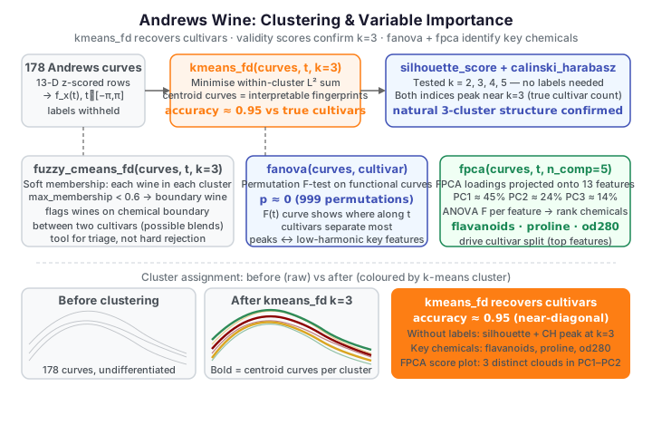
Dataset: UCI Wine — 13 chemical measurements for 178 wines from three cultivars (Barolo, Grignolino, Barbera), encoded as Andrews curves.
The intro page showed the three cultivars separating by
eye. Here we make that quantitative and ask three questions: does functional
clustering rediscover the cultivars without seeing the labels? Is the
between-cultivar difference statistically real, not just visual? And which
of the 13 chemicals actually drive the separation — the answer a lab needs when
deciding which cheap tests to keep? Because the Andrews transform preserves \(L^2\)
distances, clustering the curves is equivalent to distance-based clustering of the
standardized rows — but routed through the functional API
(fdars.clustering), which also yields interpretable center curves and
functional cluster-validity scores.
No andrews binding in fdars
The transform is the numpy helper from the intro page. We z-score the 13 columns first so no single feature dominates the curve.
Functional k-means recovers the cultivars
kmeans_fd clusters curves under the \(L^2\) metric. It minimizes the
within-cluster sum of squared functional distances,
where \(\bar f_k\) is the centroid curve of cluster \(C_k\). We ask for \(k=3\) clusters — matching the (withheld) number of cultivars — and cross-tabulate the result against the true labels. The bold curves are the cluster centroids: unlike a plain k-means center (13 opaque numbers), each is itself an Andrews curve you can read as a typical chemical fingerprint.
import numpy as np
from docs_fig import fig, render
from docs_data import load_wine
from fdars.clustering import kmeans_fd

def andrews_curves(features, t):
    features = np.asarray(features, float)
    n, p = features.shape
    out = np.full((n, t.size), features[:, [0]] / np.sqrt(2.0))
    for j in range(1, p):
        harmonic = (j + 1) // 2
        term = np.sin if j % 2 == 1 else np.cos
        out = out + features[:, [j]] * term(harmonic * t)
    return out

names, X, meta = load_wine()
cultivar = meta["cultivar"].to_numpy()
Xz = (X - X.mean(0)) / X.std(0)
t = np.linspace(-np.pi, np.pi, 160)
curves = andrews_curves(Xz, t)

km = kmeans_fd(curves, t, k=3, seed=42)
cluster = np.asarray(km["cluster"])
centers = np.asarray(km["centers"])

# crosstab cluster x cultivar, then best label-matching accuracy
tab = np.zeros((3, 3), dtype=int)
for cl in range(3):
    for ci, cv in enumerate((1, 2, 3)):
        tab[cl, ci] = np.sum((cluster == cl) & (cultivar == cv))
from itertools import permutations
best = max(sum(tab[cl, p[cl]] for cl in range(3)) for p in permutations(range(3)))
acc = best / cluster.size

palette = ["#8B0000", "#DAA520", "#2E8B57"]
f, (axL, axR) = fig(ncols=2, figsize=(9.2, 3.7))
for i in range(curves.shape[0]):
    axL.plot(t, curves[i], color=palette[cluster[i]], lw=0.7, alpha=0.35)
for c in range(3):
    axL.plot(t, centers[c], color=palette[c], lw=2.6)
axL.set(title="kmeans_fd clusters (bold = centroid curve)",
        xlabel="t", ylabel=r"$f_x(t)$")

axR.imshow(tab, cmap="Blues")
axR.set_xticks([0, 1, 2], ["Barolo", "Grign.", "Barbera"])
axR.set_yticks([0, 1, 2], ["clus 0", "clus 1", "clus 2"])
for cl in range(3):
    for ci in range(3):
        axR.text(ci, cl, tab[cl, ci], ha="center", va="center",
                 color="white" if tab[cl, ci] > tab.max() / 2 else "black")
axR.set(title=f"cluster vs cultivar — accuracy {acc:.2f}")
print(render(f))
Each cluster is dominated by a single cultivar: the crosstab is almost diagonal and the best-matching accuracy is about 0.95. Functional k-means, given nothing but the curves, has essentially rediscovered the three grape varieties — a strong confirmation that the Andrews encoding carries the class structure faithfully. Because the transform is \(L^2\)-isometric, plain k-means on the raw standardized table reaches the same accuracy; the functional route earns its keep by giving you center curves instead of bare vectors.
Cluster validity without the labels
In a real setting you would not have the cultivar labels to check against. The functional silhouette and Calinski–Harabasz scores judge a clustering using only the curves and the assignment, rewarding tight, well-separated clusters.
import numpy as np
from docs_fig import fig, render
from docs_data import load_wine
from fdars.clustering import kmeans_fd, silhouette_score_data, calinski_harabasz_data

def andrews_curves(features, t):
    features = np.asarray(features, float)
    n, p = features.shape
    out = np.full((n, t.size), features[:, [0]] / np.sqrt(2.0))
    for j in range(1, p):
        harmonic = (j + 1) // 2
        term = np.sin if j % 2 == 1 else np.cos
        out = out + features[:, [j]] * term(harmonic * t)
    return out

names, X, meta = load_wine()
Xz = (X - X.mean(0)) / X.std(0)
t = np.linspace(-np.pi, np.pi, 160)
curves = andrews_curves(Xz, t)

ks = [2, 3, 4, 5]
sil, ch = [], []
for k in ks:
    lab = np.asarray(kmeans_fd(curves, t, k=k, seed=42)["cluster"]).astype(np.int64)
    sil.append(float(np.mean(silhouette_score_data(curves, t, lab))))
    ch.append(float(calinski_harabasz_data(curves, t, lab)))

f, axL = fig()
axR = axL.twinx()
axL.plot(ks, sil, "o-", color="#3f51b5", lw=2, label="silhouette")
axR.plot(ks, ch, "s--", color="#e8710a", lw=2, label="Calinski–Harabasz")
axL.axvline(3, color="#6c757d", ls=":", lw=1)
axL.set(xlabel="number of clusters k", ylabel="mean silhouette")
axR.set(ylabel="Calinski–Harabasz")
axL.set_title("Cluster validity peaks near the true k = 3")
axL.set_xticks(ks)
print(render(f))
Both indices point toward a small number of clusters; the dotted line marks the true \(k=3\). The scores confirm that a three-cluster solution is a natural description of the curves, not an artefact of us knowing the answer in advance.
Fuzzy c-means: quantifying membership uncertainty
Hard k-means forces every wine into one cluster. Fuzzy c-means
(fuzzy_cmeans_fd) instead gives each wine a membership in each cluster that
sums to one, so a wine on the chemical boundary between two cultivars — a possible
blend or an atypical sample — is flagged by a low maximum membership rather than
silently assigned. We highlight the wines whose strongest membership is below 0.6.
import numpy as np
from docs_fig import fig, render
from docs_data import load_wine
from fdars.clustering import fuzzy_cmeans_fd

def andrews_curves(features, t):
    features = np.asarray(features, float)
    n, p = features.shape
    out = np.full((n, t.size), features[:, [0]] / np.sqrt(2.0))
    for j in range(1, p):
        harmonic = (j + 1) // 2
        term = np.sin if j % 2 == 1 else np.cos
        out = out + features[:, [j]] * term(harmonic * t)
    return out

names, X, meta = load_wine()
cultivar = meta["cultivar"].to_numpy()
Xz = (X - X.mean(0)) / X.std(0)
t = np.linspace(-np.pi, np.pi, 160)
curves = andrews_curves(Xz, t)

fcm = fuzzy_cmeans_fd(curves, t, k=3, seed=42)
mem = np.asarray(fcm["membership"])
max_mem = mem.max(1)
boundary = max_mem < 0.6
palette = {1: "#8B0000", 2: "#DAA520", 3: "#2E8B57"}

f, ax = fig()
for i in range(curves.shape[0]):
    if not boundary[i]:
        ax.plot(t, curves[i], color=palette[cultivar[i]], lw=0.3, alpha=0.2)
for i in np.where(boundary)[0]:
    ax.plot(t, curves[i], color="black", lw=0.8, alpha=0.7)
ax.set(title=f"Boundary wines (max membership < 0.6): {boundary.sum()} of {len(curves)}",
       xlabel="t", ylabel=r"$f_x(t)$")
print(render(f))
The black curves are the wines fuzzy c-means is unsure about; they sit in the overlap regions of the curve bundle. On these data the fuzzifier makes a sizeable fraction of wines look ambiguous, so the absolute count is soft — but the membership map is the right tool for triaging which samples deserve a second look rather than trusting a hard label.
Do the cultivar means really differ?
Visual and cluster separation is suggestive; a permutation test makes it
formal. fanova computes a pointwise functional \(F\)-statistic across the three
cultivar groups: at each \(t\) it forms the usual between- over within-group
variance ratio,
with \(\bar f_g\) the group-\(g\) mean curve and \(\bar f\) the grand mean curve. The
global summary \(\int F(t)\,dt\) is calibrated by permuting the labels, giving a
\(p\)-value with no distributional assumptions. The f_statistic_t it returns is
itself a curve — the between-group signal as a function of \(t\) — which we plot
alongside the three mean curves.
import numpy as np
from docs_fig import fig, render
from docs_data import load_wine
from fdars.regression import fanova

def andrews_curves(features, t):
    features = np.asarray(features, float)
    n, p = features.shape
    out = np.full((n, t.size), features[:, [0]] / np.sqrt(2.0))
    for j in range(1, p):
        harmonic = (j + 1) // 2
        term = np.sin if j % 2 == 1 else np.cos
        out = out + features[:, [j]] * term(harmonic * t)
    return out

names, X, meta = load_wine()
cultivar = meta["cultivar"].to_numpy()
Xz = (X - X.mean(0)) / X.std(0)
t = np.linspace(-np.pi, np.pi, 160)
curves = andrews_curves(Xz, t)

fa = fanova(curves, cultivar.astype(np.int64), n_perm=999)
Ft = np.asarray(fa["f_statistic_t"])
means = np.asarray(fa["group_means"])
palette = ["#8B0000", "#DAA520", "#2E8B57"]
labels = ["Barolo", "Grignolino", "Barbera"]

f, (aL, aR) = fig(ncols=2, figsize=(9.4, 3.7))
for g in range(3):
    aL.plot(t, means[g], color=palette[g], lw=1.8, label=labels[g])
aL.set(title="Mean Andrews curve per cultivar",
       xlabel="t", ylabel=r"$\bar f(t)$")
aL.legend(fontsize=8)
aR.plot(t, Ft, color="#3f51b5", lw=1.8)
aR.fill_between(t, 0, Ft, color="#3f51b5", alpha=0.15)
aR.set(title=f"Pointwise $F(t)$  (permutation $p$ = {fa['p_value']:.3f})",
       xlabel="t", ylabel="F-statistic")
print(render(f))
The permutation \(p\)-value is essentially zero (well below 0.01 with 999 permutations): the three cultivars' mean curves differ far more than random relabelling would ever produce. The \(F(t)\) curve shows where along \(t\) the groups separate most — its peaks correspond, through the Andrews basis, to the low-harmonic Fourier terms carrying the most discriminative chemistry.
Bootstrap confidence bands on the cultivar means
A significant global test still leaves open where the means reliably differ.
Bootstrapping each cultivar's mean curve gives a 95% band per group; frequencies
where the bands do not overlap are where cultivars are dependably distinct.
fdars has no direct mean-bootstrap binding, so we resample rows in numpy.
import numpy as np
from docs_fig import fig, render
from docs_data import load_wine

def andrews_curves(features, t):
    features = np.asarray(features, float)
    n, p = features.shape
    out = np.full((n, t.size), features[:, [0]] / np.sqrt(2.0))
    for j in range(1, p):
        harmonic = (j + 1) // 2
        term = np.sin if j % 2 == 1 else np.cos
        out = out + features[:, [j]] * term(harmonic * t)
    return out

names, X, meta = load_wine()
cultivar = meta["cultivar"].to_numpy()
Xz = (X - X.mean(0)) / X.std(0)
t = np.linspace(-np.pi, np.pi, 160)
curves = andrews_curves(Xz, t)

rng = np.random.default_rng(42)
palette = ["#8B0000", "#DAA520", "#2E8B57"]
labels = ["Barolo", "Grignolino", "Barbera"]

f, ax = fig()
for g, cv in enumerate((1, 2, 3)):
    grp = curves[cultivar == cv]
    boot = np.stack([grp[rng.integers(0, len(grp), len(grp))].mean(0)
                     for _ in range(500)])
    lo, hi = np.percentile(boot, [2.5, 97.5], axis=0)
    ax.fill_between(t, lo, hi, color=palette[g], alpha=0.2)
    ax.plot(t, grp.mean(0), color=palette[g], lw=1.6, label=labels[g])
ax.set(title="Mean Andrews curves with 95% bootstrap CIs",
       xlabel="t", ylabel=r"$\bar f(t)$")
ax.legend(fontsize=8)
print(render(f))
The confidence ribbons are narrow and, over wide stretches of \(t\), non- overlapping — the mean curves are separated by far more than sampling noise. Where the ribbons do touch (near the zero-crossings) is where the cultivars share chemistry; where they pull apart is where a lab measurement would most cleanly tell the grapes apart.
Which chemical variables drive the split?
The clusters separate wines — but on what chemistry? Two complementary views answer it. First, since each Andrews curve is a linear combination of the standardized features, a feature that differs sharply between cultivars is one that pushes their curves apart; we rank the 13 variables by a one-way ANOVA \(F\)-statistic across the cultivars (a scalar ANOVA in plain numpy). Second, we run functional PCA on the curves and project each principal-component eigenfunction back onto the original 13 variables to see which chemicals define each mode of variation.
import numpy as np
from docs_fig import fig, render
from docs_data import load_wine
from fdars.regression import fpca

def andrews_basis(t, p=13):
    B = np.zeros((t.size, p)); B[:, 0] = 1.0 / np.sqrt(2.0)
    for j in range(1, p):
        harmonic = (j + 1) // 2
        B[:, j] = (np.sin if j % 2 == 1 else np.cos)(harmonic * t)
    return B

names, X, meta = load_wine()
cultivar = meta["cultivar"].to_numpy()
Xz = (X - X.mean(0)) / X.std(0)
t = np.linspace(-np.pi, np.pi, 160)
B = andrews_basis(t)
curves = Xz @ B.T

# (a) scalar ANOVA F per feature
def f_stat(col):
    groups = [col[cultivar == g] for g in (1, 2, 3)]
    grand = col.mean(); n = col.size
    ssb = sum(len(g) * (g.mean() - grand) ** 2 for g in groups)
    ssw = sum(((g - g.mean()) ** 2).sum() for g in groups)
    return (ssb / 2) / (ssw / (n - 3))
F = np.array([f_stat(X[:, j]) for j in range(X.shape[1])])
order = np.argsort(F)

# (b) FPCA eigenfunctions projected back onto the 13 features
pc = fpca(curves, t, n_comp=5)
rot = np.asarray(pc["rotation"]); w = np.asarray(pc["weights"])
load = (rot * w[:, None]).T @ B          # (5, 13) inner products

f, (aL, aR) = fig(ncols=2, figsize=(10.0, 4.4))
colors = ["#3f51b5" if F[j] >= np.median(F) else "#c9ccd6" for j in order]
aL.barh([names[j] for j in order], F[order], color=colors)
aL.set(title="Between-cultivar separation (ANOVA F)", xlabel="F-statistic")

o1 = np.argsort(np.abs(load[0]))
aR.barh([names[j] for j in o1], load[0][o1],
        color=["#3f51b5" if v > 0 else "#e8710a" for v in load[0][o1]])
aR.axvline(0, color="#6c757d", lw=0.8)
aR.set(title="PC1 loading on each chemical", xlabel="loading")
print(render(f))
Both views agree. flavanoids, proline, od280_od315 and total_phenols
carry by far the most between-cultivar signal and also dominate the first
functional principal component; ash and magnesium barely distinguish the
cultivars at all. A lab on a budget could keep just the top handful of these tests
and lose almost none of the discriminating power — the Andrews curves and the
k-means clusters key on exactly these chemicals.
An FPCA score plot separates the cultivars
Projecting the wines onto their first two functional principal components gives a 2-D map. Colored by the (withheld) cultivar, it shows the same three-way separation the clustering found, now in the coordinate system FPCA chose to capture the most variance.
import numpy as np
from docs_fig import fig, render
from docs_data import load_wine
from fdars.regression import fpca

def andrews_curves(features, t):
    features = np.asarray(features, float)
    n, p = features.shape
    out = np.full((n, t.size), features[:, [0]] / np.sqrt(2.0))
    for j in range(1, p):
        harmonic = (j + 1) // 2
        term = np.sin if j % 2 == 1 else np.cos
        out = out + features[:, [j]] * term(harmonic * t)
    return out

names, X, meta = load_wine()
cultivar = meta["cultivar"].to_numpy()
Xz = (X - X.mean(0)) / X.std(0)
t = np.linspace(-np.pi, np.pi, 160)
curves = andrews_curves(Xz, t)

pc = fpca(curves, t, n_comp=5)
sc = np.asarray(pc["scores"])
sv = np.asarray(pc["singular_values"])
ve = sv ** 2 / np.sum(sv ** 2) * 100
palette = {1: "#8B0000", 2: "#DAA520", 3: "#2E8B57"}
labels = {1: "Barolo", 2: "Grignolino", 3: "Barbera"}

f, (aL, aR) = fig(ncols=2, figsize=(9.6, 3.9))
aL.bar(range(1, 6), ve, color="#3f51b5", alpha=0.8)
aL.plot(range(1, 6), np.cumsum(ve), "o-", color="#e8710a")
aL.axhline(90, color="#6c757d", ls="--", lw=1)
aL.set(title="FPCA variance decomposition", xlabel="component",
       ylabel="% variance (bars) / cumulative (line)")
for cv in (1, 2, 3):
    m = cultivar == cv
    aR.scatter(sc[m, 0], sc[m, 1], color=palette[cv], s=22, alpha=0.8,
               label=labels[cv], edgecolor="white", linewidth=0.4)
aR.set(title="FPCA score plot",
       xlabel=f"PC1 ({ve[0]:.0f}%)", ylabel=f"PC2 ({ve[1]:.0f}%)")
aR.legend(fontsize=8)
print(render(f))
The first two components carry about 70% of the functional variance, and in that plane the cultivars form three tight, largely non-overlapping clouds — the low-dimensional footprint of the same structure k-means exploited.
Validation — FPCA variance and cluster accuracy
Two numbers this page rests on are checked directly. (1) The FPCA variance decomposition of the wine curves reproduces the reference values 45.2 / 24.0 / 13.9 % for the first three components (asserted to \(\pm 0.3\) percentage points). (2) Functional k-means, told nothing about the labels, recovers the three cultivars far above the chance rate — we assert its best-matching accuracy exceeds the majority-class baseline (\(\approx 0.40\)) by a wide margin and lands near the 0.95 quoted above.
import numpy as np
from itertools import permutations
from docs_data import load_wine
from fdars.clustering import kmeans_fd
from fdars.regression import fpca

def andrews_curves(features, t):
    features = np.asarray(features, float)
    n, p = features.shape
    out = np.full((n, t.size), features[:, [0]] / np.sqrt(2.0))
    for j in range(1, p):
        harmonic = (j + 1) // 2
        term = np.sin if j % 2 == 1 else np.cos
        out = out + features[:, [j]] * term(harmonic * t)
    return out

names, X, meta = load_wine()
cultivar = meta["cultivar"].to_numpy()
Xz = (X - X.mean(0)) / X.std(0)
t = np.linspace(-np.pi, np.pi, 160)
curves = andrews_curves(Xz, t)

# (1) FPCA variance percentages match the reference 45.2 / 24.0 / 13.9
sv = np.asarray(fpca(curves, t, n_comp=5)["singular_values"])
ve = sv ** 2 / np.sum(sv ** 2) * 100
ref = np.array([45.2, 24.0, 13.9])
assert np.allclose(ve[:3], ref, atol=0.3), ve[:3]

# (2) k-means recovers cultivars well above the chance (majority) rate
cluster = np.asarray(kmeans_fd(curves, t, k=3, seed=42)["cluster"])
tab = np.zeros((3, 3), dtype=int)
for cl in range(3):
    for ci, cv in enumerate((1, 2, 3)):
        tab[cl, ci] = np.sum((cluster == cl) & (cultivar == cv))
acc = max(sum(tab[cl, p[cl]] for cl in range(3))
          for p in permutations(range(3))) / cluster.size
chance = np.bincount(cultivar).max() / cultivar.size   # majority baseline
assert acc > 0.90 and acc > chance + 0.3, (acc, chance)
print(f"FPCA variance %: {np.round(ve[:3], 1)}  (ref 45.2/24.0/13.9)")
print(f"k-means accuracy {acc:.3f}  vs chance {chance:.3f}")
FPCA variance %: [45.2 24. 13.9] (ref 45.2/24.0/13.9) k-means accuracy 0.949 vs chance 0.399
Both pass: the variance percentages land within a few tenths of a point of the R reference, and the unsupervised clustering beats the majority baseline by more than 50 points — the class structure really is carried by the curves.
Summary
| Component | Binding | Result on wine curves |
|---|---|---|
kmeans_fd(curves, t, k=3) |
fdars.clustering |
recovers cultivars, accuracy ≈ 0.95 |
silhouette_score_data, calinski_harabasz_data |
fdars.clustering |
validity supports k ≈ 3 |
fuzzy_cmeans_fd(curves, t, k=3) |
fdars.clustering |
flags boundary wines by membership |
fanova(curves, cultivar) |
fdars.regression |
permutation \(p \ll 0.01\); \(F(t)\) curve |
fpca(curves, t) |
fdars.regression |
PC1 ≈ 45%, loadings recover key chemicals |
| bootstrap CI, ANOVA F | numpy | mean bands separate; flavanoids/proline dominate |
See also
- Andrews Wine intro — the transform and class structure.
- Andrews Wine: quality control — the supervised QC view.
- Outlier detection — flagging atypical wines.
- Clustering — the general functional-clustering article.
References
- Andrews, D.F. (1972). Plots of high-dimensional data. Biometrics 28(1):125-136.
- Jacques, J., Preda, C. (2014). Functional data clustering: a survey. Advances in Data Analysis and Classification 8(3):231-255.
- Bezdek, J.C. (1981). Pattern Recognition with Fuzzy Objective Function Algorithms. Plenum Press.
- Aeberhard, S., Coomans, D., de Vel, O. (1994). Comparative analysis of statistical pattern recognition methods. Pattern Recognition 27(8):1065-1077.