Advanced Statistical Process Monitoring
The basic control chart flags an observation whenever its \(T^2\) statistic
crosses a limit. Real monitoring problems ask more: How long until a small drift is
detected? Which principal component is responsible for a fault? Is a run of borderline
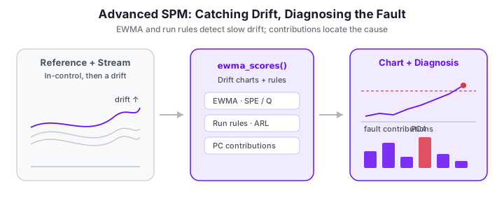
points a genuine trend or just noise? This page covers the tools fdars.spm provides
for these questions — the SPE / Q statistic, EWMA charts for slow drifts,
run rules (Nelson, Western Electric), average run length (ARL) analysis, and
per-PC contribution diagnosis for locating faults.
All of the examples below build on a single Phase I model. The setup — 120 in-control Phase I curves, then a Phase II stream of 30 in-control curves followed by a slow upward drift — is reused throughout; each figure block below re-creates it for reproducibility.
import numpy as np
from docs_fig import fig, render
from fdars.simulation import simulate
from fdars.spm import spm_phase1, spm_monitor, ewma_scores, hotelling_t2

argvals = np.linspace(0, 1, 80)

# Phase I: 120 in-control curves
ic = np.asarray(simulate(120, argvals, n_basis=6, seed=7))
p1 = spm_phase1(ic, argvals, ncomp=4, alpha=0.01)

# Phase II: 30 in-control curves followed by a slow upward drift
ok = np.asarray(simulate(30, argvals, n_basis=6, seed=21))
drift = np.asarray(simulate(20, argvals, n_basis=6, seed=33))
drift = drift + np.linspace(0, 5.0, 20)[:, None]          # ramp: 0 -> 5
new = np.vstack([ok, drift])

f, ax = fig()
ax.plot(argvals, ic.T, color="#6c757d", lw=0.5, alpha=0.30)
ax.plot(argvals, ok.T, color="#3f51b5", lw=0.7, alpha=0.5)
ax.plot(argvals, drift.T, color="#e8710a", lw=0.9, alpha=0.7)
ax.set(title="Phase I baseline (grey), in-control Phase II (indigo), drifting stream (orange)",
       xlabel="t", ylabel="x(t)")
print(render(f))
The in-control Phase II curves (indigo) are indistinguishable from the baseline cloud, while the drifting stream (orange) fans upward as the ramp accumulates. Crucially the early drift curves still sit inside the baseline envelope -- the shift only becomes obvious late -- which is exactly the situation where a memoryless chart lags and the EWMA and run-rule tools below earn their keep.
Concepts
Two statistics, two failure modes
FPCA splits every centered curve \(\tilde x_i(t) = x_i(t) - \hat\mu(t)\) into a part that lives in the retained subspace and a residual orthogonal to it:
The Hotelling \(T^2\) statistic watches the modelled part; the SPE (squared prediction error, also called the Q statistic) watches the residual:
A shift inside the subspace (an amplitude change, a mean shift along a dominant mode) inflates \(T^2\). A departure the model cannot represent (new high-frequency structure) inflates SPE. Monitoring both is standard practice.
Control limits
Under the in-control model, \(T^2 \sim \chi^2_K\), so
t2_control_limit(ncomp, alpha) returns the \(1-\alpha\) chi-squared quantile. The SPE
distribution is heavier-tailed; spe_control_limit fits a moment-matched
\(g\,\chi^2_h\) approximation to the Phase I SPE values.
import numpy as np
from fdars.simulation import simulate
from fdars.spm import spm_phase1, t2_control_limit, spe_control_limit

argvals = np.linspace(0, 1, 80)
p1 = spm_phase1(np.asarray(simulate(120, argvals, n_basis=6, seed=7)),
                argvals, ncomp=4, alpha=0.01)

t2_ucl = t2_control_limit(ncomp=4, alpha=0.01)
spe_ucl = spe_control_limit(np.asarray(p1["spe"]), alpha=0.01)
print("t2 :", t2_ucl)
print("spe:", spe_ucl)
Both return a dict with ucl, alpha, and a description string. In practice
spm_phase1 has already stored t2_limit / spe_limit; these helpers are useful when
you want a limit for a different \(\alpha\) or for a chart you are building by hand.
Average run length (ARL)
The ARL is the expected number of observations until an alarm. In-control you want
it large (\(\mathrm{ARL}_0\) = mean time between false alarms); out-of-control you want
it small (\(\mathrm{ARL}_1\) = detection delay). fdars.spm estimates both by Monte
Carlo simulation from the eigenvalues.
| Function | Purpose |
|---|---|
arl0_t2(eigenvalues, ucl, ...) |
In-control ARL of the \(T^2\) chart |
arl1_t2(eigenvalues, ucl, shift, ...) |
Detection delay for a given shift vector |
arl0_ewma_t2(eigenvalues, ucl, lambda_, ...) |
In-control ARL of the EWMA-\(T^2\) chart |
arl0_spe(spe_df, spe_scale, ucl, ...) |
In-control ARL of the SPE chart |
Each returns {arl, std_dev, median_rl}.
import numpy as np
from fdars.simulation import simulate
from fdars.spm import spm_phase1, arl0_t2, arl1_t2

argvals = np.linspace(0, 1, 80)
p1 = spm_phase1(np.asarray(simulate(120, argvals, n_basis=6, seed=7)),
                argvals, ncomp=4, alpha=0.01)
ev = np.asarray(p1["eigenvalues"])
ucl = p1["t2_limit"]

a0 = arl0_t2(ev, ucl, n_simulations=3000, seed=1)
a1 = arl1_t2(ev, ucl, shift=np.array([2.0, 0.0, 0.0, 0.0]),
             n_simulations=3000, seed=1)
print(f"ARL0 (mean run to a false alarm): {a0['arl']:.1f}")
print(f"ARL1 (delay for a 2-sigma shift on PC1): {a1['arl']:.1f}")
The gap between the two numbers is the whole point: the chart runs for on the order of a hundred observations between false alarms, yet catches a two-sigma shift on the leading component within a handful. That ratio -- large ARL\(_0\), small ARL\(_1\) -- is the quantitative definition of a well-tuned chart.
Sweeping the shift magnitude traces the chart's operating characteristic -- ARL\(_1\) as a function of fault size -- which is the single most useful summary of a chart's sensitivity:
import numpy as np
from docs_fig import fig, render
from fdars.simulation import simulate
from fdars.spm import spm_phase1, arl0_t2, arl1_t2

argvals = np.linspace(0, 1, 80)
p1 = spm_phase1(np.asarray(simulate(120, argvals, n_basis=6, seed=7)),
                argvals, ncomp=4, alpha=0.01)
ev, ucl = np.asarray(p1["eigenvalues"]), float(p1["t2_limit"])

a0 = arl0_t2(ev, ucl, n_simulations=3000, seed=1)["arl"]
deltas = np.linspace(0.0, 3.0, 9)
arls = [arl1_t2(ev, ucl, np.array([d * np.sqrt(ev[0]), 0.0, 0.0, 0.0]),
                n_simulations=3000, seed=1)["arl"] for d in deltas]

f, ax = fig()
ax.plot(deltas, arls, "o-", color="#3f51b5", label="ARL$_1$ (shift on PC1)")
ax.axhline(a0, color="#dc3545", ls="--", lw=1, label=f"in-control ARL$_0 \\approx$ {a0:.0f}")
ax.set(xlabel="mean shift along PC1 (× standard deviation)", ylabel="average run length",
       yscale="log", title="Operating characteristic of the $T^2$ chart")
ax.legend()
print(render(f))
At zero shift the simulated ARL lands near \(1/\alpha = 100\), confirming the limit hits its design false-alarm rate; beyond about a one-sigma shift the detection delay collapses toward a single observation. The flat, slow-detection shoulder at small shifts is the region the EWMA and run-rule charts below are built to shrink.
Interpreting the pair
A useful design targets a fixed \(\mathrm{ARL}_0\) (say 200) by tuning alpha, then
compares \(\mathrm{ARL}_1\) across chart types. The chart with the smaller
\(\mathrm{ARL}_1\) at the same \(\mathrm{ARL}_0\) detects the shift faster.
EWMA charts for slow drifts
A Shewhart \(T^2\) chart looks at each observation in isolation, so a shift much smaller than the control limit can persist for a long time undetected. An EWMA (exponentially weighted moving average) smooths the score vector,
so that a sustained small drift accumulates. spm_ewma(train, seq, argvals, ncomp, lam)
fits a Phase I FPCA chart on the in-control training curves and then runs the EWMA monitor
over the stream in one call, returning the smoothed-score \(T^2\), its control limit, and the
per-observation alarm flags.
import numpy as np
from docs_fig import fig, render
from fdars.simulation import simulate
from fdars.spm import spm_phase1, spm_ewma, hotelling_t2

argvals = np.linspace(0, 1, 80)
ic = np.asarray(simulate(120, argvals, n_basis=6, seed=7))
ok = np.asarray(simulate(30, argvals, n_basis=6, seed=21))
drift = np.asarray(simulate(20, argvals, n_basis=6, seed=33))
drift = drift + np.linspace(0, 5.0, 20)[:, None]          # ramp: 0 -> 5
new = np.vstack([ok, drift])

lam = 0.2
ew = spm_ewma(ic, new, argvals, ncomp=4, alpha=0.01, lam=lam)
t2_ewma = np.asarray(ew["t2"])            # EWMA-smoothed T2
ewma_ucl = ew["t2_limit"]

# a plain Shewhart T2 on the same stream, for contrast
p1 = spm_phase1(ic, argvals, ncomp=4, alpha=0.01)
scores = ((new - np.asarray(p1["mean"])) * np.asarray(p1["weights"])) @ np.asarray(p1["loadings"])
t2_raw = np.asarray(hotelling_t2(scores, np.asarray(p1["eigenvalues"])))
obs = np.arange(1, len(new) + 1)

f, ax = fig()
ax.plot(obs, t2_raw, "o-", ms=3, lw=0.8, color="#c7cbe0", label="Shewhart $T^2$")
ax.plot(obs, t2_ewma, "o-", ms=4, lw=1.4, color="#3f51b5", label=f"EWMA $T^2$ ($\\lambda={lam}$)")
ax.axhline(ewma_ucl, color="#e8710a", ls="--", lw=1.3, label="EWMA control limit")
ax.axvline(30.5, color="#6c757d", ls=":", lw=1, label="drift starts")
ax.set(title="EWMA smooths a slow drift into a clear, sustained signal",
       xlabel="observation index", ylabel="$T^2$")
ax.legend(loc="upper left", fontsize=8)
print(render(f))
The Shewhart trace (grey) wanders around the drift without a decisive crossing; the EWMA trace (indigo) ramps up smoothly once the drift begins and, once it clears the limit (around observation 38), stays above it for the rest of the run.
| Parameter | Type | Description |
|---|---|---|
train_data |
(n_train, m) array |
In-control Phase I curves |
sequential_data |
(n_seq, m) array |
Stream to monitor |
argvals |
(m,) array |
Evaluation grid |
ncomp |
int | Number of FPCA components |
lam |
float in (0, 1] |
Smoothing weight; smaller = more smoothing, slower response |
The returned dict carries t2, spe, t2_limit, spe_limit, t2_alarm, spe_alarm, and
the smoothed_scores, so the EWMA chart also watches the residual (SPE) automatically.
Choosing λ
Small \(\lambda\) (0.05–0.2) is tuned for small persistent shifts; \(\lambda \to 1\)
recovers the memoryless Shewhart chart. Use arl0_ewma_t2(ev, ucl, lambda_) to
check the in-control ARL of your chosen \(\lambda\) before deploying it.
CUSUM is exposed too
For a sequential drift the CUSUM chart is the classic alternative to EWMA.
spm_cusum(train, seq, argvals, ncomp, k=0.5, h=5.0) fits Phase I and runs the
functional CUSUM in one call, returning cusum_statistic, its decision interval ucl,
and alarm flags (plus cusum_plus / cusum_minus for the one-sided pair). On the
same drifting stream it alarms from roughly the same observation the EWMA chart does.
Run rules
Rather than looking only at limit crossings, run rules flag suspicious patterns —
several points on one side of the centre line, a monotone run, a point in the outer
zone. fdars.spm implements the two classic rule sets:
western_electric_rules(values, center, sigma)— the four Western Electric zone rules.nelson_rules(values, center, sigma)— the eight Nelson rules (a superset).
Both take the monitoring statistic, a centre line, and a \(\sigma\) estimate, and return a
list[dict], each {"rule": <name>, "indices": [...]}.
import numpy as np
from fdars.simulation import simulate
from fdars.spm import spm_phase1, hotelling_t2, western_electric_rules, nelson_rules

argvals = np.linspace(0, 1, 80)
p1 = spm_phase1(np.asarray(simulate(120, argvals, n_basis=6, seed=7)),
                argvals, ncomp=4, alpha=0.01)
ok = np.asarray(simulate(30, argvals, n_basis=6, seed=21))
drift = np.asarray(simulate(20, argvals, n_basis=6, seed=33))
drift = drift + np.linspace(0, 5.0, 20)[:, None]
new = np.vstack([ok, drift])
scores = ((new - np.asarray(p1["mean"])) * np.asarray(p1["weights"])) @ np.asarray(p1["loadings"])
ev = np.asarray(p1["eigenvalues"])

t2_stream = np.asarray(hotelling_t2(scores, ev))
center = float(np.median(np.asarray(p1["t2"])))
sigma = float(np.std(np.asarray(p1["t2"])))

we = western_electric_rules(t2_stream, center, sigma)
ns = nelson_rules(t2_stream, center, sigma)
print("Western Electric violations:")
for v in we:
    print(f"  {v['rule']:>4}  at indices {v['indices']}")
print(f"Nelson rules fired: {sorted({v['rule'] for v in ns})}")
The rules fire on the drift block even before any single point makes a dramatic limit crossing: a run of consecutive points above the centre line trips the zone and trend rules first. That is the value of run rules -- they convert a pattern of mildly elevated points into an alarm, buying detection time on gradual faults.
Plotting the \(T^2\) stream over the classic Western-Electric zones (each band one \(\sigma\) wide) makes the flagged pattern legible at a glance:
import numpy as np
from docs_fig import fig, render
from fdars.simulation import simulate
from fdars.spm import spm_phase1, hotelling_t2, nelson_rules

argvals = np.linspace(0, 1, 80)
p1 = spm_phase1(np.asarray(simulate(120, argvals, n_basis=6, seed=7)),
                argvals, ncomp=4, alpha=0.01)
ok = np.asarray(simulate(30, argvals, n_basis=6, seed=21))
drift = np.asarray(simulate(20, argvals, n_basis=6, seed=33))
drift = drift + np.linspace(0, 5.0, 20)[:, None]
new = np.vstack([ok, drift])
scores = ((new - np.asarray(p1["mean"])) * np.asarray(p1["weights"])) @ np.asarray(p1["loadings"])
ev = np.asarray(p1["eigenvalues"])

t2 = np.asarray(hotelling_t2(scores, ev))
center = float(np.median(np.asarray(p1["t2"])))
sigma = float(np.std(np.asarray(p1["t2"])))
ns = nelson_rules(t2, center, sigma)
flagged = sorted({i for v in ns for i in v["indices"]})
mask = np.zeros(len(new), bool); mask[flagged] = True
obs = np.arange(1, len(new) + 1)

f, ax = fig()
for z, col in [(1, "#eef0f8"), (2, "#e0e3f2"), (3, "#d0d5ec")]:
    ax.axhspan(center + (z - 1) * sigma, center + z * sigma, color=col, zorder=0)
ax.axhline(center, color="#6c757d", lw=1, label="centre line")
ax.plot(obs, t2, "-", color="#c7cbe0", lw=0.8, zorder=1)
ax.scatter(obs[~mask], t2[~mask], s=20, color="#3f51b5", zorder=2, label="no rule fired")
ax.scatter(obs[mask], t2[mask], s=36, color="#dc3545", zorder=3, label="rule violation")
ax.set(xlabel="observation index", ylabel="$T^2$",
       title="Nelson run rules flag the drift as a sustained pattern")
ax.legend(loc="upper left", fontsize=8)
print(render(f))
The red points cluster in the drift block, where a lengthening run of consecutive above-centre values trips the trend and zone rules well before the raw statistic would have crossed a hard limit -- the run-rule layer detects the drift as an emerging pattern rather than waiting for a single decisive spike.
| Parameter | Type | Description |
|---|---|---|
values |
(n,) array |
Monitoring statistic to scan |
center |
float | Centre line (e.g. in-control median) |
sigma |
float | Standard-deviation estimate for the zone widths |
Run rules increase sensitivity to small shifts but also raise the false-alarm rate; they are most useful layered on top of, not instead of, a limit-based chart.
Fault diagnosis: per-PC contributions
When a point alarms, the next question is why. Because \(T^2 = \sum_k \xi_k^2/\lambda_k\)
is a sum over components, each component's term is an interpretable contribution.
t2_pc_contributions(scores, eigenvalues) returns the per-PC contributions (they sum to
the total \(T^2\)), and t2_pc_significance(contributions, alpha) flags which components
are individually significant under a Bonferroni-adjusted per-component test.
import numpy as np
from docs_fig import fig, render
from fdars.simulation import simulate
from fdars.spm import spm_phase1, t2_pc_contributions, t2_pc_significance

argvals = np.linspace(0, 1, 80)
p1 = spm_phase1(np.asarray(simulate(120, argvals, n_basis=6, seed=7)),
                argvals, ncomp=4, alpha=0.01)
ok = np.asarray(simulate(30, argvals, n_basis=6, seed=21))
drift = np.asarray(simulate(20, argvals, n_basis=6, seed=33))
drift = drift + np.linspace(0, 5.0, 20)[:, None]
new = np.vstack([ok, drift])
scores = ((new - np.asarray(p1["mean"])) * np.asarray(p1["weights"])) @ np.asarray(p1["loadings"])
ev = np.asarray(p1["eigenvalues"])

contrib = np.asarray(t2_pc_contributions(scores, ev))     # (n, ncomp)
sig = np.asarray(t2_pc_significance(contrib, alpha=0.05))  # 0/1 flags

# diagnose the most extreme observation *within the drift block* (obs 31 onward)
worst = 30 + int(np.argmax(contrib[30:].sum(axis=1)))
c = contrib[worst]
flags = sig[worst].astype(bool)
pcs = np.arange(1, len(c) + 1)

f, ax = fig()
colors = ["#dc3545" if fl else "#3f51b5" for fl in flags]
ax.bar(pcs, c, color=colors)
ax.set(title=f"$T^2$ contribution breakdown for observation #{worst + 1}",
       xlabel="principal component", ylabel="contribution $\\xi_k^2/\\lambda_k$")
ax.set_xticks(pcs)
# annotate the total
ax.text(0.97, 0.95, f"total $T^2$ = {c.sum():.1f}", transform=ax.transAxes,
        ha="right", va="top", fontsize=9,
        bbox=dict(boxstyle="round", fc="#f4f4fb", ec="#c7cbe0"))
print(render(f))
Red bars mark components flagged as significant contributors — these localise the fault to specific modes of variation, telling the operator which aspect of the process moved rather than merely that it moved.
| Parameter | Type | Description |
|---|---|---|
scores |
(n, ncomp) array |
FPC scores |
eigenvalues |
(ncomp,) array |
Eigenvalues \(\lambda_k\) |
contributions |
(n, ncomp) array |
Output of t2_pc_contributions, input to t2_pc_significance |
alpha |
float | Family-wise significance level (Bonferroni-adjusted) |
See also
- Statistical Process Monitoring — the Phase I / Phase II basics and the two-fault control-chart example.
- Profile and Partial-Domain Monitoring — restricting the analysis to a sub-interval of the domain to catch localised faults.
Robust limits and CUSUM are exposed too
Beyond the EWMA, run-rule, ARL, and contribution tools shown above, fdars binds two
more of the R vignette's engines directly. spm_cusum(train, seq, argvals, ncomp, k, h)
runs the functional CUSUM chart (see the note under the EWMA section), and
t2_limit_robust(t2_values, ncomp, alpha, method) /
spe_limit_robust(spe_values, alpha, method) replace the parametric \(\chi^2\) / moment-matched
limits with distribution-free (empirical-quantile) ones estimated straight from the
Phase I statistics — useful when the in-control scores are visibly non-Gaussian:
from fdars.spm import t2_limit_robust, spe_limit_robust
t2_ucl  = t2_limit_robust(p1["t2"], ncomp=4, alpha=0.01, method="empirical")["ucl"]
spe_ucl = spe_limit_robust(p1["spe"], alpha=0.01, method="empirical")["ucl"]
Still without a dedicated binding: MEWMA / adaptive MEWMA (spm.mewma, spm.amewma)
and iterative outlier-cleaned Phase I (spm.phase1.iterative); those would have to be
assembled by hand from the projected scores until bindings land.
Everything runs in Rust
Contributions, run rules, and the Monte-Carlo ARL simulations are all implemented in
the compiled core; the projection step ((Xc * w) @ loadings) is the only piece done
in NumPy on this page, and it reproduces spm_monitor's internal \(T^2\) to machine
precision.
References
- Roberts, S. W. (1959). Control chart tests based on geometric moving averages. Technometrics, 1(3), 239–250.
- Lucas, J. M., & Saccucci, M. S. (1990). Exponentially weighted moving average control schemes: properties and enhancements. Technometrics, 32(1), 1–29.
- Nelson, L. S. (1984). The Shewhart control chart — tests for special causes. Journal of Quality Technology, 16(4), 237–239.
- Western Electric Company. (1956). Statistical Quality Control Handbook. Western Electric Co., Indianapolis.
- Colosimo, B. M., & Pacella, M. (2010). A comparison study of control charts for statistical monitoring of functional data. International Journal of Production Research, 48(6), 1575–1601.
- Kourti, T., & MacGregor, J. F. (1996). Multivariate SPC methods for process and product monitoring. Journal of Quality Technology, 28(4), 409–428.