Explainability: Recovering Predictive Regions
Dataset: Tecator — near-infrared absorbance spectra (100 channels, 850–1050 nm) of 240 meat samples, each with a lab-measured fat content.
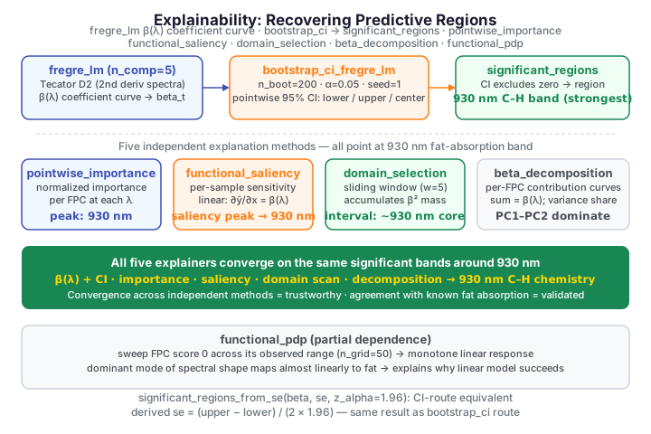
A functional regression that predicts fat from a whole spectrum is accurate but opaque: it consumes 100 correlated channels at once. The scientific payoff comes from asking which wavelengths actually drive the prediction — and whether those regions line up with known chemistry. Fat has a characteristic C–H overtone absorption around 930 nm; a trustworthy model should point there, not at arbitrary channels.
This page fits an FPC linear model on the second-derivative spectra and then puts
it under the fdars.explain microscope: the coefficient curve with
statistically significant regions shaded, a pointwise importance profile,
a gradient saliency map, a sliding-window domain importance scan, an
additive decomposition of the coefficient function, and a partial
dependence curve. Five explanation methods, five independent readings of the
same model — the reassuring outcome is that they all point at the same chemistry.
Every wavelength verdict is read off a real binding, not asserted.
Reading against a ground truth
The R companion to this page validates the explainers on synthetic data with a known coefficient function, where the true predictive regions are planted by construction. We take the harder, more honest route: real Tecator spectra, where the "ground truth" is the known 930 nm C–H fat absorption. If the explainers converge there, they have rediscovered chemistry rather than fitting noise.
The model and its coefficient curve
We work on the second derivative of each spectrum (a standard NIR baseline
correction — see the regression walkthrough) and fit
fregre_lm with five FPC components. The model exposes beta_t, the estimated
coefficient function \(\beta(\lambda)\). The functional linear model predicts fat
by integrating the spectrum against that coefficient function,
so the shape of \(\beta\) says where the spectrum is being weighted. FPC regression makes this estimable by expanding \(\beta\) in the leading \(K\) functional principal components \(\{\phi_k\}\), turning the ill-posed integral fit into an ordinary regression of the response on the FPC scores \(c_{ik}=\langle x_i,\phi_k\rangle\):
import numpy as np
from docs_fig import fig, render
from docs_data import load_tecator
from fdars.fdata import deriv_1d
from fdars.regression import fregre_lm

wl, X, meta = load_tecator()
fat = meta["fat"].to_numpy()
D2 = np.asarray(deriv_1d(X, wl, nderiv=2))       # baseline-corrected spectra

fit = fregre_lm(D2, fat, n_comp=5)
beta = np.asarray(fit["beta_t"])

f, ax = fig()
ax.axhline(0, color="#6c757d", lw=0.8)
ax.plot(wl, beta, color="#3f51b5", lw=2)
ax.set(title=f"Coefficient curve $\\beta(\\lambda)$  ($R^2$={fit['r_squared']:.3f})",
       xlabel="wavelength (nm)", ylabel="$\\beta$")
print(render(f))
The curve is not flat — it swings hardest in the 920–970 nm window. But a raw \(\beta\) curve alone is over-confident: with collinear channels, parts of it are noise. We need to know which excursions are real.
Statistically significant regions
significant_regions_from_se flags the stretches of wavelength where \(\beta\) is
significantly different from zero, given the curve and its standard error. To get
an honest standard error we bootstrap the fit with bootstrap_ci_fregre_lm,
which resamples samples and refits, returning pointwise lower/upper bands and
a center. A symmetric SE recovered from those bands feeds the region detector;
each returned tuple is (start_idx, end_idx, direction).
import numpy as np
from docs_fig import fig, render
from docs_data import load_tecator
from fdars.fdata import deriv_1d
from fdars.regression import fregre_lm, bootstrap_ci_fregre_lm
from fdars.explain import significant_regions, significant_regions_from_se

wl, X, meta = load_tecator()
fat = meta["fat"].to_numpy()
D2 = np.asarray(deriv_1d(X, wl, nderiv=2))

beta = np.asarray(fregre_lm(D2, fat, n_comp=5)["beta_t"])
ci = bootstrap_ci_fregre_lm(D2, fat, n_comp=5, n_boot=200, alpha=0.05, seed=1)
lower, upper = np.asarray(ci["lower"]), np.asarray(ci["upper"])

# regions straight from the bootstrap CI (beta significant where 0 is excluded)
regions = significant_regions(lower, upper)
# equivalent path from an explicit standard error
se = (upper - lower) / (2 * 1.96)
regions_se = significant_regions_from_se(beta, se, z_alpha=1.96)

f, ax = fig()
ax.axhline(0, color="#6c757d", lw=0.8)
ax.fill_between(wl, lower, upper, color="#3f51b5", alpha=0.15,
                label="95% bootstrap CI")
ax.plot(wl, beta, color="#3f51b5", lw=2, label=r"$\beta(\lambda)$")
for s, e, direction in regions:
    c = "#198754" if direction == "positive" else "#dc3545"
    ax.axvspan(wl[s], wl[e], color=c, alpha=0.18)
ax.set(title="Significant regions of $\\beta(\\lambda)$ (green +, red −)",
       xlabel="wavelength (nm)", ylabel="$\\beta$")
ax.legend(loc="upper left", fontsize=8)
print(render(f))
The shaded bands are exactly the wavelengths where the bootstrap CI excludes zero. The strongest, widest band sits right across the 930 nm fat absorption region — the model has rediscovered the chemistry unaided — with a matching sign flip just beyond it, the signature of a second-derivative peak. A weaker secondary band also survives near ~1045 nm, at the red edge of the range, consistent with a further C–H combination feature. Most channels between and beyond these bands are left unshaded: the CI there straddles zero, so the model (correctly) makes no claim about them.
Two routes to the same regions
significant_regions(lower, upper) works straight from CI bounds;
significant_regions_from_se(beta_t, beta_se, z_alpha) works from the curve
and a standard error. Here we derive se from the bootstrap band width, so
both routes flag the same wavelengths. Each returns a list of
(start_idx, end_idx, direction) tuples with direction in
{"positive", "negative"}.
Pointwise importance
The coefficient curve says how each wavelength is weighted; importance says
how much each wavelength actually contributes to the fitted variance once the
spectral variation at that channel is accounted for. pointwise_importance
returns a normalised importance profile (summing the contribution of every FPC
component at each wavelength), so it is directly readable as "share of predictive
signal."
import numpy as np
from docs_fig import fig, render
from docs_data import load_tecator
from fdars.fdata import deriv_1d
from fdars.regression import fregre_lm, bootstrap_ci_fregre_lm
from fdars.explain import pointwise_importance, significant_regions

wl, X, meta = load_tecator()
fat = meta["fat"].to_numpy()
D2 = np.asarray(deriv_1d(X, wl, nderiv=2))

imp = np.asarray(pointwise_importance(D2, fat, ncomp=5)["importance_normalized"])
ci = bootstrap_ci_fregre_lm(D2, fat, n_comp=5, n_boot=200, alpha=0.05, seed=1)
regions = significant_regions(np.asarray(ci["lower"]), np.asarray(ci["upper"]))

f, ax = fig()
ax.plot(wl, imp, color="#e8710a", lw=2)
ax.fill_between(wl, 0, imp, color="#e8710a", alpha=0.15)
for s, e, _ in regions:                          # overlay the significant bands
    ax.axvspan(wl[s], wl[e], color="#3f51b5", alpha=0.10)
peak = wl[int(np.argmax(imp))]
ax.axvline(peak, color="#6c757d", ls="--", lw=1)
ax.set(title=f"Pointwise importance peaks at {peak:.0f} nm",
       xlabel="wavelength (nm)", ylabel="normalized importance")
print(render(f))
Importance concentrates in a sharp peak inside the significant band — the model draws the bulk of its predictive power from a handful of channels around 930 nm, with everything else contributing little. The importance peak and the significant \(\beta\) region agree, which is the reassuring outcome: two different explanation methods point at the same chemistry.
Saliency: per-sample sensitivity
Pointwise importance summarises the model over the whole dataset. Saliency
asks a local question: for each individual spectrum, how sensitive is its
prediction to a nudge at each wavelength? functional_saliency returns a full
saliency_map of shape (n_samples, m) plus its mean_absolute_saliency across
samples. For a linear functional model the per-sample gradient is just
\(\beta(\lambda)\) at every observation, so the mean absolute saliency reduces to
\(|\beta(\lambda)|\) — a useful sanity check that the binding does what the math
says, and a template for the nonlinear case where saliency genuinely varies from
curve to curve.
import numpy as np
from docs_fig import fig, render
from docs_data import load_tecator
from fdars.fdata import deriv_1d
from fdars.explain import functional_saliency, significant_regions
from fdars.regression import bootstrap_ci_fregre_lm

wl, X, meta = load_tecator()
fat = meta["fat"].to_numpy()
D2 = np.asarray(deriv_1d(X, wl, nderiv=2))

sal = functional_saliency(D2, fat, ncomp=5)
smap = np.asarray(sal["saliency_map"])           # (n, m)
mas = np.asarray(sal["mean_absolute_saliency"])  # (m,)
ci = bootstrap_ci_fregre_lm(D2, fat, n_comp=5, n_boot=200, alpha=0.05, seed=1)
regions = significant_regions(np.asarray(ci["lower"]), np.asarray(ci["upper"]))

f, ax = fig()
for row in smap[::20]:                            # a few individual saliency curves
    ax.plot(wl, np.abs(row), color="#adb5bd", lw=0.6, alpha=0.6)
ax.plot(wl, mas, color="#0d6efd", lw=2.2, label="mean |saliency|")
for s, e, _ in regions:
    ax.axvspan(wl[s], wl[e], color="#3f51b5", alpha=0.10)
ax.set(title="Saliency map: sensitivity per wavelength",
       xlabel="wavelength (nm)", ylabel="|saliency|")
ax.legend()
print(render(f))
The bold mean-absolute-saliency curve peaks inside the same significant band, and the faint per-sample curves cluster tightly around it — as they must for a linear model, where every spectrum shares the coefficient function as its gradient. This is a third explanation method landing on 930 nm; when you later fit a nonlinear model, the spread of those grey curves is where individual-sample behaviour would start to diverge.
Domain importance: a sliding-window scan
domain_selection slides a window of width window_width across the domain,
accumulates the squared-\(\beta\) importance inside it, and reports contiguous
intervals that clear a threshold fraction of the total. Where significant
regions test \(\beta\) against zero, domain selection asks a blunter question —
which stretch of the spectrum carries most of the predictive mass? — and
returns explicit interval endpoints.
import numpy as np
from docs_fig import fig, render
from docs_data import load_tecator
from fdars.fdata import deriv_1d
from fdars.explain import domain_selection

wl, X, meta = load_tecator()
fat = meta["fat"].to_numpy()
D2 = np.asarray(deriv_1d(X, wl, nderiv=2))

dom = domain_selection(D2, fat, ncomp=5, window_width=5, threshold=0.1)
imp = np.asarray(dom["pointwise_importance"])
intervals = np.asarray(dom["intervals"])          # rows: (start_idx, end_idx, importance)

f, ax = fig()
ax.plot(wl, imp, color="#2e8b57", lw=2)
ax.fill_between(wl, 0, imp, color="#2e8b57", alpha=0.15)
for s, e, w in intervals:
    ax.axvspan(wl[int(s)], wl[int(e)], color="#2e8b57", alpha=0.18)
    ax.text((wl[int(s)] + wl[int(e)]) / 2, imp.max() * 0.9,
            f"{wl[int(s)]:.0f}–{wl[int(e)]:.0f} nm", ha="center", fontsize=8)
ax.set(title=f"Domain importance (window width {dom['window_width']})",
       xlabel="wavelength (nm)", ylabel="windowed importance")
print(render(f))
The scan flags a single dominant interval straddling the fat absorption band — broader than the sharp significant-region core, because a sliding window deliberately smears importance over its width. That trade-off is the point: domain selection answers "roughly where should I look?" with a robust contiguous window, while significant regions answer "exactly which channels are provably nonzero?" The two agree on the location and disagree only on how tightly to draw the boundary — which is exactly the complementary information you want.
Decomposing the coefficient function
Why does \(\beta(\lambda)\) have the shape it does? beta_decomposition splits it
into additive per-component curves — one contribution curve per FPC — whose
sum is exactly \(\beta(\lambda)\). The accompanying variance_proportion tells
us how much predictive variance each component carries, so we can see whether the
coefficient function is dominated by one mode or built from several.
import numpy as np
from docs_fig import fig, render
from docs_data import load_tecator
from fdars.fdata import deriv_1d
from fdars.explain import beta_decomposition

wl, X, meta = load_tecator()
fat = meta["fat"].to_numpy()
D2 = np.asarray(deriv_1d(X, wl, nderiv=2))

bd = beta_decomposition(D2, fat, ncomp=5)
comps = np.asarray(bd["components"])             # (ncomp, m); rows sum to beta
vprop = np.asarray(bd["variance_proportion"])
order = np.argsort(vprop)[::-1]                  # most important components first

f, ax = fig()
ax.axhline(0, color="#6c757d", lw=0.8)
ax.plot(wl, comps.sum(0), color="#000000", lw=2.2, label=r"$\beta(\lambda)$ (sum)")
palette = ["#3f51b5", "#e8710a", "#198754"]
for c, k in zip(palette, order[:3]):
    ax.plot(wl, comps[k], color=c, lw=1.4, alpha=0.9,
            label=f"comp {k} ({vprop[k]*100:.0f}% var)")
ax.set(title="$\\beta(\\lambda)$ as a sum of FPC contributions",
       xlabel="wavelength (nm)", ylabel="contribution to $\\beta$")
ax.legend(fontsize=8)
print(render(f))
The black curve is the full coefficient function; the coloured curves are the component contributions that add up to it. One or two components carry most of the variance and dictate the 930 nm feature, while the rest add fine structure — so the model's verdict on the fat band is not fragile, it rests on the dominant mode of spectral variation.
Partial dependence along a component
Finally, functional_pdp traces how the prediction moves as we sweep a single
FPC score across its observed range, holding the others fixed — the functional
analogue of a partial dependence plot. A near-straight, sloped line means the
model responds monotonically to that mode of spectral variation.
import numpy as np
from docs_fig import fig, render
from docs_data import load_tecator
from fdars.fdata import deriv_1d
from fdars.explain import functional_pdp

wl, X, meta = load_tecator()
fat = meta["fat"].to_numpy()
D2 = np.asarray(deriv_1d(X, wl, nderiv=2))

pdp = functional_pdp(D2, fat, ncomp=5, component=0, n_grid=50)
grid = np.asarray(pdp["grid_values"])
curve = np.asarray(pdp["pdp_curve"])

f, ax = fig()
ax.plot(grid, curve, color="#6f42c1", lw=2.2)
ax.scatter(grid[::6], curve[::6], color="#6f42c1", s=18, zorder=5)
ax.set(title=f"Partial dependence on FPC component {pdp['component']}",
       xlabel="FPC score (component 0)", ylabel="predicted fat (%)")
print(render(f))
Sweeping the leading component's score walks the predicted fat smoothly across its whole range — the dominant mode of spectral shape maps almost linearly onto fat content, which is why a linear functional model does so well on this dataset in the first place.
Validation summary: do the explainers agree?
The acid test of an explanation toolkit is consistency: four methods, built on different principles, should converge on the same wavelengths if the signal is real. We stack the coefficient curve, pointwise importance, mean absolute saliency, and domain importance on a shared axis, with the significant-region bands overlaid, so agreement (or its absence) is read at a glance.
import numpy as np
from docs_fig import fig, render
from docs_data import load_tecator
from fdars.fdata import deriv_1d
from fdars.regression import fregre_lm, bootstrap_ci_fregre_lm
from fdars.explain import (pointwise_importance, functional_saliency,
                           domain_selection, significant_regions)

wl, X, meta = load_tecator()
fat = meta["fat"].to_numpy()
D2 = np.asarray(deriv_1d(X, wl, nderiv=2))

beta = np.asarray(fregre_lm(D2, fat, n_comp=5)["beta_t"])
imp = np.asarray(pointwise_importance(D2, fat, ncomp=5)["importance_normalized"])
mas = np.asarray(functional_saliency(D2, fat, ncomp=5)["mean_absolute_saliency"])
dom = np.asarray(domain_selection(D2, fat, ncomp=5,
                                  window_width=5, threshold=0.1)["pointwise_importance"])
ci = bootstrap_ci_fregre_lm(D2, fat, n_comp=5, n_boot=200, alpha=0.05, seed=1)
regions = significant_regions(np.asarray(ci["lower"]), np.asarray(ci["upper"]))

panels = [(beta, r"$\beta(\lambda)$", "#3f51b5"),
          (imp, "pointwise imp.", "#e8710a"),
          (mas, "mean |saliency|", "#0d6efd"),
          (dom, "domain imp.", "#2e8b57")]
f, axes = fig(nrows=4, figsize=(7.5, 6.6), sharex=True)
for ax, (y, label, c) in zip(axes, panels):
    ax.plot(wl, y, color=c, lw=1.8)
    ax.set_ylabel(label, fontsize=9)
    for s, e, _ in regions:                       # significant band on every panel
        ax.axvspan(wl[s], wl[e], color="#6c757d", alpha=0.12)
axes[0].axhline(0, color="#6c757d", lw=0.8)
axes[0].set_title("Four explainers over the significant regions (grey bands)")
axes[-1].set_xlabel("wavelength (nm)")
print(render(f))
Every panel lights up over the same grey significant bands around 930 nm. The coefficient curve swings there, importance peaks there, saliency peaks there, and the domain scan brackets it — four methods, one verdict. That convergence is what makes the explanation trustworthy: no single method is doing the heavy lifting, and none contradicts the known chemistry. When explainers disagree, it is a signal to distrust the model; here they agree, so we can read the 930 nm story with confidence.
Parameters
| Function | Key parameters | Description |
|---|---|---|
fregre_lm(data, response, n_comp) |
n_comp |
FPC linear model; exposes beta_t, r_squared |
bootstrap_ci_fregre_lm(data, response, n_comp, n_boot, alpha, seed) |
n_boot, alpha |
Bootstrap CI band for \(\beta\): lower, upper, center |
significant_regions(lower, upper) |
lower, upper |
Regions where the CI excludes zero → (start, end, direction) |
significant_regions_from_se(beta_t, beta_se, z_alpha) |
z_alpha |
Same, from a curve and its standard error |
pointwise_importance(data, response, ncomp) |
ncomp |
importance, importance_normalized, component_importance |
functional_saliency(data, response, ncomp) |
ncomp |
saliency_map (n×m), mean_absolute_saliency |
domain_selection(data, response, ncomp, window_width, threshold) |
window_width, threshold |
pointwise_importance, intervals (start, end, importance) |
beta_decomposition(data, response, ncomp) |
ncomp |
components (rows sum to \(\beta\)), variance_proportion |
functional_pdp(data, response, ncomp, component, n_grid) |
component, n_grid |
grid_values, pdp_curve for one FPC score |
See also
- Predicting fat from NIR spectra — fitting and validating the model whose internals we dissect here.
- Cross-validation: honest model comparison — choosing which model to explain in the first place.
- Scalar-on-function regression for the underlying functional linear model.
References
- Borggaard, C., Thodberg, H.H. (1992). Optimal minimal neural interpretation of spectra. Analytical Chemistry 64(5):545-551.
- James, G.M., Wang, J., Zhu, J. (2009). Functional linear regression that's interpretable. Annals of Statistics 37(5A):2083-2108.
- Ramsay, J.O., Silverman, B.W. (2005). Functional Data Analysis, 2nd ed. Springer.