Andrews Wine: Why Andrews Curves?
Dataset: UCI Wine — 13 chemical measurements (alcohol, malic acid, ash, flavanoids, colour intensity, proline, …) for 178 Italian wines grown by three different cultivars. A plain multivariate table, with a known class label per row.
The three cultivars are the wines of Piedmont — Barolo, Grignolino and
Barbera. Thirteen numbers per wine is too many to eyeball as a scatter plot
and too few to feel "functional". A quality analyst who wants to flag anomalous
bottles, verify a cultivar label, or monitor a batch has to juggle a different
tool for each task: a spreadsheet for the raw numbers, MANOVA for group
differences, PCA for structure, a separate control chart per variable — each
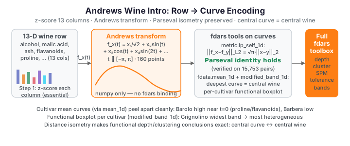
with its own distance notion. An Andrews transformation turns each 13-number
row into a smooth periodic curve, and once every wine is a curve the entire
fdars toolbox — depth, functional boxplots, clustering, tolerance bands,
control charts — becomes available for what started as an ordinary spreadsheet,
all under one consistent \(L^2\) geometry. This page motivates the encoding,
verifies that the geometry is preserved exactly, and shows that the three
cultivars already separate visually as bundles of curves. The follow-on pages
then do real analysis: outlier detection,
clustering & variable importance, and
quality control.
No andrews binding in fdars
There is no Andrews-curve function in fdars. The transform is a
handful of lines of numpy, reproduced below and lifted directly from
Andrews transformation. fdars
enters only after the transform, once the curves are wrapped in Fdata.
The problem with tables
Look first at the raw ingredient of the problem: 13 chemicals, one boxplot each, split by cultivar. Some variables separate the cultivars cleanly; many overlap. Reading 13 marginal views and stitching them back into a judgement about a whole wine is exactly what the eye is bad at.
import numpy as np
from docs_fig import fig, render
from docs_data import load_wine

names, X, meta = load_wine()
cultivar = meta["cultivar"].to_numpy()
Xz = (X - X.mean(0)) / X.std(0)
labels = {1: "Barolo", 2: "Grignolino", 3: "Barbera"}
palette = {1: "#8B0000", 2: "#DAA520", 3: "#2E8B57"}

f, axes = fig(3, 5, figsize=(11.0, 6.2))
for j, ax in enumerate(axes.ravel()):
    if j >= X.shape[1]:
        ax.axis("off")
        continue
    data = [Xz[cultivar == c, j] for c in (1, 2, 3)]
    bp = ax.boxplot(data, widths=0.6, patch_artist=True,
                    tick_labels=["B", "G", "Ba"], showfliers=False)
    for patch, c in zip(bp["boxes"], (1, 2, 3)):
        patch.set_facecolor(palette[c]); patch.set_alpha(0.6)
    ax.set_title(names[j], fontsize=8.5)
    ax.tick_params(labelsize=7)
f.suptitle("13 chemicals, one boxplot each (standardized) — B=Barolo, G=Grignolino, Ba=Barbera",
           fontsize=10)
print(render(f))
Flavanoids, proline and colour intensity pull the cultivars apart; ash and magnesium barely move. The signal is distributed across the 13 columns, and no single panel tells you whether a given bottle is unusual overall. That is the gap the Andrews transform closes — it fuses all 13 into one object you can rank, cluster and monitor as a unit.
From 13 columns to one curve
Andrews encodes a feature vector \(x = (x_1, \ldots, x_p)\) as the coefficients of a truncated Fourier series in a dummy variable \(t \in [-\pi, \pi]\):
Two properties make this more than decoration. By Parseval's theorem the \(L^2\) distance between two curves is exactly proportional to the Euclidean distance between the underlying feature vectors,
so similar wines trace similar curves and the constant \(\sqrt{\pi} \approx 1.7725\) is the same for every pair. The transform is also linear, so the curve of the average wine is the average of the curves. Both facts are what let functional depth and functional clustering say something meaningful about the original table — we verify the distance identity numerically below.
Because the low-order terms (\(x_1/\sqrt 2\), \(x_2\sin t\), \(x_3\cos t\)) dominate
the shape while high harmonics contribute fast wiggles, one must standardize
the columns first — otherwise a large-magnitude feature like proline
(hundreds of mg/L) would swamp hue (around 1.0). We z-score every column
before transforming.
Wine Andrews curves, coloured by cultivar
import numpy as np
from docs_fig import fig, render
from docs_data import load_wine

def andrews_curves(features, t):
    """Map rows of a (n, p) table to Andrews curves evaluated at t."""
    features = np.asarray(features, float)
    n, p = features.shape
    out = np.full((n, t.size), features[:, [0]] / np.sqrt(2.0))
    for j in range(1, p):
        harmonic = (j + 1) // 2               # 1,1,2,2,3,3,...
        term = np.sin if j % 2 == 1 else np.cos
        out = out + features[:, [j]] * term(harmonic * t)
    return out

names, X, meta = load_wine()               # X is RAW (178, 13)
cultivar = meta["cultivar"].to_numpy()

Xz = (X - X.mean(0)) / X.std(0)            # per-column z-score (essential!)
t = np.linspace(-np.pi, np.pi, 160)
curves = andrews_curves(Xz, t)             # (178, 160)

palette = {1: "#8B0000", 2: "#DAA520", 3: "#2E8B57"}
labels = {1: "Barolo", 2: "Grignolino", 3: "Barbera"}
f, ax = fig()
for c in (1, 2, 3):
    rows = np.where(cultivar == c)[0]
    for i in rows:
        ax.plot(t, curves[i], color=palette[c], lw=0.8, alpha=0.35)
    # one opaque curve per class for the legend
    ax.plot(t, curves[rows[0]], color=palette[c], lw=1.6, label=labels[c])
ax.set(title="Andrews curves of 178 wines, coloured by cultivar",
       xlabel="t", ylabel=r"$f_x(t)$")
ax.legend()
print(render(f))
The three cultivars are tinted differently, but at the level of individual curves
the bundles overlap heavily — no clean visual separation emerges from this
tangle of 178 curves. The class structure only becomes obvious once we average
within each cultivar (the mean-curve figure
below): those per-cultivar signatures peel apart cleanly. No model has been
fitted; this is just the transform plus colour, and that latent separation is
exactly the signal the later pages exploit with real fdars depth and
clustering.
Proving the bridge: distance is preserved exactly
Before trusting any curve-based conclusion, we check the load-bearing claim: the
\(L^2\) distance between two Andrews curves equals \(\sqrt{\pi}\) times the Euclidean
distance between the original standardized rows. We compute all
\(\binom{178}{2} = 15{,}753\) pairwise distances both ways — the functional
distance with fdars.metric.lp_self_1d, the Euclidean distance in numpy — and
plot one against the other.
import numpy as np
from docs_fig import fig, render
from docs_data import load_wine
from fdars.metric import lp_self_1d

def andrews_curves(features, t):
    features = np.asarray(features, float)
    n, p = features.shape
    out = np.full((n, t.size), features[:, [0]] / np.sqrt(2.0))
    for j in range(1, p):
        harmonic = (j + 1) // 2
        term = np.sin if j % 2 == 1 else np.cos
        out = out + features[:, [j]] * term(harmonic * t)
    return out

names, X, meta = load_wine()
Xz = (X - X.mean(0)) / X.std(0)
t = np.linspace(-np.pi, np.pi, 160)
curves = andrews_curves(Xz, t)

# functional L2 distances between curves
D_andrews = np.asarray(lp_self_1d(curves, t, 2.0))
# Euclidean distances between the standardized rows
G = Xz @ Xz.T
sq = np.diag(G)[:, None] + np.diag(G)[None, :] - 2 * G
D_euclid = np.sqrt(np.maximum(sq, 0.0))

iu = np.triu_indices(len(Xz), 1)
d_a, d_e = D_andrews[iu], D_euclid[iu]
nz = d_e > 1e-10
ratio = d_a[nz] / d_e[nz]

f, ax = fig()
ax.scatter(d_e[nz], d_a[nz], s=5, alpha=0.08, color="#3f51b5")
xs = np.linspace(0, d_e.max(), 2)
ax.plot(xs, np.sqrt(np.pi) * xs, color="#dc3545", lw=1.6,
        label=r"slope $=\sqrt{\pi}\approx1.7725$")
ax.set(title="Andrews $L^2$ distance vs Euclidean distance",
       xlabel="Euclidean distance (standardized rows)",
       ylabel="Andrews $L^2$ distance")
ax.legend()
print(render(f))

print(f"\nratio (Andrews / Euclidean): mean {ratio.mean():.4f}, "
      f"sd {ratio.std():.1e}   (sqrt(pi) = {np.sqrt(np.pi):.4f})")
Every one of the 15,753 points lands on the red line: the ratio is
\(\sqrt{\pi}\) to four decimals with a spread of order \(10^{-5}\) (pure grid
discretization — a finer t shrinks it further). The transform is an
isometry up to a constant, so any statement we make about outliers or
clusters in curve space translates back exactly to chemical units. This is the
guarantee that makes the whole functional detour rigorous rather than
decorative.
The mean curve per cultivar
Averaging the curves within each cultivar gives a clean "signature" for each class. Because the transform is linear, each mean curve is the Andrews curve of that cultivar's mean wine.
import numpy as np
from docs_fig import fig, render
from docs_data import load_wine
from fdars.fdata import mean_1d

def andrews_curves(features, t):
    features = np.asarray(features, float)
    n, p = features.shape
    out = np.full((n, t.size), features[:, [0]] / np.sqrt(2.0))
    for j in range(1, p):
        harmonic = (j + 1) // 2
        term = np.sin if j % 2 == 1 else np.cos
        out = out + features[:, [j]] * term(harmonic * t)
    return out

names, X, meta = load_wine()
cultivar = meta["cultivar"].to_numpy()
Xz = (X - X.mean(0)) / X.std(0)
t = np.linspace(-np.pi, np.pi, 160)
curves = andrews_curves(Xz, t)

palette = {1: "#8B0000", 2: "#DAA520", 3: "#2E8B57"}
labels = {1: "Barolo", 2: "Grignolino", 3: "Barbera"}
f, ax = fig()
for c in (1, 2, 3):
    band = curves[cultivar == c]
    mu = np.asarray(mean_1d(band))             # fdars functional mean
    lo, hi = band.min(0), band.max(0)
    ax.fill_between(t, lo, hi, color=palette[c], alpha=0.12)
    ax.plot(t, mu, color=palette[c], lw=2.2, label=f"{labels[c]} mean")
ax.set(title="Per-cultivar mean Andrews curve (shaded = full range)",
       xlabel="t", ylabel=r"$f_x(t)$")
ax.legend()
print(render(f))
The three mean curves peel apart cleanly; Barolo (cultivar 1) sits high near
\(t=0\) (driven by its large standardized proline and flavanoids), while
Barbera (cultivar 3) runs low. The shaded envelopes are the full within-class
range — Grignolino (cultivar 2, the largest and most heterogeneous class) has
the widest band.
A functional boxplot per cultivar
The mean-and-range view above is not robust: a single wild bottle stretches the envelope. The functional boxplot replaces it with the depth-based median curve and the central 50% region — the band swept out by the deepest half of the curves. We rank each cultivar's curves by modified band depth, draw the deepest as the median, and shade between the pointwise min and max of the top 50%.
import numpy as np
from docs_fig import fig, render
from docs_data import load_wine
from fdars.depth import modified_band_1d

def andrews_curves(features, t):
    features = np.asarray(features, float)
    n, p = features.shape
    out = np.full((n, t.size), features[:, [0]] / np.sqrt(2.0))
    for j in range(1, p):
        harmonic = (j + 1) // 2
        term = np.sin if j % 2 == 1 else np.cos
        out = out + features[:, [j]] * term(harmonic * t)
    return out

names, X, meta = load_wine()
cultivar = meta["cultivar"].to_numpy()
Xz = (X - X.mean(0)) / X.std(0)
t = np.linspace(-np.pi, np.pi, 160)
curves = andrews_curves(Xz, t)

palette = {1: "#8B0000", 2: "#DAA520", 3: "#2E8B57"}
labels = {1: "Barolo", 2: "Grignolino", 3: "Barbera"}
f, axes = fig(ncols=3, figsize=(11.0, 3.4), sharey=True)
for ax, c in zip(axes, (1, 2, 3)):
    band = curves[cultivar == c]
    depth = np.asarray(modified_band_1d(band, band))
    order = np.argsort(depth)[::-1]              # deepest first
    central = band[order[: max(1, len(band) // 2)]]   # deepest 50%
    lo, hi = central.min(0), central.max(0)
    ax.fill_between(t, lo, hi, color=palette[c], alpha=0.30, label="central 50%")
    ax.plot(t, band[order[0]], color=palette[c], lw=2.4, label="median")
    ax.plot(t, band[order[-1]], color="#333", lw=1.0, ls=":", label="shallowest")
    ax.set(title=labels[c], xlabel="t")
axes[0].set(ylabel=r"$f_x(t)$")
axes[0].legend(fontsize=8)
print(render(f))
Each panel is a functional boxplot: the solid line is the depth median, the shade is the central 50% envelope, and the dotted line is the least-central curve in the class. Grignolino's central band is visibly the widest — its typical wines vary more from one another — while Barolo's is tight, matching its role as the most homogeneous cultivar. The dotted shallow curves preview the outlier-detection page: these are the bottles that ride the edge of their class.
Wrapping the curves in Fdata
From here the wines are functional data. Bundle the curves into an fdars.Fdata
object and every method of the class becomes available.
import numpy as np
from fdars import Fdata
from docs_data import load_wine

# ... build `curves` and `t` as above, plus meta ...
fd = Fdata(curves, argvals=t, metadata=meta)
print(fd.n_obs(), "wines on", fd.n_points(), "points")
| Step | Object | Notes |
|---|---|---|
| Feature table | np.ndarray (178, 13) |
RAW wine measurements |
| z-score columns | np.ndarray (178, 13) |
So no feature dominates the curve |
andrews_curves(...) |
np.ndarray (178, m) |
Pure numpy, shown above |
Fdata(curves, argvals=t, metadata=meta) |
fdars.Fdata |
Enables depth, clustering, SPM |
Ordering matters — for the eye, not the distances
Andrews curves are not invariant to the order of the features:
low-index features shape the slow part of the curve and high-index features
add fast wiggles, so reordering changes what you see. It does not
change the \(L^2\) distances between curves (Parseval), so downstream depth
and clustering results are order-invariant. Put the most discriminative
variables first for readability — here flavanoids, proline and
od280_od315 carry the most between-cultivar signal (quantified on the
clustering page).
Where this goes next
- Outlier detection — functional depth,
magnitude_shape,outliergramanddetect_outliers_lrtflag atypical wines. - Clustering & variable importance —
kmeans_fdandgmm_clusterrecover the cultivars; per-feature ANOVA says which chemistry drives the split. - Quality control — treat one cultivar as the in-control reference and monitor the others with tolerance bands and Hotelling \(T^2\) control charts.
See also
- Andrews transformation — the reference article on the transform, with the distance- and mean-preservation proofs.
- Functional depth — the centrality measures used on the next page.
References
- Andrews, D.F. (1972). Plots of high-dimensional data. Biometrics 28(1):125-136.
- Aeberhard, S., Coomans, D., de Vel, O. (1994). Comparative analysis of statistical pattern recognition methods in high dimensional settings. Pattern Recognition 27(8):1065-1077.
- Dua, D., Graff, C. (2019). UCI Machine Learning Repository. University of California, Irvine.