Canadian Temperature: Annual Cycle Detection & Decomposition
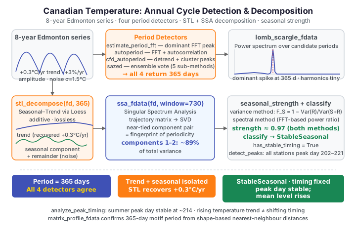
Dataset: Canadian Weather — daily mean temperature (°C) for 35 stations. We take one continental station (Edmonton, 53.6°N) and stitch eight simulated years together, so the series is long enough to detect, decompose, and track the annual cycle rather than merely display it.
A single year of daily temperature shows the annual cycle, but you cannot ask a
period detector "how long is the cycle?" or an STL routine "separate trend from
season" when the data contains only one pass. Real seasonal analysis needs
several cycles. So we build a plausible eight-year record from Edmonton's average
annual curve, injecting three things a climate series really has: a slow
warming trend (+0.3 °C/year), a growing amplitude (+3%/year), and
year-to-year weather noise. Everything below is then recovered from the raw
signal by fdars.seasonal — the true period, the warming trend, the seasonal
component, and whether the timing of summer is shifting.
Building an eight-year record
import numpy as np
from docs_fig import fig, render
from docs_data import load_canadian_weather

day, X, meta = load_canadian_weather("temperature")
station = meta["station"].to_numpy()
i = int(np.where(station == "Edmonton")[0][0])
base = np.ascontiguousarray(X[i], dtype=np.float64)   # one average annual cycle

rng = np.random.default_rng(42)
segments = []
for yr in range(8):
    trend = 0.3 * yr                # +0.3 °C per year warming
    amp = 1.0 + 0.03 * yr           # amplitude grows ~3%/year
    noise = rng.normal(0, 1.5, 365)  # year-to-year weather variability
    segments.append(base * amp + trend + noise)

long = np.concatenate(segments)
days = np.arange(1, len(long) + 1, dtype=np.float64)
fd = np.ascontiguousarray(long[None, :], dtype=np.float64)   # (1, 2920)

f, ax = fig(figsize=(7.5, 3.6))
for b in range(365, 8 * 365, 365):
    ax.axvline(b, color="#adb5bd", ls=":", lw=0.7)
ax.plot(days, long, color="#3f51b5", lw=0.4)
ax.set(title=f"Edmonton: 8 simulated years "
             f"({long.min():.0f} to {long.max():.0f} °C)",
       xlabel="day", ylabel="temperature (°C)")
print(render(f))
Each year repeats a deep winter trough and a short summer peak, with the whole envelope drifting slowly upward. That is exactly the structure the detectors below have to disentangle: a 365-day period, a linear trend, and a growing amplitude, all on top of daily weather noise.
Period-detection showdown
fdars.seasonal ships several period detectors that each attack the problem
differently. All take a 2-D (n, m) matrix and the argument grid and return a
dict whose period is in the units of argvals — here, days:
estimate_period_fft— dominant peak of the FFT periodogram (fast, robust).autoperiod— FFT candidates validated against the autocorrelation.cfd_autoperiod— detrends first, then clusters FFT peaks (best on trended data).sazed— an ensemble that votes across five sub-methods.
import numpy as np
from docs_fig import fig, render
from docs_data import load_canadian_weather
from fdars.seasonal import (estimate_period_fft, autoperiod,
                            cfd_autoperiod, sazed)

day, X, meta = load_canadian_weather("temperature")
i = int(np.where(meta["station"].to_numpy() == "Edmonton")[0][0])
base = np.ascontiguousarray(X[i], dtype=np.float64)
rng = np.random.default_rng(42)
long = np.concatenate([base * (1 + 0.03 * y) + 0.3 * y + rng.normal(0, 1.5, 365)
                       for y in range(8)])
days = np.arange(1, len(long) + 1, dtype=np.float64)
fd = np.ascontiguousarray(long[None, :], dtype=np.float64)

methods = [("FFT", estimate_period_fft), ("autoperiod", autoperiod),
           ("CFD-autoperiod", cfd_autoperiod), ("SAZED", sazed)]
names, periods = [], []
for name, fn in methods:
    names.append(name)
    periods.append(fn(fd, days)["period"])

f, ax = fig(figsize=(6.4, 3.8))
bars = ax.bar(names, periods, color=["#3f51b5", "#e8710a", "#198754", "#6f42c1"],
              width=0.6)
ax.axhline(365, color="#dc3545", ls="--", lw=1, label="true period (365 d)")
for b, p in zip(bars, periods):
    ax.text(b.get_x() + b.get_width() / 2, p + 4, f"{p:.0f}", ha="center")
ax.set(title="All four detectors converge on the annual cycle",
       ylabel="detected period (days)", ylim=(0, 420))
ax.legend()
print(render(f))
Every method lands on 365 days. They differ only in confidence: the FFT
returns the largest raw peak height, while cfd_autoperiod earns the highest
normalised confidence (~0.96) because it removes the +0.3 °C/year warming trend
before looking at the spectrum, letting the annual peak dominate. When a series
has a trend, detrending-based detectors are the safer choice.
Spectral analysis and harmonics
A single "period" number hides the full frequency content. lomb_scargle_fdata
computes the Lomb–Scargle periodogram — power against candidate period — which
exposes not just the fundamental cycle but its harmonics. At angular
frequency \(\omega = 2\pi/P\) it fits a sinusoid by least squares and reports the
explained power,
where the phase offset \(\tau\) is chosen to make the estimator exact for unevenly-spaced samples. A peak at candidate period \(P\) marks a dominant cycle.
import numpy as np
from docs_fig import fig, render
from docs_data import load_canadian_weather
from fdars.seasonal import lomb_scargle_fdata

day, X, meta = load_canadian_weather("temperature")
i = int(np.where(meta["station"].to_numpy() == "Edmonton")[0][0])
base = np.ascontiguousarray(X[i], dtype=np.float64)
rng = np.random.default_rng(42)
long = np.concatenate([base * (1 + 0.03 * y) + 0.3 * y + rng.normal(0, 1.5, 365)
                       for y in range(8)])
days = np.arange(1, len(long) + 1, dtype=np.float64)
fd = np.ascontiguousarray(long[None, :], dtype=np.float64)

ls = lomb_scargle_fdata(fd, days, oversampling=4)
periods = np.asarray(ls["periods"])
power = np.asarray(ls["power"])
sel = (periods >= 30) & (periods <= 500)

f, ax = fig()
ax.plot(periods[sel], power[sel], color="#3f51b5", lw=1.4)
ax.axvline(365, color="#dc3545", ls="--", lw=1)
ax.text(365, ax.get_ylim()[1] * 0.9, "365 d (fundamental)", rotation=90,
        va="top", ha="right", fontsize=8, color="#dc3545")
ax.set(title="Lomb–Scargle periodogram: the annual fundamental dominates",
       xlabel="candidate period (days)", ylabel="spectral power")
print(render(f))
One overwhelming spike sits at 365 days — the annual fundamental — dwarfing everything else in the band by roughly two orders of magnitude. In principle a non-sinusoidal cycle also seeds weaker harmonics at integer fractions of the period (182.5 d, 121.7 d …), because the annual temperature curve is sharper at its winter trough than a pure sine. Here, though, any such harmonic power is tiny next to the fundamental and does not stand out as a distinct spike; the periodogram is emphatically single-peaked, which is itself strong evidence that one clean annual cycle governs the series.
Matrix profile: shape-based motifs
The matrix profile takes a completely different route to periodicity. For every
365-day window it finds the nearest-neighbour window elsewhere in the series;
the distances between matched windows cluster at multiples of the true period.
matrix_profile_fdata returns the profile plus detected_periods and a
primary_period.
import numpy as np
from docs_fig import fig, render
from docs_data import load_canadian_weather
from fdars.seasonal import matrix_profile_fdata

day, X, meta = load_canadian_weather("temperature")
i = int(np.where(meta["station"].to_numpy() == "Edmonton")[0][0])
base = np.ascontiguousarray(X[i], dtype=np.float64)
rng = np.random.default_rng(42)
long = np.concatenate([base * (1 + 0.03 * y) + 0.3 * y + rng.normal(0, 1.5, 365)
                       for y in range(8)])
fd = np.ascontiguousarray(long[None, :], dtype=np.float64)

mp = matrix_profile_fdata(fd, subsequence_length=365)
prof = np.asarray(mp["profile"])
detected = np.asarray(mp["detected_periods"])

f, ax = fig(figsize=(7.5, 3.4))
ax.plot(np.arange(len(prof)), prof, color="#198754", lw=0.6)
ax.set(title=f"Matrix profile (primary period {mp['primary_period']:.0f} d, "
             f"detected {', '.join(f'{d:.0f}' for d in detected[:4])})",
       xlabel="window start (day)", ylabel="distance to nearest neighbour")
print(render(f))
The primary period is 365 days, and the top detected_periods come out as
multiples of a year — 365, 730, 1095, 1825 … — because a 365-day window matches
its counterpart one, two, or more years away. The gentle downward slope of the
profile is the
amplitude trend leaking through: later years, with larger swings, are more
self-similar than early ones. The moderate confidence reflects that trend and
noise, not any doubt about the annual cycle.
Decomposition: STL vs SSA
Detecting the period is half the job; the other half is splitting the signal
into trend + seasonal + remainder. fdars.seasonal offers two complementary
decompositions:
stl_decompose— Seasonal–Trend decomposition using Loess. Additive and lossless: the three components sum back to the observed series exactly.ssa_fdata— Singular Spectrum Analysis. It embeds the series in a trajectory matrix and reads the cycle off the leading singular components.
import numpy as np
from docs_fig import fig, render
from docs_data import load_canadian_weather
from fdars.seasonal import stl_decompose, ssa_fdata

day, X, meta = load_canadian_weather("temperature")
i = int(np.where(meta["station"].to_numpy() == "Edmonton")[0][0])
base = np.ascontiguousarray(X[i], dtype=np.float64)
rng = np.random.default_rng(42)
long = np.concatenate([base * (1 + 0.03 * y) + 0.3 * y + rng.normal(0, 1.5, 365)
                       for y in range(8)])
days = np.arange(1, len(long) + 1, dtype=np.float64)
fd = np.ascontiguousarray(long[None, :], dtype=np.float64)

stl = stl_decompose(fd, 365)
trend = np.asarray(stl["trend"])[0]
seasonal = np.asarray(stl["seasonal"])[0]
remainder = np.asarray(stl["remainder"])[0]

f, axes = fig(nrows=4, figsize=(7.5, 6.4), sharex=True)
axes[0].plot(days, long, color="#212529", lw=0.4); axes[0].set_ylabel("observed")
axes[1].plot(days, trend, color="#3f51b5", lw=1.4); axes[1].set_ylabel("trend")
axes[2].plot(days, seasonal, color="#198754", lw=0.5); axes[2].set_ylabel("seasonal")
axes[3].plot(days, remainder, color="#dc3545", lw=0.5); axes[3].set_ylabel("remainder")
axes[3].set_xlabel("day")
axes[0].set_title("STL decomposition (period = 365 days)")
print(render(f))
The trend panel rises smoothly — STL has recovered the +0.3 °C/year warming without being told about it. The seasonal panel is the repeating annual cycle, and the remainder is the leftover weather noise. The three panels add back to the observed series exactly.
SSA reaches the same split through the algebra of the trajectory matrix, and its scree of singular-value contributions is diagnostic:
import numpy as np
from docs_fig import fig, render
from docs_data import load_canadian_weather
from fdars.seasonal import ssa_fdata

day, X, meta = load_canadian_weather("temperature")
i = int(np.where(meta["station"].to_numpy() == "Edmonton")[0][0])
base = np.ascontiguousarray(X[i], dtype=np.float64)
rng = np.random.default_rng(42)
long = np.concatenate([base * (1 + 0.03 * y) + 0.3 * y + rng.normal(0, 1.5, 365)
                       for y in range(8)])
fd = np.ascontiguousarray(long[None, :], dtype=np.float64)

ssa = ssa_fdata(fd, window_length=730)
contrib = np.asarray(ssa["contributions"])
pair = 100 * contrib[:2].sum()

f, ax = fig(figsize=(6.0, 3.8))
k = np.arange(1, min(8, len(contrib)) + 1)
ax.bar(k, contrib[:len(k)] * 100, color="#6f42c1", width=0.6)
ax.set(title=f"SSA scree — components 1–2 carry {pair:.0f}% of variance",
       xlabel="component", ylabel="variance contribution (%)")
print(render(f))
The first two components are nearly equal in size and together explain about 89% of the variance. A near-tied leading pair is the algebraic fingerprint of a periodic oscillation: a sine and its quarter-phase-shifted cosine enter SSA as twins. Component 1 alone would be a trend; the tied pair is the annual cycle.
Seasonal strength and classification
seasonal_strength scores, on a 0–1 scale, what fraction of a curve's variation
the seasonal cycle explains (the variance measure of Wang, Smith & Hyndman).
After an STL-type decomposition into seasonal \(S_t\) and remainder \(R_t\) parts,
the strength is one minus the ratio of residual to seasonal-plus-residual
variance,
so \(F_S \to 1\) when the seasonal signal dwarfs the residual noise and \(F_S \to 0\)
when it is negligible. We also let classify_seasonality render an overall
verdict.
import numpy as np
from docs_fig import fig, render
from docs_data import load_canadian_weather
from fdars.seasonal import seasonal_strength, classify_seasonality

day, X, meta = load_canadian_weather("temperature")
i = int(np.where(meta["station"].to_numpy() == "Edmonton")[0][0])
base = np.ascontiguousarray(X[i], dtype=np.float64)
rng = np.random.default_rng(42)
long = np.concatenate([base * (1 + 0.03 * y) + 0.3 * y + rng.normal(0, 1.5, 365)
                       for y in range(8)])
days = np.arange(1, len(long) + 1, dtype=np.float64)
fd = np.ascontiguousarray(long[None, :], dtype=np.float64)

methods = ["variance", "spectral"]
strengths = [seasonal_strength(fd, days, 365.0, method=m) for m in methods]
cls = classify_seasonality(fd, days, 365.0)

f, ax = fig(figsize=(5.4, 3.8))
ax.bar(methods, strengths, color=["#3f51b5", "#e8710a"], width=0.5)
for j, s in enumerate(strengths):
    ax.text(j, s + 0.01, f"{s:.3f}", ha="center")
ax.set(title=f"Seasonal strength — classified '{cls['classification']}'",
       ylabel="strength (0–1)", ylim=(0, 1.1))
print(render(f))
Both measures score around 0.97 — the annual swing dwarfs everything else.
classify_seasonality returns StableSeasonal with has_stable_timing=True:
the cycle is strong and its timing does not drift, which the next section
confirms peak by peak.
Peak timing across stations
Zooming back out to the real 35-station record (one average year each), we ask a
geographic question: when does summer peak, and does that day shift with
latitude? detect_peaks locates the maxima of each station's curve.
import numpy as np
from docs_fig import fig, render
from docs_data import load_canadian_weather
from fdars.seasonal import detect_peaks

day, X, meta = load_canadian_weather("temperature")
day = np.ascontiguousarray(day, dtype=np.float64)
lat = meta["lat"].to_numpy()
region = meta["region"].to_numpy()

peak_day = np.empty(X.shape[0])
for k in range(X.shape[0]):
    pk = detect_peaks(np.ascontiguousarray(X[k:k + 1], dtype=np.float64), day,
                      min_distance=200, smooth_first=False)
    p = np.asarray(pk["peaks"][0])              # rows: (time, value, prominence)
    peak_day[k] = p[int(np.argmax(p[:, 1])), 0]  # day of the warmest peak

colors = {"Atlantic": "#3f51b5", "Continental": "#e8710a",
          "Pacific": "#198754", "Arctic": "#dc3545"}
f, ax = fig(figsize=(6.4, 4.2))
for r, c in colors.items():
    m = region == r
    ax.scatter(lat[m], peak_day[m], color=c, s=36, alpha=0.85,
               edgecolor="white", label=r)
coef = np.polyfit(lat, peak_day, 1)
xs = np.array([lat.min(), lat.max()])
ax.plot(xs, np.polyval(coef, xs), color="#6c757d", ls="--", lw=1)
ax.set(title=f"Summer peak timing vs latitude "
             f"(range {peak_day.min():.0f}–{peak_day.max():.0f} d)",
       xlabel="latitude (°N)", ylabel="peak day of year")
ax.legend(fontsize=8)
print(render(f))
Across all of Canada the summer peak falls in a tight window — roughly day 202–221 (late July to early August) — regardless of latitude. Pacific stations peak a touch later, moderated by the ocean's thermal lag. The near-flat fitted line says latitude sets how warm the peak is, not when it arrives.
Is the timing shifting?
Finally, back on the eight-year Edmonton series, analyze_peak_timing extracts
one peak per cycle and measures whether summer is arriving earlier or later over
time.
import numpy as np
from docs_fig import fig, render
from docs_data import load_canadian_weather
from fdars.seasonal import analyze_peak_timing

day, X, meta = load_canadian_weather("temperature")
i = int(np.where(meta["station"].to_numpy() == "Edmonton")[0][0])
base = np.ascontiguousarray(X[i], dtype=np.float64)
rng = np.random.default_rng(42)
segments = [base * (1 + 0.03 * y) + 0.3 * y + rng.normal(0, 1.5, 365)
            for y in range(8)]
long = np.concatenate(segments)
days = np.arange(1, len(long) + 1, dtype=np.float64)
fd = np.ascontiguousarray(long[None, :], dtype=np.float64)

# analyze_peak_timing reports one peak per cycle; its std_timing is the honest
# stability metric. Its peak_times land on integer days, so for a *continuous*
# view of where summer peaks each year we refine each yearly maximum with a
# parabolic (sub-day) interpolation around the smoothed argmax.
pt = analyze_peak_timing(fd, days, 365.0)
std_days = float(np.asarray(pt["std_timing"]) * 365)

ker = np.ones(15) / 15                              # light smoothing kernel
peak_day, peak_val = [], []
for seg in segments:
    ys = np.convolve(seg, ker, mode="same")
    j = int(np.clip(np.argmax(ys), 1, len(ys) - 2))
    a, b, c = ys[j - 1], ys[j], ys[j + 1]
    off = 0.5 * (a - c) / (a - 2 * b + c)          # vertex of the fitted parabola
    peak_day.append(j + 1 + off)                   # continuous day-of-year
    peak_val.append(seg.max())
peak_day = np.asarray(peak_day)
peak_val = np.asarray(peak_val)
years = np.arange(1, len(peak_day) + 1)

f, ax = fig(figsize=(6.4, 4.0))
sc = ax.scatter(years, peak_day, c=peak_val, cmap="plasma", s=70,
                edgecolor="#333")
coef = np.polyfit(years, peak_day, 1)
ax.plot(years, np.polyval(coef, years), color="#6c757d", ls="--", lw=1,
        label=f"trend {coef[0]:+.2f} d/yr")
ax.set(title=f"Peak timing over 8 years "
             f"(std {peak_day.std():.1f} d)",
       xlabel="year", ylabel="peak day of year (continuous)")
f.colorbar(sc, ax=ax, label="peak temp (°C)")
ax.legend()
print(render(f))
On the continuous (sub-day) scale the summer peak scatters within only a few days
of day ~214 across the eight years, with no systematic drift — the fitted trend is
a fraction of a day per year, indistinguishable from noise. This matches the
binding's own std_timing, which puts the peak-day standard deviation at well
under a day. Meanwhile the peak temperature (colour) climbs steadily with the
injected warming trend. That is the honest signal: this series has a rising
level and amplitude, but a stable timing, exactly matching the
StableSeasonal verdict above.
Change detection needs a threshold
detect_seasonality_changes(data, argvals, period, threshold, window_size,
min_duration)
flags points where local seasonal strength crosses a
threshold. Unlike the R reference's auto-thresholded variant, the Python
binding takes an explicit threshold (e.g. 0.988); pick it from the
strength curve's typical level. On this stable series it finds no change
points — correctly, since seasonality here never breaks down.
Parameters
| Function | Key parameters | Description |
|---|---|---|
estimate_period_fft(data, argvals) |
— | Dominant FFT period; period, frequency, power, confidence |
autoperiod(data, argvals) |
— | FFT candidates validated by autocorrelation |
cfd_autoperiod(data, argvals) |
— | Detrended, clustered-FFT autoperiod (best on trended data) |
sazed(data, argvals, tolerance) |
— | Ensemble vote across five sub-methods |
lomb_scargle_fdata(data, argvals, oversampling) |
oversampling |
Lomb–Scargle periodogram: periods, power, peak_period |
matrix_profile_fdata(data, subsequence_length) |
subsequence_length |
Motif-based primary_period, detected_periods, profile |
stl_decompose(data, period) |
period |
Additive trend / seasonal / remainder |
ssa_fdata(data, window_length) |
window_length |
SSA split + contributions (near-tied pair ⇒ cycle) |
seasonal_strength(data, argvals, period, method) |
method |
0–1 strength ("variance", "spectral") |
classify_seasonality(data, argvals, period) |
— | classification, is_seasonal, has_stable_timing |
detect_peaks(data, argvals, min_distance, smooth_first) |
min_distance |
Per-series peaks: (time, value, prominence) |
analyze_peak_timing(data, argvals, period) |
period |
Per-cycle peak_times, std_timing, timing_trend |
Input shape
Every fdars.seasonal routine expects a 2-D (n, m) array — pass a
single series as X[i:i+1], not X[i]. The returned period is in the
units of argvals.
See also
- Weather curves: FPCA and clustering — the same stations as modes of variation, plus FANOVA and function-on-scalar regression.
- Canadian precipitation — geographic drivers of a second weather variable.
References
- Ramsay, J.O., Silverman, B.W. (2005). Functional Data Analysis, 2nd ed. Springer.
- Cleveland, R.B., Cleveland, W.S., McRae, J.E., Terpenning, I. (1990). STL: a seasonal-trend decomposition procedure based on loess. Journal of Official Statistics 6(1):3-73.
- Golyandina, N., Nekrutkin, V., Zhigljavsky, A. (2001). Analysis of Time Series Structure: SSA and Related Techniques. Chapman & Hall/CRC.