Andrews Wine: Quality Control
Dataset: UCI Wine — 13 chemical measurements for 178 wines from three cultivars (Barolo, Grignolino, Barbera), encoded as Andrews curves.
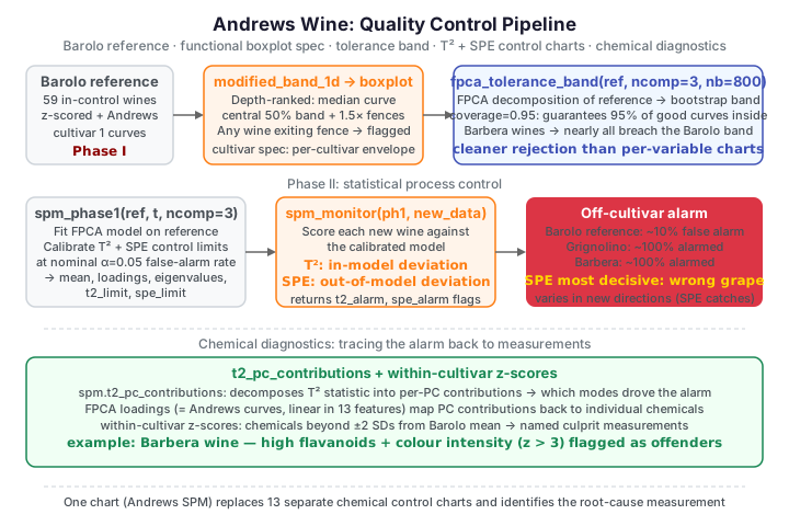
Quality control asks a different question from clustering: given a batch of wines
we know are good, would a new bottle raise a flag? Classical QC would need 13
separate control charts — one per chemical — with no way to judge whether the
combination of values is normal. Encoding each wine as a single Andrews curve
lets fdars monitor all 13 chemicals simultaneously. We build up the full
process-validation workflow: a functional boxplot as a cultivar
specification, functional depth as a typicality score, a robust center
that resists contamination, a tolerance band as a coverage region, an SPC
control chart on functional PCA scores, and chemical-level diagnostics that
trace a failure back to the offending measurements.
No andrews binding in fdars
The transform is the numpy helper from the intro page. We z-score the 13 columns first so no single feature dominates the curve. Note the standardization uses the whole data set's column statistics — a real deployment would fix them from the reference batch alone.
The functional boxplot: a cultivar specification
A functional boxplot summarises a bundle of curves the way an ordinary boxplot
summarises numbers. The median curve is the deepest (most central) wine by
functional depth; the dark band is the central 50% region spanned by the
deepest half of curves; the light band extends to fences at 1.5× the central
envelope. Any wine escaping the fence at any \(t\) is flagged. fdars has no
single boxplot binding, so we assemble it from fdars.depth.modified_band_1d
(modified band depth) — the same depth the R reference uses.
import numpy as np
from docs_fig import fig, render
from docs_data import load_wine
from fdars.depth import modified_band_1d

def andrews_curves(features, t):
    features = np.asarray(features, float)
    n, p = features.shape
    out = np.full((n, t.size), features[:, [0]] / np.sqrt(2.0))
    for j in range(1, p):
        harmonic = (j + 1) // 2
        term = np.sin if j % 2 == 1 else np.cos
        out = out + features[:, [j]] * term(harmonic * t)
    return out

def functional_boxplot(C):
    d = np.asarray(modified_band_1d(C, C))
    order = np.argsort(-d)                       # deepest first
    median = C[order[0]]
    central = C[order[:len(C) // 2]]             # deepest 50%
    env_lo, env_hi = central.min(0), central.max(0)
    iqr = env_hi - env_lo
    fence_lo, fence_hi = env_lo - 1.5 * iqr, env_hi + 1.5 * iqr
    out = np.array([(C[i] > fence_hi).any() or (C[i] < fence_lo).any()
                    for i in range(len(C))])
    return median, (env_lo, env_hi), (fence_lo, fence_hi), out

names, X, meta = load_wine()
cultivar = meta["cultivar"].to_numpy()
Xz = (X - X.mean(0)) / X.std(0)
t = np.linspace(-np.pi, np.pi, 160)
curves = andrews_curves(Xz, t)

median, (elo, ehi), (flo, fhi), out = functional_boxplot(curves)

f, ax = fig()
ax.fill_between(t, flo, fhi, color="#B0C4DE", alpha=0.5, label="fences (1.5×)")
ax.fill_between(t, elo, ehi, color="#4682B4", alpha=0.5, label="central 50%")
ax.plot(t, median, color="black", lw=2, label="median curve")
for i in np.where(out)[0]:
    ax.plot(t, curves[i], color="#dc3545", lw=0.8, alpha=0.7)
ax.set(title=f"Functional boxplot of all wines ({out.sum()} outside fences)",
       xlabel="t", ylabel=r"$f_x(t)$")
ax.legend(fontsize=8)
print(render(f))
The median traces the most typical wine, the shaded envelope shows where half of all wines live at every \(t\), and any red curve that pierces the fence is an automatic candidate for investigation — one chart covering all 13 chemicals at once.
Per-cultivar specifications
Pooling all three grapes makes the envelope wide. In practice each cultivar has its own specification, so we build a functional boxplot per cultivar; a narrower, cultivar-specific envelope is a tighter go/no-go gate.
import numpy as np
from docs_fig import fig, render
from docs_data import load_wine
from fdars.depth import modified_band_1d

def andrews_curves(features, t):
    features = np.asarray(features, float)
    n, p = features.shape
    out = np.full((n, t.size), features[:, [0]] / np.sqrt(2.0))
    for j in range(1, p):
        harmonic = (j + 1) // 2
        term = np.sin if j % 2 == 1 else np.cos
        out = out + features[:, [j]] * term(harmonic * t)
    return out

def fbox(C):
    d = np.asarray(modified_band_1d(C, C)); order = np.argsort(-d)
    central = C[order[:len(C) // 2]]
    return C[order[0]], central.min(0), central.max(0)

names, X, meta = load_wine()
cultivar = meta["cultivar"].to_numpy()
Xz = (X - X.mean(0)) / X.std(0)
t = np.linspace(-np.pi, np.pi, 160)
curves = andrews_curves(Xz, t)
palette = ["#8B0000", "#DAA520", "#2E8B57"]
labels = ["Barolo", "Grignolino", "Barbera"]

f, axes = fig(ncols=3, figsize=(10.5, 3.4))
for ax, cv, col, lab in zip(axes, (1, 2, 3), palette, labels):
    grp = curves[cultivar == cv]
    med, elo, ehi = fbox(grp)
    ax.fill_between(t, elo, ehi, color=col, alpha=0.3)
    ax.plot(t, med, color=col, lw=1.8)
    ax.set(title=f"{lab} (n = {grp.shape[0]})", xlabel="t")
axes[0].set_ylabel(r"$f_x(t)$")
print(render(f))
Each cultivar's envelope has a distinct shape and location — the boxplot itself is the cultivar's chemical fingerprint, and a new wine can be judged against the envelope of the grape it claims to be.
Depth as a typicality score
Functional depth gives every wine a scalar typicality score within its cultivar — high depth means central and representative, low depth means atypical. This has no clean classical equivalent: it accounts for all 13 chemicals at once without inverting a covariance matrix. We rank wines by depth within each cultivar and show the most and least typical.
import numpy as np
from docs_fig import fig, render
from docs_data import load_wine
from fdars.depth import modified_band_1d

def andrews_curves(features, t):
    features = np.asarray(features, float)
    n, p = features.shape
    out = np.full((n, t.size), features[:, [0]] / np.sqrt(2.0))
    for j in range(1, p):
        harmonic = (j + 1) // 2
        term = np.sin if j % 2 == 1 else np.cos
        out = out + features[:, [j]] * term(harmonic * t)
    return out

names, X, meta = load_wine()
cultivar = meta["cultivar"].to_numpy()
Xz = (X - X.mean(0)) / X.std(0)
t = np.linspace(-np.pi, np.pi, 160)
curves = andrews_curves(Xz, t)

grp = curves[cultivar == 2]                       # Grignolino
d = np.asarray(modified_band_1d(grp, grp))
order = np.argsort(-d)
deep, shallow = order[:3], order[-3:]

f, (aL, aR) = fig(ncols=2, figsize=(9.4, 3.7))
aL.plot(t, grp.T, color="#adb5bd", lw=0.4, alpha=0.4)
for i in deep:
    aL.plot(t, grp[i], color="#2E8B57", lw=1.6)
aL.set(title="3 most typical Grignolino (highest depth)",
       xlabel="t", ylabel=r"$f_x(t)$")
aR.plot(t, grp.T, color="#adb5bd", lw=0.4, alpha=0.4)
for i in shallow:
    aR.plot(t, grp[i], color="#dc3545", lw=1.6)
aR.set(title="3 least typical Grignolino (lowest depth)", xlabel="t")
print(render(f))
The deepest curves sit squarely in the middle of the bundle; the shallowest hug its edges. The depth score turns "which wines are unusual?" into a single sortable number — the front end of any monitoring workflow.
Robust location: trimmed mean vs ordinary mean
The ordinary mean curve is pulled toward outliers. A trimmed mean discards the shallowest (least typical) curves before averaging, giving a center that resists contamination — no need to first detect and manually remove outliers. We show this by removing the three shallowest Grignolino wines and measuring how far each estimator moves: the robust trimmed mean should barely budge.
import numpy as np
from docs_fig import fig, render
from docs_data import load_wine
from fdars.depth import modified_band_1d

def andrews_curves(features, t):
    features = np.asarray(features, float)
    n, p = features.shape
    out = np.full((n, t.size), features[:, [0]] / np.sqrt(2.0))
    for j in range(1, p):
        harmonic = (j + 1) // 2
        term = np.sin if j % 2 == 1 else np.cos
        out = out + features[:, [j]] * term(harmonic * t)
    return out

def trimmed_mean(C, trim=0.25):
    d = np.asarray(modified_band_1d(C, C))
    keep = np.argsort(-d)[:int(round((1 - trim) * len(C)))]
    return C[keep].mean(0)

names, X, meta = load_wine()
cultivar = meta["cultivar"].to_numpy()
Xz = (X - X.mean(0)) / X.std(0)
t = np.linspace(-np.pi, np.pi, 160)
curves = andrews_curves(Xz, t)

grp = curves[cultivar == 2]
d = np.asarray(modified_band_1d(grp, grp))
clean = np.delete(grp, np.argsort(d)[:3], axis=0)   # drop 3 shallowest

mean_full, trim_full = grp.mean(0), trimmed_mean(grp)
mean_clean, trim_clean = clean.mean(0), trimmed_mean(clean)
dt = t[1] - t[0]
mean_shift = np.sqrt(np.sum((mean_full - mean_clean) ** 2) * dt)
trim_shift = np.sqrt(np.sum((trim_full - trim_clean) ** 2) * dt)

f, ax = fig()
ax.plot(t, mean_full, color="#3f51b5", lw=1.6, label="mean (all wines)")
ax.plot(t, mean_clean, color="#3f51b5", lw=1.6, ls="--",
        label="mean (outliers removed)")
ax.plot(t, trim_full, color="#e8710a", lw=1.8, label="25% trimmed mean")
ax.set(title=f"Trimmed mean shifts {trim_shift:.2f} vs mean {mean_shift:.2f} "
             f"when 3 wines are dropped",
       xlabel="t", ylabel=r"$\bar f(t)$")
ax.legend(fontsize=8)
print(render(f))
Removing three atypical wines moves the ordinary mean noticeably (dashed vs solid blue), but the trimmed mean — which never let those wines into the average in the first place — is far more stable. Robustness comes for free, without a separate outlier-removal step.
A tolerance band from functional PCA
A tolerance band is a coverage region: fpca_tolerance_band builds a band that,
with confidence, covers a target fraction (coverage) of curves from the same
process. It decomposes the reference curves into ncomp functional principal
components and bootstraps the band width. Unlike a prediction interval (which
covers the next single curve), a tolerance interval guarantees a fixed fraction
of the whole population — the right notion for a QC specification. We treat
cultivar 1 as the in-control reference and test cultivar 3 against it.
import numpy as np
from docs_fig import fig, render
from docs_data import load_wine
from fdars.tolerance import fpca_tolerance_band

def andrews_curves(features, t):
    features = np.asarray(features, float)
    n, p = features.shape
    out = np.full((n, t.size), features[:, [0]] / np.sqrt(2.0))
    for j in range(1, p):
        harmonic = (j + 1) // 2
        term = np.sin if j % 2 == 1 else np.cos
        out = out + features[:, [j]] * term(harmonic * t)
    return out

names, X, meta = load_wine()
cultivar = meta["cultivar"].to_numpy()
Xz = (X - X.mean(0)) / X.std(0)
t = np.linspace(-np.pi, np.pi, 160)
curves = andrews_curves(Xz, t)

ref = curves[cultivar == 1]                  # Barolo reference
test = curves[cultivar == 3]                 # Barbera = off-spec

band = fpca_tolerance_band(ref, ncomp=3, nb=800, coverage=0.95)
lo, hi = np.asarray(band["lower"]), np.asarray(band["upper"])

def breaches(C):
    return np.mean([(C[i] > hi).any() or (C[i] < lo).any() for i in range(len(C))])

f, ax = fig()
ax.fill_between(t, lo, hi, color="#3f51b5", alpha=0.18,
                label="95% tolerance band (Barolo)")
ax.plot(t, np.asarray(band["center"]), color="#0d1b52", lw=1.6)
for i in range(test.shape[0]):
    ax.plot(t, test[i], color="#dc3545", lw=0.7, alpha=0.5)
ax.set(title=f"Barbera wines vs Barolo band "
             f"({breaches(test)*100:.0f}% breach)",
       xlabel="t", ylabel=r"$f_x(t)$")
ax.legend()
print(render(f))
The band covers most of the reference wines (close to its 95% target), but nearly every off-cultivar wine leaves it — their curves sit visibly outside the reference band. As a go/no-go gate, the tolerance band cleanly rejects the wrong grape.
Statistical process control: \(T^2\) and SPE charts
A tolerance band flags pointwise excursions; SPC instead reduces each curve to a few functional-PCA scores \(\xi_1, \dots, \xi_A\) and monitors two summary statistics:
- Hotelling \(T^2\) — how far the in-model scores are from the reference centre (a deviation within the principal-component subspace), the sum of squared scores standardized by their reference variances \(\lambda_a\):
- SPE (squared prediction error, or \(Q\)) — how much of the curve lies outside that subspace (a new kind of variation the reference never showed), the residual energy after projecting onto the retained eigenfunctions \(\phi_a\):
spm_phase1 calibrates the model and both control limits on the reference batch;
spm_monitor then scores new wines against those fixed limits.
import numpy as np
from docs_fig import fig, render
from docs_data import load_wine
from fdars.spm import spm_phase1, spm_monitor

def andrews_curves(features, t):
    features = np.asarray(features, float)
    n, p = features.shape
    out = np.full((n, t.size), features[:, [0]] / np.sqrt(2.0))
    for j in range(1, p):
        harmonic = (j + 1) // 2
        term = np.sin if j % 2 == 1 else np.cos
        out = out + features[:, [j]] * term(harmonic * t)
    return out

names, X, meta = load_wine()
cultivar = meta["cultivar"].to_numpy()
Xz = (X - X.mean(0)) / X.std(0)
t = np.linspace(-np.pi, np.pi, 160)
curves = andrews_curves(Xz, t)

ref = curves[cultivar == 1]
new = curves[cultivar == 3]

ph1 = spm_phase1(ref, t, ncomp=3, alpha=0.05)
mon = spm_monitor(ph1["mean"], ph1["loadings"], ph1["weights"],
                  ph1["eigenvalues"], ph1["t2_limit"], ph1["spe_limit"],
                  new, t)

t2_ref, spe_ref = np.asarray(ph1["t2"]), np.asarray(ph1["spe"])
t2_new, spe_new = np.asarray(mon["t2"]), np.asarray(mon["spe"])
t2_lim, spe_lim = ph1["t2_limit"], ph1["spe_limit"]

f, (axT, axS) = fig(ncols=2, figsize=(9.4, 3.6))
n_ref = t2_ref.size
xr = np.arange(n_ref)
xn = np.arange(n_ref, n_ref + t2_new.size)
for ax, ref_s, new_s, lim, name in [
        (axT, t2_ref, t2_new, t2_lim, "Hotelling $T^2$"),
        (axS, spe_ref, spe_new, spe_lim, "SPE (Q)")]:
    ax.scatter(xr, ref_s, color="#3f51b5", s=16, label="reference (Barolo)")
    ax.scatter(xn, new_s, color="#dc3545", s=16, label="monitored (Barbera)")
    ax.axhline(lim, color="#6c757d", ls="--", lw=1.2, label="control limit")
    ax.axvline(n_ref - 0.5, color="#adb5bd", ls=":", lw=1)
    ax.set(title=name, xlabel="wine index", ylabel="statistic")
axT.legend(fontsize=7)
print(render(f))
To the left of the dotted divider are the reference wines, mostly under both limits (a few cross, consistent with the nominal 5% false-alarm rate). To the right, the off-cultivar wines: every one exceeds the SPE limit and most exceed \(T^2\). SPE is the more decisive alarm here — the wrong grape varies in directions the reference model has no component for, which is exactly what SPE catches.
How many wines are caught?
import numpy as np
from docs_fig import fig, render
from docs_data import load_wine
from fdars.spm import spm_phase1, spm_monitor

def andrews_curves(features, t):
    features = np.asarray(features, float)
    n, p = features.shape
    out = np.full((n, t.size), features[:, [0]] / np.sqrt(2.0))
    for j in range(1, p):
        harmonic = (j + 1) // 2
        term = np.sin if j % 2 == 1 else np.cos
        out = out + features[:, [j]] * term(harmonic * t)
    return out

names, X, meta = load_wine()
cultivar = meta["cultivar"].to_numpy()
Xz = (X - X.mean(0)) / X.std(0)
t = np.linspace(-np.pi, np.pi, 160)
curves = andrews_curves(Xz, t)

ref = curves[cultivar == 1]
ph1 = spm_phase1(ref, t, ncomp=3, alpha=0.05)

def alarm_rate(batch):
    mon = spm_monitor(ph1["mean"], ph1["loadings"], ph1["weights"],
                      ph1["eigenvalues"], ph1["t2_limit"], ph1["spe_limit"],
                      batch, t)
    return float((np.asarray(mon["t2_alarm"]) |
                  np.asarray(mon["spe_alarm"])).mean())

self_rate = float(((np.asarray(ph1["t2"]) > ph1["t2_limit"]) |
                   (np.asarray(ph1["spe"]) > ph1["spe_limit"])).mean())
rates = {"Barolo\n(reference)": self_rate,
         "Grignolino": alarm_rate(curves[cultivar == 2]),
         "Barbera": alarm_rate(curves[cultivar == 3])}

f, ax = fig()
bars = ax.bar(list(rates), [100 * v for v in rates.values()],
              color=["#8B0000", "#DAA520", "#2E8B57"])
ax.axhline(5, color="#dc3545", ls="--", lw=1.2, label="nominal 5% false alarm")
for b, v in zip(bars, rates.values()):
    ax.text(b.get_x() + b.get_width() / 2, 100 * v + 1.5,
            f"{100*v:.0f}%", ha="center", fontsize=9)
ax.set(title="Out-of-spec alarm rate vs the Barolo monitor",
       ylabel="% wines alarmed", ylim=(0, 108))
ax.legend()
print(render(f))
The monitor built on Barolo alarms on only a handful of its own reference wines (about 10%, roughly twice the nominal 5% — unsurprising with only 59 reference curves and combined \(T^2\)/SPE limits) but on essentially all Grignolino and Barbera wines. As a QC gate for "is this the wine we meant to make?", the Andrews-curve control chart is decisive.
Chemical-level diagnostics: why did a wine fail?
An alarm is only actionable if it points to a cause. Because each Andrews curve is linear in the 13 standardized chemicals, we can trace a failing wine back to the measurements that put it out of spec: compute its z-score on each chemical relative to the reference cultivar's mean and SD, and flag those beyond ±2. We diagnose a Barbera wine against the Barolo reference.
import numpy as np
from docs_fig import fig, render
from docs_data import load_wine

names, X, meta = load_wine()
cultivar = meta["cultivar"].to_numpy()
Xz = (X - X.mean(0)) / X.std(0)

ref = Xz[cultivar == 1]                       # Barolo reference (standardized)
ref_mean, ref_sd = ref.mean(0), ref.std(0)
# pick the Barbera wine most atypical vs Barolo
barbera = np.where(cultivar == 3)[0]
z_all = (Xz[barbera] - ref_mean) / ref_sd
suspect = barbera[np.argmax(np.abs(z_all).max(1))]
z = (Xz[suspect] - ref_mean) / ref_sd
order = np.argsort(np.abs(z))
colors = ["#dc3545" if abs(v) > 2 else "#e8710a" if abs(v) > 1 else "#2E8B57"
          for v in z[order]]

f, ax = fig(figsize=(6.6, 4.6))
ax.barh([names[j] for j in order], z[order], color=colors)
for x in (-2, 2):
    ax.axvline(x, color="#dc3545", ls="--", lw=1)
for x in (-1, 1):
    ax.axvline(x, color="#e8710a", ls=":", lw=1)
ax.set(title=f"Wine {suspect} (Barbera) vs Barolo spec",
       xlabel="z-score (SDs from Barolo mean)")
print(render(f))
The bar chart names the culprits directly: the chemicals whose bars cross the ±2 lines are why the SPC monitor flagged this wine. Red bars are out of spec, orange borderline, green within Barolo's normal range — turning a single functional alarm into a specific, checkable list of measurements.
Parameters
| Function | Key parameters | Description |
|---|---|---|
modified_band_1d(data, ref_data) |
— | Modified band depth used for the boxplot / trimmed mean |
fpca_tolerance_band(data, ncomp, nb, coverage) |
coverage |
Target fraction of good curves inside the band |
spm_phase1(data, argvals, ncomp, alpha) |
alpha, ncomp |
Calibrate model + \(T^2\)/SPE limits on the reference |
spm_monitor(mean, loadings, weights, eigenvalues, t2_limit, spe_limit, new_data, argvals) |
— | Score new curves; returns t2, spe, t2_alarm, spe_alarm |
Diagnosing why a wine alarmed, from the model
Besides the raw z-scores above, fdars.spm.t2_pc_contributions decomposes a
\(T^2\) statistic into its principal-component contributions; combined with the
FPCA loadings (which are themselves Andrews curves, hence linear in the 13
features) this points back to the offending chemistry directly from the
monitor.
See also
- Andrews Wine intro — the transform and class structure.
- Andrews Wine: clustering — the unsupervised view.
- Outlier detection — depth and outliergram, an unsupervised counterpart to this supervised QC view.
- Tolerance bands and statistical process monitoring for the general monitoring tools.
References
- Andrews, D.F. (1972). Plots of high-dimensional data. Biometrics 28(1):125-136.
- Sun, Y., Genton, M.G. (2011). Functional boxplots. JCGS 20(2):316-334.
- Colosimo, B.M., Pacella, M. (2010). A comparison study of control charts for statistical monitoring of functional data. Quality and Reliability Engineering International 26(4):327-342.