Biopharmaceutical Batch Monitoring: Penicillin Fermentation
Dataset: Penicillin — 46 fed-batch fermentation runs, each a penicillin
concentration trajectory sampled at 200 time points over a 400-hour cultivation.
Every batch carries a status label, normal (40 batches) or faulty (6).
Synthetic, single-variable dataset
This penicillin dataset is synthetic — deterministic, seeded logistic trajectories that mimic a fed-batch fermentation, not measured data. It is included so the monitoring workflow runs end-to-end on labelled normal/faulty batches. The R reference uses the real, multivariate IndPenSim data (temperature, dissolved O₂, sugar feed, pH, …); our loader carries only the penicillin trajectory, so this page mirrors the R page's monitoring and yield-prediction structure but omits its multivariate variable-screening / yield-driver sections, which have no faithful analogue here (see the note at the end). Treat the numbers as illustrative.
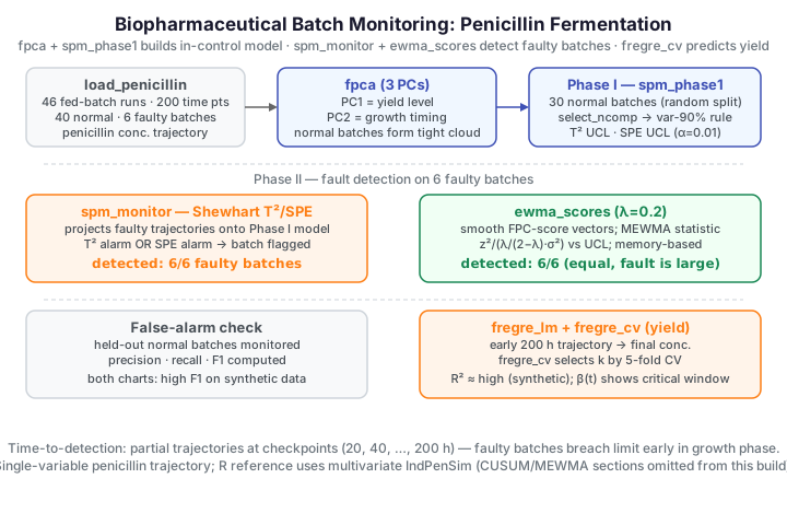
In biopharmaceutical manufacturing a batch that goes wrong is expensive: raw materials, reactor time, and often a whole downstream campaign are lost. The goal of batch monitoring is to notice a deviating batch while it is still running. Each batch is a whole trajectory, so this is a functional process-monitoring problem: learn the in-control trajectory distribution from known-good batches (Phase I), then track every batch against that model (Phase II).
Batch trajectory exploration
import numpy as np
from docs_fig import fig, render
from docs_data import load_penicillin

t, X, meta = load_penicillin()
status = meta["status"].to_numpy()
normal, faulty = status == "normal", status == "faulty"

f, ax = fig()
ax.plot(t, X[normal].T, color="#3f51b5", lw=0.7, alpha=0.4)
ax.plot(t, X[faulty].T, color="#dc3545", lw=1.4, alpha=0.9)
ax.plot(t, X[normal].mean(0), color="black", lw=1.6, label="normal mean")
ax.plot([], [], color="#3f51b5", label="normal batches")
ax.plot([], [], color="#dc3545", label="faulty batches")
ax.set(title="Penicillin fermentation trajectories (synthetic)",
       xlabel="time (h)", ylabel="concentration (g/L)")
ax.legend(loc="lower right")
print(render(f))
The normal batches (indigo) rise to a plateau near 1.4 g/L; the faulty batches (red) grow more slowly and level off well below the healthy band. The separation is clear by eye at the end — the question is how early, and how automatically, a control chart can flag it.
FPCA: modes of batch variation
Functional PCA characterises how batches vary around their mean.
fdars.regression.fpca returns the mean trajectory, the principal-component
functions (rotation), and the per-batch scores. Plotting the first two scores
shows where each batch sits in the dominant modes of variation.
import numpy as np
from docs_fig import fig, render, plt
from docs_data import load_penicillin
from fdars.regression import fpca
from fdars.spm import spm_phase1, select_ncomp

t, X, meta = load_penicillin()
t = np.ascontiguousarray(t)
status = meta["status"].to_numpy()
normal = status == "normal"
Xn = np.ascontiguousarray(X[normal])

eig = np.asarray(spm_phase1(Xn, t, ncomp=8, alpha=0.01)["eigenvalues"])
cum = np.cumsum(eig) / eig.sum()
ncomp = int(select_ncomp(np.ascontiguousarray(eig),
                         method="cumulative_variance", threshold=0.90))
pc = fpca(Xn, t, n_comp=3)
scores = np.asarray(pc["scores"])

f, (a1, a2) = plt.subplots(1, 2, figsize=(9.2, 3.8))
pcs = np.arange(1, len(eig) + 1)
a1.plot(pcs, cum, "o-", color="#3f51b5")
a1.axhline(0.90, color="#e8710a", ls="--")
a1.axvline(ncomp + 0.5, color="#e8710a", ls="--", alpha=0.5)
a1.set(title=f"Cumulative variance (picks {ncomp} PCs)", xlabel="component",
       ylabel="variance explained", ylim=(0, 1.02))
a2.scatter(scores[:, 0], scores[:, 1], s=40, color="#3f51b5",
           alpha=0.8, edgecolor="white")
a2.set(title="FPC score plot (normal batches)",
       xlabel="FPC 1 (yield level)", ylabel="FPC 2 (growth timing)")
print(render(f))
A couple of components capture almost all the between-batch variation: PC1 tracks the overall yield level and PC2 the timing of the growth phase. Concentrating the variation in a low-dimensional subspace is exactly what makes the FPCA control chart below both sensitive and interpretable.
Phase I — the in-control model
We fit the FPCA control model on 30 randomly chosen normal batches with
spm_phase1 (component count from the variance-90 % rule, \(\alpha = 0.01\)),
holding out the remaining normal batches to check false-alarm behaviour. Each
batch trajectory \(x(t)\) is reduced to \(A\) functional-PCA scores \(\xi_a\), and two
statistics with \(\alpha\)-level control limits summarize it — Hotelling's \(T^2\)
inside the model subspace and the squared prediction error outside it:
where \(\lambda_a\) and \(\phi_a\) are the reference eigenvalues and eigenfunctions. The Phase I model gives a mean trajectory and a control envelope.
T2 limit : 9.210 SPE limit: 0.1191
The faulty batches leave the ±2σ envelope in the growth phase and never rejoin it — a functional deviation the control chart is built to quantify.
Fault detection — monitoring the faulty batches
With the Phase I model fixed, we monitor the faulty batches with two charts: the
Shewhart \(T^2\)/SPE chart (spm_monitor) and an EWMA chart on the FPC
scores (ewma_scores). The EWMA smooths the score vector \(\xi_i\) across the
batch sequence,
so the monitored MEWMA statistic \(z_i^\top \bigl(\tfrac{\lambda}{2-\lambda}\Sigma_\xi\bigr)^{-1} z_i\) carries the variance factor \(\lambda/(2-\lambda)\). A batch is out-of-control if a statistic crosses its limit.
Shewhart detected: 6/6 | EWMA detected: 6/6
On these synthetic batches the deviation is strong enough that both charts catch all six faulty batches on the full trajectory. (The R reference, on its harder real-data faults, finds single-variable penicillin monitoring misses them — a reminder that detectability depends entirely on how strongly the fault manifests in the monitored signal, and that multivariate monitoring is sometimes essential.)
False-positive check, precision, recall, F1
Detection rate (recall) alone is incomplete: a chart that flags everything scores 100 % recall but is useless. We estimate false positives on the held-out normal batches, then combine with the fault detections into precision, recall, and F1.
held-out normal false alarms — Shewhart: 0/10, EWMA: 0/10
Both charts reach high recall (all faults caught) with few false alarms on the held-out normal batches, so precision and F1 stay high. On harder faults the picture would be more nuanced — precision and recall would diverge and F1 would locate the smallest reliably-detectable fault, as in the inline-monitoring study.
When does a batch breach the limit?
Whole-batch monitoring only tells us after the run finishes. The manufacturing value is in catching a fault sooner. We monitor partial trajectories: at a sequence of checkpoints we refit the Phase I model on the same window of the normal batches and monitor each batch up to that point. The first checkpoint at which a batch alarms is its time-to-detection.
faulty first-alarm times (h): [38, 38, 38, 38, 38, 38] held-out normal batches ever flagged: 2/10
The faulty batches breach the limit early in the growth phase — roughly a tenth of the way through a 400-hour run, long before the trajectories visibly separate at the plateau. A couple of held-out normal batches trip a transient early flag when the window is very short and the model is estimated from few points; in practice one would require a run of consecutive alarms (see the run rules) before stopping a batch.
Yield prediction from early process data
Beyond raising alarms, we can predict the final penicillin concentration from
the early part of the trajectory (first 200 h) — useful for screening and
early intervention. fdars.regression.fregre_lm fits a scalar-on-function
(principal-component) regression, and fregre_cv picks the component count by
cross-validation.
R² climbs as components are added — more of the yield-relevant variation in the
early trajectory is captured — and the CV-selected model tracks the final
concentration closely. On this synthetic data the relationship is nearly
deterministic, so R² is very high; on the real IndPenSim data the R page reports
a more realistic R² ≈ 0.49, still useful for early screening but far from exact.
The beta_t coefficient function returned by fregre_lm shows which time
windows of the early trajectory carry the most predictive weight — the critical
control windows.
Refitting the window vs. a landmark-registered model
The time-to-detection section refits Phase I at each checkpoint so the model always matches the observed window length. An alternative is to register batches to a common phase (e.g. by a maturity index) and monitor against a single model — see Profile and Partial-Domain Monitoring.
Binding / dataset gaps vs. the R reference
The R vignette runs on the multivariate IndPenSim data and includes a
variable-screening / yield-driver analysis across temperature, dissolved O₂,
sugar feed, pH, and aeration, plus CUSUM and MEWMA charts. Our
synthetic loader carries only the single penicillin trajectory, and this
build has no CUSUM or packaged MEWMA binding — so those sections are omitted
rather than faked, and the second monitoring chart here is an EWMA assembled
transparently from ewma_scores.
Parameters
| Function | Key parameters | Description |
|---|---|---|
fpca(data, argvals, n_comp) |
n_comp |
Modes of batch variation; returns scores, rotation, mean |
spm_phase1(data, argvals, ncomp, alpha) |
ncomp, alpha |
Fit the in-control FPCA model and control limits |
select_ncomp(eigenvalues, method, threshold) |
method, threshold |
Choose the number of components |
spm_monitor(mean, loadings, weights, eigenvalues, t2_limit, spe_limit, new_data, argvals) |
new_data |
Project and flag batches |
ewma_scores(scores, lambda_) |
lambda_ |
Smooth FPC-score vectors for an EWMA chart |
fregre_lm(data, response, n_comp) |
n_comp |
Scalar-on-function (PCR) regression; returns r_squared, beta_t |
fregre_cv(data, response, k_min, k_max, n_folds) |
k_max, n_folds |
Cross-validate the component count |
See also
- Statistical Process Monitoring — the two-phase workflow and the \(T^2\) / SPE statistics.
- Advanced Statistical Process Monitoring — EWMA charts for slow drifts, run rules, and ARL analysis.
- Inline Quality Monitoring — detection power and false-alarm trade-offs, with precision/recall/F1 over fault severity.
References
- Birol, G., Undey, C., Cinar, A. (2002). A modular simulation package for fed-batch fermentation: penicillin production. Computers & Chemical Engineering 26(11):1553-1565.
- Nomikos, P., MacGregor, J.F. (1995). Multivariate SPC charts for monitoring batch processes. Technometrics 37(1):41-59.
- Colosimo, B.M., Pacella, M. (2010). A comparison study of control charts for functional data. Quality and Reliability Engineering International 26(4):327-342.