Canadian Weather: Regional Climate Patterns
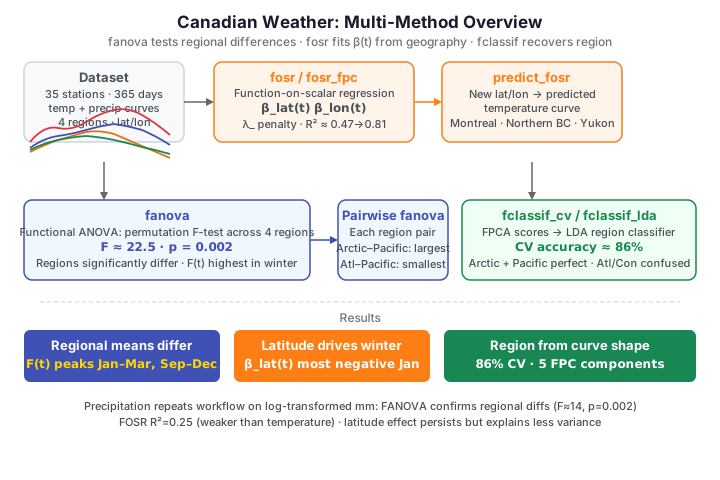
Dataset: Canadian Weather — daily mean temperature (°C) and precipitation (mm) over a 365-day year for 35 weather stations, each tagged with its climatic region: Arctic (3 stations), Atlantic (15), Continental (12), and Pacific (5), plus its latitude and longitude.
A climate analyst asks two linked questions. First, do the regions genuinely
differ in their seasonal temperature and precipitation, or could the spread be
chance? That is a hypothesis test on whole curves — functional ANOVA.
Second, which geographic variables drive the seasonal pattern? Latitude and
longitude are scalars; the response is a curve, so this is function-on-scalar
regression (FOSR). We answer both with fdars, then close by predicting the
temperature curve of a station that does not exist and classifying region from
shape alone.
Temperature curves by region
import numpy as np
from docs_fig import fig, render
from docs_data import load_canadian_weather

day, X, meta = load_canadian_weather("temperature")

region = meta["region"].to_numpy()
colors = {"Atlantic": "#3f51b5", "Continental": "#e8710a",
          "Pacific": "#198754", "Arctic": "#dc3545"}

f, ax = fig()
for r, c in colors.items():
    ax.plot(day, X[region == r].T, color=c, lw=1, alpha=0.55)
for r, c in colors.items():
    ax.plot([], [], color=c, label=r)
ax.set(title="Daily mean temperature, 35 Canadian stations",
       xlabel="day of year", ylabel="temperature (°C)")
ax.legend(ncol=2)
print(render(f))
Every station shows the same summer-peaked annual cycle, but they differ in level (Arctic stations sit far below Pacific ones) and in amplitude (coastal Pacific stations are mild year-round; Continental ones swing hard between summer and winter). The regional separation is largest in winter — keep that in mind, because the analyses below quantify it.
Functional ANOVA: do the regions differ?
fanova tests the null hypothesis that all four regions share one mean
temperature curve. It computes a pointwise F-statistic — at each day \(t\), the
ratio of between-region to within-region variance,
with \(\bar Y_g\) the region-\(g\) mean curve and \(\bar Y\) the grand mean — aggregates
it to a global statistic, and calibrates a p-value by permutation —
reshuffling the region labels n_perm times and asking how often the shuffled
data produce as extreme a statistic. The group codes are integer-encoded region
labels.
import numpy as np
from docs_fig import fig, render
from docs_data import load_canadian_weather
from fdars.regression import fanova

day, X, meta = load_canadian_weather("temperature")
X = np.ascontiguousarray(X, dtype=np.float64)
region = meta["region"].to_numpy()
classes = sorted(set(region))
grp = np.array([classes.index(r) for r in region], dtype=np.int64)

res = fanova(X, grp, n_perm=500)
means = np.asarray(res["group_means"])          # (4, 365)
fstat = np.asarray(res["f_statistic_t"])        # pointwise F(t)

colors = {"Atlantic": "#3f51b5", "Continental": "#e8710a",
          "Pacific": "#198754", "Arctic": "#dc3545"}
f, (a1, a2) = fig(nrows=2, figsize=(7.5, 5.6), sharex=True,
                  gridspec_kw={"height_ratios": [2, 1]})
for k, cls in enumerate(classes):
    a1.plot(day, means[k], color=colors[cls], lw=2.2, label=cls)
a1.set(ylabel="mean temp (°C)",
       title=f"FANOVA: regional mean curves "
             f"(F={res['global_statistic']:.1f}, p={res['p_value']:.3f})")
a1.legend(ncol=2)
a2.plot(day, fstat, color="#6f42c1", lw=1.6)
a2.fill_between(day, 0, fstat, color="#6f42c1", alpha=0.15)
a2.set(xlabel="day of year", ylabel="pointwise F(t)")
print(render(f))
The global F-statistic is about 22.5 with a permutation p-value of 0.002: the regions are separated far beyond chance. The pointwise \(F(t)\) panel shows where — it towers in the winter months (days 1–90 and 275–365) and dips in summer, confirming visually that regions diverge most when it is cold and converge when it is warm.
Which pairs of regions differ?
A significant global test does not say which regions differ. Running fanova
on each pair localises the contrasts.
import numpy as np, itertools
from docs_fig import fig, render
from docs_data import load_canadian_weather
from fdars.regression import fanova

day, X, meta = load_canadian_weather("temperature")
X = np.ascontiguousarray(X, dtype=np.float64)
region = meta["region"].to_numpy()
classes = sorted(set(region))
grp = np.array([classes.index(r) for r in region], dtype=np.int64)

labels, fstats = [], []
for a, b in itertools.combinations(range(4), 2):
    m = (grp == a) | (grp == b)
    g2 = (grp[m] == b).astype(np.int64)
    r = fanova(np.ascontiguousarray(X[m]), g2, n_perm=500)
    labels.append(f"{classes[a][:4]}–{classes[b][:4]}")
    fstats.append(r["global_statistic"])

order = np.argsort(fstats)
f, ax = fig(figsize=(6.4, 4.0))
ax.barh(range(len(labels)), np.array(fstats)[order], color="#3f51b5")
ax.set_yticks(range(len(labels)))
ax.set_yticklabels([labels[i] for i in order])
ax.set(title="Pairwise FANOVA F-statistics", xlabel="global F")
print(render(f))
The largest contrasts are Arctic vs Pacific and Arctic vs Atlantic — the climatic extremes — with F-statistics above 50. The smallest is Atlantic vs Pacific (both maritime, both mild). Every pair is significant, but the ordering recovers the intuitive geography: the further apart two regions sit on the warmth–continentality spectrum, the larger their curves diverge.
FOSR: temperature ~ latitude + longitude
Functional ANOVA treats region as a category. fosr goes further and regresses
the whole temperature curve on continuous predictors — here latitude and
longitude — fitting a coefficient function \(\beta_j(t)\) for each. The model is
so \(\beta_{\text{lat}}(t)\) reads as "°C of temperature change per degree of
latitude, on day \(t\)." The lambda_ argument penalises roughness in the
coefficient curves.
import numpy as np
from docs_fig import fig, render
from docs_data import load_canadian_weather
from fdars.regression import fosr

day, X, meta = load_canadian_weather("temperature")
X = np.ascontiguousarray(X, dtype=np.float64)
lat = meta["lat"].to_numpy()
lon = meta["lon"].to_numpy()
predictors = np.column_stack([lat, lon])

fo = fosr(X, predictors, lambda_=1.0)
beta = np.asarray(fo["beta"])                    # (2, 365): lat, lon

f, ax = fig()
ax.axhline(0, color="#6c757d", lw=0.8)
ax.plot(day, beta[0], color="#3f51b5", lw=2, label=r"$\beta_{\rm lat}(t)$")
ax.plot(day, beta[1], color="#e8710a", lw=2, label=r"$\beta_{\rm lon}(t)$")
ax.set(title=f"FOSR coefficient functions ($R^2$={fo['r_squared']:.3f})",
       xlabel="day of year", ylabel="°C per unit predictor")
ax.legend()
print(render(f))
The model explains about 47% of the curve-to-curve variation. The latitude coefficient is negative all year — higher latitude means colder — and it is most negative in winter, exactly where the regional means fan out. The longitude coefficient is subtler: western stations run slightly warmer in winter (the Pacific's maritime moderation) and the effect flattens in summer. Latitude is by far the stronger driver of seasonal temperature.
FPC-based FOSR: a tighter fit
Penalised FOSR works pointwise; fosr_fpc first projects the response curves
onto their leading functional principal components, regresses in that
low-dimensional space, and maps back. Because it borrows strength across the
whole domain, it fits considerably better.
import numpy as np
from docs_fig import fig, render
from docs_data import load_canadian_weather
from fdars.regression import fosr, fosr_fpc

day, X, meta = load_canadian_weather("temperature")
X = np.ascontiguousarray(X, dtype=np.float64)
predictors = np.column_stack([meta["lat"].to_numpy(), meta["lon"].to_numpy()])

r2_pw = fosr(X, predictors, lambda_=1.0)["r_squared"]
fpc = fosr_fpc(X, predictors, n_comp=5)
r2_fpc_t = np.asarray(fpc["r_squared_t"])        # pointwise R^2(t)

f, ax = fig()
ax.plot(day, r2_fpc_t, color="#198754", lw=2,
        label=f"FPC-FOSR, 5 comp ($R^2$={fpc['r_squared']:.3f})")
ax.axhline(r2_pw, color="#3f51b5", ls="--", lw=1.4,
           label=f"penalised FOSR ($R^2$={r2_pw:.3f})")
ax.set(title="Variance explained by geography, across the year",
       xlabel="day of year", ylabel=r"$R^2(t)$", ylim=(0, 1))
ax.legend()
print(render(f))
The FPC model lifts the overall \(R^2\) from 0.47 to about 0.81. The pointwise \(R^2(t)\) curve shows geography explains almost all the variation in winter (latitude nearly determines how cold January is) and less in summer, when even Arctic stations warm up and the stations converge.
Predicting an unobserved station
Because FOSR is a genuine regression, predict_fosr returns a full temperature
curve for any latitude/longitude — including coordinates no station occupies.
import numpy as np
from docs_fig import fig, render
from docs_data import load_canadian_weather
from fdars.regression import predict_fosr

day, X, meta = load_canadian_weather("temperature")
X = np.ascontiguousarray(X, dtype=np.float64)
predictors = np.column_stack([meta["lat"].to_numpy(), meta["lon"].to_numpy()])

new_locs = np.array([[45., -75.],    # Montreal-like (Continental)
                     [55., -120.],   # Northern BC
                     [65., -135.]])  # Yukon (Arctic)
names = ["45°N, 75°W (Montreal-like)", "55°N, 120°W (Northern BC)",
         "65°N, 135°W (Yukon)"]
pred = np.asarray(predict_fosr(X, predictors, new_locs, lambda_=1.0))  # (3, 365)

f, ax = fig()
for row, name, c in zip(pred, names, ["#3f51b5", "#e8710a", "#dc3545"]):
    ax.plot(day, row, color=c, lw=2, label=name)
ax.set(title="Predicted temperature curves at hypothetical locations",
       xlabel="day of year", ylabel="temperature (°C)")
ax.legend(fontsize=8)
print(render(f))
The three predicted curves order by latitude in winter exactly as physical intuition demands: the Montreal-like station stays mildest through the cold months while the Yukon coordinate plunges to the deepest winter trough. The summer ranking, though, is not a simple warmest→coldest-by-latitude ordering — at the July peak the curves nearly converge, and the higher-latitude coordinates actually edge above the Montreal-like one (the shorter, more continental northern summer warms hard and briefly). What latitude really controls is the amplitude: the further north, the deeper the winter trough and the larger the annual swing, while the summer peak barely moves. All three share the summer-peaked shape the coefficient functions encode, so FOSR has effectively learned a map from geography to seasonal climate — one dominated by winter, not summer, contrasts.
Precipitation: same tools, weaker geography
Repeating the workflow on precipitation (log₁₀ mm, to match the multiplicative nature of rainfall) tests whether geography drives how much it rains as cleanly as it drives temperature.
import numpy as np
from docs_fig import fig, render
from docs_data import load_canadian_weather
from fdars.regression import fanova, fosr

day, Xp, meta = load_canadian_weather("precipitation")
Xp = np.ascontiguousarray(np.log10(np.maximum(Xp, 0.05)), dtype=np.float64)
region = meta["region"].to_numpy()
classes = sorted(set(region))
grp = np.array([classes.index(r) for r in region], dtype=np.int64)
predictors = np.column_stack([meta["lat"].to_numpy(), meta["lon"].to_numpy()])

fa = fanova(Xp, grp, n_perm=500)
means = np.asarray(fa["group_means"])
fo = fosr(Xp, predictors, lambda_=1.0)

colors = {"Atlantic": "#3f51b5", "Continental": "#e8710a",
          "Pacific": "#198754", "Arctic": "#dc3545"}
f, ax = fig()
for k, cls in enumerate(classes):
    ax.plot(day, means[k], color=colors[cls], lw=2.2, label=cls)
ax.set(title=f"Regional mean precipitation "
             f"(FANOVA F={fa['global_statistic']:.1f}, "
             f"FOSR $R^2$={fo['r_squared']:.3f})",
       xlabel="day of year", ylabel="log₁₀ precipitation (mm)")
ax.legend(ncol=2)
print(render(f))
Precipitation regions differ significantly too (FANOVA F ≈ 14, p ≈ 0.002). The Atlantic curve sits highest — wettest year-round — while the Pacific curve is the one with a distinct seasonal shape: it is the only region that is clearly wetter in winter than in summer, the maritime wet-winter/dry-summer signature. The regional gaps here are modest, though, and geography explains far less of precipitation than of temperature: the FOSR \(R^2\) is only about 0.25 versus 0.47. Rainfall is governed by local terrain and storm tracks that latitude and longitude capture poorly — a genuine scientific finding, not a modelling artefact.
Classifying region from the temperature curve
Finally, can we recover a station's region from its temperature curve alone?
fclassif_cv runs cross-validated functional LDA — projecting each curve onto
FPCA scores, then discriminating — and reports an honest out-of-fold error rate.
import numpy as np
from docs_fig import fig, render
from docs_data import load_canadian_weather
from fdars.classification import fclassif_cv, fclassif_lda

day, X, meta = load_canadian_weather("temperature")
X = np.ascontiguousarray(X, dtype=np.float64)
day = np.ascontiguousarray(day, dtype=np.float64)
region = meta["region"].to_numpy()
classes = sorted(set(region))
grp = np.array([classes.index(r) for r in region], dtype=np.int64)

cv = fclassif_cv(X, day, grp, method="lda", nfold=5)
acc_cv = 1.0 - float(cv["error_rate"])

# full-data confusion matrix
pred = np.asarray(fclassif_lda(X, grp, ncomp=int(cv["best_ncomp"]))["predicted"])
K = len(classes)
cm = np.zeros((K, K), int)
for t_, p_ in zip(grp, pred):
    cm[t_, p_] += 1

f, ax = fig(figsize=(5.2, 4.4))
ax.imshow(cm, cmap="Blues", aspect="auto")
ax.set_xticks(range(K)); ax.set_xticklabels(classes, rotation=30, ha="right")
ax.set_yticks(range(K)); ax.set_yticklabels(classes)
for i in range(K):
    for j in range(K):
        ax.text(j, i, cm[i, j], ha="center", va="center",
                color="#222" if cm[i, j] < cm.max() * 0.6 else "white")
ax.set(title=f"Region from temperature (CV acc {acc_cv:.0%}, "
             f"ncomp={int(cv['best_ncomp'])})",
       xlabel="predicted", ylabel="true region")
ax.grid(False)
print(render(f))
Cross-validated accuracy is about 86% (error rate 0.14) with just a few FPCA components. The confusion matrix shows Arctic and Pacific stations recognised almost perfectly — their profiles are distinctive — while the handful of errors land between Atlantic and Continental, whose summer temperatures overlap. The classifier's mistakes echo the pairwise FANOVA: the regions hardest to tell apart statistically are the ones it confuses.
Parameters
| Function | Key parameters | Description |
|---|---|---|
fanova(data, groups, n_perm) |
n_perm |
Permutation F-test across groups; global_statistic, p_value, f_statistic_t, group_means |
fosr(response, predictors, lambda_) |
lambda_ |
Function-on-scalar regression; beta (one row per predictor), fitted, r_squared |
fosr_fpc(data, predictors, n_comp) |
n_comp |
FPC-based FOSR; beta, r_squared, r_squared_t, intercept |
predict_fosr(response, predictors, new_predictors, lambda_) |
new_predictors |
Predicted response curves at new predictor values |
fclassif_cv(data, argvals, labels, method, nfold) |
method, nfold |
Cross-validated error_rate, best_ncomp |
fclassif_lda(data, labels, ncomp) |
ncomp |
LDA on FPCA scores; predicted, accuracy |
FOSR beta rows
fosr returns one coefficient curve per predictor column (here row 0 =
latitude, row 1 = longitude); the intercept curve is fit internally.
fosr_fpc additionally exposes the fitted intercept and a pointwise
r_squared_t. R's reference uses log10precip; the Python loader returns raw
mm, so we log-transform to reproduce the same coefficients and \(R^2\).
See also
- Canadian temperature: seasonal analysis — the same stations treated as periodic signals (period detection, STL/SSA, peak timing).
- Functional PCA for the decomposition underlying FPC-FOSR and the classifier.
- Scalar-on-function regression for the complementary direction (curve predictors, scalar response).
References
- Ramsay, J.O., Silverman, B.W. (2005). Functional Data Analysis, 2nd ed. Springer.
- Ramsay, J.O., Hooker, G., Graves, S. (2009). Functional Data Analysis with R and MATLAB. Springer.
- Febrero-Bande, M., Oviedo de la Fuente, M. (2012). Statistical computing in functional data analysis: fda.usc. JSS 51(4):1-28.