Canadian Precipitation: Geographic Effects on Rainfall Profiles
Dataset: Canadian Weather — daily precipitation (mm) over a 365-day year for 35 weather stations, each tagged with its climatic region (Arctic, Atlantic, Continental, Pacific) and its geographic coordinates (latitude, longitude).
Precipitation across Canada varies dramatically with place. Pacific stations
receive heavy winter rain from moisture-laden air masses off the ocean,
Continental stations see summer-dominated convective rainfall, and Arctic
stations remain dry year-round because cold air holds little moisture. Each
station is a precipitation curve, and the question is how geography shapes
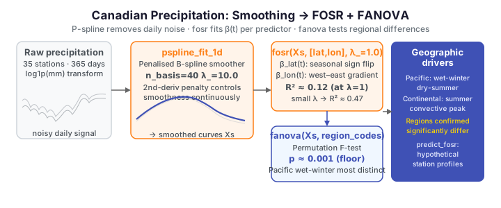
its shape. We use fdars to smooth the noisy daily curves, then fit
function-on-scalar regression (FOSR) on latitude and longitude and a
functional ANOVA on region to quantify how geography drives the whole annual
profile.
The data
Raw daily precipitation (mm/day) has many near-zero days and a long right tail,
so a log1p transform stabilises the variance and handles the zeros gracefully.
We work on log1p(precip) throughout, exactly as the R reference does. The four
regions are unbalanced — Atlantic (15) and Continental (12) dominate, with only
5 Pacific and 3 Arctic stations.
import numpy as np
from docs_fig import fig, render
from docs_data import load_canadian_weather

day, X, meta = load_canadian_weather("precipitation")
X = np.log1p(X)                                   # stabilise variance, handle zeros
region = meta["region"].to_numpy()
colors = {"Arctic": "#0dcaf0", "Atlantic": "#e8710a",
          "Continental": "#198754", "Pacific": "#6f42c1"}

f, ax = fig()
for r, c in colors.items():
    ax.plot(day, X[region == r].T, color=c, lw=0.5, alpha=0.5)
for r, c in colors.items():
    n = int((region == r).sum())
    ax.plot([], [], color=c, label=f"{r} ({n})")
ax.set(title="Daily precipitation profiles, 35 Canadian stations",
       xlabel="day of year", ylabel="log1p(precipitation, mm)")
ax.set_xticks([1, 91, 182, 274]); ax.set_xticklabels(["Jan", "Apr", "Jul", "Oct"])
ax.legend(ncol=2)
print(render(f))
Several patterns emerge at once. Pacific stations sit high in winter and drop in summer, Continental stations peak in mid-summer, Arctic stations hug the bottom all year, and Atlantic stations are intermediate and comparatively uniform. The shapes differ, not just the averages — exactly what functional methods exploit.
Regional patterns
Averaging within each region isolates the between-group contrast from the station-to-station scatter. The regional mean curve (dark) rides through its band of member stations (light).
import numpy as np
from docs_fig import fig, render, plt
from docs_data import load_canadian_weather

day, X, meta = load_canadian_weather("precipitation")
X = np.log1p(X)
region = meta["region"].to_numpy()
regions = ["Arctic", "Atlantic", "Continental", "Pacific"]
colors = ["#0dcaf0", "#e8710a", "#198754", "#6f42c1"]

f, axes = plt.subplots(2, 2, figsize=(8.4, 5.4), sharex=True, sharey=True)
for ax, r, c in zip(axes.ravel(), regions, colors):
    m = region == r
    ax.plot(day, X[m].T, color="#adb5bd", lw=0.5, alpha=0.7)
    ax.plot(day, X[m].mean(0), color=c, lw=2.0)
    ax.set_title(f"{r} ({int(m.sum())})", color=c)
    ax.set_xticks([1, 91, 182, 274]); ax.set_xticklabels(["Jan", "Apr", "Jul", "Oct"])
for ax in axes[:, 0]:
    ax.set_ylabel("log1p(precip)")
f.suptitle("Precipitation by region (coloured = regional mean)", y=1.0)
print(render(f))
The regional signatures are clear: the Pacific wet-winter/dry-summer cycle driven by frontal systems, the Continental summer convective hump, the Atlantic near-uniform year with a slight autumn lift, and the uniformly low Arctic. Clear by eye, these differences are what the FANOVA below tests formally.
Smoothing
Daily precipitation is noisy even after averaging over 30+ years. Before fitting any regression we fit each curve with a penalised B-spline (P-spline) on 40 basis functions, which removes high-frequency day-to-day fluctuation while preserving the seasonal signal. For a curve with B-spline coefficients \(c\) the smoother minimizes a penalized least-squares criterion,
where \(B\) is the B-spline design matrix and the second-derivative penalty
enforces smoothness. fdars.basis.pspline_fit_1d fits the penalised
coefficients and returns the smoothed curves directly in its fitted field; the
roughness penalty lambda_ (\(\lambda\) above) controls how aggressively the daily
noise is damped.
Why P-splines rather than a fixed basis?
We use the penalised-spline smoother (pspline_fit_1d) rather than a plain
fixed-count B-spline projection (fdata_to_basis_1d/basis_to_fdata_1d)
because the roughness penalty lambda_ controls smoothness directly — a
single continuous knob — instead of forcing us to choose an exact number of
basis functions. On noisy daily precipitation that gives a stable,
non-negative-respecting fit without hunting for the right n_basis.
import numpy as np
from docs_fig import fig, render
from docs_data import load_canadian_weather
from fdars.basis import pspline_fit_1d

day, X, meta = load_canadian_weather("precipitation")
X = np.ascontiguousarray(np.log1p(X), dtype=np.float64)
day = np.ascontiguousarray(day, dtype=np.float64)
station = meta["station"].to_numpy()

Xs = np.ascontiguousarray(
    np.asarray(pspline_fit_1d(X, day, n_basis=40, lambda_=10.0)["fitted"]),
    dtype=np.float64)

i = int(np.where(station == "Vancouver")[0][0]) if "Vancouver" in station else 0
f, ax = fig()
ax.plot(day, X[i], color="#adb5bd", lw=0.6, label="raw")
ax.plot(day, Xs[i], color="#3f51b5", lw=1.8, label="P-spline smoothed (40)")
ax.set(title=f"{station[i]}: raw vs. P-spline smoothed precipitation",
       xlabel="day of year", ylabel="log1p(precipitation, mm)")
ax.set_xticks([1, 91, 182, 274]); ax.set_xticklabels(["Jan", "Apr", "Jul", "Oct"])
ax.legend()
print(render(f))
The smoothed curve captures the winter-peak seasonality without the daily noise,
and stays non-negative like the underlying log1p precipitation. All subsequent
analyses use these smoothed curves Xs.
FOSR: latitude and longitude effects
Function-on-scalar regression models each station's whole precipitation curve as a linear function of its two scalar geographic predictors:
Each coefficient is itself a curve \(\beta_p(t)\), revealing when during the
year each geographic variable matters most. fdars.regression.fosr takes the
(n, m) response and an (n, p) predictor matrix, plus a roughness penalty
lambda_.
import numpy as np
from docs_fig import fig, render
from docs_data import load_canadian_weather
from fdars.basis import pspline_fit_1d
from fdars.regression import fosr

day, X, meta = load_canadian_weather("precipitation")
X = np.ascontiguousarray(np.log1p(X), dtype=np.float64)
day = np.ascontiguousarray(day, dtype=np.float64)
lat = meta["lat"].to_numpy(); lon = meta["lon"].to_numpy()

Xs = np.ascontiguousarray(
    np.asarray(pspline_fit_1d(X, day, n_basis=40, lambda_=10.0)["fitted"]),
    dtype=np.float64)

predictors = np.ascontiguousarray(np.column_stack([lat, lon]), dtype=np.float64)
fit = fosr(Xs, predictors, lambda_=1.0)
beta = np.asarray(fit["beta"])                    # (2, 365): lat, lon

f, ax = fig()
ax.plot(day, beta[0], color="#e8710a", lw=1.8, label=r"$\beta_{\mathrm{lat}}(t)$")
ax.plot(day, beta[1], color="#0072b2", lw=1.8, label=r"$\beta_{\mathrm{lon}}(t)$")
ax.axhline(0, color="#6c757d", ls="--", lw=1)
ax.set(title=f"FOSR coefficient functions (R² = {fit['r_squared']:.3f})",
       xlabel="day of year", ylabel=r"$\beta(t)$")
ax.set_xticks([1, 91, 182, 274]); ax.set_xticklabels(["Jan", "Apr", "Jul", "Oct"])
ax.legend()
print(render(f))
The latitude coefficient \(\hat\beta_{\text{lat}}(t)\) swings across the year: clearly negative in winter — higher-latitude stations are drier when the wet weather is coastal and southern — but rising to positive in mid-summer, when interior/northern convection lifts high-latitude rainfall. The longitude coefficient \(\hat\beta_{\text{lon}}(t)\) is near zero in deep winter and positive through spring, summer, and autumn (peaking around August), when the east–west position separates the drier interior from the wetter coasts.
Pointwise R²
The overall R² is a single number, but the explanatory power of latitude and
longitude varies across the year. fosr does not return a pointwise R²
directly, so we compute it honestly from the fitted residuals as
\(R^2(t) = 1 - \mathrm{SS}_{\text{res}}(t)/\mathrm{SS}_{\text{tot}}(t)\) (clipped at
0 where the sample variance is tiny and the estimate is unstable).
import numpy as np
from docs_fig import fig, render
from docs_data import load_canadian_weather
from fdars.basis import pspline_fit_1d
from fdars.regression import fosr

day, X, meta = load_canadian_weather("precipitation")
X = np.ascontiguousarray(np.log1p(X), dtype=np.float64)
day = np.ascontiguousarray(day, dtype=np.float64)
lat = meta["lat"].to_numpy(); lon = meta["lon"].to_numpy()

Xs = np.ascontiguousarray(
    np.asarray(pspline_fit_1d(X, day, n_basis=40, lambda_=10.0)["fitted"]),
    dtype=np.float64)
predictors = np.ascontiguousarray(np.column_stack([lat, lon]), dtype=np.float64)
fit = fosr(Xs, predictors, lambda_=1.0)

resid = np.asarray(fit["residuals"])
ss_res = (resid ** 2).sum(axis=0)
ss_tot = ((Xs - Xs.mean(axis=0)) ** 2).sum(axis=0)
r2t = np.clip(1 - ss_res / ss_tot, 0, 1)

f, ax = fig()
ax.plot(day, r2t, color="#3f51b5", lw=1.6)
ax.fill_between(day, 0, r2t, color="#3f51b5", alpha=0.12)
ax.set(title="Pointwise R²(t): precipitation ~ latitude + longitude",
       xlabel="day of year", ylabel=r"$R^2(t)$", ylim=(0, 1))
ax.set_xticks([1, 91, 182, 274]); ax.set_xticklabels(["Jan", "Apr", "Jul", "Oct"])
print(render(f))
Explanatory power peaks in spring (around April, R² ≈ 0.23), when the coastal moisture gradient creates a strong contrast that latitude and longitude capture well, and collapses to near zero in mid-summer, when convective rain is more uniform geographically and geography explains little of the day-to-day pattern.
FOSR with an FPC basis
An alternative to penalising the coefficient functions directly is to project
the response onto its leading functional principal components before fitting,
which compresses the response variation into a few modes and tends to give
smoother coefficient estimates when the sample is small.
fdars.regression.fosr_fpc does this and — unlike plain fosr — returns the
pointwise r_squared_t for free.
import numpy as np
from docs_fig import fig, render, plt
from docs_data import load_canadian_weather
from fdars.basis import pspline_fit_1d
from fdars.regression import fosr, fosr_fpc

day, X, meta = load_canadian_weather("precipitation")
X = np.ascontiguousarray(np.log1p(X), dtype=np.float64)
day = np.ascontiguousarray(day, dtype=np.float64)
lat = meta["lat"].to_numpy(); lon = meta["lon"].to_numpy()

Xs = np.ascontiguousarray(
    np.asarray(pspline_fit_1d(X, day, n_basis=40, lambda_=10.0)["fitted"]),
    dtype=np.float64)
predictors = np.ascontiguousarray(np.column_stack([lat, lon]), dtype=np.float64)

fit = fosr(Xs, predictors, lambda_=1.0)
fit_fpc = fosr_fpc(Xs, predictors, n_comp=5)
b_pen = np.asarray(fit["beta"]); b_fpc = np.asarray(fit_fpc["beta"])

f, axes = plt.subplots(1, 2, figsize=(9.0, 3.8))
for ax, k, name in zip(axes, range(2), ["Latitude", "Longitude"]):
    ax.plot(day, b_pen[k], color="#e8710a", lw=1.4, label="penalised")
    ax.plot(day, b_fpc[k], color="#0072b2", lw=1.4, ls="--", label="FPC-based")
    ax.axhline(0, color="#6c757d", ls=":", lw=1)
    ax.set_title(name); ax.set_xlabel("day of year")
    ax.set_xticks([1, 91, 182, 274]); ax.set_xticklabels(["Jan", "Apr", "Jul", "Oct"])
axes[0].set_ylabel(r"$\beta(t)$"); axes[0].legend()
f.suptitle(f"Penalised (R² = {fit['r_squared']:.3f}) vs "
           f"FPC-based (R² = {fit_fpc['r_squared']:.3f}) coefficients", y=1.02)
print(render(f))
The FPC-based fit reaches a much higher overall R² here (≈0.47 vs ≈0.12 for the penalised fit at λ=1) because the response variation is concentrated in a few principal components that the 5-component model captures almost entirely. As the lambda-sensitivity section shows, much of that gap is really about penalty strength, not the FPC machinery itself — the penalised fit at a small λ closes most of it.
Regional FANOVA
Function-on-scalar regression treats geography as continuous. Functional
ANOVA instead asks the categorical question: do the four regions have
significantly different mean precipitation profiles?
fdars.regression.fanova runs a permutation-based global F-test and returns the
per-region group_means, a pointwise f_statistic_t, the global_statistic,
and a permutation p_value. Group labels are passed as integer codes.
import numpy as np
from docs_fig import fig, render
from docs_data import load_canadian_weather
from fdars.basis import pspline_fit_1d
from fdars.regression import fanova

day, X, meta = load_canadian_weather("precipitation")
X = np.ascontiguousarray(np.log1p(X), dtype=np.float64)
day = np.ascontiguousarray(day, dtype=np.float64)
region = meta["region"].to_numpy()

Xs = np.ascontiguousarray(
    np.asarray(pspline_fit_1d(X, day, n_basis=40, lambda_=10.0)["fitted"]),
    dtype=np.float64)

labels, codes = np.unique(region, return_inverse=True)
codes = np.ascontiguousarray(codes, dtype=np.int64)
fan = fanova(Xs, codes, n_perm=999)
gm = np.asarray(fan["group_means"])               # (4, 365)

colors = {"Arctic": "#0dcaf0", "Atlantic": "#e8710a",
          "Continental": "#198754", "Pacific": "#6f42c1"}
f, ax = fig()
for k, lab in enumerate(labels):
    ax.plot(day, gm[k], color=colors[lab], lw=1.8, label=lab)
ax.set(title=f"FANOVA regional mean precipitation "
             f"(global F = {fan['global_statistic']:.1f}, p = {fan['p_value']:.3g})",
       xlabel="day of year", ylabel="log1p(precipitation, mm)")
ax.set_xticks([1, 91, 182, 274]); ax.set_xticklabels(["Jan", "Apr", "Jul", "Oct"])
ax.legend(ncol=2)
print(render(f))
The permutation test rejects the null decisively (a large global F, p at the
permutation floor): the four regions genuinely differ. The mean curves rank as
the raw data suggested — Pacific highest and most distinctive in winter,
Continental peaking in summer, Arctic lowest throughout.
Prediction
With the fitted FOSR model, we can predict a precipitation profile for a
hypothetical station at any latitude/longitude. predict_fosr takes the same
fitted design plus a (k, p) matrix of new predictor rows. Here we predict a
northern Saskatchewan station at 55 °N, 100 °W and overlay the actual smoothed
curves of real stations near that latitude for context.
import numpy as np
from docs_fig import fig, render
from docs_data import load_canadian_weather
from fdars.basis import pspline_fit_1d
from fdars.regression import predict_fosr

day, X, meta = load_canadian_weather("precipitation")
X = np.ascontiguousarray(np.log1p(X), dtype=np.float64)
day = np.ascontiguousarray(day, dtype=np.float64)
lat = meta["lat"].to_numpy(); lon = meta["lon"].to_numpy()
station = meta["station"].to_numpy()

Xs = np.ascontiguousarray(
    np.asarray(pspline_fit_1d(X, day, n_basis=40, lambda_=10.0)["fitted"]),
    dtype=np.float64)
predictors = np.ascontiguousarray(np.column_stack([lat, lon]), dtype=np.float64)

new = np.ascontiguousarray(np.array([[55.0, -100.0]]), dtype=np.float64)
pred = np.asarray(predict_fosr(Xs, predictors, new, lambda_=1.0))[0]

near = np.where(np.abs(lat - 55) < 5)[0]
f, ax = fig()
for i in near:
    ax.plot(day, Xs[i], color="#adb5bd", lw=0.8, alpha=0.9)
ax.plot([], [], color="#adb5bd", label="actual stations near 55°N")
ax.plot(day, pred, color="#3f51b5", lw=2.4, label="predicted (55°N, 100°W)")
ax.set(title="Predicted vs. actual profiles near 55°N",
       xlabel="day of year", ylabel="log1p(precipitation, mm)")
ax.set_xticks([1, 91, 182, 274]); ax.set_xticklabels(["Jan", "Apr", "Jul", "Oct"])
ax.legend()
print(render(f))
The predicted curve falls within the band of actual stations at similar latitude, reproducing the Continental summer-peak character expected of an interior northern station.
Model comparison and lambda sensitivity
How much does each predictor contribute alone versus together? We fit latitude-only, longitude-only, and the joint model — first all at λ=1, then sweeping λ.
import numpy as np
from docs_fig import fig, render
from docs_data import load_canadian_weather
from fdars.basis import pspline_fit_1d
from fdars.regression import fosr

day, X, meta = load_canadian_weather("precipitation")
X = np.ascontiguousarray(np.log1p(X), dtype=np.float64)
day = np.ascontiguousarray(day, dtype=np.float64)
lat = meta["lat"].to_numpy(); lon = meta["lon"].to_numpy()

Xs = np.ascontiguousarray(
    np.asarray(pspline_fit_1d(X, day, n_basis=40, lambda_=10.0)["fitted"]),
    dtype=np.float64)
Zlat = np.ascontiguousarray(lat.reshape(-1, 1), dtype=np.float64)
Zlon = np.ascontiguousarray(lon.reshape(-1, 1), dtype=np.float64)
Zboth = np.ascontiguousarray(np.column_stack([lat, lon]), dtype=np.float64)

lambdas = [0.01, 0.1, 1.0, 10.0]
specs = [("Latitude only", Zlat, "#e8710a"),
         ("Longitude only", Zlon, "#0072b2"),
         ("Latitude + Longitude", Zboth, "#198754")]

f, ax = fig()
w = 0.26
x = np.arange(len(lambdas))
for j, (name, Z, c) in enumerate(specs):
    r2 = [max(float(fosr(Xs, Z, lambda_=lam)["r_squared"]), 0) for lam in lambdas]
    ax.bar(x + (j - 1) * w, r2, w, color=c, label=name)
ax.set_xticks(x); ax.set_xticklabels([f"{lam:g}" for lam in lambdas])
ax.set(title="FOSR R² is sensitive to λ (joint model wins only at small λ)",
       xlabel=r"roughness penalty $\lambda$", ylabel="R²", ylim=(0, 1))
ax.legend(loc="upper right", ncol=1)
print(render(f))
At small λ (0.01) the joint model outperforms either single predictor, as expected when latitude and longitude carry complementary information. At λ=1 the heavier penalty shrinks two coefficient functions more aggressively than one, so the joint fit falls below both single-predictor models — a regularisation artefact, not evidence that the predictors hurt. The single-predictor models have only one coefficient function to penalise, so they degrade more slowly.
The moderate correlation between the predictors (\(r \approx -0.53\): Canadian stations cluster along a northwest–southeast line) amplifies this sensitivity. The practical lesson: when comparing FOSR models with different numbers of predictors, either select λ separately per model by cross-validation, or compare them all at the same, well-chosen λ.
Automatic penalty selection
Pass a negative lambda_ to fosr / predict_fosr to select the
roughness penalty automatically by generalized cross-validation instead of
fixing it by hand — the cleanest way to make the model comparison above fair.
Conclusion
- Latitude has a seasonal sign flip (higher-latitude stations are drier in winter but relatively wetter at the mid-summer convective peak), and longitude carries a west-to-east moisture gradient that is largest in the warmer half of the year.
- The joint model's apparent underperformance at λ=1 is a penalty-strength artefact; at small λ, latitude and longitude together beat either alone.
- Functional ANOVA confirms highly significant regional differences, with Pacific the most distinctive region.
- P-spline smoothing removes daily noise while preserving seasonal structure; the FPC-based FOSR variant offers a smoother, lower-variance alternative.
With only 35 stations and 2 predictors the models are necessarily limited, but they capture the dominant geographic signal.
Binding notes vs. the R reference
Plain fosr here returns fitted, beta, residuals, and a scalar
r_squared — it does not expose a gcv field or a pointwise
r_squared_t, so the pointwise curve above is computed by hand from the
residuals, and the model-comparison table is shown as overall R² only.
fosr_fpc does return r_squared_t and an explicit intercept.
Absolute R² values differ slightly from the R vignette because the smoothing
and penalty scaling are not identical, but the qualitative story — and the
λ-sensitivity ordering — matches exactly.
Parameters
| Function | Key parameters | Description |
|---|---|---|
pspline_fit_1d(data, argvals, n_basis, lambda_, order) |
n_basis, lambda_ |
Penalised B-spline smooth; returns fitted, coefficients, edf, gcv, … |
fosr(response, predictors, lambda_) |
lambda_ |
Function-on-scalar regression; returns fitted, beta, residuals, r_squared |
fosr_fpc(data, predictors, n_comp) |
n_comp |
FPC-basis FOSR; returns beta, intercept, r_squared, r_squared_t |
predict_fosr(response, predictors, new_predictors, lambda_) |
new_predictors |
Fitted response curves for new predictor rows |
fanova(data, groups, n_perm) |
groups (int codes), n_perm |
Permutation functional ANOVA; returns group_means, f_statistic_t, global_statistic, p_value |
See also
- Weather curves: FPCA and clustering — FPCA and clustering on the temperature curves for the same stations.
- Canadian temperature: annual cycle — period detection and STL on the seasonal signal.
- Functional PCA for the decomposition in depth.
References
- Ramsay, J.O., Silverman, B.W. (2005). Functional Data Analysis, 2nd ed. Springer.
- Ramsay, J.O., Hooker, G., Graves, S. (2009). Functional Data Analysis with R and MATLAB. Springer.
- Reiss, P.T., Huang, L., Mennes, M. (2010). Fast function-on-scalar regression with penalized basis expansions. International Journal of Biostatistics 6(1):Article 28.