Inline Quality Monitoring: Detection Power & False-Alarm Analysis
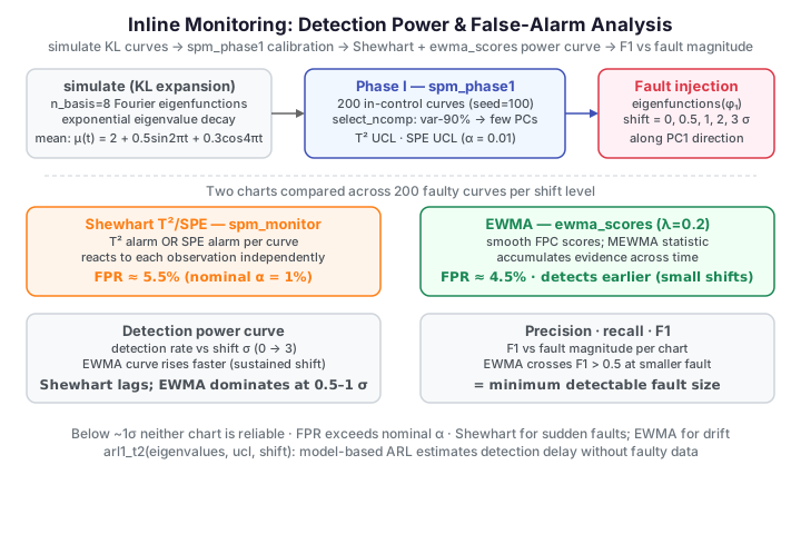
Every control chart lives on a trade-off. Loosen the limit and you catch more faults but cry wolf on good product; tighten it and false alarms vanish but small faults slip through. This page evaluates an FPCA-based functional control chart the way you would validate a real monitor: simulate in-control spectra with a known generative process, calibrate a Phase I chart, measure the false-positive rate on fresh in-control data, then inject faults of increasing magnitude and measure detection power — closing with precision, recall, and F1 to find the fault size at which monitoring becomes practically useful.
Simulated data, by design
To trace a smooth power curve at a controllable fault severity we need many
faulty and many fresh in-control curves. We use fdars.simulation.simulate
(a Karhunen–Loève expansion on Fourier eigenfunctions) with a smooth mean
function, so we can dial the fault magnitude and generate large fresh
samples. The biopharma page runs the same
machinery on fixed labelled batches.
In-control data
We build absorbance-like spectra on a 100-point grid: a smooth mean function \(\mu(t) = 2 + 0.5\sin 2\pi t + 0.3\cos 4\pi t\) plus KL variation on 8 Fourier eigenfunctions with exponentially decaying eigenvalues. Phase I uses 200 clean curves.
import numpy as np
from docs_fig import fig, render
from fdars.simulation import simulate

m = 100
t = np.ascontiguousarray(np.linspace(0, 1, m))
M = 8
mean_fn = 2 + 0.5 * np.sin(2 * np.pi * t) + 0.3 * np.cos(4 * np.pi * t)

ic = np.asarray(simulate(200, t, n_basis=M, efun_type="fourier",
                         eval_type="exponential", seed=100)) + mean_fn

f, ax = fig()
ax.plot(t, ic.T, color="#3f51b5", lw=0.3, alpha=0.15)
ax.plot(t, mean_fn, color="black", lw=1.6, label="mean function $\\mu(t)$")
ax.set(title="Phase I: in-control spectra (200 curves)",
       xlabel="wavelength (rescaled)", ylabel="absorbance")
ax.legend(loc="upper right")
print(render(f))
The 200 curves scatter smoothly around the mean, oscillating in the way NIR spectra do. Their covariance structure — the KL eigenfunctions and eigenvalues — is exactly what the FPCA chart will learn.
Phase I calibration
We fit a generous 10-component chart to inspect the eigenvalue spectrum, let
select_ncomp choose the number of components by the cumulative-variance rule
(≥ 90 %), and refit at \(\alpha = 0.01\).
import numpy as np
from docs_fig import fig, render, plt
from fdars.simulation import simulate
from fdars.spm import spm_phase1, select_ncomp

t = np.ascontiguousarray(np.linspace(0, 1, 100)); M = 8
mean_fn = 2 + 0.5 * np.sin(2 * np.pi * t) + 0.3 * np.cos(4 * np.pi * t)
ic = np.ascontiguousarray(
    np.asarray(simulate(200, t, n_basis=M, efun_type="fourier",
                        eval_type="exponential", seed=100)) + mean_fn)

eig = np.asarray(spm_phase1(ic, t, ncomp=10, alpha=0.01)["eigenvalues"])
cum = np.cumsum(eig) / eig.sum()
ncomp = int(select_ncomp(np.ascontiguousarray(eig),
                         method="cumulative_variance", threshold=0.90))

pcs = np.arange(1, len(eig) + 1)
f, (a1, a2) = plt.subplots(1, 2, figsize=(9.0, 3.6))
a1.bar(pcs, eig, color="#3f51b5", width=0.6)
a1.axvline(ncomp + 0.5, color="#e8710a", ls="--")
a1.set(title="Scree plot", xlabel="component", ylabel="eigenvalue")
a2.plot(pcs, cum, "o-", color="#3f51b5")
a2.axhline(0.90, color="#e8710a", ls="--")
a2.axvline(ncomp + 0.5, color="#e8710a", ls="--", alpha=0.5)
a2.set(title="Cumulative variance", xlabel="component",
       ylabel="variance explained", ylim=(0, 1.02))
f.suptitle(f"Component selection: variance-90 % rule picks {ncomp} PCs", y=1.02)
print(render(f))
The exponentially decaying eigenvalues concentrate the variation in the first few modes, so the rule keeps a handful of components — enough to span the in-control subspace without chasing noise.
False-positive check
A well-calibrated chart should false-alarm at roughly the nominal \(\alpha\) on genuinely in-control data. Projecting a centred curve onto the \(K\) retained FPC loadings gives a score vector \(z\) with in-control variances \(\lambda_k\); the Shewhart chart combines a Hotelling \(T^2\) on those scores with a squared prediction error (SPE) on the residual outside the subspace:
The EWMA chart instead smooths the score vector recursively and monitors the smoothed vector against a MEWMA statistic that rescales each variance by the steady-state factor \(\lambda/(2-\lambda)\):
We generate 200 fresh in-control curves (same process,
new seed) and monitor them with two charts: the Shewhart \(T^2\)/SPE chart, and
an EWMA chart built on the FPC scores (ewma_scores, scored with the MEWMA
variance factor \(\lambda/(2-\lambda)\)).
Shewhart FPR: 5.5% | EWMA FPR: 4.5% (nominal α = 1.0%)
Both charts false-alarm at a low rate — here about 4–6% (Shewhart ≈ 5.5%, EWMA ≈ 4.5%), several times the nominal \(\alpha = 1\%\). That gap is expected: the limits are estimated from only 200 Phase I curves, so the empirical FPR sits above the nominal target in finite samples (the chart is under-, not over-calibrated), and the FPCA limits are approximate rather than exact. The rate is still low enough to be operationally usable; tightening it toward 1% would take a larger calibration set or bootstrap-corrected limits. The EWMA statistic is smoother (it averages the scores over time), so its handful of false alarms tend to cluster.
Fault injection along the first eigenfunction
We build faulty curves by adding a mean shift along the first eigenfunction \(\phi_1\) — the dominant mode of spectral variation — scaled to a multiple of the in-control first-score standard deviation \(\sigma = \sqrt{\lambda_1}\). Five levels: 0, 0.5, 1, 2, 3 σ.
import numpy as np
from docs_fig import fig, render, plt
from fdars.simulation import simulate, eigenfunctions
from fdars.spm import spm_phase1

t = np.ascontiguousarray(np.linspace(0, 1, 100)); M = 8
mean_fn = 2 + 0.5 * np.sin(2 * np.pi * t) + 0.3 * np.cos(4 * np.pi * t)
ic = np.ascontiguousarray(
    np.asarray(simulate(200, t, n_basis=M, efun_type="fourier",
                        eval_type="exponential", seed=100)) + mean_fn)
chart = spm_phase1(ic, t, ncomp=3, alpha=0.01)
sigma = float(np.sqrt(np.asarray(chart["eigenvalues"])[0]))
phi1 = np.asarray(eigenfunctions(t, M, efun_type="fourier"))[:, 0]

levels = [0.0, 0.5, 1.0, 2.0, 3.0]
f, axes = plt.subplots(2, 3, figsize=(9.6, 5.0), sharex=True, sharey=True)
axes = axes.ravel()
for ax, s in zip(axes, levels):
    base = np.asarray(simulate(20, t, n_basis=M, efun_type="fourier",
                               eval_type="exponential", seed=300 + int(s * 10))) + mean_fn
    faulty = base + s * sigma * phi1
    ax.plot(t, faulty.T, color="#3f51b5", lw=0.4, alpha=0.5)
    ax.set_title(f"{s}σ shift")
axes[-1].axis("off")
f.suptitle("Faulty spectra at increasing shift magnitude "
           "(along $\\phi_1$)", y=1.01)
print(render(f))
At 0 σ the curves are indistinguishable from in-control data; as the shift grows, the spectra drift upward along \(\phi_1\) and become progressively easier to catch.
Detection power
We monitor 200 faulty curves at each level with both charts and record the detection rate — the fraction flagged. Plotting it against shift magnitude gives the chart's operating-characteristic curve.
Both charts start near the noise floor and climb with the shift, but the EWMA chart detects far earlier: because the fault is a sustained shift, averaging the scores over time accumulates evidence the Shewhart chart discards at each step. This is the central lesson — for persistent small shifts, a memory-based chart is worth a great deal.
Precision, recall, and F1
Detection rate (recall) alone is incomplete: a chart that flags everything scores 100 % recall but is useless. Precision is the fraction of alarms that are genuine faults; the F1 score harmonises the two and locates the smallest fault at which monitoring is practically useful (\(F_1 > 0.5\)).
At small shifts precision is high (few false alarms) but recall is low, dragging F1 down; both converge toward 1 as the fault grows. The EWMA chart crosses the \(F_1 = 0.5\) usefulness line at a smaller fault than Shewhart — it becomes operationally useful earlier. That crossover is the honest answer to "what is the smallest fault this monitor can reliably catch?".
Practical implications
The experiment answers three deployment questions:
- Minimum detectable fault. Below roughly 1 σ the shift is masked by natural variation; neither chart is reliable there without accepting more false alarms.
- False-alarm budget. In-control the charts run a few points above the nominal 1 % (here ~4–6 %) because the limits are estimated from a finite Phase I sample; a target in-control run length translates into a choice of \(\alpha\) only after that finite-sample inflation is accounted for (e.g. with a larger calibration set or bootstrap-corrected limits).
- Which chart. A Shewhart chart reacts fastest to sudden large shifts (equipment failure); an EWMA/CUSUM-style chart wins on gradual degradation (drift, fouling) by accumulating evidence. Running both covers both regimes.
Model-based ARL without a fault stream
When a fault can be characterised as a shift vector in FPC-score space,
fdars.spm.arl1_t2(eigenvalues, ucl, shift, ...) estimates the detection
delay by Monte-Carlo directly from the Phase I eigenvalues — no faulty data
required. See Advanced SPM.
Binding gap vs. the R reference
R compares Shewhart, CUSUM, and MEWMA. This build has no CUSUM or
packaged MEWMA binding, so the second method here is an EWMA chart assembled
transparently from ewma_scores (the FPC-score smoother) rather than a
packaged routine — it plays the same role as R's MEWMA. Absolute rates differ
from the R vignette because the simulation seeds and eigenstructure are not
identical, but the ordering (memory-based chart beats Shewhart on sustained
small shifts) matches.
Parameters
| Function | Key parameters | Description |
|---|---|---|
simulate(n, argvals, n_basis, efun_type, eval_type, seed) |
efun_type, eval_type, seed |
Generate KL functional data |
eigenfunctions(argvals, n_basis, efun_type) |
efun_type |
The eigenfunctions used to inject a directional fault |
spm_phase1(data, argvals, ncomp, alpha) |
alpha |
Fit the in-control model at a given significance level |
select_ncomp(eigenvalues, method, threshold) |
method, threshold |
Choose the number of components |
spm_monitor(..., new_data, argvals) |
new_data |
Return \(T^2\)/SPE statistics and alarm flags |
ewma_scores(scores, lambda_) |
lambda_ |
Smooth FPC-score vectors for an EWMA chart |
See also
- Statistical Process Monitoring — the Phase I / Phase II workflow.
- Advanced Statistical Process Monitoring — EWMA charts, run rules, and model-based ARL estimation.
- Biopharmaceutical Batch Monitoring — the same workflow applied to labelled fermentation batches.
References
- Colosimo, B.M., Pacella, M. (2010). A comparison study of control charts for functional data. Quality and Reliability Engineering International 26(4):327-342.
- Lucas, J.M., Saccucci, M.S. (1990). Exponentially weighted moving average control schemes: properties and enhancements. Technometrics 32(1):1-12.
- Woodall, W.H. (2007). Current research on profile monitoring. Production 17(3):420-425.