Profile and Partial-Domain Monitoring
Functional control charts summarise a whole curve into a single \(T^2\) or SPE number. That
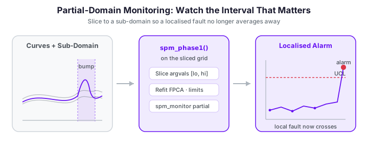
global view is a liability when a fault is localised — a defect confined to a short
sub-interval of the domain. Averaged over the full curve, a small local bump barely moves
the global statistic and slips past the limit. The remedy is simple and powerful:
restrict the monitoring model to the sub-interval that matters. This page shows how
to slice the argument grid and rerun the ordinary fdars.spm Phase I / Phase II workflow
on a partial domain, and quantifies the sensitivity gain.
import numpy as np
from docs_fig import fig, render
from fdars.simulation import simulate

argvals = np.linspace(0, 1, 120)
ic = np.asarray(simulate(100, argvals, n_basis=6, seed=7))     # Phase I reference

# Phase II: 20 in-control curves + 8 with a bump localised near t = 0.78
ok = np.asarray(simulate(20, argvals, n_basis=6, seed=21))
loc = np.asarray(simulate(8, argvals, n_basis=6, seed=33))
bump = np.exp(-0.5 * ((argvals - 0.78) / 0.035) ** 2) * 1.8
loc = loc + bump
new = np.vstack([ok, loc])

lo, hi = 0.68, 0.88          # the sub-domain of interest

f, ax = fig()
ax.plot(argvals, ic.T, color="#6c757d", lw=0.5, alpha=0.30)
ax.plot(argvals, ok.T, color="#3f51b5", lw=0.7, alpha=0.5)
ax.plot(argvals, loc.T, color="#dc3545", lw=1.0, alpha=0.8)
ax.axvspan(lo, hi, color="#e8710a", alpha=0.12, label="monitored sub-domain")
ax.set(title="A fault localised near t = 0.78 (red); grey = Phase I, indigo = in-control Phase II",
       xlabel="t", ylabel="x(t)")
ax.legend(loc="upper left", fontsize=8)
print(render(f))
Away from the shaded window the faulty curves (red) are indistinguishable from the in-control ones. Only inside the window does the bump appear.
The monitoring statistics
Both charts on this page are built from the same two functional statistics. Fix a domain \([a,b]\) (the full grid \([0,1]\) or a restricted sub-interval), and let the Phase I sample \(x_1,\dots,x_N\) define the mean function \(\hat\mu(t)\) and the leading FPCA eigenpairs \((\lambda_k,\phi_k)\), \(k=1,\dots,K\), of the sample covariance operator on \([a,b]\).
FPCA scores
A new curve \(x(t)\) is projected onto each eigenfunction through the \(L^2\) inner product,
On a discrete grid the integral becomes a weighted sum \(\xi_k = \sum_j (x(t_j)-\hat\mu(t_j))\,\phi_k(t_j)\,w_j\),
where the quadrature weights \(w_j\) are the weights returned by spm_phase1. When the
grid is restricted to \([a,b]\) the weights are recomputed on that grid, so every \(\xi_k\) is
a bona fide functional score on the sub-domain, not a truncation of a full-domain score.
Hotelling \(T^2\) — variation inside the model
The \(T^2\) statistic is the squared Mahalanobis length of the score vector, whitened by the eigenvalues (the FPC variances):
Under in-control Gaussianity \(T^2\) is \(\chi^2_K\)-distributed, giving the closed-form upper
control limit implemented by t2_control_limit,
The single-observation contribution of component \(k\) is \(c_k = \xi_k^2/\lambda_k\), and
\(T^2 = \sum_k c_k\). These per-PC contributions (t2_pc_contributions) are the raw material
for fault diagnosis: an alarm with an outsized \(c_k\) tells you which mode of variation
moved, and t2_pc_significance tests each \(c_k\) against its own limit.
Squared prediction error — variation the model cannot explain
\(T^2\) only sees the part of \(x\) that lives in the span of \(\phi_1,\dots,\phi_K\). The residual — everything the \(K\)-component model fails to reconstruct — is measured by the squared prediction error (SPE, also called the \(Q\)-statistic):
Its distribution has no simple closed form, so spe_control_limit sets the limit from the
Phase I SPE values by a Box moment-matching approximation \(\mathrm{SPE}\sim g\,\chi^2_h\)
(fit \(g,h\) from the sample mean and variance). A fault with a new shape — a wiggle no
eigenfunction captures — leaves \(T^2\) untouched but inflates SPE; a fault along a known
mode inflates \(T^2\). Charting both catches both failure modes.
These formulas are exact, not approximations
Projecting the centred, restricted data onto loadings with weights and applying the
two formulas above reproduces the t2 and spe arrays from spm_monitor to machine
precision. The second worked example
below relies on that identity to compute per-PC contributions and the SPE residual by
hand on the sub-domain.
Why the full domain hides local faults
The FPCA \(T^2\) statistic weights every point of the curve. If the fault occupies a fraction \(\rho\) of the domain, its contribution to a full-domain score is diluted roughly in proportion to \(\rho\), while in-control variability over the whole domain still counts against the control limit. The signal-to-noise ratio therefore scales like
where \(\delta\) is the fault signal supported on \([a,b]\) and \(\sigma^2\) is the in-control pointwise variance. Restricting the analysis to \([a,b]\) replaces the denominator with \(\int_a^b \sigma^2(t)\,dt\) — a factor of roughly \(1/\rho\) smaller — sharpening the ratio and, provided the fault truly lives there, dramatically improving detection.
Partial-domain monitoring is just monitoring on a slice
There is no special API: a partial-domain chart is an ordinary chart built on sliced
arrays. Pick the index set of the sub-domain, slice both argvals and the data columns,
and run the usual spm_phase1 / spm_monitor. Because the integration weights are
recomputed on the restricted grid, the resulting statistics are proper functional
statistics on the sub-domain.
import numpy as np

argvals = np.linspace(0, 1, 120)
lo, hi = 0.68, 0.88
mask = (argvals >= lo) & (argvals <= hi)
idx = np.where(mask)[0]
print(f"full domain : {argvals.size} points")
print(f"sub-domain  : {idx.size} points on [{lo}, {hi}]")
The boolean mask collapses the 120-point grid to just the handful of samples inside [0.68, 0.88]. Everything downstream -- the reference curves, the stream, and argvals itself -- is sliced with this same index set, so the Phase I model sees only the critical window and spends none of its variance budget on the quiet regions outside it.
Slicing must stay contiguous and aligned
Slice argvals and every data matrix with the same index set, and pass
C-contiguous arrays (np.ascontiguousarray) to the Rust functions. The reference and
stream must share the grid, so slice them identically.
Full-domain vs partial-domain
We wrap the workflow in a small helper and run it twice: once on the whole grid, once on
the sub-domain. Everything else — ncomp, alpha — is held fixed for a fair comparison.
import numpy as np
from fdars.simulation import simulate
from fdars.spm import spm_phase1, spm_monitor

argvals = np.linspace(0, 1, 120)
ic = np.asarray(simulate(100, argvals, n_basis=6, seed=7))
ok = np.asarray(simulate(20, argvals, n_basis=6, seed=21))
loc = np.asarray(simulate(8, argvals, n_basis=6, seed=33))
loc = loc + np.exp(-0.5 * ((argvals - 0.78) / 0.035) ** 2) * 1.8
new = np.vstack([ok, loc])
idx = np.where((argvals >= 0.68) & (argvals <= 0.88))[0]

def monitor_on(index):
    a = np.ascontiguousarray(argvals[index])
    ref = np.ascontiguousarray(ic[:, index])
    stream = np.ascontiguousarray(new[:, index])
    p1 = spm_phase1(ref, a, ncomp=4, alpha=0.01)
    p2 = spm_monitor(
        mean=p1["mean"], loadings=p1["loadings"], weights=p1["weights"],
        eigenvalues=p1["eigenvalues"], t2_limit=p1["t2_limit"],
        spe_limit=p1["spe_limit"], new_data=stream, argvals=a,
    )
    t2 = np.asarray(p2["t2"])
    alarm = np.asarray(p2["t2_alarm"]) | np.asarray(p2["spe_alarm"])
    return t2, p1["t2_limit"], alarm

full_idx = np.arange(argvals.size)
t2_full, ucl_full, alarm_full = monitor_on(full_idx)
t2_part, ucl_part, alarm_part = monitor_on(idx)

fault = slice(20, 28)     # the 8 faulty observations
print(f"full-domain    : {alarm_full[fault].sum()}/8 faults caught, "
      f"{alarm_full[:20].sum()}/20 false alarms")
print(f"partial-domain : {alarm_part[fault].sum()}/8 faults caught, "
      f"{alarm_part[:20].sum()}/20 false alarms")
The full-domain chart misses every localised fault; the partial-domain chart catches all eight, with no false alarms on the in-control observations. The figure makes the gap visible: on the full domain the faulty points (red) sit comfortably below the limit, while on the sub-domain they jump far above it.
The two panels tell the whole story of partial-domain monitoring. On the full domain (left) the localised fault is diluted by the in-control behaviour everywhere else, so its \(T^2\) barely clears -- or misses -- the limit. Restricting the chart to [0.68, 0.88] (right) concentrates all of the model's sensitivity on the affected window, and the same faulty observations now stand out sharply above the limit. Focusing the domain is what turns a marginal signal into a decisive alarm.
Where do the sub-domain bounds come from?
Domain knowledge (a known critical region — a curing window, a specific frequency
band) is the usual source. When the location is unknown, a sliding-window scan — run
the partial-domain chart over a series of overlapping windows — turns detection into
localisation, at the cost of a multiplicity correction on alpha. The next section
walks through exactly that scan.
Worked example 2: localise then diagnose an unknown fault
The first example assumed we already knew the critical window. Here the fault location is unknown, and we recover it in two stages: a sliding-window scan finds where the process drifted, then per-PC contribution analysis on the winning window explains which mode of variation moved. The fault is a narrow bump centred at \(t=0.32\) injected into 5 of 20 Phase II curves; the scan is not told this.
Stage 1 — sliding-window scan localises the fault
We slide a width-\(0.12\) window across the domain in steps, rebuild a partial-domain chart on each window, and count how many of the known-faulty curves alarm. The detection count peaks where the window straddles the true fault — turning a detection tool into a localisation tool.
import numpy as np
from docs_fig import fig, render
from fdars.simulation import simulate
from fdars.spm import spm_phase1, spm_monitor

argvals = np.linspace(0, 1, 120)
ic  = np.asarray(simulate(80, argvals, n_basis=6, seed=7))
ok  = np.asarray(simulate(15, argvals, n_basis=6, seed=21))
loc = np.asarray(simulate(5,  argvals, n_basis=6, seed=44))
true_center = 0.32
loc = loc + np.exp(-0.5 * ((argvals - true_center) / 0.03) ** 2) * 1.6
new = np.vstack([ok, loc])                     # obs 0..14 in-control, 15..19 faulty

centers = np.linspace(0.10, 0.90, 17)
half = 0.06
detected = []
for c in centers:
    idx = np.where((argvals >= c - half) & (argvals <= c + half))[0]
    a   = np.ascontiguousarray(argvals[idx])
    ref = np.ascontiguousarray(ic[:, idx])
    st  = np.ascontiguousarray(new[:, idx])
    p1  = spm_phase1(ref, a, ncomp=3, alpha=0.01)
    p2  = spm_monitor(mean=p1["mean"], loadings=p1["loadings"], weights=p1["weights"],
                      eigenvalues=p1["eigenvalues"], t2_limit=p1["t2_limit"],
                      spe_limit=p1["spe_limit"], new_data=st, argvals=a)
    alarm = np.asarray(p2["t2_alarm"]) | np.asarray(p2["spe_alarm"])
    detected.append(int(alarm[15:20].sum()))
detected = np.asarray(detected)

f, ax = fig()
ax.bar(centers, detected, width=0.035, color="#3f51b5", alpha=0.85)
ax.axvline(true_center, color="#dc3545", ls="--", lw=1.4, label="true fault centre")
ax.set(title="Sliding-window scan recovers the fault location",
       xlabel="window centre  t", ylabel="faulty curves detected (of 5)")
ax.legend(loc="upper right", fontsize=8)
print(render(f))
The scan lights up precisely over \(t\approx0.25\text{–}0.40\) and is silent everywhere else: detection is localisation. Away from the fault the window sees only in-control variation and stays dark.
Correct alpha for the number of windows
A scan over \(W\) overlapping windows runs \(W\) charts, so the family-wise false-alarm
rate inflates. Divide the per-chart alpha by \(W\) (Bonferroni) or, because
neighbouring windows are strongly correlated, calibrate a scan-wide threshold from the
Phase I data by re-running the scan on held-out in-control curves.
Stage 2 — per-PC contributions diagnose the fault mode
Having localised the fault to the window \([0.26, 0.38]\), we now ask why those curves
alarmed. spm_monitor returns only the aggregate \(T^2\); to open it up we reconstruct the
FPCA scores by projecting the centred, sub-domain data onto the loadings (the exact
identity noted above) and feed them to
t2_pc_contributions. The contribution \(c_k=\xi_k^2/\lambda_k\) localises the alarm to a
mode of variation the same way the scan localised it to a region of the domain.
import numpy as np
from docs_fig import fig, render
from fdars.simulation import simulate
from fdars.spm import spm_phase1, t2_pc_contributions, t2_pc_significance

argvals = np.linspace(0, 1, 120)
ic  = np.asarray(simulate(80, argvals, n_basis=6, seed=7))
ok  = np.asarray(simulate(15, argvals, n_basis=6, seed=21))
loc = np.asarray(simulate(5,  argvals, n_basis=6, seed=44))
loc = loc + np.exp(-0.5 * ((argvals - 0.32) / 0.03) ** 2) * 1.6
new = np.vstack([ok, loc])

idx  = np.where((argvals >= 0.26) & (argvals <= 0.38))[0]     # the located window
a    = np.ascontiguousarray(argvals[idx])
p1   = spm_phase1(np.ascontiguousarray(ic[:, idx]), a, ncomp=3, alpha=0.05)
mean = np.asarray(p1["mean"]); L = np.asarray(p1["loadings"])
w    = np.asarray(p1["weights"]); eig = np.asarray(p1["eigenvalues"])

# scores = ∫ (x - mean) φ_k dt, discretised with the quadrature weights
scores  = np.ascontiguousarray((new[:, idx] - mean) @ (L * w[:, None]))
contrib = np.asarray(t2_pc_contributions(scores, eig))        # (n, ncomp) = ξ_k²/λ_k
sig     = np.asarray(t2_pc_significance(np.ascontiguousarray(contrib), 0.05))
worst   = 1 + int(contrib[15:].mean(axis=0).argmax())     # dominant fault mode

ic_mean = contrib[:15].mean(axis=0)
ft_mean = contrib[15:].mean(axis=0)
pcs = np.arange(1, contrib.shape[1] + 1)

f, ax = fig()
ww = 0.38
ax.bar(pcs - ww/2, ic_mean, ww, color="#3f51b5", label="in-control (mean $c_k$)")
ax.bar(pcs + ww/2, ft_mean, ww, color="#dc3545", label="faulty (mean $c_k$)")
ax.set(title="Per-PC $T^2$ contributions isolate the fault mode",
       xlabel="functional principal component  k", ylabel="contribution  $c_k=\\xi_k^2/\\lambda_k$",
       xticks=pcs)
ax.legend(fontsize=8)
n_flagged = int((np.asarray(sig[15:]) != 0).any(axis=1).sum())
print(f"# faulty curves with a flagged PC: {n_flagged}/5; dominant fault mode: PC{worst}")
print(render(f))
The diagnosis is unambiguous: on the located window the faulty curves pile essentially all
of their \(T^2\) onto PC3, while PC1 and PC2 stay at in-control levels.
t2_pc_significance flags exactly that component. In practice PC3's eigenfunction is the
shape that best matches the injected bump, so "PC3 is out" is a mechanistic clue to the
physical fault, not just a number.
To make that mechanistic claim concrete, plot the three restricted-domain eigenfunctions \(\phi_1,\phi_2,\phi_3\) alongside the (rescaled) fault signal. The flagged component is the one whose shape aligns with the fault — the geometric reason its score, and hence its contribution \(\xi_k^2/\lambda_k\), blows up.
The dotted fault curve tracks \(\phi_3\), not \(\phi_1\) or \(\phi_2\) — which is exactly why the contribution mass landed on PC3.
Stage 3 — SPE catches shapes the model never learned
\(T^2\) can only flag variation inside the \(K\)-component span. A fault whose shape no
eigenfunction represents is invisible to \(T^2\) but lands entirely in the residual, where
SPE catches it. Below we inject a high-frequency ripple — deliberately unlike the smooth
in-control modes — and compute SPE from the reconstruction residual on the sub-domain,
matching spm_monitor's spe array exactly.
import numpy as np
from docs_fig import fig, render
from fdars.simulation import simulate
from fdars.spm import spm_phase1, spm_monitor, spe_control_limit

argvals = np.linspace(0, 1, 120)
ic  = np.asarray(simulate(80, argvals, n_basis=6, seed=7))
new = np.asarray(simulate(12, argvals, n_basis=6, seed=21))
new[8:] += np.sin(80 * argvals) * 0.4          # obs 8..11: high-freq shape outside the model

idx  = np.where((argvals >= 0.26) & (argvals <= 0.38))[0]
a    = np.ascontiguousarray(argvals[idx])
p1   = spm_phase1(np.ascontiguousarray(ic[:, idx]), a, ncomp=2, alpha=0.05)
mean = np.asarray(p1["mean"]); L = np.asarray(p1["loadings"]); w = np.asarray(p1["weights"])

st     = np.ascontiguousarray(new[:, idx])
scores = (st - mean) @ (L * w[:, None])
resid  = st - (mean + scores @ L.T)
spe    = np.sum(resid**2 * w, axis=1)          # ∫ (x - x̂)² dt on [a, b]

p2 = spm_monitor(mean=p1["mean"], loadings=p1["loadings"], weights=p1["weights"],
                 eigenvalues=p1["eigenvalues"], t2_limit=p1["t2_limit"],
                 spe_limit=p1["spe_limit"], new_data=st, argvals=a)
assert np.allclose(spe, np.asarray(p2["spe"]), atol=1e-9)   # exact identity

ucl_info = spe_control_limit(np.ascontiguousarray(p1["spe"]), 0.05)
ucl = ucl_info["ucl"]                           # {'ucl', 'alpha', 'description'}
obs = np.arange(1, len(new) + 1)
fm  = np.zeros(len(new), bool); fm[8:] = True

f, ax = fig()
ax.vlines(obs, 0, spe, color="#c7cbe0", lw=1)
ax.scatter(obs[~fm], spe[~fm], s=22, color="#3f51b5", zorder=3, label="in-control")
ax.scatter(obs[fm],  spe[fm],  s=30, color="#dc3545", zorder=3, label="off-model shape")
ax.axhline(ucl, color="#e8710a", ls="--", lw=1.3, label="SPE limit")
ax.set(title="SPE flags an off-model shape that $T^2$ would miss",
       xlabel="observation index", ylabel="SPE (Q-statistic)", ylim=(0, None))
ax.legend(loc="upper left", fontsize=8)
print(ucl_info["description"])              # e.g. "SPE ~ g * chi2(h), alpha=0.05"
print(render(f))
The ripple leaves the \(T^2\) scores near-normal but drives the SPE of the four off-model curves through the limit. Running \(T^2\) and SPE together — on the full domain or a sub-domain — is what makes the chart robust to faults you did not anticipate.
Profile-by-profile monitoring
Profile monitoring treats each functional observation as a "profile" and asks whether it conforms to the reference shape. The Phase II loop above already does this one observation at a time; the partial-domain twist simply changes which part of each profile is judged. The two ideas compose cleanly: monitor each incoming profile, but score it only on the sub-domain where the specification is tight.
spm_phase1(data, argvals, ncomp=3, alpha=0.05) and
spm_monitor(mean, loadings, weights, eigenvalues, t2_limit, spe_limit, new_data, argvals)
| Parameter | Type | Description |
|---|---|---|
data / new_data |
(n, m) array |
Reference / stream profiles, already sliced to the sub-domain |
argvals |
(m,) array |
Sub-domain grid, sliced identically |
ncomp |
int | FPC components \(K\) retained on the sub-domain |
alpha |
float | Per-chart false-alarm rate; sets \(\mathrm{UCL}_{T^2}=\chi^2_{K,1-\alpha}\) |
mean, loadings, weights, eigenvalues |
arrays | Phase I model \((\hat\mu,\ \phi_k,\ w_j,\ \lambda_k)\) passed straight from spm_phase1 |
The diagnostic helpers used in example 2 operate on the reconstructed score matrix \(\Xi\in\mathbb{R}^{n\times K}\):
| Function | Signature | Returns |
|---|---|---|
hotelling_t2 |
(scores, eigenvalues) |
\(T^2_i=\sum_k \xi_{ik}^2/\lambda_k\), one per row |
t2_pc_contributions |
(scores, eigenvalues) |
(n, K) matrix of \(c_{ik}=\xi_{ik}^2/\lambda_k\) |
t2_pc_significance |
(contributions, alpha) |
(n, K) boolean-coded flags per PC |
t2_control_limit |
(ncomp, alpha) |
\(\chi^2_{K,1-\alpha}\) scalar |
spe_control_limit |
(spe_values, alpha) |
moment-matched SPE limit from Phase I |
select_ncomp |
(eigenvalues, method='cumulative_variance', threshold=0.95) |
suggested \(K\) |
Matrix Profile is a different \"profile\"
fdars.seasonal.matrix_profile_fdata also has profile in its name, but it solves an
unrelated problem — finding repeated subsequences / periodicity within a series
(profile, primary_period, confidence) rather than SPC-style conformance of one
curve to a reference. Reach for it for motif and period discovery, not process
monitoring.
See also
- Statistical Process Monitoring — the Phase I / Phase II fundamentals used here.
- Advanced Statistical Process Monitoring — EWMA charts, run rules, ARL analysis, and per-PC fault diagnosis, all of which apply unchanged on a sub-domain.
Where this differs from the R vignette
The R article implements three dedicated engines that have no fdars Python binding
yet: covariate-aware profile monitoring (spm.profile.phase1 / .monitor, built
on sliding-window function-on-scalar regression), conditional-completion partial
monitoring (spm.monitor.partial with BLUP / projection / zero-pad tails for
curves seen only up to some fraction of the domain), and elastic SPM
(spm.elastic.phase1 / .monitor, which splits amplitude from phase variation). The
sub-domain slicing shown on this page reproduces the spirit of partial-domain
monitoring using only the exposed spm_phase1 / spm_monitor primitives — it charts a
fixed critical window rather than completing an unobserved tail. Amplitude/phase
separation is available through the elastic alignment
tools (SRSF alignment, Karcher mean) if you want to build an elastic chart by hand.
The R engine's conditional-completion variant solves a genuinely different problem: scoring a curve seen only on \([0,\tau]\) with \(\tau<1\). Splitting the score vector into observed and unobserved blocks \(\xi=(\xi_o,\xi_u)\) with covariance blocks \(\Sigma_{oo},\Sigma_{ou},\Sigma_{uo},\Sigma_{uu}\), the BLUP completion imputes the tail by the conditional expectation \(\hat\xi_u=\Sigma_{uo}\Sigma_{oo}^{-1}\xi_o\) before forming \(T^2\). That is not the same as our fixed-window chart, which never imputes anything — it simply declines to look outside \([a,b]\). Use this page for a known critical region; reach for the R engine (or a hand-rolled BLUP) when the tail is genuinely unobserved.
References
- Colosimo, B. M. and Pacella, M. (2010). A comparison study of control charts for statistical monitoring of functional data. International Journal of Production Research, 48(6), 1575–1601.
- Capezza, C., Lepore, A., Menafoglio, A., Palumbo, B. and Vantini, S. (2020). Control charts for monitoring ship operating conditions and CO₂ emissions based on scalar-on-function regression. Applied Stochastic Models in Business and Industry, 36(3), 477–500.
- Ramsay, J. O. and Silverman, B. W. (2005). Functional Data Analysis (2nd ed.). Springer. — FPCA, the \(L^2\) score projection, and reconstruction underlying \(T^2\)/SPE.
- Jackson, J. E. and Mudholkar, G. S. (1979). Control procedures for residuals associated with principal component analysis. Technometrics, 21(3), 341–349. — the SPE/\(Q\) statistic and its moment-matched control limit.
- Srivastava, A. and Klassen, E. P. (2016). Functional and Shape Data Analysis. Springer. — elastic amplitude/phase separation referenced in the note above.