A functional outlier-detection workflow
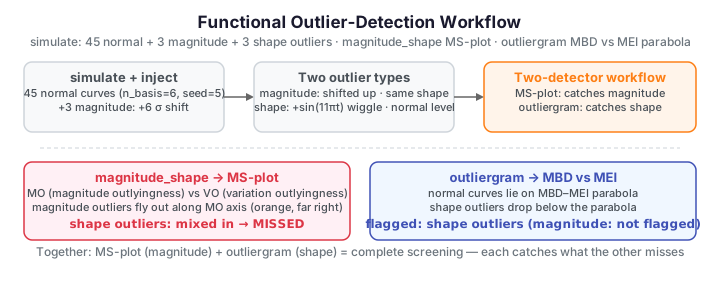
The problem. A curve can be an outlier in two very different ways. A magnitude outlier is shifted away from the crowd but keeps the usual shape; a shape outlier stays in the same value range but wiggles differently. A single detector rarely catches both, so the practical workflow pairs two complementary views: the magnitude–shape plot (MS-plot) exposes magnitude outliers, and the outliergram exposes shape outliers that hide inside the normal value range.
This page builds a sample with both kinds of injected outlier and shows each tool catching the type it is designed for.
A sample with two kinds of outlier
Start from 45 well-behaved curves, then inject three magnitude outliers (shifted up) and three shape outliers (a high-frequency wiggle at the normal level).
import numpy as np
from docs_fig import fig, render
from fdars.simulation import simulate

t = np.linspace(0, 1, 80)
normal = np.asarray(simulate(45, t, n_basis=6, seed=5))
sd = normal.std()
mag   = np.asarray(simulate(3, t, n_basis=6, seed=11)) + 6 * sd
shape = np.asarray(simulate(3, t, n_basis=6, seed=12)) + 2.5 * sd * np.sin(11 * np.pi * t)
X = np.vstack([normal, mag, shape])
is_mag   = np.zeros(len(X), bool); is_mag[45:48] = True
is_shape = np.zeros(len(X), bool); is_shape[48:51] = True

f, ax = fig()
ax.plot(t, normal.T, color="#adb5bd", lw=0.8, alpha=0.5)
ax.plot(t, X[is_mag].T,   color="#D55E00", lw=1.6, label="magnitude outliers")
ax.plot(t, X[is_shape].T, color="#4A90D9", lw=1.6, label="shape outliers")
ax.set(title="45 normal curves + 3 magnitude + 3 shape outliers",
       xlabel="t", ylabel="x(t)")
ax.legend()
print(render(f))
The magnitude outliers (orange) are obvious by eye. The shape outliers (blue) are the hard case — they sit inside the grey band, so any detector that only looks at level will miss them.
The MS-plot catches magnitude outliers
magnitude_shape returns two outlyingness scores per curve: MO (magnitude — how far
the curve sits from the centre) and VO (variation — how much its distance-to-centre
fluctuates across the domain). Plotting VO against MO, the magnitude outliers fly out
along the MO axis.
import numpy as np
from docs_fig import fig, render
from fdars.simulation import simulate
from fdars.outliers import magnitude_shape

t = np.linspace(0, 1, 80)
normal = np.asarray(simulate(45, t, n_basis=6, seed=5)); sd = normal.std()
mag   = np.asarray(simulate(3, t, n_basis=6, seed=11)) + 6 * sd
shape = np.asarray(simulate(3, t, n_basis=6, seed=12)) + 2.5 * sd * np.sin(11 * np.pi * t)
X = np.vstack([normal, mag, shape])
is_mag = np.zeros(len(X), bool); is_mag[45:48] = True
is_shape = np.zeros(len(X), bool); is_shape[48:51] = True

ms = magnitude_shape(X)
mo, vo = np.asarray(ms["magnitude"]).ravel(), np.asarray(ms["shape"]).ravel()

f, ax = fig()
normal_mask = ~(is_mag | is_shape)
ax.scatter(mo[normal_mask], vo[normal_mask], color="#adb5bd", s=24, label="normal")
ax.scatter(mo[is_mag], vo[is_mag], color="#D55E00", s=45, label="magnitude")
ax.scatter(mo[is_shape], vo[is_shape], color="#4A90D9", s=45, label="shape")
ax.set(title="MS-plot: magnitude outliers separate on the MO axis",
       xlabel="magnitude outlyingness (MO)", ylabel="variation outlyingness (VO)")
ax.legend()
print(render(f))
The orange points sit far to the side; the blue shape outliers, however, are tangled up with the normal cloud — the MS-plot alone would let them through.
The outliergram catches shape outliers
The outliergram compares each curve's modified band depth (MBD) with its modified
epigraph index (MEI). Well-behaved curves fall on a characteristic parabola; a curve
whose shape is anomalous sits below it, and outliergram returns the flagged indices.
import numpy as np
from docs_fig import fig, render
from fdars.simulation import simulate
from fdars.outliers import outliergram

t = np.linspace(0, 1, 80)
normal = np.asarray(simulate(45, t, n_basis=6, seed=5)); sd = normal.std()
mag   = np.asarray(simulate(3, t, n_basis=6, seed=11)) + 6 * sd
shape = np.asarray(simulate(3, t, n_basis=6, seed=12)) + 2.5 * sd * np.sin(11 * np.pi * t)
X = np.vstack([normal, mag, shape])
is_shape = np.zeros(len(X), bool); is_shape[48:51] = True

og = outliergram(X)
mei, mbd = np.asarray(og["mei"]).ravel(), np.asarray(og["mbd"]).ravel()
flagged = np.asarray(og["outliers"]).ravel()

f, ax = fig()
ax.scatter(mei, mbd, color="#adb5bd", s=24, label="on the parabola")
ax.scatter(mei[is_shape], mbd[is_shape], color="#4A90D9", s=45, label="injected shape")
if flagged.dtype == bool and flagged.any():
    ax.scatter(mei[flagged], mbd[flagged], facecolors="none",
               edgecolors="#D55E00", s=90, lw=1.8, label="flagged by outliergram")
ax.set(title="Outliergram: shape outliers drop below the parabola",
       xlabel="modified epigraph index (MEI)", ylabel="modified band depth (MBD)")
ax.legend()
print(render(f))
The shape outliers now stand out — they are the points pulled down and away from the parabola that the MS-plot could not distinguish. Running both tools is the reliable workflow: MS-plot for magnitude/amplitude, outliergram for shape, and a curve flagged by either deserves a closer look.
Parameters
| Function | Key argument | Meaning |
|---|---|---|
magnitude_shape(data) |
— | Returns {"magnitude": MO, "shape": VO} outlyingness scores |
outliergram(data, factor=1.5) |
factor |
Tukey-style fence multiplier; larger = fewer curves flagged |
detect_outliers_lrt(data, alpha=…) |
alpha |
Likelihood-ratio test for a hard outlier decision at level alpha |
See also
- Outlier detection — concept diagram — the three outlier types and detection methods
- Depth centrality — depth ranks curves; shallow curves are outlier candidates
- Andrews wine — outlier detection — the same tools on a real dataset
References
- Dai, W. & Genton, M. G. (2018). Multivariate functional outlier detection. Statistical Methods & Applications, 27, 231–250. (MS-plot)
- Arribas-Gil, A. & Romo, J. (2014). Shape outlier detection and visualization for functional data: the outliergram. Biostatistics, 15(4), 603–619.