Phoneme spectra: shape distance and when elastic methods help
Dataset: Phoneme — log-periodograms (256 frequency points each) of spoken sounds, five phoneme classes: aa (as in dark), ao (as in water), dcl (the d closure), iy (as in she), and sh (as in she). The curve is the sound's frequency spectrum; the label is the phoneme.
Speakers producing the same phoneme place their spectral peaks at slightly
different frequencies — a form of phase variation. Elastic (shape) analysis
is built exactly for this: it compares curves modulo reparameterisation of the
x-axis, so two spectra with the same shape but shifted peaks count as similar.
This case study asks a sharper question than "does shape analysis work?" — it
asks when it should be used at all. We diagnose the phase content, compare shape
distance against ordinary \(L^2\) distance, and let the two drive clustering
head-to-head. The result is a cautionary one: on spectral data, standard \(L^2\)
methods win, and fdars tells us why before we cluster.
Distance and clustering scale quadratically, so we work with a balanced subset of 10 curves per class (50 total); the shape-mean and phase diagnostics use the full per-class pools.
Log-periodogram spectra
import numpy as np
from docs_fig import fig, render
from docs_data import load_phoneme

freq, X, meta = load_phoneme()
ph = meta["phoneme"].to_numpy()
classes = sorted(set(ph))
palette = {"aa": "#3f51b5", "ao": "#e8710a", "dcl": "#198754",
           "iy": "#dc3545", "sh": "#6f42c1"}

f, axes = fig(ncols=5, figsize=(9.5, 2.8), sharey=True)
for ax, cls in zip(axes, classes):
    ax.plot(freq, X[ph == cls][:20].T, color=palette[cls], lw=0.4, alpha=0.5)
    ax.set_title(cls, color=palette[cls])
    ax.set_xlabel("freq bin")
axes[0].set_ylabel("log-periodogram")
f.suptitle("Log-periodogram spectra by phoneme class", y=1.05)
print(render(f))
The vowels aa and ao carry broad low-frequency energy; the fricative sh pushes energy into the high bins; dcl and iy sit in between. What distinguishes the classes is where the spectral peaks lie — a fact that will matter enormously when we decide whether warping the frequency axis helps or hurts.
Is there phase variation to exploit?
Before reaching for elastic tools, quantify how much of a class's variation is
phase (peak-position shifts) rather than amplitude (height differences).
alignment_quality aligns the curves to their Karcher mean and decomposes total
variance into amplitude and phase parts; phase_amplitude_ratio is the phase
fraction.
import numpy as np
from docs_fig import fig, render
from docs_data import load_phoneme
from fdars.alignment import alignment_quality

freq, X, meta = load_phoneme()
freq = np.ascontiguousarray(freq, dtype=np.float64)
ph = meta["phoneme"].to_numpy()
classes = sorted(set(ph))

ratios = []
for cls in classes:
    pool = np.ascontiguousarray(X[ph == cls][:30], dtype=np.float64)
    aq = alignment_quality(pool, freq, max_iter=15)
    ratios.append(100 * aq["phase_amplitude_ratio"])

f, ax = fig(figsize=(6.0, 3.8))
bars = ax.bar(classes, ratios, color=[
    "#3f51b5", "#e8710a", "#198754", "#dc3545", "#6f42c1"], width=0.6)
ax.axhline(5, color="#6c757d", ls="--", lw=1, label="5% (L2 preferred below)")
ax.axhline(15, color="#dc3545", ls=":", lw=1, label="15% (elastic likely helps)")
for b, r in zip(bars, ratios):
    ax.text(b.get_x() + b.get_width() / 2, r + 0.4, f"{r:.0f}%", ha="center")
ax.set(title="Phase fraction of variance, per phoneme",
       ylabel="phase / total variance (%)")
ax.legend(fontsize=8)
print(render(f))
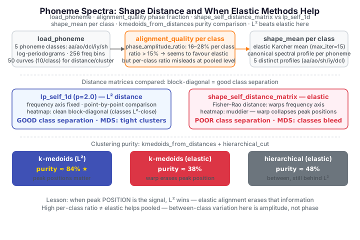
The rule of thumb: below ~5% phase, standard \(L^2\) methods are preferred; above ~15%, elastic alignment likely pays off; in between, test both. Every class here clears the 15% line — the phase fractions run from 16% (iy) to 28% (aa, sh) — so there is real peak-position variation within a phoneme, and taken at face value this whole panel argues for shape analysis. But a per-class ratio can mislead, because the real task pools all five classes together, where the story changes.
Shape distance vs \(L^2\) distance
Two distance matrices, two views of the same 50 curves.
shape_self_distance_matrix measures elastic (Fisher–Rao) shape distance —
frequency axis free to warp; lp_self_1d measures ordinary \(L^2\) distance —
frequency axis fixed. In the square-root velocity representation \(q =
\operatorname{sign}(\dot f)\sqrt{|\dot f|}\), the Fisher–Rao shape distance
minimises the \(L^2\) gap over all reparameterisations \(\gamma\) of the axis, while
\(L^2\) compares the curves point by point on the fixed grid:
A good distance for classification should be small within a class and large between classes: a block-diagonal heatmap.
import numpy as np
from docs_fig import fig, render
from docs_data import load_phoneme
from fdars.alignment import shape_self_distance_matrix
from fdars.metric import lp_self_1d

freq, X, meta = load_phoneme()
freq = np.ascontiguousarray(freq, dtype=np.float64)
ph = meta["phoneme"].to_numpy()
classes = sorted(set(ph))
idx = np.concatenate([np.where(ph == c)[0][:10] for c in classes])
Xs = np.ascontiguousarray(X[idx], dtype=np.float64)

D_shape = np.asarray(shape_self_distance_matrix(Xs, freq))
D_l2 = np.asarray(lp_self_1d(Xs, freq, p=2.0))
bounds = np.arange(10, 50, 10) - 0.5

f, axes = fig(ncols=2, figsize=(8.4, 4.0))
for ax, D, name in [(axes[0], D_l2, "L2 distance"),
                    (axes[1], D_shape, "shape (elastic) distance")]:
    ax.imshow(D, cmap="plasma", aspect="equal")
    for b in bounds:
        ax.axhline(b, color="white", lw=0.4, ls="--")
        ax.axvline(b, color="white", lw=0.4, ls="--")
    ax.set(title=name, xlabel="curve index", ylabel="curve index")
f.suptitle("Dashed lines mark class blocks (10 curves each)", y=1.02)
print(render(f))
The \(L^2\) heatmap has a clean block-diagonal structure — dark (small distance) squares along the diagonal, brighter off-diagonal — meaning same-class spectra really are \(L^2\)-close. The shape heatmap is muddier: by warping the frequency axis to match shapes, elastic distance collapses distinctions that the phoneme label depends on. Two different phonemes can be warped into similar shapes, so their shape distance shrinks. This is the first sign that elastic alignment is throwing away the signal.
Shape means
The shape_mean (elastic Karcher mean) of each class is its canonical spectral
profile, computed without letting peak-position jitter blur the average.
import numpy as np
from docs_fig import fig, render
from docs_data import load_phoneme
from fdars.alignment import shape_mean

freq, X, meta = load_phoneme()
freq = np.ascontiguousarray(freq, dtype=np.float64)
ph = meta["phoneme"].to_numpy()
classes = sorted(set(ph))
palette = {"aa": "#3f51b5", "ao": "#e8710a", "dcl": "#198754",
           "iy": "#dc3545", "sh": "#6f42c1"}

f, ax = fig()
for cls in classes:
    pool = np.ascontiguousarray(X[ph == cls][:20], dtype=np.float64)
    mean = np.asarray(shape_mean(pool, freq, max_iter=15)["mean"])
    ax.plot(freq, mean, color=palette[cls], lw=2.4, label=cls)
ax.set(title="Elastic (shape) mean spectrum per phoneme",
       xlabel="frequency bin", ylabel="log-periodogram")
ax.legend(ncol=3)
print(render(f))
The five shape means are visibly distinct — sharp, canonical profiles that a plain pointwise average would smear. As spectra they clearly occupy different frequency regions, which is precisely why we might hope shape clustering works. The next section tests that hope directly.
MDS: what each distance "sees"
Classical multidimensional scaling embeds each distance matrix in 2-D so we can look at how well it separates the classes. We compute it with plain NumPy from the distance matrices (no external library needed).
import numpy as np
from docs_fig import fig, render
from docs_data import load_phoneme
from fdars.alignment import shape_self_distance_matrix
from fdars.metric import lp_self_1d

freq, X, meta = load_phoneme()
freq = np.ascontiguousarray(freq, dtype=np.float64)
ph = meta["phoneme"].to_numpy()
classes = sorted(set(ph))
idx = np.concatenate([np.where(ph == c)[0][:10] for c in classes])
Xs = np.ascontiguousarray(X[idx], dtype=np.float64)
cls_sub = ph[idx]

def cmds(D, k=2):                                # classical MDS
    n = D.shape[0]
    J = np.eye(n) - np.ones((n, n)) / n
    B = -0.5 * J @ (D ** 2) @ J
    w, V = np.linalg.eigh(B)
    o = np.argsort(w)[::-1][:k]
    return V[:, o] * np.sqrt(np.maximum(w[o], 0))

D_shape = np.asarray(shape_self_distance_matrix(Xs, freq))
D_l2 = np.asarray(lp_self_1d(Xs, freq, p=2.0))
palette = {"aa": "#3f51b5", "ao": "#e8710a", "dcl": "#198754",
           "iy": "#dc3545", "sh": "#6f42c1"}

f, axes = fig(ncols=2, figsize=(8.4, 4.0))
for ax, D, name in [(axes[0], D_l2, "MDS: L2 distance"),
                    (axes[1], D_shape, "MDS: shape distance")]:
    Y = cmds(D)
    for cls in classes:
        m = cls_sub == cls
        ax.scatter(Y[m, 0], Y[m, 1], color=palette[cls], s=34, alpha=0.85,
                   edgecolor="white", label=cls)
    ax.set(title=name, xlabel="MDS 1", ylabel="MDS 2")
axes[1].legend(fontsize=8, ncol=2)
print(render(f))
Under \(L^2\) the classes form recognisable clusters; under shape distance the classes overlap far more, several colours bleeding together. The embedding confirms the heatmap: frequency warping removes the very peak-position information that separates phonemes.
Clustering head-to-head
Now the decisive test. We cluster the 50 curves with k-medoids on each distance matrix — elastic shape distance versus \(L^2\) — and score each partition by purity: assigning each cluster its majority true class and counting the curves that agree, normalised by the total,
where the sum runs over clusters \(c\) and the max over true classes \(j\); purity
\(1\) means every cluster is pure. Since there are no elastic-k-means or
standard-k-means bindings that take a precomputed distance,
kmedoids_from_distances gives both methods a fair, identical clustering engine
— the only thing that differs is the distance.
import numpy as np
from docs_fig import fig, render
from docs_data import load_phoneme
from fdars.alignment import (shape_self_distance_matrix,
                             kmedoids_from_distances, hierarchical_cut)
from fdars.metric import lp_self_1d

freq, X, meta = load_phoneme()
freq = np.ascontiguousarray(freq, dtype=np.float64)
ph = meta["phoneme"].to_numpy()
classes = sorted(set(ph))
idx = np.concatenate([np.where(ph == c)[0][:10] for c in classes])
Xs = np.ascontiguousarray(X[idx], dtype=np.float64)
cls_sub = ph[idx]

D_shape = np.asarray(shape_self_distance_matrix(Xs, freq))
D_l2 = np.asarray(lp_self_1d(Xs, freq, p=2.0))

def purity(labels):
    labels = np.asarray(labels)
    return sum(np.unique(cls_sub[labels == c], return_counts=True)[1].max()
               for c in np.unique(labels)) / len(cls_sub)

pur_l2 = purity(kmedoids_from_distances(D_l2, k=5, seed=42)["labels"])
pur_shape = purity(kmedoids_from_distances(D_shape, k=5, seed=42)["labels"])
pur_hier = purity(hierarchical_cut(D_shape, k=5, linkage="complete"))

names = ["k-medoids (L2)", "k-medoids (elastic)", "hierarchical (elastic)"]
vals = [pur_l2, pur_shape, pur_hier]
f, ax = fig(figsize=(6.4, 3.8))
bars = ax.barh(range(3), vals, color=["#3f51b5", "#e8710a", "#dc3545"])
ax.set_yticks(range(3)); ax.set_yticklabels(names)
for b, v in zip(bars, vals):
    ax.text(v + 0.01, b.get_y() + b.get_height() / 2, f"{v:.0%}", va="center")
ax.set(title="Cluster purity: L2 beats elastic on spectral data",
       xlabel="purity", xlim=(0, 1.05))
print(render(f))
The verdict is stark and reproducible: \(L^2\) k-medoids reaches ~84% purity, while elastic k-medoids languishes near ~38% — worse than some naive baselines. Switching to hierarchical (complete-linkage) clustering on the same shape distances lands in between at ~48%: better than elastic k-medoids but still far below \(L^2\). Neither shape-based partition comes close. The diagnostic at the top of the page predicted this: once all five classes are pooled, the discriminative variation is amplitude, not phase, and elastic alignment spends its freedom erasing the peak positions that separate phonemes.
Elastic methods are not universally better
Fisher–Rao / SRSF alignment warps the independent variable. That is
exactly right when the x-axis is time and phase is a nuisance (gait cycles,
ECG beats, growth curves). It is exactly wrong when the x-axis is frequency
and the peak positions carry the meaning — as in these spectra. The
phase_amplitude_ratio from alignment_quality is the switch: high phase
fraction ⇒ reach for elastic tools; low phase fraction ⇒ stay with \(L^2\).
Parameters
| Function | Key parameters | Description |
|---|---|---|
alignment_quality(data, argvals, max_iter) |
max_iter |
Amplitude/phase variance split; phase_amplitude_ratio, mean_variance_reduction |
shape_self_distance_matrix(data, argvals, quotient) |
quotient |
Pairwise elastic (Fisher–Rao) shape distances |
lp_self_1d(data, argvals, p) |
p |
Pairwise \(L^p\) distances (p=2 ⇒ \(L^2\)) |
shape_mean(data, argvals, max_iter, tol) |
max_iter |
Elastic Karcher mean; mean, aligned_data, gammas |
kmedoids_from_distances(dist_mat, k, seed) |
k, seed |
k-medoids on a precomputed distance matrix; labels |
hierarchical_cut(dist_mat, k, linkage) |
k, linkage |
Agglomerative clustering cut into k groups |
See also
- Alignment and elastic distances — Karcher means, SRSF, and when phase variation is the signal.
- Classification — supervised LDA/QDA/k-NN on these same spectra, where the frequency axis stays fixed.
- Clustering functional data — k-means, fuzzy c-means, and GMM in function space.
References
- Hastie, T., Buja, A., Tibshirani, R. (1995). Penalized discriminant analysis. Annals of Statistics 23(1):73-102.
- Ferraty, F., Vieu, P. (2003). Curves discrimination: a nonparametric functional approach. Computational Statistics & Data Analysis 44(1-2):161-173.
- Srivastava, A., Klassen, E.P. (2016). Functional and Shape Data Analysis. Springer.