Growth curve alignment
Dataset: Berkeley Growth Study — heights of 39 boys and 54 girls measured at 31 ages between 1 and 18 years.
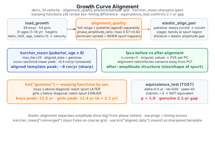
The pubertal growth spurt is the defining feature of a child's height trajectory, but it happens at a different age for every child. If we simply average the raw curves, the spurts land at different times and cancel out, blurring the very feature we care about. This is phase variation, and it is exactly what elastic alignment is built to separate from amplitude variation (how big each spurt is).
This case study works with growth velocity — the derivative of height with
respect to age — where the spurt shows up as a sharp peak. We align the
velocity curves with fdars.alignment, quantify how much variation is phase
(timing), recover a sharpened population spurt, run FPCA before and after
alignment, and finally read the warping functions as per-child timing
scores that reveal girls mature about two years earlier than boys.
Growth velocity curves
We differentiate each height curve with fdars.fdata.deriv_1d to obtain
velocity (cm/year). The peak of each curve marks that child's growth spurt.
import numpy as np
from docs_fig import fig, render
from docs_data import load_growth
from fdars.fdata import deriv_1d

age, X, meta = load_growth()
V = np.asarray(deriv_1d(X, age, nderiv=1))     # (93, 31) velocity curves

f, ax = fig()
male = meta["sex"].to_numpy() == "male"
ax.plot(age, V[male].T, color="#3f51b5", lw=1, alpha=0.35)
ax.plot(age, V[~male].T, color="#e8710a", lw=1, alpha=0.35)
ax.plot([], [], color="#3f51b5", label="boys")
ax.plot([], [], color="#e8710a", label="girls")
ax.set(title="Growth velocity — the spurt peaks at different ages",
       xlabel="age (years)", ylabel="velocity (cm/year)")
ax.legend()
print(render(f))
The spurts are smeared across roughly ages 10–16. A pointwise (cross-sectional) mean of these curves under-states the true spurt because the peaks do not line up. The infant growth spike near age 1 dominates the early part of the axis; to study the pubertal spurt on its own we will later restrict to ages 8–18.
The elastic-alignment idea
Two curves \(f\) and \(g\) differing only in timing are related by a warping function \(\gamma\) — a smooth, increasing bijection of the time axis — via \(g \approx f \circ \gamma\). The elastic framework compares curves through their square-root velocity functions (SRSF)
and defines the amplitude distance between \(f\) and \(g\) as the smallest \(L^2\) distance between their SRSFs achievable over all warpings \(\gamma\),
where \(\Gamma\) is the group of increasing bijections of the time axis. The
optimal \(\gamma\) is the phase (timing) difference; the residual SRSF
distance is the amplitude difference. Aligning the whole sample to a Karcher
mean \(\mu\) then splits the total variance into an amplitude and a phase part,
whose ratio is the diagnostic reported by alignment_quality:
fdars exposes this through elastic_align_pair (pairwise), karcher_mean
(a template + all warpings) and alignment_quality (the phase/amplitude
variance split).
Aligning a single pair
elastic_align_pair(curve1, curve2, argvals) warps curve2 onto curve1 and
returns the aligned curve, the warping function gamma, and the elastic
distance.
import numpy as np
from docs_fig import fig, render
from docs_data import load_growth
from fdars.fdata import deriv_1d
from fdars.alignment import elastic_align_pair

age, X, meta = load_growth()
V = np.asarray(deriv_1d(X, age, nderiv=1))
a, b = V[60], V[70]                              # two girls, offset spurts
res = elastic_align_pair(a, b, age)
b_aligned, gamma = np.asarray(res["f_aligned"]), np.asarray(res["gamma"])

f, (ax1, ax2) = fig(1, 2, figsize=(9.5, 3.8))
ax1.plot(age, a, color="#3f51b5", lw=2, label="target")
ax1.plot(age, b, color="#e8710a", lw=2, ls="--", label="before")
ax1.plot(age, b_aligned, color="#198754", lw=2, label="after")
ax1.set(title="Velocity: before vs after warping", xlabel="age", ylabel="cm/year")
ax1.legend()
ax2.plot(age, age, color="#6c757d", lw=1, ls=":")     # identity = no warp
ax2.plot(age, gamma, color="#6f42c1", lw=2)
ax2.set(title="Warping function $\\gamma$", xlabel="age", ylabel="warped age")
print(render(f))
The warping function bends away from the diagonal exactly where the second child's spurt has to be shifted to match the first; the aligned green curve now peaks together with the blue target.
How much variation is timing? The phase/amplitude split
Before aligning the whole sample it pays to ask how much of the spread across
curves is phase (fixable by warping) versus amplitude (genuine differences in
spurt size). alignment_quality runs the elastic alignment and reports the
total, amplitude and phase variance, together with their ratio. We
compute it on the full age range and again on the pubertal region alone.
import numpy as np
from docs_fig import fig, render
from docs_data import load_growth
from fdars.fdata import deriv_1d
from fdars.alignment import alignment_quality

age, X, meta = load_growth()
V = np.asarray(deriv_1d(X, age, nderiv=1))
pub = age >= 8                                   # pubertal region, ages 8-18
Vp, ap = V[:, pub], age[pub]

aq_full = alignment_quality(V, age, max_iter=20)
aq_pub = alignment_quality(Vp, ap, max_iter=20)

labels = ["full range\n(1-18)", "pubertal\n(8-18)"]
amp = [aq_full["amplitude_variance"], aq_pub["amplitude_variance"]]
pha = [aq_full["phase_variance"], aq_pub["phase_variance"]]
ratio = [aq_full["phase_amplitude_ratio"], aq_pub["phase_amplitude_ratio"]]

f, ax = fig()
xpos = np.arange(2)
ax.bar(xpos, amp, 0.55, color="#3f51b5", label="amplitude variance")
ax.bar(xpos, pha, 0.55, bottom=amp, color="#e8710a", label="phase variance")
for x, r in zip(xpos, ratio):
    ax.text(x, amp[x] + pha[x], f"  phase/amp = {r:.2f}",
            ha="center", va="bottom", fontsize=9)
ax.set(title="Variance decomposition: amplitude vs phase",
       ylabel="mean pointwise variance")
ax.set_xticks(xpos); ax.set_xticklabels(labels)
ax.legend()
print(render(f))
Restricting to the pubertal window raises the phase share substantially (the phase/amplitude ratio rises from about 0.57 to 0.82). Away from the confounding infant spike, the dominant source of spread across children really is when the spurt happens — precisely the situation elastic alignment is designed for.
Karcher mean: aligning the whole sample
karcher_mean estimates the elastic (Fréchet) mean template and, as a
by-product, warps every curve onto it. We run it on the pubertal region so the
sharpened spurt is not swamped by the infant spike.
import numpy as np
from docs_fig import fig, render
from docs_data import load_growth
from fdars.fdata import deriv_1d
from fdars.alignment import karcher_mean

age, X, meta = load_growth()
V = np.asarray(deriv_1d(X, age, nderiv=1))
pub = age >= 8
Vp, ap = V[:, pub], age[pub]

km = karcher_mean(Vp, ap, max_iter=25)
aligned = np.asarray(km["aligned_data"])     # curves registered to the template
aligned_mean = aligned.mean(axis=0)          # sharpened template = mean of registered curves
xsec_mean = Vp.mean(axis=0)                   # naive cross-sectional mean of raw curves

f, (ax1, ax2) = fig(1, 2, figsize=(9.5, 3.8), sharey=True)
ax1.plot(ap, Vp.T, color="#3f51b5", lw=1, alpha=0.3)
ax1.plot(ap, xsec_mean, color="#dc3545", lw=2.5, label="cross-sectional mean")
ax1.set(title="Raw pubertal velocity + naive mean", xlabel="age", ylabel="cm/year")
ax1.legend()
ax2.plot(ap, aligned.T, color="#198754", lw=1, alpha=0.3)
ax2.plot(ap, aligned_mean, color="#e8710a", lw=2.5, label="aligned mean (template)")
ax2.set(title="Aligned velocity + template mean", xlabel="age")
ax2.legend()
print(render(f))

print(f"\ncross-sectional mean peak: {xsec_mean.max():.2f} cm/yr "
      f"at age {ap[xsec_mean.argmax()]:.1f}")
print(f"aligned template peak:     {aligned_mean.max():.2f} cm/yr "
      f"at age {ap[aligned_mean.argmax()]:.1f}")
After registration the peaks stack up, so the mean of the aligned curves (orange) is a sharp, tall template that tracks the registered sample — about 8 cm/yr, whereas the naive cross-sectional mean of the raw curves (red) is only about 6.4 cm/yr and smeared, because it averages peaks that occur at different ages. Phase-aligned averaging recovers the true amplitude of the population spurt that cross-sectional averaging destroys.
Which mean to plot
karcher_mean also returns km["mean"], the elastic (Fréchet) mean
reconstructed in SRSF space. On this coarse, unequally-spaced grid that
reconstruction does not converge (km["converged"] stays False even
at large max_iter, and smoothing the velocities onto a finer regular grid
first does not fix it here — the SRSF reconstruction overshoots). So we plot
the pointwise mean of the registered curves km["aligned_data"] — the
standard sharpened template, which is the value quoted above. (Tracked
upstream: fdars-core.)
FPCA before and after alignment
If alignment really removed a coherent source of variation, the aligned curves
should be lower-dimensional: a functional PCA should need fewer components to
explain the same variance. We fit fdars.regression.fpca to the raw pubertal
curves and to the aligned curves and compare the percentage of variance
explained (PVE) by the first three components.
import numpy as np
from docs_fig import fig, render
from docs_data import load_growth
from fdars.fdata import deriv_1d
from fdars.alignment import karcher_mean
from fdars.regression import fpca

age, X, meta = load_growth()
V = np.asarray(deriv_1d(X, age, nderiv=1))
pub = age >= 8
Vp, ap = V[:, pub], age[pub]
aligned = np.asarray(karcher_mean(Vp, ap, max_iter=25)["aligned_data"])

def pve(curves):
    s = np.asarray(fpca(curves, ap, n_comp=3)["singular_values"]) ** 2
    return 100.0 * s / s.sum()

pve_before, pve_after = pve(Vp), pve(aligned)

f, ax = fig()
xpos = np.arange(3)
w = 0.38
ax.bar(xpos - w / 2, pve_before, w, color="#3f51b5", label="before alignment")
ax.bar(xpos + w / 2, pve_after, w, color="#e8710a", label="after alignment")
for x in xpos:
    ax.text(x - w / 2, pve_before[x] + 1, f"{pve_before[x]:.0f}", ha="center", fontsize=8)
    ax.text(x + w / 2, pve_after[x] + 1, f"{pve_after[x]:.0f}", ha="center", fontsize=8)
ax.set(title="FPCA variance explained, before vs after alignment",
       ylabel="% variance explained")
ax.set_xticks(xpos); ax.set_xticklabels(["PC1", "PC2", "PC3"])
ax.legend()
print(render(f))
The story is subtle but real. Alignment does not slash the number of components here — instead it redistributes variance away from PC1 (which before alignment absorbs a lot of the timing spread) into PC2 and PC3. What is left is amplitude structure: after removing phase, the leading modes describe how big and how broad each child's spurt is, not merely when it occurred.
Warping functions as timing scores
The real prize of alignment is the collection of warping functions
\(\gamma_i\), one per child, returned in km["gammas"]. Each \(\gamma_i\) says how
that child's clock maps onto the shared reference: a curve below the identity
diagonal reaches any given developmental milestone earlier, above it
later. Colouring the warps by sex turns the abstract registration into a
biological statement.
import numpy as np
from docs_fig import fig, render
from docs_data import load_growth
from fdars.fdata import deriv_1d
from fdars.alignment import karcher_mean

age, X, meta = load_growth()
V = np.asarray(deriv_1d(X, age, nderiv=1))
male = meta["sex"].to_numpy() == "male"
pub = age >= 8
Vp, ap = V[:, pub], age[pub]

km = karcher_mean(Vp, ap, max_iter=25)
gammas = np.asarray(km["gammas"])            # (93, m) warps, already on the age axis
tg = ap                                       # reference age grid

f, (ax1, ax2) = fig(1, 2, figsize=(9.5, 3.8))
ax1.plot([ap[0], ap[-1]], [ap[0], ap[-1]], color="#6c757d", ls="--", lw=1)
ax1.plot(tg, gammas[male].T, color="#3f51b5", lw=0.7, alpha=0.35)
ax1.plot(tg, gammas[~male].T, color="#e8710a", lw=0.7, alpha=0.35)
ax1.plot([], [], color="#3f51b5", label="boys")
ax1.plot([], [], color="#e8710a", label="girls")
ax1.set(title="Warping functions by sex", xlabel="reference age", ylabel="child's age")
ax1.legend()

# mean warp per sex, with the identity for reference
ax2.plot([ap[0], ap[-1]], [ap[0], ap[-1]], color="#6c757d", ls="--", lw=1, label="identity")
ax2.plot(tg, gammas[male].mean(0), color="#3f51b5", lw=2.4, label="boys mean")
ax2.plot(tg, gammas[~male].mean(0), color="#e8710a", lw=2.4, label="girls mean")
ax2.set(title="Mean warping function by sex", xlabel="reference age", ylabel="child's age")
ax2.legend()
print(render(f))
Boys' warps (blue) sit above the diagonal in the spurt region and girls' (orange) below. Reading the axes — a point at a given reference age maps to the child's own age — a below-diagonal warp means the child reaches the shared reference spurt at a younger calendar age. So the girls' curves dipping below say girls hit the spurt earlier, while the boys' rising above say they hit it later. The two mean warps peel cleanly apart — a population-level picture of girls maturing ahead of boys.
Testing the timing difference
The separation between the mean warps is visually obvious, but is it
statistically real? Two complementary checks. First, a direct read of each
child's peak spurt age — the age at which their raw velocity is maximal —
split by sex. Second, a functional equivalence test (equivalence_test,
two one-sided tests) asking whether the boys' and girls' warping functions are
equivalent to within a \(\delta = 0.5\)-year margin.
import numpy as np
from docs_fig import fig, render
from docs_data import load_growth
from fdars.fdata import deriv_1d
from fdars.alignment import karcher_mean
from fdars.tolerance import equivalence_test

age, X, meta = load_growth()
V = np.asarray(deriv_1d(X, age, nderiv=1))
male = meta["sex"].to_numpy() == "male"
pub = age >= 8
Vp, ap = V[:, pub], age[pub]

# peak spurt age per child
peak_age = ap[Vp.argmax(axis=1)]
boys, girls = peak_age[male], peak_age[~male]

# equivalence test on the warping functions, delta = 0.5 years
gammas = np.asarray(karcher_mean(Vp, ap, max_iter=25)["gammas"])
et = equivalence_test(gammas[male], gammas[~male], delta=0.5, nb=500, seed=42)

f, ax = fig(figsize=(6.2, 4.0))
ax.boxplot([girls, boys], tick_labels=["girls", "boys"],
           patch_artist=True,
           boxprops=dict(facecolor="#f2c9a0"),
           medianprops=dict(color="#333"))
ax.scatter(np.full(girls.size, 1) + np.random.default_rng(0).uniform(-.08, .08, girls.size),
           girls, color="#e8710a", s=14, alpha=0.6, zorder=3)
ax.scatter(np.full(boys.size, 2) + np.random.default_rng(1).uniform(-.08, .08, boys.size),
           boys, color="#3f51b5", s=14, alpha=0.6, zorder=3)
ax.set(title="Peak spurt age by sex", ylabel="age of peak velocity (years)")
print(render(f))

print(f"\nboys:  mean peak age = {boys.mean():.1f} yr (sd {boys.std():.1f})")
print(f"girls: mean peak age = {girls.mean():.1f} yr (sd {girls.std():.1f})")
print(f"difference:           {boys.mean() - girls.mean():.1f} yr\n")
print(f"equivalence test (delta=0.5 yr): equivalent = {et['equivalent']}, "
      f"p = {et['p_value']:.3f}, statistic = {et['test_statistic']:.3f}")
The boxplots barely overlap: boys peak at a mean of 13.5 years, girls at 11.4 years — a 2.1-year difference, exactly the classic result. The equivalence test agrees emphatically: with a test statistic well above the \(\delta = 0.5\) margin it fails to declare equivalence (\(p = 1\)), so the timing profiles of boys and girls are not interchangeable within half a year. The visual gap in the warping functions is a genuine developmental signal, not sampling noise.
TOST direction
equivalence_test runs two one-sided tests (TOST): the null is
non-equivalence, and only a small statistic (inside \(\pm\delta\)) would let
us declare equivalence. Here the statistic is large, so we correctly fail
to declare the sexes equivalent — the honest, expected outcome for a
genuine 2-year timing gap.
Parameters
| Function | Key parameters | Description |
|---|---|---|
deriv_1d(data, argvals, nderiv) |
nderiv |
Order of numerical derivative (1 = velocity, 2 = acceleration) |
elastic_align_pair(c1, c2, argvals, lambda_) |
lambda_ |
Roughness penalty on the warping (0 = unpenalized) |
alignment_quality(data, argvals, lambda_, max_iter, tol) |
max_iter |
Returns amplitude_variance, phase_variance, phase_amplitude_ratio |
karcher_mean(data, argvals, lambda_, max_iter, tol) |
max_iter, tol |
Template + aligned_data, gammas, converged |
fpca(data, argvals, n_comp) |
n_comp |
FPCA; singular_values give the variance spectrum |
equivalence_test(data1, data2, delta, alpha, nb, seed) |
delta, nb |
TOST equivalence; equivalent, p_value, test_statistic |
See also
- Curve alignment concepts for the SRSF theory.
- Sonar: when elastic alignment helps — the same machinery on data where phase removal hurts instead.
- FPCA & clustering of weather curves — the same amplitude/phase distinction applied to temperature.
References
- Tuddenham, R.D., Snyder, M.M. (1954). Physical growth of California boys and girls from birth to age 18. University of California Publications in Child Development 1:183-364.
- Ramsay, J.O., Silverman, B.W. (2005). Functional Data Analysis, 2nd ed. Springer.
- Srivastava, A., Klassen, E.P. (2016). Functional and Shape Data Analysis. Springer.
- Tucker, J.D., Wu, W., Srivastava, A. (2013). Generative models for functional data using phase and amplitude separation. Computational Statistics & Data Analysis 61:50-66.