Predicting fat from NIR spectra
Dataset: Tecator — near-infrared absorbance spectra (100 channels, 850–1050 nm) of 240 meat samples, each with a lab-measured fat content.
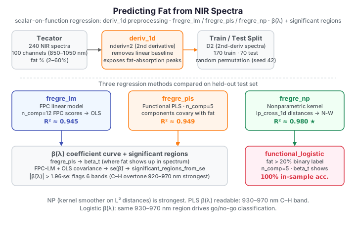
A food manufacturer wants to replace slow, destructive wet chemistry with a rapid near-infrared (NIR) spectrometer for measuring the fat content of meat. Can we predict the fat percentage directly from the spectrum? Each observation is a whole absorbance curve, and the response is a single number — a textbook scalar-on-function regression problem. This page walks the full workflow: inspect and pre-process the spectra, fit and compare several functional regressions, read the estimated coefficient curve \(\beta(\lambda)\), check the model's residuals, and finish with a high-vs-low-fat classification.
The spectra, colored by fat
import numpy as np
from docs_fig import fig, render
from docs_data import load_tecator

wl, X, meta = load_tecator()
fat = meta["fat"].to_numpy()
order = np.argsort(fat)
norm = (fat - fat.min()) / np.ptp(fat)

import matplotlib.cm as cm
f, ax = fig()
for i in order:
    ax.plot(wl, X[i], color=cm.viridis(norm[i]), lw=0.8, alpha=0.7)
ax.set(title="Tecator spectra, colored by fat content (dark = lean)",
       xlabel="wavelength (nm)", ylabel="absorbance $-\\log_{10}T$")
sm = cm.ScalarMappable(cmap="viridis")
sm.set_array(fat)
f.colorbar(sm, ax=ax, label="fat (%)")
print(render(f))
The spectra look almost parallel — the dominant variation is a vertical baseline shift plus multiplicative scatter, not shape. The fat signal lives in subtle curvature around the 930–970 nm fat-absorption band, largely hidden under that baseline.
Pre-processing: smoothing and derivatives
A standard NIR preprocessing trick removes the baseline by differentiating: a
constant or linear offset vanishes under d²/dλ², exposing the absorption peaks
and sharpening spectral features. We compute the first and second derivatives
with fdars.fdata.deriv_1d and show all three views stacked.
import numpy as np
from docs_fig import fig, render
from docs_data import load_tecator
from fdars.fdata import deriv_1d

wl, X, meta = load_tecator()
fat = meta["fat"].to_numpy()
D1 = np.asarray(deriv_1d(X, wl, nderiv=1))
D2 = np.asarray(deriv_1d(X, wl, nderiv=2))
norm = (fat - fat.min()) / np.ptp(fat)

import matplotlib.cm as cm
f, (a0, a1, a2) = fig(nrows=3, figsize=(7.2, 7.4))
for ax, data, ttl, yl in [
        (a0, X, "Smoothed absorbance", "$A$"),
        (a1, D1, "First derivative", "$dA/d\\lambda$"),
        (a2, D2, "Second derivative", "$d^2A/d\\lambda^2$")]:
    for i in np.argsort(fat):
        ax.plot(wl, data[i], color=cm.viridis(norm[i]), lw=0.7, alpha=0.7)
    ax.set(title=ttl, ylabel=yl)
a2.set_xlabel("wavelength (nm)")
print(render(f))
The raw spectra barely separate by fat; the first derivative already fans out,
and the second derivative — free of any linear baseline — turns an invisible
signal into a clearly visible one. All the regressions below run on this
second-derivative representation D2.
Comparing regression methods honestly
fdars offers several scalar-on-function regressions. We split 170 samples for
training and hold out 70, then compare three that predict a fat value directly:
- FPC linear model (
fregre_lm) — project spectra onto their leading functional principal components, then run ordinary least squares on the scores. - Functional PLS (
fregre_pls) — choose components that covary with the response rather than maximise spectral variance. - Nonparametric (
fregre_np) — no coefficient curve at all: predict each spectrum from a kernel-weighted average of its neighbours in curve space. It has no separate predict binding, so we form its held-out prediction transparently with a Nadaraya–Watson average over the cross distances (fdars.metric.lp_cross_1d) between test and train spectra.
import numpy as np
from docs_fig import fig, render
from docs_data import load_tecator
from fdars.fdata import deriv_1d
from fdars.metric import lp_self_1d, lp_cross_1d
from fdars.regression import (fregre_lm, predict_fregre_lm,
                              fregre_pls, predict_fregre_pls, fregre_np)

wl, X, meta = load_tecator()
fat = meta["fat"].to_numpy()
D2 = np.asarray(deriv_1d(X, wl, nderiv=2))

rng = np.random.default_rng(42)
idx = rng.permutation(X.shape[0])
tr, te = idx[:170], idx[170:]
def r2(y, p): return 1 - np.sum((y - p) ** 2) / np.sum((y - y.mean()) ** 2)
def rmse(y, p): return float(np.sqrt(np.mean((y - p) ** 2)))

# FPC-LM
pred_lm = np.asarray(predict_fregre_lm(D2[tr], fat[tr], D2[te], n_comp=12))
# PLS (n_comp kept modest — see warning)
pred_pls = np.asarray(predict_fregre_pls(D2[tr], wl, fat[tr], D2[te], n_comp=5))
# NP: Nadaraya–Watson via cross distances
h = fregre_np(np.asarray(lp_self_1d(D2[tr], wl, 2.0)), fat[tr], 0.0)["h_func"]
Dc = np.asarray(lp_cross_1d(D2[te], D2[tr], wl, 2.0))
W = np.exp(-0.5 * (Dc / h) ** 2)
pred_np = (W @ fat[tr]) / W.sum(1)

methods = {"FPC-LM": pred_lm, "PLS": pred_pls, "NP": pred_np}
lim = [fat.min() - 2, fat.max() + 2]
f, axes = fig(ncols=3, figsize=(10.5, 3.7))
for ax, (name, pred) in zip(axes, methods.items()):
    ax.plot(lim, lim, color="#6c757d", ls=":", lw=1)
    ax.scatter(fat[te], pred, color="#3f51b5", s=22, alpha=0.8, edgecolor="white")
    ax.set(title=f"{name}: $R^2$={r2(fat[te], pred):.3f}, RMSE={rmse(fat[te], pred):.2f}",
           xlabel="measured fat (%)", ylabel="predicted fat (%)",
           xlim=lim, ylim=lim)
print(render(f))
All three clear an honest \(R^2\) of about 0.94–0.98 on the held-out samples — NIR really can stand in for wet chemistry. On these second-derivative spectra the nonparametric neighbour model is clearly strongest (\(R^2 \approx 0.98\)); the two linear models trail it and sit almost on top of each other, with PLS (\(0.949\)) just edging out the FPC linear model (\(0.945\)) despite using far fewer components. The cross-validation page puts this comparison on a fully out-of-fold footing.
Functional PLS and the coefficient curve
The functional linear model writes the response as an integral against a coefficient curve \(\beta(\lambda)\):
Because neighbouring channels are highly collinear, we cannot fit \(\beta\) freely.
Functional partial least squares (fregre_pls) projects the curves onto a
few components chosen to covary with the response, then reconstructs a smooth
\(\beta(\lambda)\) returned as beta_t. Reading it tells us where in the
spectrum the model looks.
import numpy as np
from docs_fig import fig, render
from docs_data import load_tecator
from fdars.fdata import deriv_1d
from fdars.regression import fregre_pls

wl, X, meta = load_tecator()
fat = meta["fat"].to_numpy()
D2 = np.asarray(deriv_1d(X, wl, nderiv=2))
fit = fregre_pls(D2, wl, fat, n_comp=5)
beta = np.asarray(fit["beta_t"])

f, ax = fig()
ax.axhline(0, color="#6c757d", lw=0.8)
ax.plot(wl, beta, color="#e8710a", lw=2)
ax.fill_between(wl, 0, beta, color="#e8710a", alpha=0.15)
peak = wl[np.argmax(np.abs(beta))]
ax.axvline(peak, color="#3f51b5", ls="--", lw=1, label=f"peak ≈ {peak:.0f} nm")
ax.set(title="PLS coefficient curve $\\beta(\\lambda)$ — where fat shows up",
       xlabel="wavelength (nm)", ylabel="$\\beta$")
ax.legend()
print(render(f))
The strongest weights cluster around the 920–970 nm region, consistent with the known C–H overtone absorption band of fat.
A coefficient curve with a confidence band
Which of those wiggles are real? We can attach a pointwise confidence band to
the coefficient curve. fdars has no direct standard-error binding for
fregre_pls, so we build one transparently from the FPCA route the R reference
uses. Expanding \(\beta\) in the leading FPC loadings \(V=[\phi_1,\dots,\phi_K]\)
turns the functional fit into an OLS of fat on the FPC scores \(\gamma\), so the
coefficient curve and its pointwise standard error follow by propagating the
OLS covariance through the loadings:
A wavelength is flagged significant where the 95% band excludes zero,
\(|\hat\beta(\lambda)| > 1.96\,\operatorname{se}(\hat\beta(\lambda))\), via
fdars.explain.significant_regions_from_se.
import numpy as np
from docs_fig import fig, render
from docs_data import load_tecator
from fdars.fdata import deriv_1d
from fdars.regression import fpca
from fdars.explain import significant_regions_from_se

wl, X, meta = load_tecator()
fat = meta["fat"].to_numpy()
D2 = np.asarray(deriv_1d(X, wl, nderiv=2))
n = len(fat)

ncomp = 6
pc = fpca(D2, wl, n_comp=ncomp)
scores = np.asarray(pc["scores"]); V = np.asarray(pc["rotation"])
Z = np.column_stack([np.ones(n), scores])
coef, *_ = np.linalg.lstsq(Z, fat, rcond=None)
resid = fat - Z @ coef
sigma2 = resid @ resid / (n - Z.shape[1])
cov = sigma2 * np.linalg.inv(Z.T @ Z)
beta = V @ coef[1:]
se = np.sqrt(np.clip(np.diag(V @ cov[1:, 1:] @ V.T), 0, None))
regions = significant_regions_from_se(beta, se, z_alpha=1.96)

f, ax = fig()
ax.axhline(0, color="#6c757d", ls="--", lw=0.8)
ax.fill_between(wl, beta - 1.96 * se, beta + 1.96 * se,
                color="#0072B2", alpha=0.2)
ax.plot(wl, beta, color="#0072B2", lw=1.6)
for lo, hi, _sign in regions:                 # (start_idx, end_idx, sign)
    ax.axvspan(wl[int(lo)], wl[int(hi)], color="#e8710a", alpha=0.12)
ax.set(title="FPC-LM $\\hat\\beta(\\lambda)$ with 95% band (orange = significant)",
       xlabel="wavelength (nm)", ylabel="$\\hat\\beta(\\lambda)$")
print(render(f))
The significant regions are diffuse rather than concentrated: the 95% band excludes zero in six separate stretches spread across the whole range — roughly 850–886, 901–913, 927–947, and 971–1036 nm — not just at the 925–950 nm C–H overtone band. That band does carry the sharpest, deepest feature (the strong negative lobe near 935 nm), but on the second-derivative representation the model draws reliable signal from several wavelength windows, and only the narrow gaps between the shaded bands straddle zero.
Model diagnostics: are the residuals well behaved?
A fitted model is only trustworthy if its residuals look like noise. We fit the FPC linear model on all samples and inspect its residuals two ways: against the fitted values (to spot heteroscedasticity or curvature) and as a normal quantile–quantile plot (to check the error distribution).
import numpy as np
from docs_fig import fig, render
from docs_data import load_tecator
from fdars.fdata import deriv_1d
from fdars.regression import fregre_lm

wl, X, meta = load_tecator()
fat = meta["fat"].to_numpy()
D2 = np.asarray(deriv_1d(X, wl, nderiv=2))
fit = fregre_lm(D2, fat, n_comp=12)
fitted = np.asarray(fit["fitted_values"])
resid = np.asarray(fit["residuals"])

f, (aL, aR) = fig(ncols=2, figsize=(9.4, 3.7))
aL.axhline(0, color="#dc3545", ls="--", lw=1)
aL.scatter(fitted, resid, color="#0072B2", s=18, alpha=0.6)
aL.set(title=f"Fitted vs residuals ($R^2$={fit['r_squared']:.3f})",
       xlabel="fitted fat (%)", ylabel="residual")

# normal QQ-plot (numpy — no scipy dependency)
rs = np.sort(resid); q = (np.arange(1, len(rs) + 1) - 0.5) / len(rs)
def norm_ppf(p):
    # rational approximation (Acklam) for the standard-normal quantile
    a = [-3.969683028665376e+01, 2.209460984245205e+02, -2.759285104469687e+02,
         1.383577518672690e+02, -3.066479806614716e+01, 2.506628277459239e+00]
    b = [-5.447609879822406e+01, 1.615858368580409e+02, -1.556989798598866e+02,
         6.680131188771972e+01, -1.328068155288572e+01]
    c = [-7.784894002430293e-03, -3.223964580411365e-01, -2.400758277161838e+00,
         -2.549732539343734e+00, 4.374664141464968e+00, 2.938163982698783e+00]
    d = [7.784695709041462e-03, 3.224671290700398e-01, 2.445134137142996e+00,
         3.754408661907416e+00]
    plow, phigh = 0.02425, 1 - 0.02425
    if p < plow:
        q = np.sqrt(-2 * np.log(p))
        return (((((c[0]*q+c[1])*q+c[2])*q+c[3])*q+c[4])*q+c[5]) / \
               ((((d[0]*q+d[1])*q+d[2])*q+d[3])*q+1)
    if p > phigh:
        q = np.sqrt(-2 * np.log(1 - p))
        return -(((((c[0]*q+c[1])*q+c[2])*q+c[3])*q+c[4])*q+c[5]) / \
               ((((d[0]*q+d[1])*q+d[2])*q+d[3])*q+1)
    q = p - 0.5; r = q * q
    return (((((a[0]*r+a[1])*r+a[2])*r+a[3])*r+a[4])*r+a[5])*q / \
           (((((b[0]*r+b[1])*r+b[2])*r+b[3])*r+b[4])*r+1)
theo = np.array([norm_ppf(p) for p in q]) * resid.std()
aR.plot([theo.min(), theo.max()], [theo.min(), theo.max()],
        color="#dc3545", ls="--", lw=1)
aR.scatter(theo, rs, color="#0072B2", s=18, alpha=0.6)
aR.set(title="Normal QQ-plot of residuals",
       xlabel="theoretical quantile", ylabel="sample residual")
print(render(f))
The residuals scatter around zero with no obvious trend against the fitted values, and the QQ-plot hugs the diagonal apart from a couple of tails — the linear functional model is an adequate description of how fat maps onto the NIR spectrum.
Classification extension: high vs low fat
For a go/no-go quality check we often care only whether a sample is high-fat
(here, fat > 20%). Functional logistic regression (functional_logistic)
models the log-odds of the high-fat class as an integral against a coefficient
curve, using the same FPC machinery. Its beta_t shows which wavelengths push a
sample toward the high-fat verdict.
import numpy as np
from docs_fig import fig, render
from docs_data import load_tecator
from fdars.fdata import deriv_1d
from fdars.regression import functional_logistic

wl, X, meta = load_tecator()
fat = meta["fat"].to_numpy()
D2 = np.asarray(deriv_1d(X, wl, nderiv=2))
label = (fat > 20).astype(float)          # binding wants float labels

fit = functional_logistic(D2, label, n_comp=5)
pred = np.asarray(fit["predicted_classes"])
acc = float(np.mean(pred == label))
beta = np.asarray(fit["beta_t"])

# in-sample confusion matrix
cm = np.zeros((2, 2), int)
for a, p in zip(label.astype(int), pred.astype(int)):
    cm[a, p] += 1

f, (aL, aR) = fig(ncols=2, figsize=(9.4, 3.7))
aL.axhline(0, color="#6c757d", ls="--", lw=0.8)
aL.plot(wl, beta, color="#D55E00", lw=1.8)
aL.fill_between(wl, 0, beta, color="#D55E00", alpha=0.15)
aL.set(title="Logistic $\\hat\\beta(\\lambda)$ (log-odds of high fat)",
       xlabel="wavelength (nm)", ylabel="$\\hat\\beta(\\lambda)$")
aR.imshow(cm, cmap="Greens")
aR.set_xticks([0, 1], ["pred low", "pred high"])
aR.set_yticks([0, 1], ["true low", "true high"])
for i in range(2):
    for j in range(2):
        aR.text(j, i, cm[i, j], ha="center", va="center",
                color="white" if cm[i, j] > cm.max() / 2 else "black")
aR.set(title=f"Confusion matrix — accuracy {acc*100:.1f}%")
print(render(f))
Functional logistic regression separates high- from low-fat meat with 100% in-sample accuracy here, and its coefficient curve again emphasises the 900–965 nm region (a deep negative lobe near 930 nm flanked by positive peaks) — the same chemistry that drives the continuous fat prediction now drives the classification.
In-sample only
This confusion matrix is fit and evaluated on all 240 samples — it reports resubstitution accuracy, not generalisation. With 5 FPC components on 240 curves the model easily achieves a perfect in-sample fit; a held-out or cross-validated split (as in the regression comparison above) would give a lower, more honest number. Treat the 100% as a sanity check that the classes are separable in this feature space, not as an out-of-sample error rate.
A nonparametric alternative for regression
fregre_np regresses on a distance matrix rather than a coefficient
curve — build one with fdars.metric.lp_self_1d(D2, wl, 2.0) and pass it to
fregre_np(dist_matrix, fat). It fits the training data very tightly
(in-sample \(R^2 \approx 0.98\)) but, being a kernel smoother in curve space,
needs its own held-out evaluation to compare fairly with PLS (as in the
method comparison above).
Parameters
| Function | Key parameters | Description |
|---|---|---|
deriv_1d(data, argvals, nderiv) |
nderiv |
Derivative order (2 removes a linear baseline) |
fregre_lm(data, response, n_comp) |
n_comp |
Number of FPC components in the linear model |
predict_fregre_lm(data_fit, response, new_data, n_comp) |
new_data |
Spectra to predict from a refit model |
fregre_pls(data, argvals, response, n_comp) |
n_comp |
Number of PLS components |
predict_fregre_pls(data, argvals, response, new_data, n_comp) |
new_data |
Spectra to predict |
fregre_np(dist_matrix, response, h) |
h |
Kernel bandwidth (0 = auto, returned as h_func) |
functional_logistic(data, labels, n_comp) |
labels |
Binary labels as float array |
fpca(data, argvals, n_comp) |
n_comp |
FPC scores/rotation used for the beta CI |
Binding note
fregre_pls raises a Cholesky error (matrix is singular or
near-singular) once n_comp gets large relative to the effective rank of
these highly collinear spectra (here around n_comp ≥ 7). Keep the
component count modest, or select it by cross-validation. The FPC-LM
(fregre_lm) and nonparametric routes tolerate more components, which is why
the method comparison above uses n_comp = 12 for FPC-LM but 5 for PLS.
See also
- Cross-validation — the same three models compared fully out-of-fold, with component selection.
- Explainability: recovering predictive regions — which wavelengths drive a fitted model.
- Scalar-on-function regression for the functional linear model in general.
- Basis representation for smoothing spectra before differentiating.
References
- Borggaard, C., Thodberg, H.H. (1992). Optimal minimal neural interpretation of spectra. Analytical Chemistry 64(5):545-551.
- Ramsay, J.O., Silverman, B.W. (2005). Functional Data Analysis, 2nd ed. Springer.
- Febrero-Bande, M., Oviedo de la Fuente, M. (2012). Statistical computing in functional data analysis: the R package fda.usc. Journal of Statistical Software 51(4):1-28.
- Preda, C., Saporta, G., Leveder, C. (2007). PLS classification of functional data. Computational Statistics 22(2):223-235.