Tecator Spectra: Inline Quality Monitoring
Dataset: Tecator — near-infrared absorbance spectra (100 channels, 850–1050 nm) of 240 finely minced meat samples, each with a lab-measured fat content.
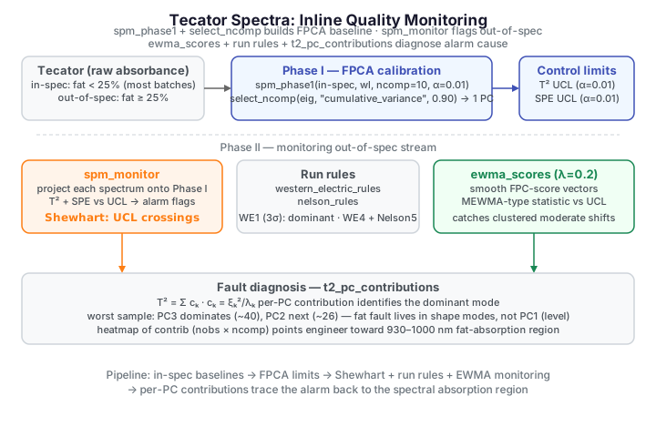
A meat processor wants to run its near-infrared (NIR) spectrometer inline: every sample that comes off the line is scanned, and the operator needs an automatic flag whenever a spectrum drifts away from on-spec product. Because each measurement is a whole absorbance curve, this is a functional statistical-process-monitoring problem. We treat samples with fat below 25 % as in-specification (normal production), learn their curve distribution in Phase I, then monitor the out-of-spec (high-fat) samples in Phase II — using several detection strategies (Shewhart, run rules, an EWMA chart) and finally a diagnostic decomposition that points back to the spectral region responsible.
The two groups overlap heavily in raw spectral space, but subtle shape differences — particularly in the 930–1000 nm fat-absorption region — distinguish them, and the monitor learns those differences from in-spec data alone.
The data
We work on the raw absorbance spectra (as the R reference does), splitting on
fat content: fat < 25 % is in-spec, the rest out-of-spec.
import numpy as np
from docs_fig import fig, render
from docs_data import load_tecator

wl, X, meta = load_tecator()
fat = meta["fat"].to_numpy()
in_spec = fat < 25

f, ax = fig()
ax.plot(wl, X[in_spec].T, color="#3f51b5", lw=0.4, alpha=0.35)
ax.plot(wl, X[~in_spec].T, color="#e8710a", lw=0.4, alpha=0.5)
ax.plot([], [], color="#3f51b5", label=f"in-spec, fat < 25 % ({int(in_spec.sum())})")
ax.plot([], [], color="#e8710a", label=f"out-of-spec ({int((~in_spec).sum())})")
ax.axvspan(930, 1000, color="#dc3545", alpha=0.06)
ax.set(title="Tecator NIR absorbance spectra",
       xlabel="wavelength (nm)", ylabel="absorbance")
ax.legend(loc="upper left")
print(render(f))
The out-of-spec spectra (orange) sit slightly higher, especially in the shaded 930–1000 nm fat band, but the overlap with the in-spec cloud is substantial — which is exactly why a shape-aware control chart earns its keep.
Phase I — calibration and component selection
Phase I builds an FPCA control chart from in-spec samples only. We first fit a
generous model to get the eigenvalue spectrum, then let
fdars.spm.select_ncomp pick the number of components by the cumulative-variance
rule (≥ 90 %), and refit the chart at \(\alpha = 0.01\).
import numpy as np
from docs_fig import fig, render, plt
from docs_data import load_tecator
from fdars.spm import spm_phase1, select_ncomp

wl, X, meta = load_tecator()
fat = meta["fat"].to_numpy()
wl = np.ascontiguousarray(wl, dtype=np.float64)
in_spec = fat < 25
Xtr = np.ascontiguousarray(X[in_spec], dtype=np.float64)

prelim = spm_phase1(Xtr, wl, ncomp=10, alpha=0.01)
eig = np.asarray(prelim["eigenvalues"])
cum = np.cumsum(eig) / eig.sum()
ncomp = int(select_ncomp(np.ascontiguousarray(eig),
                         method="cumulative_variance", threshold=0.90))

pcs = np.arange(1, len(eig) + 1)
f, (a1, a2) = plt.subplots(1, 2, figsize=(9.0, 3.6))
a1.bar(pcs, eig, color="#3f51b5", width=0.6)
a1.axvline(ncomp + 0.5, color="#e8710a", ls="--")
a1.set(title="Scree plot", xlabel="component", ylabel="eigenvalue", yscale="log")
a2.plot(pcs, cum, "o-", color="#3f51b5")
a2.axhline(0.90, color="#e8710a", ls="--")
a2.axvline(ncomp + 0.5, color="#e8710a", ls="--", alpha=0.5)
a2.set(title="Cumulative variance", xlabel="component",
       ylabel="variance explained", ylim=(0, 1.02))
f.suptitle(f"Component selection: variance-90 % rule picks {ncomp} PC", y=1.02)
print(render(f))
PC1 alone explains almost all the variance in the raw spectra, so the rule selects a single component. That is characteristic of NIR data: one dominant mode (broadly, an overall absorbance level/tilt) carries the bulk of the between- sample variation, with the fat signal riding on it.
T2 limit : 6.635 SPE limit: 14.703
Almost every in-spec training point sits below its UCL, confirming a clean
calibration set. The Phase I chart returns the mean function, FPCA loadings,
integration weights, eigenvalues, and the two limits t2_limit/spe_limit.
Phase II — monitoring the out-of-spec stream
spm_monitor projects each out-of-spec spectrum onto the Phase I model and
returns its Hotelling \(T^2\) and SPE (Q) statistics with alarm flags. Writing
\(\xi_k = \langle x-\mu,\,\phi_k\rangle\) for the score of a centred spectrum on
the \(k\)-th eigenfunction, \(T^2\) watches for shifts inside the retained FPC
subspace while SPE watches the reconstruction residual outside it:
A sample alarms when either statistic exceeds its Phase I control limit, \(T^2 > \text{UCL}_{T^2}\) or \(\text{SPE} > \text{UCL}_{\text{SPE}}\); \(T^2\) catches faults along the retained modes, SPE catches structure the \(K\)-component model cannot represent.
T2 alarms : 6 of 74 SPE alarms: 0 of 74 either : 6 of 74
A share of the out-of-spec spectra breach a control limit purely on their shape — the chart never sees the fat value. Which statistic fires depends on how the fault manifests: a departure along the dominant mode inflates \(T^2\), while structure orthogonal to it inflates SPE.
In-spec threshold is illustrative
The 25 % fat cutoff is a stand-in for a real quality band. Tecator ships fat labels so we can define "in-spec" and check the monitor against a known truth; on a live line the labels are unavailable and the chart's whole job is to reproduce that judgement from the spectrum alone.
Western Electric and Nelson run rules
A single UCL crossing is the crudest alarm. Run rules catch subtler
non-random patterns — sustained one-sided runs, near-limit clustering,
oscillation — that also signal an out-of-control process.
fdars.spm.western_electric_rules and nelson_rules scan a statistic against a
center and sigma (here estimated from the Phase I \(T^2\) values) and return the
list of violated patterns.
Western Electric: 9 violations, 14/74 obs flagged Nelson : 10 violations, 20/74 obs flagged
The run rules fire far more often than plain UCL crossings, dominated by single points beyond 3σ (WE1) — the signature of large individual excursions rather than a slow drift. The sustained-run (WE4) and 2-of-3-beyond-2σ (WE2) rules add a handful more, and Nelson's larger rule set contributes an oscillation pattern (Nelson5), so it flags strictly more of the sequence.
An EWMA chart for sustained small shifts
The R reference compares a CUSUM and an MEWMA chart here. fdars's Python
binding does not expose CUSUM or a packaged MEWMA, but it does provide
fdars.spm.ewma_scores, which exponentially smooths the FPC-score vectors. We
build the MEWMA statistic transparently on top of it: an EWMA of the scores,
scored by a Hotelling-type quadratic form with the standard MEWMA variance factor
\(\lambda/(2-\lambda)\). Small \(\lambda\) means long memory — high sensitivity to a
persistent moderate shift, at the cost of slower response (\(\lambda = 1\) recovers
the Shewhart chart).
EWMA alarms: 37 of 74
The out-of-spec stream is not a single clean shift but a mixture of severities, so the smoothed statistic is spiky rather than monotone: it surges well above the UCL where consecutive high-fat spectra reinforce each other (the peak near observation 16), then relaxes back toward zero over the calmer stretches (observations ~22–28 and ~62–68). Even so, the EWMA spends most of the run above the limit and flags roughly half the stream — catching clustered departures that individual \(T^2\) points may not flag on their own.
Binding gap vs. the R reference
R's spm.cusum, spm.mewma, and bootstrap-robust limits (spm.limit.robust)
have no direct Python binding in this build. The EWMA chart above is
assembled transparently from ewma_scores rather than called as a packaged
routine, and this page omits the CUSUM and bootstrap-limit sections of the R
vignette rather than fake them.
Fault diagnosis: per-PC contributions
When a sample alarms, the operator wants to know why. Because \(T^2\) is a sum over principal components, each term is an interpretable contribution \(c_k\) whose share of the total isolates the mode responsible:
t2_pc_contributions returns the per-PC breakdown \(c_k\) for every monitored
sample; we show the worst sample as a bar and the whole stream as a heatmap.
For the worst sample the \(T^2\) mass is carried by the higher-order shape modes, not PC1: PC3 dominates (≈ 40), PC2 is next (≈ 26), and the leading absorbance- level mode PC1 contributes barely 2. That makes sense — PC1 captures the overall absorbance level that in-spec and out-of-spec spectra largely share, whereas the fault lives in the subtler PC2/PC3 shape modes. The heatmap confirms the pattern across the stream (PC3 is the darkest row overall), and since each eigenfunction is a weighted combination of wavelengths, a high PC2/PC3 contribution points the engineer back toward the 930–1000 nm fat-absorption region for root-cause work.
Conclusion
- Phase I learned the in-spec spectral variation and set control limits, with
select_ncompreducing NIR spectra to a single dominant component. - Shewhart \(T^2\)/SPE flagged out-of-spec spectra from shape alone.
- Run rules caught extra excursions (mostly single points beyond 3σ) beyond the isolated UCL crossings.
- An EWMA chart on the FPC scores accumulated evidence over clustered departures, spiking above the UCL and relaxing over calmer stretches.
- Per-PC contributions translated alarms back toward the fat-absorption wavelengths for diagnosis.
Parameters
| Function | Key parameters | Description |
|---|---|---|
spm_phase1(data, argvals, ncomp, alpha) |
ncomp, alpha |
Fit the in-control FPCA model and control limits |
select_ncomp(eigenvalues, method, threshold) |
method, threshold |
Choose the number of components (e.g. cumulative-variance ≥ 0.90) |
spm_monitor(mean, loadings, weights, eigenvalues, t2_limit, spe_limit, new_data, argvals) |
new_data |
Project and flag incoming curves |
western_electric_rules(values, center, sigma) / nelson_rules(...) |
center, sigma |
Run-rule violations on a statistic sequence |
ewma_scores(scores, lambda_) |
lambda_ |
Exponentially smooth FPC-score vectors (basis for an EWMA chart) |
t2_pc_contributions(scores, eigenvalues) |
— | Per-PC breakdown of \(T^2\) |
See also
- Statistical Process Monitoring — the Phase I / Phase II workflow and the two control statistics.
- Advanced Statistical Process Monitoring — EWMA charts, run rules, ARL, and fault diagnosis in depth.
- Predicting fat from NIR spectra — the same dataset as a scalar-on-function regression problem.
References
- Borggaard, C., Thodberg, H.H. (1992). Optimal minimal neural interpretation of spectra. Analytical Chemistry 64(5):545-551.
- Colosimo, B.M., Pacella, M. (2010). A comparison study of control charts for functional data. Quality and Reliability Engineering International 26(4):327-342.
- Kourti, T., MacGregor, J.F. (1996). Multivariate SPC methods for process and product monitoring. Journal of Quality Technology 28(4):409-428.